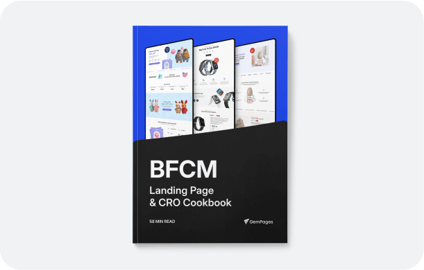
Design landing page for ads

A landing page is a dedicated web page designed to guide visitors toward a specific action, such as making a purchase, signing up, or learning more about a product. For ads, it’s a crucial tool to bridge the gap between your campaign and conversions

Start for free

About Sales Funnels 

Why your landing page doesn’t convert?

Weak or unclear value proposition

If visitors cannot quickly understand what makes your offer unique, they will leave.

Ineffective Call-to-Action (CTA)

CTAs that are too generic or hidden fail to guide visitors toward conversion.

Too much content or distractions

Overloading visitors with unnecessary information or too many links can dilute the focus.

Lack of trust elements

Poor Visual Storytelling

Without trust-building elements like testimonials, reviews, etc., Visitors may hesitate yo take an action.

Misalignment with ad or campaign messaging

If your landing page doesn’t match the promises or tone of your ad, visitors may lose interest.

Not mobile-optimized

Limited Mobile Optimization

With the majority of users browsing on mobile, an unresponsive design can result in a poor user experience.

Boost landing page conversions with these key elements

Above the fold optimization

This section is the first thing visitors see, 

so it needs to grab attention and encourage action.

What to include: A strong, benefit-driven headline, a clear and compelling subheadline, and a visually prominent Call-to-Action (CTA).

Design tips: Use eye-catching visuals, such as product images or videos, and ensure the layout is clutter-free for immediate readability.

Pro Tip: Keep key information, like offers or benefits, visible without requiring visitors to scroll.

Table comparison

Comparison tables make it easy for users to evaluate your product’s value against competitors or different pricing tiers.

What to include: Key features, benefits, and pricing differences. Highlight your product’s unique advantages.

Design tips: Use a clean, easy-to-read table format with contrasting colors to emphasize your best option.

Pro Tip: Label one option as “Most Popular” or “Best Value” to guide user decisions subtly.

As featured in

Showcase where your product or brand has been mentioned to build credibility and trust.

What to include: Logos of well-known publications, media outlets, or brands that have featured or collaborated with you.

Design tips: Display logos in a grid or carousel format to make them stand out. Use recognizable brand colors and maintain consistent logo sizing.

Pro Tip: Add links to the articles or features for authenticity.

Social proofs, product reviews & testimonials

Social proof reassures visitors by showing that others have had positive experiences with your product.

What to include: Star ratings, customer testimonials, user-generated photos, and video reviews.

Design tips: Highlight impactful quotes in large fonts and pair them with the reviewer’s name, photo, or brand logo for authenticity.

Pro Tip: Use tools to pull in live reviews or real-time data to show social proof dynamically.

Guarantee & trust badges

Adding guarantees and trust indicators helps reduce hesitation and builds confidence in your brand.

What to include: Trust badges like “Money-Back Guarantee,” “100% Secure Checkout,” or third-party certifications.

Design tips: Place trust badges near the CTA buttons and within the checkout process. Use high-quality, minimalistic designs to maintain professionalism.

Pro Tip: Include a short line explaining your guarantee, such as “30-Day Risk-Free Returns.”

Increase average order value with GemPages custom landing page

Add Volumne discount bundle

Encourage customers to buy more by offering discounts on bulk purchases.

What to include: Set up bundles like “Buy 2, Get 10% Off” or “Buy 3, Get 20% Off.” Tailor these offers to your store’s product type to maximize appeal.

Design tips:
Highlight the discounts near the product price.
Use vibrant badges like “Best Value” or “Save More!” to catch attention.

Volumne Discount Table

Make it easy for customers to understand the savings they can have by purchasing in larger quantities.

What to include: A table that lists quantity tiers alongside corresponding discounts

Design tips:
Use a clean and minimalistic layout for the table.
Highlight the highest discount row with a different color to drive interest.
Incorporate icons or visuals, such as a shopping cart or arrows, to make it engaging.

Subscription Widgets

Encourage recurring purchases and increase customer lifetime value by integrating subscription options.

What to include: Display subscription benefits like discounts on recurring orders, flexible delivery schedules, or exclusive perks.

Design tips:
Use toggles for “One-Time Purchase” and “Subscribe & Save” options.
Highlight the savings percentage for subscriptions (e.g., “Save 15% with a Subscription!”).
Add trust indicators like “Cancel Anytime” to reduce hesitation.

Don’t overlook mobile optimization, your customers are on the go

Ready to Build Landing Pages That Convert and Drive Revenue?

Start for free