Shopify One Page Checkout - Everything You Need to Know Before Signing Up

Attention spans are shrinking, which means customers don't have the patience for complicated checkout processes. That's why Shopify is offering a streamlined one-page checkout to keep your customers happy and prevent them from abandoning their carts.
In this article, we'll cover all the essential information about Shopify one-page checkout, including what it is, its advantages, and its disadvantages.
What is One-Page Checkout?
One-page checkout is a design style for eCommerce websites that allows the entire checkout process to happen on a single page. It's a convenient and efficient way for customers to complete their purchases without having to go through multiple pages or forms.
With one-page checkout, customers can view their shopping cart, enter payment information, provide billing and delivery addresses, and choose their shipping options all in one go.
Take a look at The Stockist Shop, a popular brand that embraces technology to save time and effort. Their checkout page exemplifies the convenience of a one-page checkout, with all essential information for delivery, shipping, billing, and payment conveniently displayed in one place.

The Stockist Shop applies one page checkout to speed up the checkout process
Learn more: How to Customize Your Shopify Checkout Page in Minutes
One-Page Checkout: Pros and Cons
Advantages of One-page Checkout
- Streamline checkout process
One of the best advantages of one-page checkout is that it simplifies the checkout process for customers. It significantly removes needless steps or form fields to save customers’ time. Plus, they can effortlessly update and revise their information all on one seamless screen, without the hassle of navigating back and forth.
- Reduce cart abandonment
With fewer steps and quicker loading times, one-page checkout minimizes distractions, helps customers swiftly complete their purchase, and ultimately reduces cart abandonment.
- Improve Customers Satisfaction
With Shopify's One-Page Checkout, customers see all necessary fields for order completion, avoiding the hassle of lengthy forms. This streamlined experience enhances customers’s satisfaction and encourages their loyalty.
Disadvantages of One-page Checkout
- Slow down the site speed
One-page checkout involves putting much information on a single page, which can slow down loading times.
- Overwhelm customers
Despite having fewer steps, having all the fields on one page can overwhelm users with too much information and annoy them. This frustration can be heightened by long scrolling in Shopify's One-Page Checkout.
- Induce Analytics Challenges
Due to the consolidation of all information onto a single page and within a URL, tracking and analyzing various materials and resources becomes challenging. This, in turn, makes it difficult for website developers to identify the point at which customers abandon their transactions and gather insights for future development.
Examples of Shopify One Page Checkout
Stellar Eats
Stellar Eats has started selling health food since 2020 and got favored by a wide range of customers. But like many food brands, they faced a common challenge: getting customers to embrace the convenience of online grocery shopping. To overcome this hurdle, Stellar Eats took action and simplified their checkout process.
By harnessing the power of Shopify One-Page Checkout and implementing a free shipping threshold, Stellar Eats transformed the way customers make purchases. The result? A remarkable 3.5% increase in conversions!

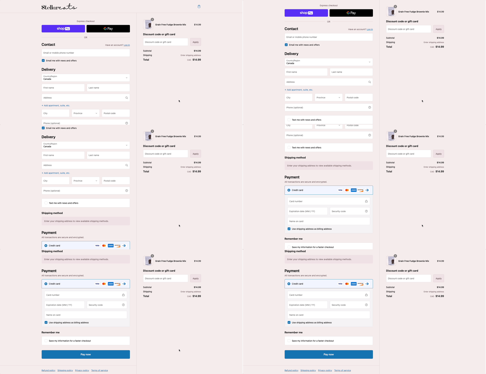
Stellar Eats’s One-page checkout
Hemlock & Oak
Hemlock & Oak provides a variety of planners, notebooks, and notepads that use materials from the waste cycle. With a view to differentiate buying experience, this brand switched to One-Page Checkout. Its result was a 7% increase in online store conversion rates and a lift in pre-orders with split payments.

Hemlock Oak One Page Checkout Example
How To Implement One-Page Checkout On Shopify
Shopify has evolved the current three-page steps to a much more streamlined experience that’s optimized for speed and conversion, providing buyers with the best shopping experience on the internet.
If your store is on Shopify Plus and has early access, you can offer customers faster checkout by switching to a one-page layout; Try Shopify checkout-upgrade to use checkout extensibility for eligibility.
To create a one-page checkout on Shopify Plus, follow these steps:
- Log in to your Shopify Plus store admin dashboard.
- Go to "Online Store" and click on "Themes."
- Select "Edit HTML/CSS" and click on "Add a new layout."
- Choose "Checkout" from the dropdown instead of "Theme."
- Customize your checkout page by editing the code as needed.
For non-Shopify Plus stores with early access, enable it in your checkout settings for a faster checkout experience.

Wrapping up
Shopify's one-page checkout is set to revolutionize the checkout process, making it easier and faster than ever before. With a sleek and streamlined checkout page design, your store will exude joy and entice customers to make purchases.
If you are looking for a faster and smarter way to build or customize, and yes, even your entire Shopify store! Thanks to GemPages, you're in for a treat.
Imagine having a powerful editor at your fingertips, a bunch of amazing templates to choose from, and the cherry on top – the Image-to-Layout feature. This AI feature lets you turn reference images or URLs into editable layouts without breaking a sweat.


 Facebook Community
 Change Log
 Help Center


