


 Facebook Community
 Change Log
 Help Center


10+ Best Above the Fold Examples to Get Inspired in 2025
If your website is a digital asset, the above-the-fold section is one of the most valuable parts of that asset.
It’s the first thing your website visitors see when landing on your website. Thus, it carries a significant importance, especially in eCommerce businesses.
But the question is — what should you consider when creating your above-the-fold section and its content?
In this blog post, we’ll walk you through some of the best above-the-fold website examples and share the tips and best practices that you can implement when creating your above-the-fold content and design.
What Does “Above the Fold” Mean in Websites?
“Above the fold” is the top section of a web page that appears immediately once you land on it — and before scrolling down the page.
A typical above-the-fold section of an eCommerce store’s homepage may contain elements such as the brand logo, announcement bar, header menu, hero image or video, heading and subheading copy, promotional offer, search bar, CTA (Call to Action) button.
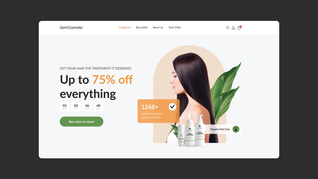
13 Best Above-the-Fold Website Examples
Now, let’s go through the best above-the-fold or hero banner examples that we have collected from the eCommerce world — after reviewing more than a hundred websites/Shopify stores.
1. Huel
Huel is a nutritional food brand that makes its products from plant-based and sustainable ingredients such as peas, rice, oats, coconut, etc.

Key takeaways from Huel’s above-the-fold section:
- Great use of CTA buttons:
The brand has provided two different CTA buttons — “Shop Huel” and “What is Huel?” — to help two different types of customers: 1. Those who are already aware of the brand and 2. new customers who might not be aware of the brand or its products.
- Display of the social proof:
The brand highlights the many popular media platforms where it was featured, such as Women's Health, Men's Health, CNN, Shape, Vox, TIME, Fox, and Wired. This helps enhance the brand’s credibility.
- Mention of the third-party customer reviews:
Another great thing the brand has done is that they have displayed its Trustpilot rating (TrustScore 4.3 from 16,454 reviews). This shows to customers that thousands of customers have already used this brand’s products.
2. Allbirds
Allbirds is one of the most popular Shopify-powered brands that offers a wide range of comfortable shoes and clothing products.

Key takeaways from Allbirds’ above-the-fold section:
- Short but great copy:
- Allbirds’ headline copy is just two short sentences but still gets the point across about how its products are beneficial.
- Teaser to continue scrolling:
- Right below the hero image section, it has the header “Our Favorites” which makes us scroll down to see what those products are.
- Use of sidebar menu:
- It has featured collections given as a sidebar menu, which makes navigation much more accessible for customers.
3. Amazfit
Amazfit is a smart wearables brand that offers smartwatches, bands, and accessories.

Key takeaways from Amazfit’s above-the-fold section:
- Eye-catching announcement bar:
When landing on the Amazfit website, its announcement bar grabs the attention where the brand has mentioned some important information, i.e., free shipping, a 12-month warranty, and the 30-day returns policy. All these details can help customers purchase the product without hesitation.
- Great use of slideshow:
The slideshow highlights some of the best products offered by the brand. While each slide has the "Learn more" button, customers can click anywhere on the image, and it'll redirect them to the respective product page.
- Use of stunning product images and features:
Amazfit’s above-the-fold section displays some impressive product images along with its key features which can allow entire buyers to make a quick purchasing decision.
When designing your above-the-fold section, consider all the different device types, especially mobile. If you’re using GemPages to design your website, you can easily switch between different device types in the editor and create a mobile-optimized and responsive above-the-fold design.
4. Kylie Cosmetics
Kylie Cosmetics — a cosmetics brand run by a famous celebrity, Kylie Jenner — is an excellent example of a beautifully designed above-the-fold section.

Key takeaways from Allbirds’ above-the-fold section:
- Use of an exciting offer:
Customers love getting free treats, and Kylie Cosmetics knows it very well. It has highlighted an enticing offer of “free treats” in its hero section. This makes it an attention-grabbing above-the-fold section.
- Nice and clean design:
The overall design of Kylie Cosmetics’ above-the-fold section looks aesthetically pleasing with the mild colors and nice fonts.
5. Cupshe
Cupshe is a fashion brand that offers stylish beachwear, swimwear, jumpsuits, and dresses at affordable prices for women of all sizes.

Key takeaways from Cupshe’s above-the-fold section:
- Display of promotional offers:
Right below the menu section, Cupshe highlights promotional offers with three blocks — "FASTER & FREE", "10% OFF | SITEWIDE", and "GET EXTRA 15% OFF".
- Use of two different CTAs:
Under the Pre-Black Friday and the subscription discount offers, there are two different CTAs — “SHOP ALL CLOTHING” and “SHOP CLEARANCE”. By using such specific CTAs, you can make it easy for customers to explore any specific promotional offers.
- Announcement bar:
Apart from the hero image section, Cupshe uses the announcement bar to promote its different discount offers and free shopping offers (for a certain order value).
6. Bulletproof
Bulletproof is a popular brand that started by selling coffee and now offers a variety of other products including protein bars and other supplements.

Key takeaways from Bulletproof’s above-the-fold section:
- Aesthetically pleasing design:
The overall look and feel of Bulletproof’s homepage look so elegant thanks to its great color scheme and proper use of color contrast.
- Use of a discount offer widget:
The 20% discount offer is being promoted with a dedicated widget. Customers can click on that widget and unlock the offer. Another good thing about this widget is that it’s a sticky widget. So, even if you scroll down, it appears on your screen.
- Enticing customers to explore more:
The heading title after the hero image — “DISCOVER WHAT BETTER FEELS LIKE WITH BULLETPROOF FUNCTIONAL NUTRITION” — is also a great way to intrigue the visitors to explore more on the website.
7. Peak Design
Peak Design offers a wide range of products including everyday bags, bag accessories, mobile cases and accessories, camera gear, and tripods.

Key takeaways from Peak Design’s above-the-fold section:
- Showcasing the different collections:
- Raising awareness about the cause:
Peak Design donates a small portion of its sales to nonprofits and it makes the customers aware of this case through the announcement bar at the top of the website that says, “1% OF EVERY SALE GOES TO ENVIRONMENTAL NONPROFITS”.
- Use of the About tab:
One more interesting thing about Peak Design’s above-the-fold section is the About tab in the top right corner of the website. When you expand that tab, it provides links to all the company resources.

8. William Painter
William Painter offers sunglasses with high-quality and durable material for an "adventurous lifestyle".

Key takeaways from William Painter’s above-the-fold section:
- Use of a video in the hero section:
The video in the hero section showcases the benefits of the product (sunglasses) and how it can be used for various types of adventures.
- Accessibility adjustments widget:
One of the unique aspects we observed on this brand’s above-the-fold section was the widget given for accessibility adjustments. It provided different settings to adjust the website's accessibility based on individual needs.

- Free shipping offer:
The brand offers free shipping on all orders in the US above $100 and it has highlighted this offer in the announcement bar.
Learn more: How to Do Free Shiping on Shopify? (+Evergreen Tips)
9. Bombas
Bombas is a sock and apparel brand with a great mission to help others who are in need. The brand creates comfortable socks for men and women.

Key takeaways from Bombas’ above-the-fold section:
- Display of featured collections:
Bombas has a unique design displaying its major collections right below the menu bar. This can help customers easily find what they’re looking for.
- Highlighting the noble cause:
In the above-the-fold section, typically brands use copy promoting their product benefits or discount offers; however, Bombas is different. It has mentioned its initiative of "One Purchased = One Donated" and that the brand has already completed 100 million donations.
10. Manscaped
Manscaped is a lifestyle consumer brand for men that offers essential grooming products such as beard grooming kits, hair trimmers, body care kits, deodorants—and clothing items such as t-shirts and boxers.

Key takeaways from Manscaped’s above-the-fold section:
- Great display of the products:
Manscaped has put its products in the limelight in the hero image section. With a great color contrast, the overall visual appeal of its above-the-fold section looks quite stunning.
- Use of an expandable announcement bar:
Sometimes, you might have too much to share in the announcement bar but too little space. Manscaped has created an announcement bar that can be expanded to review more details. In this section, the brand promotes its offers like free gifts, free shipping, the peak hygiene plan, etc.

11. Figs
Figs is a medical uniforms and apparel brand that offers comfortable and stylish scrubs, outerwear, loungewear, layering essentials, and more.

Key takeaways from Manscaped’s above-the-fold section:
- “Shop by Color” menu:
The header menu is one of the crucial elements in the above-the-fold section. It helps visitors navigate through the website easily by finding different collections. However, Figs has taken it to the next level.
It allows visitors to explore the products by color. There are many customers who are very specific about their color choice, and this section could be incredibly helpful to them.

- Use of lifestyle images:
Figs shows how its different products look on people by showcasing lifestyle images with different models. This makes the overall look and feel of the website aesthetic as well as authentic.
12. Hand Dyed Shoe Co.
As the name suggests, Hand Dyed Shoe Co. offers custom handmade shoes. This brand uses GemPages to design its store.

Key takeaways from the above-the-fold section:
- Use of high-quality product video:
Hand Dyed Shoe Co. shows how premium and elegant its finished product looks through a high-quality video. We must say — the video steals the show in this above-the-fold section.
- Brand philosophy:
Instead of using a copy explaining the product and its features/benefits, this brand has focused on the brand philosophy. You can see the quote by the founder that says, “It's not about what you do in your unique shoes, it's about how you feel when you do it”.
- Personalized CTA buttons:
There are two different CTAs — “Design Yours Now” and “Book a Fitting” — and this makes it easy for customers to go for the specific CTA based on their requirements.
13. Brooklinen
Brooklinen was founded with a mission of providing high-quality home essentials at accessible prices. The brand sells products such as bed sheets, towels, blankets, home fragrances, wall art, and much more.

Key takeaways from Brooklinen’s above-the-fold section:
- Reward points promotion:
Brooklinen promotes an interesting offer to its customers by giving them the opportunity to earn four times more points on every gift guide purchase.
- A creative way to promote the email newsletter:
In the header section, it has a message icon that entices us to click on it. Upon clicking on that icon, a pop-up appears that offers a 15% discount for signing up for the newsletter. This is a creative way to capture email subscribers.

Why Above-the-Fold Content is Important?
-
Brand Impression:
First impression is essential, and it applies to web design as well. The first thing that visitors notice when landing on your website is the above-the-fold section.
And that’s why it’s so crucial to create a great first impression with your above-the-fold content.
Use GemPages to create your entire web page and not just the above-the-field section. You can create different pages such as the About page, Contact page, and Blog page — with a similar design and style as your homepage.
-
Search Engine Optimization (SEO):
You might be wondering how above-the-fold content can impact SEO!
While it’s definitely not the direct factor in SEO, it’s still important to consider it. If the above-the-fold content is poor, your visitor may exit your website immediately. This can increase the bounce rate, and eventually, it may impact your website’s SEO.
Great above-the-fold content makes the user stay on your website and explore more content. As a result, it’ll not only reduce the bounce rate but also help enhance your ranking.
-
Conversion Optimization:
Your website’s above-the-fold content plays a crucial role in influencing your website visitors. It can really build or damage your customers’ perception of your brand.
Compelling above-the-fold copy along with a CTA can entice visitors to convert into buyers. Some brands also use this section to highlight and promote their best offers in this section.
Key Elements of Above the Fold Website
A Compelling Headline
The heading copy or the tagline can be used in different ways. Many brands use it to highlight the key benefit or the USP (Unique Selling Point) of their business.
Some brands prefer to use their headline copy to state the brand’s mission. It creates a strong bond between your brand and your customers.
All in all, make sure to use a tagline that aligns with what your brand is doing and what makes you stand apart from the competitors.
Use Personalized CTAs
Personalized CTAs have 202% better conversion than basic CTAs.
Typically, most online stores have one commonly used CTA button — “Shop Now”. However, you can be more specific and create more personalized CTAs depending on your products and customers.
Best Practices for Above-the-Fold Optimization
Use a page builder app
Design is one of the most important aspects of the above-the-fold section. If you’re using Shopify and wondering how to nail your website design, GemPages can help you do so.

GemPages lets you design your website with an intuitive drag-and-drop editor, and you can customize the design as you wish.
GemPages is one of the most loved page builder apps on the Shopify app store. What’s more exciting is that GemPages also has an AI-powered image-to-layout feature that makes the design process smarter and faster.
Keep the right size for the header section
One of the common mistakes we see a lot of stores make is that they keep too long a header section. As a result, the hero section gets too little space to create an impression as needed.
Try to keep the header section reasonably short in terms of its height. Also, we would advise using a rectangular-shaped logo instead of a square logo. A square logo takes up too much space.
Be concise with your copy
Think of your above-the-fold copy as a quick intro to your brand. It doesn’t have to be too lengthy. Ideally, you can write a heading copy with just a one-liner of no more than 5-7 words.
Then, for the subheading, just a couple of lines to briefly expand on your main heading. Be creative but get to the point straight away.
Optimized SEO
Optimizing your above-the-fold content for search engines is essential for visibility. Use targeted keywords in headings, subheadings, and alt text for images to help your page rank higher. However, maintain a balance—prioritize readability and user engagement to avoid keyword stuffing. A well-optimized above-the-fold section not only improves your SEO but also sets a positive tone for the rest of your content.
Attractive Design
A visually appealing design is critical for making a strong first impression. Use eye-catching visuals, bold typography, and colors that reflect your brand identity. A clean, clutter-free layout ensures that users focus on the essential elements, such as your headline and call-to-action (CTA). Don't forget to make the design responsive so that it looks great on all devices, especially mobile, as many users will visit your site on their phones.
Ample Testing and Improvement
Continuously testing and refining your above-the-fold section is crucial to optimizing its performance. Conduct A/B tests to experiment with different headlines, layouts, or CTAs, and use analytics to track metrics like bounce rates and conversions. This data-driven approach helps you understand what works and what doesn't. Regular updates based on insights will keep your content fresh and engaging, ensuring long-term success.
Pro tip: Try GemX to streamline your landing page optimization process. This cutting-edge Shopify app, designed for Conversion Rate Optimization (CRO) and A/B testing, allows you to effortlessly create and test multiple landing pages for the same product.
Adjust the Contrast Level
One more common mistake we noticed in many websites is that the background is too busy and it’s hard to read the text. It can completely eliminate the positive impact that your copy could bring.
So, make sure the texts are clearly visible by adjusting the contrast level of the background image or video and the text. Use image overlay if the background is too busy.
Final Thoughts on Above the Fold
Above-the-fold content is a great opportunity to create a solid first impression. Don’t miss out on that opportunity. Create a unique and compelling design to show customers why they should buy from your brand.
Also, you must update and change your above-the-fold content at regular intervals. And that’s why using a page builder app like GemPages can make your job much easier and faster.
Lastly, whenever you’ve created/changed the design of your above-the-fold section, make sure to check it out on different devices to ensure everything looks perfect on all types of devices.
FAQs about Above the Fold


