


 Facebook Community
 Change Log
 Help Center


 Shopify
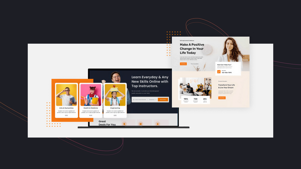
15 Best Online Course Landing Page Examples to Boost Enrollments & Design Tips for Success
Shopify
15 Best Online Course Landing Page Examples to Boost Enrollments & Design Tips for Success
15 Best Online Course Landing Page Examples to Boost Enrollments & Design Tips for Success
Want to be inspired by the most effective online course landing page examples to stand out?
You’re in the right place now. A dedicated landing page can address the audience’s pain points, showcase the course's value, and establish trust through social proof and compelling visuals. That’s why it is known as the difference between a visitor bouncing away and a loyal customer.
This blog will list out 15 of the best online course landing page examples that illustrate powerful design strategies and practical lessons you can apply today. Now, enjoy your discovery with us!
What Is An Online Course Landing Page?
An online course landing page is a landing page developed to promote an online/offline course. Its key goal is to convert visitors into a single action, such as enrolling in a course, signing up for a waitlist, paying for registration, or downloading a free guide. This page is distraction-free from multiple links or navigation options; instead, it focuses on the offer and the call-to-action (CTA).
Key Elements to Include for Your Online Course Landing Page
A successful online course landing page example often comes up with the following elements:
- A bold, benefit-driven headline, paired with a concise subheading that promises a result.
- Hero images or teaser videos that display instructors, lesson previews, or dashboards.
- Bullet-driven benefits topped with a CTA placed above the fold and repeated throughout.
- Social proofs (e.g., real customer stories, solid numbers, outcomes, logos, etc.).
- A FAQ or objection-handling section to quell gestation and reduce refunds.
- Clean, fast-loading design, mobile responsiveness, and alt-text with keywords.
- Elements of storytelling for customers’ emotional connection with the brand.
Learn more: 8 Must-have Elements for a Winning Landing Page
15 Best Online Course Landing Page Examples To Get Inspired
#1. Ahrefs
Industry: SEO and Digital Marketing
The first online course landing page example is powered by Ahrefs, one of the SEO industry's leaders. The page features a direct, no-nonsense design to appeal to an expert audience and prioritize facts and functionality over flashy graphics, immediately capturing visitors’ attention.

Ahrefs stands out with a clean, uncluttered online course landing page layout
What inspires its design:
- The direct headline "SEO Course for Beginners" instantly tells visitors what they'll get.
- The design uses a clean, uncluttered layout with a simple color palette.
- The "Start course" button stands out with a contrasting color.
- A professional headshot of the instructor is featured prominently to build trust.
- Key metrics like "14 lessons" and "2h 00m" are presented in an easy-to-read format.
#2. BrunchWork
Industry: Professional Development & Business Education
BrunchWork’s online business class landing page is vibrant and community-driven, featuring bold typography, white space, and text-heavy sections. Notably, this online course landing page especially succeeds in establishing visitors’ trust by displaying the logos of renowned partners, detailed information about speakers, specific customer reviews, and transparent pricing plans.

The BrunchWork online course landing page example heavily relies on text to provide visitors with detailed information.
What inspires its design:
- Bold headline, clear CTA, speakers' images, and top-partner logos boost credibility.
- A modular, colorful curriculum layout design with icons makes content easy to scan.
- Reviews with ratings, names, and headshots build trust and community.
- 4 CTA buttons for various conversion aims: Download Syllabus, Intro Chat, Apply Now, and Employee Reimbursement.
#3. CFA Institute
Industry: Finance & Professional Certification
As a leading global association for investment professionals, CFA Institute’s page needs to exude credibility to attract professionals to register. That’s why this online course landing page design example uses a direct design with solid numbers to highlight the institution's reputation.

CFA Institute’s prestige and trust are built with bold stats and authentic reviews
What inspires its design:
- Bold statistics for diverse aspects (e.g., charterholders, salary, etc.) to boost trust.
- Strong headline, deep-blue layout projects professionalism and prestige.
- Testimonials with names, titles, and companies boost authenticity.
- Minimalist design keeps attention on core values and key numbers.
#4. HubSpot
Industry: Marketing & Sales Software
This HubSpot online course landing page example is to engage beginners in eCommerce. The page emphasizes the ‘Free’ aspect of the offer, helping grow HubSpot’s email list effectively. Moreover, HubSpot showcases the course curriculum with detailed video titles, giving visitors a transparent view of what they’ll learn and achieve by the course before they decide to sign up.

HubSpot embraces a minimalist layout that highlights value and drives sign-ups.
What inspires its design:
- A clear offer is presented with the subheadlines “FREE Course” and “100% free”.
- Instructor profiles and a preview video help build credibility and personal connection.
- An easy sign-up form with social logins (Google, Microsoft, Apple) simplifies enrollment.
- Clear headings and lesson lists with time lengths create a skimmable layout.
#5. BASB
Industry: Personal Knowledge Management
Building A Second Brain (BASB) uses a dark color scheme that makes its white text and bright yellow CTAs pop in key parts: the hero and contact sections. The long-form page design guides the audience from the challenge of information overload to the promise of organized knowledge. Moreover, BASB is highly evaluated for blending storytelling with social proof to grab attention.

BASB uses a story-driven, long-form layout to guide users from chaos to clarity
What inspires its design:
- Headline tackles pain points with a clear solution, backed by an engaging hero video.
- Relatable problems lead to the course as the solution for emotional connections.
- Bright yellow button with affirming copy drives more substantial user commitment.
- Top media mentions are used at the top to boost credibility effectively.
#6. Skill Share
Industry: Creative & Professional Skills
Skill Share’s landing pages, such as those for its storytelling classes, are visually engaging and user-friendly. Their design engages visitors with the standout hero section: the subheading “7 free days” repeated twice, the “Cancel anytime” commitment, and a bold, large-sized headline. Notably, Skill Share only changes the hero design for each course and keeps the remaining similar across courses (a discovery-oriented layout with cards) to achieve higher consistency.

Skill Share uses a discovery-oriented layout with relevant tags for an easier discovery
What inspires its design:
- The discovery-oriented layout with category tags makes it easier to explore options.
- A strong hero section for conversions by repeating values and using standout formats.
- Engaging, reliable videos with the instructor’s name and headshot.
#7. Adobe
Industry: Software & Professional Certification
Adobe’s online course landing page example for its professional certifications is a testament to its brand authority, presenting a clear career growth path. The design speaks directly to ambitious individuals seeking to validate their skills with benefits and three stages to success. As a result, the audience can easily clarify what they will learn to achieve this Adobe certificate.

Adobe online course landing page design displays a structured information flow with three stages to offer an in-depth understanding of the course
What inspires its design:
- The page uses a dynamic, bright color palette with abstract shapes and imagery.
- A clear value proposition uses bolded points to highlight the benefits of certification.
- A structured information flow: Professional, Expert, and Master.
- Authority through branding embraces data-backed claims (e.g., 87% of IT employees).
#8. London School of Economics and Political Science (LSE)
Industry: Higher Education
LSE blends academic prestige with modern marketing psychology and UX best practices, creating one of the best online course landing page examples that you should get inspired by. Its clean layout and strong credibility markers reinforce trust. Moreover, by framing the program as a ‘career milestone,’ it positions itself as a transformative chance rather than another course.

LSE is a must-see example of an online course landing page in education.
What inspires its design:
- The page uses a “From…to…” format to highlight real career transitions
- “August Only” banner creates a sense of urgency.
- Detailed form (e.g., work experience, education) pre-qualifies leads.
- Logos of well-known companies and respective professionals boost trust.
- Key course details like duration and start date are presented in an easy-to-read format.
#9. ELSA Speak
Industry: Language Learning
ELSA Speak’s page for its English pronunciation course is a fantastic online landing page example for an app-based product. It combines an intuitive design with a 3-step demonstration of the product's value to succeed in engaging visitors. The page builds trust with a mix of social proof, media mentions, the number of downloads, and 4.x ratings from satisfied global learners.

ELSA Speak tries to drive downloads with a visible CTA through the landing page
What inspires its design:
- Visitors feel engaged with a live tool to practice words and discover the app’s core.
- Testimonials, media logos, and download/rating stats build credibility.
- Practical outcomes are strategically added to deliver clear, benefit-driven messaging.
- A “Download ELSA App” CTA app is visible within the page for better conversions.
#10. Gym Box
Industry: Fitness & Wellness
Gym Box is a successful online course landing page example for selling fitness-related courses. The design uses a bold, contrasting color scheme of black and yellow to create a striking visual impact. In short, it is minimalist but focused with a clear signup form and a direct, strong CTA.

Gym Box comes up with realistic photos of training to make an impression on visitors
What inspires its design:
- Sections use a high-energy photo of a person training to set a dynamic tone.
- Contrasting colors between frames and backgrounds make the content stand out.
- The registration form is direct, only asking for essentials to reduce friction.
#11. Oxford Mindfulness
Industry: Oxford Mindfulness
Oxford Mindfulness combines Courses and Events into its online course landing page design, engaging visitors with the benefit-driven headline “Mindfulness training for greater well-being.” Notably, marketers try to display relevant videos with tutors' images as a reliable preview so that visitors are willing to download the Mindfulness app, try it, and register for the desired classes.

Oxford Mindfulness features an example with a benefit-driven headline to engage visitors with strong health awareness.
What inspires its design:
- The use of a soft, light blue and yellow color scheme spotlights a good visuality.
- The page has a structured content organization from key sections to relevant events.
- The “Retreats” section features headshots of the instructors, giving a face to the course.
#12. Turito
Industry: Tutoring
Turito's landing page is a highly functional and conversion-focused online course landing page example. The design utilizes a clean, two-column layout to immediately showcase the core benefit of this service and a clear path to action. It effectively leverages a no-cost, low-friction offer to capture leads, making it an ideal example of a page designed purely for lead generation.

Turito’s landing page comes up with a prominent demo form and urgency cues
What inspires its design:
- A large "Book a free demo" form is prominently placed for immediate action.
- Key benefits in the hero section are listed with checkmarks for easy scanning.
- “Limited Slots Available” banner motivates quick action from visitors.
#13. Meta Blueprint
Industry: Social Media Marketing & Professional Certification
The Meta Blueprint landing page design for its online courses seems simple to some users, but it instantly builds authority by leveraging the Meta brand. This page presents a clear and logical path for marketers to advance their careers. Additionally, simplifying a complex array of certifications makes it easier for all visitors to find the right specialization and take the next step.

Meta Blueprint uses role-based navigation to guide users to choose a proper course
What inspires its design:
- Meta’s global recognition helps build credibility effectively, with only a simple design.
- Role-based navigation guides users to certifications with a clear, icon-based layout.
- Key benefits come up with a “Watch Video” CTA for immersive experiences.
- #14. Master Class
Industry: Entertainment & Lifestyle Learning
MasterClass has transformed the concept of the online course landing page into a real art form. Its design is cinematic and aspirational, using the star power of its instructors to highlight both courses and experiences. Great videos and emotional copy also help compel visitors to enroll.

MasterClass offers a unique landing page design for online courses to engage visitors
What inspires its design:
- The hero section features cinematic portraits of celebrity instructors to convey prestige.
- Motivational copy inspires personal transformation and connection to experts.
- Value-focused content like “Accessible Anywhere” emphasizes outcomes.
- A time-sensitive banner (e.g., 50% OFF) is visible to drive instant action.
#15. Code Academy
Industry: Tech & Coding
The final online course landing page example is from Code Academy. Its clean, technical design appeals to visitors who value logic and clear instruction. The copy addresses common fears about learning complex skills and emphasizes the supportive learning community and experts.

Code Academy landing page has a direct, clean layout with benefit-driven highlights
What inspires its design:
- A benefit-driven hero with a headline highlight live learning with industry experts
- Four modules with icons in “Why Choose Us” showcase key course benefits clearly
- Banner and CTA create urgency with start/end dates and “Reserve your seat.”
- Industry-recognized certifications and expert content build trust.
What Makes Your Online Course Landing Page Superpowerful
#1. Choose the right landing page builder
While it can be challenging to start designing from scratch, brands with high-performing online course landing page examples use landing page builders to save effort effectively. Top-rated solutions like GemPages for Shopify stores can empower everyone to generate stunning pages.
GemPages’ user-friendly, drag-and-drop editor allows you to arrange elements effortlessly, customize designs, and integrate with other Shopify apps to boost conversions. Additionally, with a library of 200+ CRO-optimized templates for online courses and digital products, you will have a professional starting point tailored to your industry, whether you’re an expert or beginner.
Impressively, GemPages recently introduced the AI-Powered Image-to-Layout feature, part of its AI capabilities suite, which instantly converts reference images or URLs into an editable layout. Its apparent effectiveness is backed by 80,000+ sections supported monthly through GemAI.
Learn more: AI-Powered Website Optimization — Guide, Tools, Tips
#2. Use captivating visuals and copy
Your landing page's hero section is often its most crucial asset, and you should consider it first. A high-resolution, focused video, high-quality images, or any other type of visuals can showcase the course's value and build an emotional connection. Your copy should be benefit-driven and use bulleted points, which is better than being feature-focused to capture customers’ attention. For example, instead of saying, "The course has 10 modules," say, "Master the skills in 10 easy-to-follow modules to launch your dream career.", helping provide a deeper understanding.
Throughout your landing page, maintain consistent, persuasive messaging to guide audiences along the discovery journey while keeping them engaged effectively. Generally, bulleted points, subheadings, and short paragraphs are essential to making content digestible and scannable.
#3. Pepper your page with social proof
Here’s what we learn from the best online course landing page examples to make social proof:
- Use Real Testimonials: Include quotes from registrants or those who achieved real results with your online course. Specific statements like “I landed my first freelance client within 2 weeks of completing this course” can help resonate more than vague praise.
- Show Case Studies or Success Stories: Highlight measurable outcomes, including before-and-after examples, to create a narrative that potential audiences can relate to.
- Include Ratings and Reviews: Display star ratings or aggregated reviews from credible sources to add authority. People tend to trust peer feedback more than marketing copy.
- Feature Recognizable Logos: If your alumni work at well-known companies or if your course has been featured in reputable media, display these logos to reinforce credibility.
- Leverage User-Generated Content: Screenshots, social media mentions, or video reviews from your customers can feel more authentic than polished marketing material.
#4. Optimize mobile-responsiveness
So, what about making your page look perfect on any screen to satisfy mobile responsiveness?
You should prioritize clear readability of text and headlines, correctly scaled images and videos, and easy-to-click buttons and forms. Additionally, don’t forget to preview your mobile layout before publishing so that no potential customer slips away because of poor mobile experiences.
#5. Test, track, and refine
Even the polished online course landing page design examples need ongoing optimization. That’s also where A/B testing, heatmaps, and analytics come into play for helpful insights about:
- Which headlines drive the most clicks
- How visitors navigate your page
- Conversion rates across different sections
By testing and tracking, you can refine your design to maximize sign-ups and sales. Tools like Gem X make this process easier with features such as custom traffic routing, funnel analytics, and seamless integration with leading page builders like GemPages. This ensures that your current landing page doesn’t look good; it continuously improves based on real user behavior.
Conclusion
With 15 dedicated online course landing page examples above, we hope you’ve gained inspiration to identify what works best and adapt those strategies to your own products. Interestingly, most course-selling pages don’t rely heavily on interactive elements like complex animations. Instead, they focus on clarity, compelling copy, and conversion-driven design by highlighting course benefits, storytelling sections, scarcity, instructor credibility, and clear CTAs.
Learn more on the GemPages blogs and see how you can elevate your online course business.
FAQs


