Effective Tips to Create Call to Action Buttons that Convert

In today's rapidly evolving digital landscape, every business’s goal is to transform website visitors into paying customers. The secret to achieving this lies in the call-to-action (CTA) buttons–a critical element that can make or break your conversion rates.
A well-designed and strategically placed CTA button can drive visitors to take the desired action and hit your revenue targets. In this article, we'll explore the art of creating powerful and persuasive call-to-action buttons that convert, enabling you to unleash the full potential of this game-changing feature and take your business to new heights.
What Is A CTA Button?

An example of a Shopify Store with good CTA buttons
CTA buttons hold incredible power on your page or site. It is a conversion button that urges readers to take action on a website, blog or any form of communication. It invites your targeted audience to complete the intended goals you have in mind.
The most commonly used CTA buttons in everyone’s vocabulary are - Buy, Add to Cart, Know more, Subscribe, and more. However, there’s no limit to how creative CTA buttons can be. The list is truly endless!
Why Are CTA Buttons Important?
Imagine you've poured your heart and soul into hundreds of hours of researching, writing, rewriting and refining your website. After all, it takes a lot of sweat to make your site stand out from millions of pages competing for the reader's attention. But in all the excitement, you couldn't give much attention to a critical element that completes the page's goal - a captivating CTA button.
A weak or unnoticed CTA will make all your labor go to waste and your goals unmet. This silly misstep can be catastrophic, a failure that can lead your efforts down the drain.
What Are The Different Types of Call to Action Buttons?
CTA buttons vary with the goal you want your reader to achieve.
Some of the commonly used CTAs are:
|
Intention |
CTA |
|
To add a product or service to pay money for the value offered. |
Buy, Shop, Order, Reserve, Save, Add to Cart, Pick, View. |
|
To give the reader a feel of the product by offering them to test it out for a limited period and then make a purchase decision. |
Try, Free trial, 30 days free, Sign up for FREE |
|
Build community |
Subscribe, Join, Sign Up, Refer. |
|
Freebie giveaway |
Download, Get, Grab, Claim. |
|
To guide users to a more complete version of the snippet shared. |
Learn More, See More, See How, Start, Find Out, Check it Out, Click Here, Continue, Swipe Up. |
|
To nudge the reader to share the content with their network. The common platforms are Meta products, Twitter, and LinkedIn. |
Share, Refer, Spread the Word. |
14 Top Tips to Nail Your Call to Action Buttons
The ultimate CTA tips you should always keep in mind; please take notes!
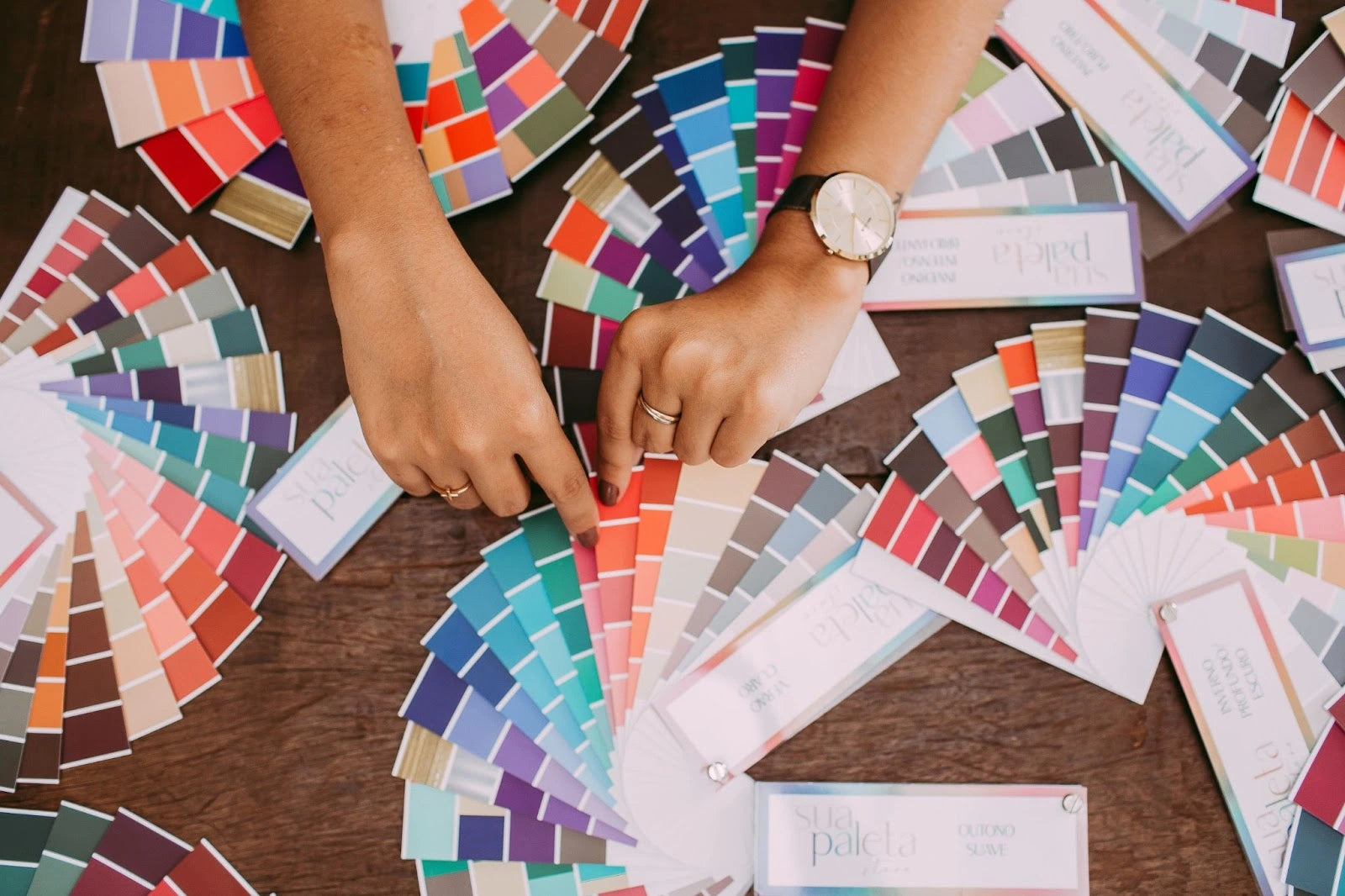
Choose The Color of CTA Buttons Super-wisely
What color is best for CTA? The answer is more complex!
Picking the right colors for your CTA buttons is critical for skyrocketing clicks and conversions. But hold on; it's not just a matter of red or green. You must consider various factors, such as branding, color harmony, and contrast.

There is no universal palette that is ready to go.
Some emotions associated with colors are:
|
Color |
Emotion |
|
Blue |
trustworthiness, loyalty, and sincerity |
|
Red |
energy, strength, and urgency |
|
Green |
balance, refreshment, and restoration |
|
Black |
sophistication, and efficiency |
|
Orange |
fun, passion, and security |
|
Purple |
luxury, transparency |
Companies are constantly testing CTA button colors.
SAP has found that orange CTAs boosted their website conversion by over 32.5%.
Be bold in experimenting with colors once you get the desired conversion targets.

Orange color CTA button of the brand Bokksu
Readable Fonts Make Clickable Buttons

Remember, in the 90s, it was either Times New Roman used for formal or Comic MS Sans for informal messaging? Now we have thousands of fonts to choose from!
For CTA buttons, a general rule is: is the text readable? Look for fonts that will effortlessly do the job.
Add Negative Space Around CTA Buttons<
Where’s Waldo? Where’s the CTA button?
If your CTA button cannot breathe and is suffocated by words surrounding it, it will be a big miss! You cannot expect the reader to navigate seamlessly if the most critical section is crowded with words.
Adding white space helps the reader focus on the CTA and take action and direct their eyes on where exactly you want them to go!
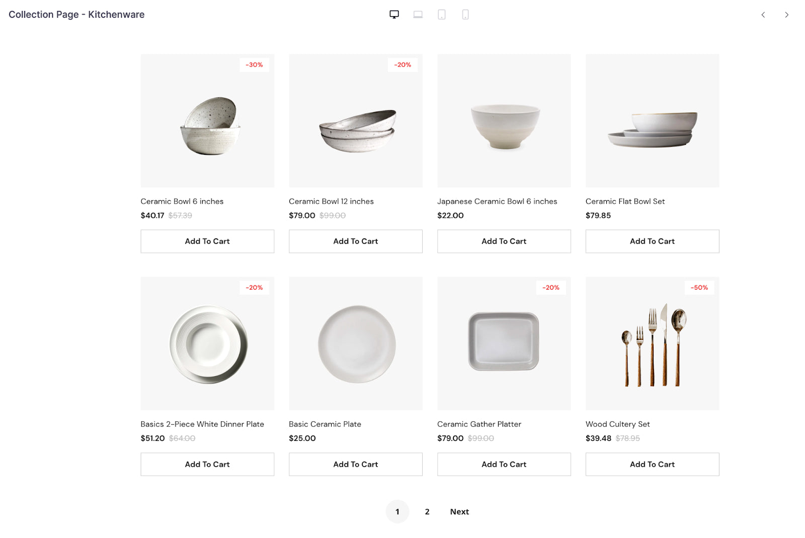
See the GemPages’ template below:

Each button is strategically placed with ample white space surrounding it, creating a harmonious balance between form and function
By adding negative space around CTA buttons, GemPages ensures that the buttons stand out and are easy to click. This not only improves the user experience but also increases the likelihood of conversions. The negative space around the CTA buttons on this GemPages’ template is carefully calculated to provide just the right amount of breathing room, without compromising on the visual appeal of the website.
Pro tip: Why spend countless hours designing CTA buttons from scratch when you can take the shortcut with GemPages’ ready-made templates? All templates include well-designed CTA buttons that are sure to drive conversions, saving you time and effort.

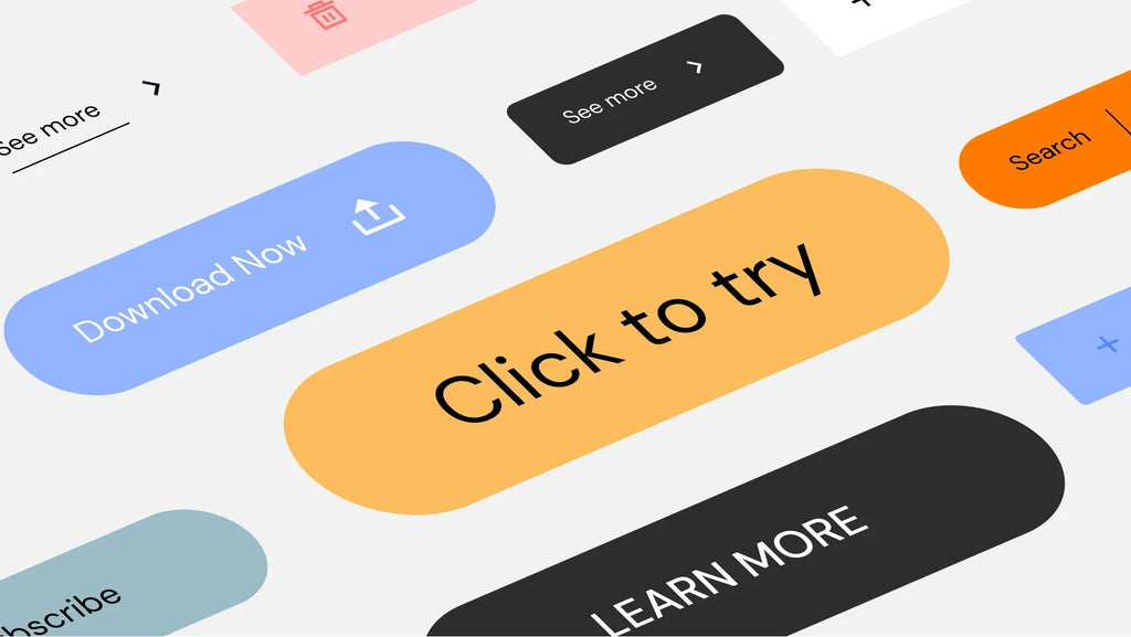
Have Fun With The Shapes Of The CTA Button

Shopify website with a different CTA button shape
Who said CTA buttons have to follow a particular shape? It all boils down to how you make the button attract attention naturally.
Some insights, as per psychological and UI/UX research, suggests
- Buttons with inward-pointing rounded corners draw attention toward the inner.
- Square edges with outward-pointing corners divert attention away from the object.
- Rounded corners have a calming effect on the subconscious mind, as we have an innate tendency to avoid sharp edges in nature due to the perceived threat they pose.
- Rectangles with sharp edges require more cognitive effort to process visually than shapes such as ellipses of the same size, which is helpful if the messaging is critical.

Add Animations’ Cause Why Not!
There is a universe of animations you can apply on your CTA. But it all depends on the target audience for your website. For example, you can add subtle shine for a jewelry CTA button or colorful animations for kids to take action on a children’s website.
Some engaging animations you can try:
- Change text when you hover on it
- Modify the shape when you tap
- Add glow to text upon touching the button
- Swiftly add doodles/ scribbles to nudge clicking.
There’s no limit to what you can try as long as you make it click-worthy!
Test For Mobile
According to Stat Counter, mobile devices accounted for 42% of all web visits, while desktops comprised 56%.
Generally, websites work perfectly on desktops, but it’s anarchy on mobile when websites are not optimized. The mobile screen size is not even 1/3rd of a desktop. Here you may have to choose how tight your CTA button and messaging need to be.
Use Action Verbs In Your Copy
Here is where elements of CTA copywriting can add the much-needed spark and excitement to trigger action. Mundane "yes/no/cancel" options make the experience transactional and one-sided. Opt for more interactive action verbs such as Sign me Up!/I'm in!/Ask me later. The goal is to make it more interactive and reader-friendly than forced black-and-white options.
Write First-Person Copy Instead Of Second
When you write in first-person, you subconsciously make the reader experience the action vs. being a passive spectator. Words like “you” and “your” can be replaced with “my” and “me”.
Read the text below objectively:
“Get your 50% OFF coupon” and “Get my 50% OFF coupon”.
Which one sounds better and makes you involved?

Using "my" instead of "your" makes the reader feel like they are personally getting something of value, rather than being passively told about a promotion
Create Urgency With FOMO

CTA creating FOMO or urgency
It’s a war zone when it comes to getting users to do a desired action, as thousands of other platforms are trying to win their attention. The goal should be to make users click without friction and give them the feeling that they might miss out on a great offering. For example:
Save 50%. Offer ends today
This translates in our mind - BETTER ACT NOW!
Add benefits next or below the button.
Write Copy That Will Reduce Risk And Give Rewards

GemPages’ “Start For Free” CTA Button
Most sales-driven copy on the CTA button centers around how much they care about the reader and genuinely want them to benefit. Post COVID-19, many are reducing their spending, which is why many sales tactics are focused on giving an experience first, hooking them with the product or service awesomeness and then completing the purchase. Another most practiced strategy in the eCommerce domain is offering exclusive memberships that give great savings and rewards that would have otherwise cost the customer a lot.
Some risk-reducing and reward-sharing CTA examples are: Money-back guarantee, 7 day-free, Try NOW, pay LATER.
Avoid Wordy Text On Buttons
The longer the text on the CTA button, the more cognitive effort it will take on the reader’s part to take action. This can create friction, double-reading and can potentially hold back the reader from clicking on it. Solve it with impactful short text without writing an essay on the button.
Find The Emotion You Want To Target And Write Copy To Activate It
Studies on neuroscience say that most purchase decisions are primarily emotional. Use this insight to charge the CTA text emotionally. Explore the emotions list, play with their intensity, combine them to create reactions in the reader.
For instance, instead of using a ‘Donate’ button text CTA for children’s cause, you may go specific to ‘Help a child.’
Check For Functional Errors
Make a functional checklist, and see if the CTA button is:
- Properly and correctly linked.
- The landing page of CTA has an SSL certificate (security certification); otherwise, browsers automatically block the site.
- Has CTA text been enabled for the text-only site? - usually, for cases when the browser auto adapts in low network conditions
Keep Testing - Never Settle Until Your Goals Are Met
It is crucial to test your CTA buttons thoroughly, as they play a vital role in converting visitors.
Even if you're new to A/B testing, experimenting with your call-to-action buttons can be a great starting point, as even small changes can lead to significant improvements. Be sure you test various aspects such as placement (e.g. above or below the fold), color, font, and text. Leave no stone unturned!
Conclusion
CTA buttons are more than just pretty design elements - they're powerful calls to action that can drive your visitors to take the actions you want them to. But designing effective CTA buttons can be a challenge - how do you make them stand out, without overwhelming the rest of your website?
That's where GemPages comes in. Our pre-made templates are designed by CRO experts to include well-optimized CTA buttons that are both visually stunning and highly effective. And with our intuitive drag-and-drop editor, you can easily customize your buttons to match your brand's unique style and voice.
So if you're ready to take your website's conversion rate to the next level, head over to GemPages today and start exploring our library of templates. We can't wait to see what you create!


 Facebook Community
 Change Log
 Help Center


