


 Facebook Community
 Change Log
 Help Center


10+ Best Practices of Intuitive Website Navigation for Store Branding
One often overlooked yet crucial aspect of effective branding is intuitive website navigation. A well-organized and user-friendly navigation system can greatly influence a visitor's perception of a brand and significantly impact their overall shopping experience. This article outlines 10+ best practices to achieve a seamless and memorable user journey.
What is Website Navigation?
Website navigation refers to the process by which users move from one webpage to another within a website, starting from the landing page. It serves as a roadmap for users, with clear signs directing them to the information they seek. A well-structured website navigation menu enhances user experience by making it easier to find desired products, services, or information.
Effective website navigation includes intuitive website menus and clearly defined categories that prevent users from feeling lost. Websites like Amazon and eBay are prime website navigation examples, featuring header and footer menus, dropdowns, and prominent category listings. Observing how such major sites handle navigation can provide insights into best practices for website design, including layout, color schemes, and fonts. Even when they introduce new products or services, these sites maintain consistent navigation bar designs to ensure a seamless user experience.
Why is Website Navigation Important?
Enhances User Experience
A good website menu makes it simple for users to access key sections. Visitors appreciate intuitive design, where they can find what they need in just a few clicks. As a result, they develop trust in the website’s content, stay longer, and are more likely to return.
Boosts SEO
Search engines rely on web crawlers to explore websites. A clean navigation structure ensures that these crawlers can efficiently index the site, leading to better rankings in search results. Incorporating best practices for website navigation design also improves SEO performance.
Improves Conversions
An optimized website navigation bar plays a crucial role in guiding visitors through the sales funnel. Easy access to products or services increases the likelihood of conversion, as users can quickly find what they need and take action with minimal effort.
Types of Website Navigation
To create a well-rounded website, consider using multiple types of navigation elements. Below are four popular types:
Horizontal Navigation Bar
A horizontal navigation bar is a common feature on most websites. You can design it using tabs, buttons, or scrolling menus. Ensure that it adapts well across devices, from desktop screens to mobile phones, by using responsive design techniques. Enhancing the visual appeal with proper fonts, colors, and high-quality images further improves usability.
Dropdown Navigation Menu
A dropdown menu offers a compact way to organize a large volume of content, such as blog categories, product types, or service offerings. By employing CSS and JavaScript, you can create smooth and interactive dropdowns that enhance user experience. Test these menus thoroughly before launching to ensure they work flawlessly across browsers.
Hamburger Navigation Menu
A hamburger menu helps streamline navigation on mobile and minimalist designs. It consolidates multiple links into a single icon, freeing up space for the main content. When designing a hamburger navigation bar, keep in mind the balance between aesthetics and functionality to ensure users can easily access important pages.
Vertical Sidebar Navigation Menu
Vertical sidebar menus are often used for complex websites with multiple sections. They can be presented as drop-downs, sliding panels, or tabbed content, depending on the website’s layout. Ensure the design remains user-friendly by keeping categories logically grouped and visually distinct.
Best Practices of Intuitive Website Navigation
1. Simplify and Prioritise
Streamline the main navigation menu only to include essential categories. Prioritise items that align with the brand's core offerings. Avoid overwhelming users with too many options.
 Vapor95's menu focuses on primary categories to avoid overwhelming customers with an abundance of choices.
2. Clear Labelling Menu
Use concise and descriptive labels for navigation items. Avoid jargon or overly creative names that might confuse users. Clarity is critical to helping visitors understand what each section offers.
3. Hierarchy and Structure
Organize navigation items in a logical hierarchy. Group related items together and utilize dropdown menus for subcategories. A structured layout guides users and allows them to navigate intuitively.
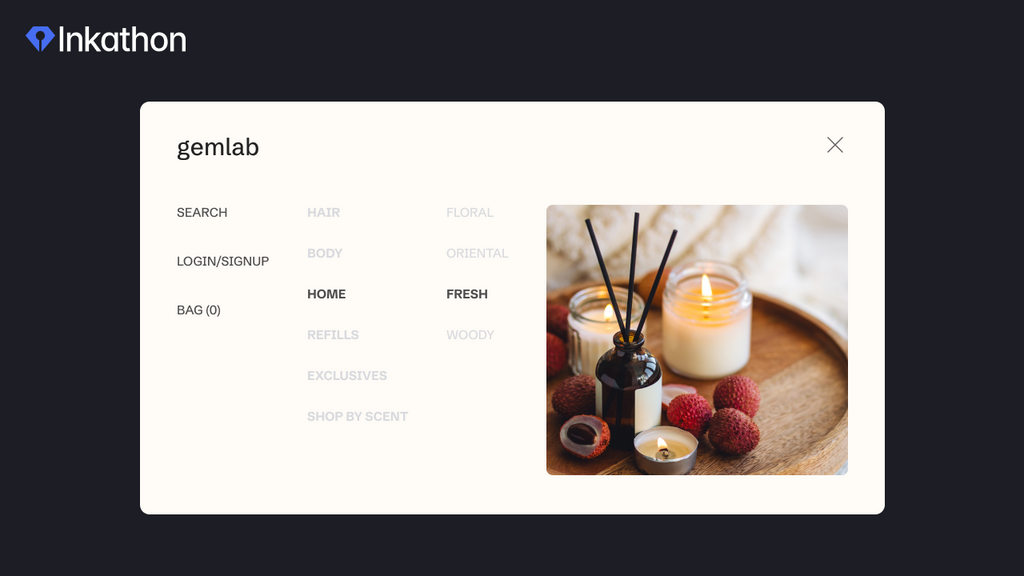
 OUAI's nominal side navigation menu groups related items together to help customers easily find what they are looking for.
4. Search Functionality
 Easily locate your desired items by using the Searchanise search bar.
Implement a prominent search bar that is easily accessible from any page. Include a "Search History" or "Recent Searches" feature that lets users quickly revisit their past search queries. Allow users to explore your product catalog by offering pre-defined search queries, such as "new arrivals," "best sellers," or "clearance items." Consider implementing voice search functionality to accommodate users who prefer to speak their search queries. Another suggestion is complementing auto-suggestions that provide real-time recommendations as users type in the search bar. This helps users find relevant products faster and correct spelling errors.
5. Visual Cues
 Capture customers' attention and aid navigation by featuring the most popular items with distinctive colors in the heading and CTA buttons.
Use visual cues such as icons or images to aid navigation. These cues provide a visual representation of the content and make it easier for users to identify where they want to go. Highlight selected or focused elements with visual cues like borders, shadows, or background color changes. This helps users understand their current interaction. Design CTA buttons with contrasting colors, clear labels, and enticing text encouraging users to act. You should also maintain a consistent design language throughout your website. Use a cohesive color palette, typography, and design elements to create a unified and visually pleasing experience. Implement subtle hover effects on interactive elements like buttons and links to indicate their interactivity and encourage engagement.
6. Consistent Placement
Keep the main navigation menu in a consistent location, typically at the top of the page. Users are accustomed to this placement, and changing it could lead to confusion.
7. Efficient Filtering and Sorting
 Best Choice Products' customers can effortlessly filter items by type, price, color, and size.
Users can quickly refine their search results by applying filters (e.g., price, size, color) and sorting options (e.g., relevance, price, popularity). Provide real-time updates when users apply filters or change sorting options. Display a loading indicator to let users know that results are being updated.
8. Breadcrumb Navigation
Breadcrumbs show users their current location within the website's hierarchy, helping them backtrack or move forward in their browsing journey. Decide on the type of breadcrumbs that best suit your website's structure. There are three main types:
- Hierarchy-based breadcrumbs: Show the site's structure, helping users understand the relationship between pages.
- Attribute-based breadcrumbs: Display attributes of the current page, like product categories or filters.
- History-based breadcrumbs: Show the user's path through the website, allowing them to backtrack easily.
Think about how users navigate your website and where they might need breadcrumbs the most. Place breadcrumbs in strategic locations based on user behavior.
 Simply create a breadcrumb by dragging and dropping the element in the GemPages editor.
9. Guided Selling
Create interactive questionnaires or quizzes that help customers narrow their options based on their preferences. Ask questions about their needs, style, budget, and other relevant factors. Offer the opportunity for customers to connect with a human customer support representative, especially if they have more complex or specific needs.
10. Test and Iterate
Continuously monitor user behavior and gather feedback to identify pain points in navigation. Regularly update and refine the navigation structure based on user preferences and behavior.
11. Responsive Design
 GemPages ensures the responsive design across devices: desktop, tablet, and mobile.
Ensure your navigation system works seamlessly on all devices, especially mobile:
- Use fluid and flexible grid layouts (e.g., CSS Grid or Flexbox) that automatically adjust and reorganize content based on screen size. This allows your website to maintain its structure while accommodating different devices.
- Include the viewport meta tag in your HTML to ensure your website scales properly on mobile devices. This tag helps control the initial zoom level and viewport dimensions.
- Design your website with a mobile-first mindset. You can start by creating the mobile version of your site and then progressively enhance it for larger screens. This approach ensures that the most essential content and features are prioritized for smaller devices.
Learn more: Discover why online stores should prioritize a mobile-first approach in website design.
- Conduct user testing to gather feedback from users interacting with your responsive website. This helps identify any usability issues and areas for improvement.
- Ensure that buttons, links, and interactive elements are appropriately sized and spaced to accommodate touch gestures. Avoid using small elements that could be difficult to tap accurately.
Learn more: Mobile Conversion Optimization: 10+ Proven Tactics (2023)
12. Loading Speed
Image Optimization for Shopify is an effective way to fasten the page loading speed and make your online store look professional:
- Use image formats like JPEG for photographs and PNG for graphics.
- Specify image dimensions in HTML to prevent layout shifts while images load.
- Implement lazy loading for photos and videos. Only load media as the user scrolls down the page, reducing initial load times.
Learn more: Shopify Image Optimization: 11 Easy Ways
 Effortlessly optimize the image within GemPages' settings section.
You also can consider some other ways to optimize the page loading time:
- Optimize your server performance by choosing a reliable hosting provider, using server-side caching, and minimizing database queries.
- Minify CSS and JavaScript files by removing unnecessary spaces, line breaks, and comments.
- Combine multiple CSS and JavaScript files into fewer files to reduce HTTP requests.
- Review and eliminate unnecessary plugins and widgets that slow down your website's performance.
Learn more: How to Increase Shopify Store Speed: 11 Effective Ways (2023)
13. Accessibility Considerations
 Souce: HTML Color Codes
Create navigation with accessibility in mind. Choose color combinations with sufficient contrast to ensure readability for users with low vision or color blindness. Avoid relying solely on color to convey information. Another thing to remember is to select easily readable fonts and provide options for users to adjust text size. Use relative units like percentages or ems, which allow text to be resized without breaking the layout.
Wrapping-Up
In conclusion, intuitive website navigation is a cornerstone of effective store branding in the e-commerce realm. By focusing on enhancing user experience, promoting brand perception, ensuring consistency, and reducing bounce rates, a well-designed navigation system can significantly contribute to a positive brand image. Implementing best practices such as simplification, unambiguous labeling, hierarchy, visual cues, and responsive design will guide users seamlessly through the online store, fostering trust and leaving a lasting impression. In a competitive online marketplace, mastering intuitive navigation is essential to building a successful and distinctive brand.
___________________
About Inkathon
This article belongs to the Inkathon, an illuminating series focused on eCommerce. This series offers a comprehensive repository of expert knowledge, informative case studies, and practical use cases that help you gain valuable eCommerce insights.