


 Facebook Community
 Change Log
 Help Center


- Key Factors Contributing to Mobile Conversion Rates
- 10+ Tips for Mobile Conversion Optimization
- 1. Compress Images and Videos
- 2. Fix Redirects and Broken Links
- 3. Remove Unnecessary Apps
- 4. Embrace Touch-friendly Design
- 5. Maximize Product Image Use
- 6. Make CTA Buttons Easy to Click
- 7. Display On-page Product Recommendations
- 8. Prioritize The Readability of Your Content
- 9. Enable The Search Function
- 10. Integrate Digital Wallets
- 11. Minimize Pop-up Usage
- 12. Simplify Checkout Process
- It's Time to Optimize Your Mobile Conversion!
- FAQs about Mobile Conversion Optimization


Mobile Conversion Optimization: 10+ Proven Tactics (2025)
Ever since the first ever smartphones were introduced, it is hard to imagine our lives without a handy, know-it-all device at our disposal. Mobile phones started out as communication devices to now have the ability to give us the luxury of purchasing goods without ever having to leave one’s doorsteps.
While eCommerce provides buyers the convenience of shopping through a virtual screen, mobile commerce, or m-Commerce, takes it a step further, and shrinks said screen down to the size of a Pop-Tart.
So, how can you lean into this opportunity while m-Commerce is as prevalent as ever? Keep on scrolling to find out the tips and tricks to implement mobile conversion optimization, using our neatly-composed tactics.
Key Factors Contributing to Mobile Conversion Rates
1. Mobile performance
Nobody likes waiting. Not in the line at the bank, in the restaurant, and especially not for a website to load while they are occupied with a million other things.
A mere two-second delay can directly increase a visitor's bounce rate on a website. By elevating your website performance on mobile, visitors will feel more inclined to stick around, and the conversion rate will naturally grow.
The good news is, it only takes a few steps to up your speed game and get rid of the hindrance of slow waiting time on both potential buyers and your store.
Learn more: Shopify Speed Optimization: 11 Effective Ways (2023)
2. Design
When visitors get past the (hopefully lightning speed) load time, an appealing website layout is what will keep them around longer.
Choosing a suitable mobile-friendly design for your website is only the first step of many to successfully deliver a fully immersed shopping experience to your customers. It is important to consider the actual size of your business (low traffic vs. high traffic, number of products on sale, etc.) to determine a responsive or adaptive strategy.
3. Navigation
Should your visitors decide to make a purchase, that is when navigation comes to the party. It is best to put yourself in the shoes of your potential customer and try to visualize the perfect shopping journey from beginning to end. Which drawbacks will annoy you the most? Which features will make you go “I didn’t know I needed this”?
Here are a few factors that significantly influence the customer journey:
- Purchase path: From the moment the visitors scan your website and check your products to add them to their cart. A good navigation strategy can effectively convert prospects into customers.
- Product recommendations: This element may seem obvious, but what, when, and where to display relevant recommendations will have a huge impact on the mobile conversion rate of your website.
- Checkout process: Keeping it simple and quick is the key to avoiding getting drop-offs at this very last step.
10+ Tips for Mobile Conversion Optimization
Maximize Mobile Performance
1. Compress Images and Videos
Resizing visual content is one of the most effective ways to accelerate the load time of your mobile site. When a visitor comes to your online store, they expect to be presented with the images of a product, similar to a brick-and-mortar business.
To ensure a good first impression, you can use simple tools such as TinyPNG and Compressor to optimize large images. With these image optimization tools, you can easily drag your large image files into the upload area, compress them, so they’re smaller (while still retaining image quality), and redownload the new file.
Per Shopify’s recommendation, your header and background images should be no larger than 1 MB, and your product images should be around 300 MB.
Hence, all aspects of image uploading should be taken into consideration, including image size, number of images per page, and file type. Furthermore, consider adding alternative text (ALT text), which is a replacement when an image file does not load.
Videos are also a great medium to deliver informative product descriptions to your visitors instead of walls of text. As it poses as a quick alternative, fast load time is expected. HandBrake is a free and trustworthy tool to get started with video compression without compromising the quality of the video.
For videos, here are the Shopify criteria:
- Video length: Up to 10 minutes
- Video size: Up to 1 GB
- Video resolution: Up to 4K (4096 x 2160 px)
- Video file type: .mp4 or .mov
Learn more: How to Add Video to Shopify Product Page
2. Fix Redirects and Broken Links
One single broken link or unnecessary redirect can make the prospects quickly click off your site.
Although there are benefits to redirects while building your website, it is recommended to keep them as minimal as possible. Keep in mind that visitors use a mobile phone with possibly unstable internet (as compared to a desktop), the last thing you would want is to make them wait even more.
The most prominent use of redirects is in the transition from your desktop site to your mobile site. It is also a helpful tool to help visitors arrive at the current address of your online store when an old address is typed in.
The use of 301 redirects simultaneously gets rid of broken links on your website, thus reducing page weight and boosting speed.
3. Remove Unnecessary Apps
Finding Shopify apps that work and support your eCommerce store is beneficial, but having too much on your plate can tremendously slow down your site speed and negatively impact mobile performance as a whole. Keeping the must-haves is imperative to secure a smoother customer journey and relieve major page weight.
Optimize Your Page Design for Mobile Devices
4. Embrace Touch-friendly Design
These days, most people use their fingers to navigate through their phone instead of the slender stylus pen that came with early generation touchscreen mobile phones (remember those?). Mobile websites are bound to be designed around that technology shift.
Think of the most common way one holds their phone. The thumb is the obvious star of the show, which does all the hard work of scrolling and typing. It is also the shortest and bulkiest finger. Consequently, catering to this little guy can be the key to achieving successful mobile conversions for your website.
A good rule of thumb (pun intended) is to prioritize your main content by placing them at the center of the screen, the most important features (e.g. call-to-action buttons) at the bottom, a sticky hamburger menu for easy access as the visitors scroll, and the other elements (logos, search bar, etc.) can stay on top of the page.

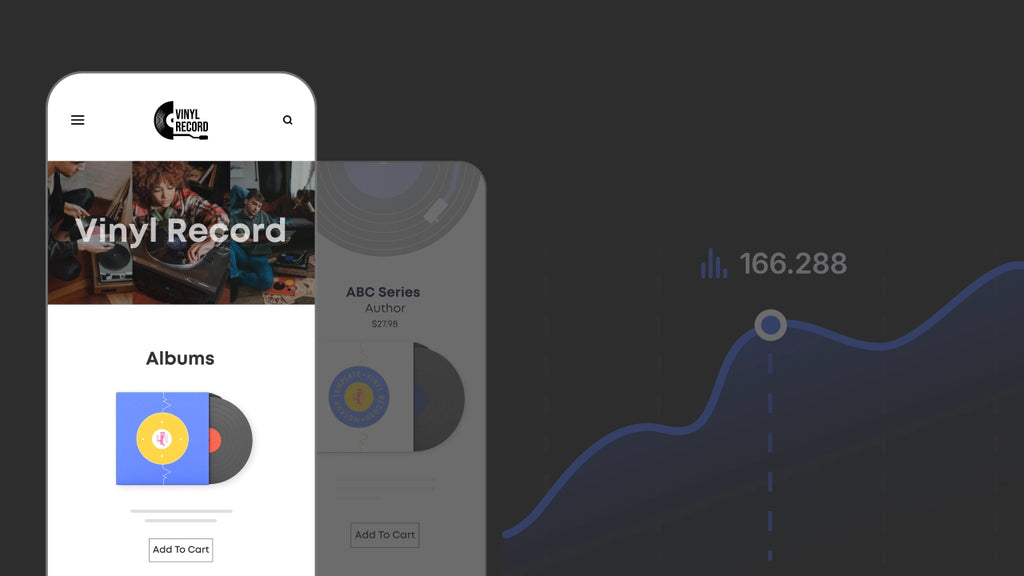
5. Maximize Product Image Use
Images are good, image-adjacent elements are better if properly utilized. Generally, visuals are easier and more efficiently perceivable than plain texts.
By adding interesting design elements such as 3D model images, sliders, or carousels, you have a higher chance of holding visitors’ attention. A more detailed and professional-looking product page also establishes a sense of trust and gives you that edge over your competitors.
Implementing these features does not require intense investment or prior coding experience. As a Shopify store owner, you can make the most out of these upgrades with the help of GemPages Powerful Page Builder.

No problem! Get started with GemPages' free plan. Explore wonderful features that can do wonders for your store.
6. Make CTA Buttons Easy to Click
Call-to-action buttons (CTA buttons) help potential customers advance to the next step in their shopping journey. They could be an excellent medium to increase eCommerce conversion rates for your mobile site.
As opposed to a tiny cursor, visitors tap on the screen with their fingers. Size-wise, CTA buttons should be made as present and distinguishable as possible. Intuitive CTA buttons encourage visitors to continue their purchase path without unnecessary delay.
Additionally, making them sticky at the bottom of the page as the visitors scroll also poses as a natural reminder without being overly disruptive.
Check out how Loop utilizes this feature to encourage prospects to make a purchase:

Loop using a sticky ‘Add to cart’ button to encourage purchase
7. Display On-page Product Recommendations
As visitors view a specific product, it is too big of a chance to pass on without showing relevant products. The most common and effective practice is to display products in the same category (style, color, size, etc.) or upsell their product of interest.
While it is rather straightforward on a desktop site, the mobile version requires a more deliberate approach due to its limited space. Depending on the overall layout of your online store, knowing where to feature product recommendations will help increase average order value and enhance the shopping journey as a whole.
For Shopify owners, this feature is made simple with the assistance of GemPages. If you already have our app installed, the process is as easy as one, two, three.
8. Prioritize The Readability of Your Content
Think of yourself as a first-time buyer on your own online store via a mobile screen.
As much as you would like to explore the store and make a purchase, the texts are ant-sized, and there are too many of them. How many seconds does it take for the ‘x’ button to be clicked?
The readability of your content is equally as crucial as the quality of an image or a video’s load time. It is best to choose the most eye-pleasing font style and font size, as well as color, in juxtaposition with the background (no neon green on white, please!).
Breaking the texts into short paragraphs eases the eyes and increases attention span, while sprinkling in visual content assures an interesting customer journey.
Take a peep at how the chocolate brand Marou tells its stories through texts, with visuals and font changes added in.

9. Enable The Search Function
When visitors come to your online store with a clear-cut intent, the search bar could be the first thing that they opt for. Below are a few tips to ensure an efficient mobile-optimized search:
- Make it recognizable: A simple string of words, such as “Click to search”, or a logo of a magnifying glass never fails to catch one’s attention.
- Place it strategically: The search function could be placed on the top part of the page, or behind the hamburger menu. Try not to hide it at the bottom of the page, which requires more scrolling.
- Multi-functional search: Whether there is a typo, grammatical error, or synonym for the actual product’s name, the visitors should still be able to see what they are looking for.
- Zero match search: Even when your store might not offer the specific product the visitors have in mind, products with related features and categories should still be recommended instead. This will keep them on the site for longer and inspire possible conversions.
- Display recent search history: By keeping track of the user’s previous search, you can make use of this function to engage them further with their customer journey. This practice is incredibly useful to increase CRO for mobile devices.

The brand Lucy&Yak, a GemPages client, places a search bar right on top of the homepage to make it easy for customers to find their desired products.
10. Integrate Digital Wallets
As humans, we tend to trust what we already know.
Online shopping means paying first and receiving goods second. Consequently, visitors will feel safer while making a purchase on a website with trustworthy payment options.
Digital wallets are not only popular and flexible, but they also come with enhanced security and many other benefits as well. By integrating these options into the checkout page, users will be more likely to finish their purchase.
The most common choices are PayPal, Apple Pay, Google Pay, and Android Pay. As Shopify sellers, you can weigh in Shopify Payments as an option as well.
Refer here for our in-depth analysis of these payment methods to see how you can integrate one or all options into your online store: Shopify Payments vs. Paypal: What's Best for You in 2023?
Optimize Your Mobile Navigation
11. Minimize Pop-up Usage
Or, in other words, only use when needed.
Pop-ups can be powerful to get a message across in an instant and a one-of-a-kind instrument on how to increase mobile conversion rates.
In fact, pop-ups are the “crème de la crème” in collecting visitors’ emails.
However, this happens when only done right. Here are some of our suggestions for you to elevate your pop-up game:
- Keep it short and positive: There are only a few things more terrifying than being hit in the face with a wall of texts. Whether you want visitors to subscribe to the newsletter, or promote a limited-time deal, a few words should do the trick. Moreover, try not to make the visitors feel bad for clicking off.
- Avoid disruption: Don’t take up the whole screen of their phone, do use minimal pop-up design on the bottom of the page. More importantly, Google has made an official announcement to start penalizing websites with disruptive pop-ups which can hamper users’ browsing experience. Therefore, keeping it lowkey is the way to go.
- Easy click off: Make sure the ‘x’ button is made abundantly clear to give visitors the choice to refuse service and browse the site of their own will.
The fashion brand Miu Miu has a sleek pop-up that blends into the whole website:

Miu Miu using a seamless pop-up window
12. Simplify Checkout Process
Nothing is more frustrating than getting your visitors hooked until the very last step, just for them to click off your store due to a lengthy and troublesome checkout process. For eCommerce hustlers, this is one of the most crucial features that needs investment in order to build a brilliant mobile website. These tips below can help you achieve this specific goal:
- Only keep relevant fields
- Reduce steps to a minimum
- Reduce distractions on the checkout page
- Make use of a progress bar
- Implement one-step and guest checkout functions
It's Time to Optimize Your Mobile Conversion!
So there you go, these are some ideas on how to increase conversion rate, using our mobile conversion optimization tips. Shopify is already a thriving ecosystem for sellers to grow their business with the support of various apps, namely GemPages page builder. Therefore, the possibilities are endless when it comes to customizing your store.
We have done our part of composing these tips, now it’s on to you to take a leap and elevate your business to a new level.
FAQs about Mobile Conversion Optimization


![How to Become an eCommerce Expert for Shopify [2026]](http://gempages.net/cdn/shop/articles/ecommerce_expert_-_thumbnail_e8eaf7df-a923-4b6e-bdd5-0881f6b818f0_480x480.webp?v=1780039642)