


 Facebook Community
 Change Log
 Help Center


How to Grow Your Shopify Email List with Website Popups?
Imagine your Shopify store’s marketing is a giant machine.
Of the many cogs, email list growth occupies a prominent space. It’s an engine with lots of intake channels doing the work.
One of the most valuable lead generation tools that can make that cog wheel turn? The website popup.
Sure, some visitors bat away website popups as if playing a game of Whac-A-Mole. But plenty more will expect and welcome this subscriber growth strategy, especially if given the right offer in exchange for their contact information.
Whether you’re a website popup newcomer or your current version needs some love, follow along for best practices with a sprinkling of popup examples. This is your guide to designing website popups that convert visitors into email subscribers.
What Are Website Popups and Why Do You Need Them?
First, the basics.
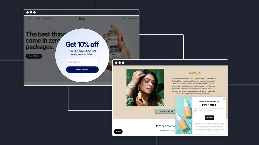
Website popups are forms that appear on an eCommerce site by “popping up” or sliding in after some amount of time. They invite visitors to subscribe to the brand’s email and/or SMS list.

GemPages’ customer–Backbone Swag’s website popup lures visitors to subscribe with a mystery discount
Every visitor who says yes to a website popup opens a portal, empowering the brand with a direct line of communication for nurturing the new relationship.
Enter the significance of email messages. Email marketing continually proves it’s a must-have for any Shopify store. Its median return on investment (ROI) is 122% — quadruple the ROI of any other digital marketing channel.
Need more evidence of its prowess? A study found that, when compared to other marketing efforts, general email is most influential in online purchase decision-making.
Now, let’s get back to the list growth engine and what makes website popups an integral component.
When someone stops by your Shopify storefront to check you out, they’re interested in your brand to some degree. It’s a wasted opportunity if you let them leave without asking for their contact information.
In other words, you’re squandering the chance to increase your first-party data—the best type of data to own because the person behind it has verified it.
One extra thing to know before we move to the meat of this post: website popups are not just for stoking your email list growth.
Website popups are advantageous for:
- Steering visitors to a particular product page
- Making an announcement, like a sale
- Communicating shipping delays
- Recommending a complementary purchase/cross-selling at checkout
Website Popups 101
Creating a website popup isn’t difficult once you understand the fundamentals and correlating decisions that formulate them. The four essential elements for devising your eCommerce site are:
- The bones of a popup
- Size and placement location
- Strategy
- Timing
The Bones (Framework) of a Popup
Great-performing popups mold to a standard framework.
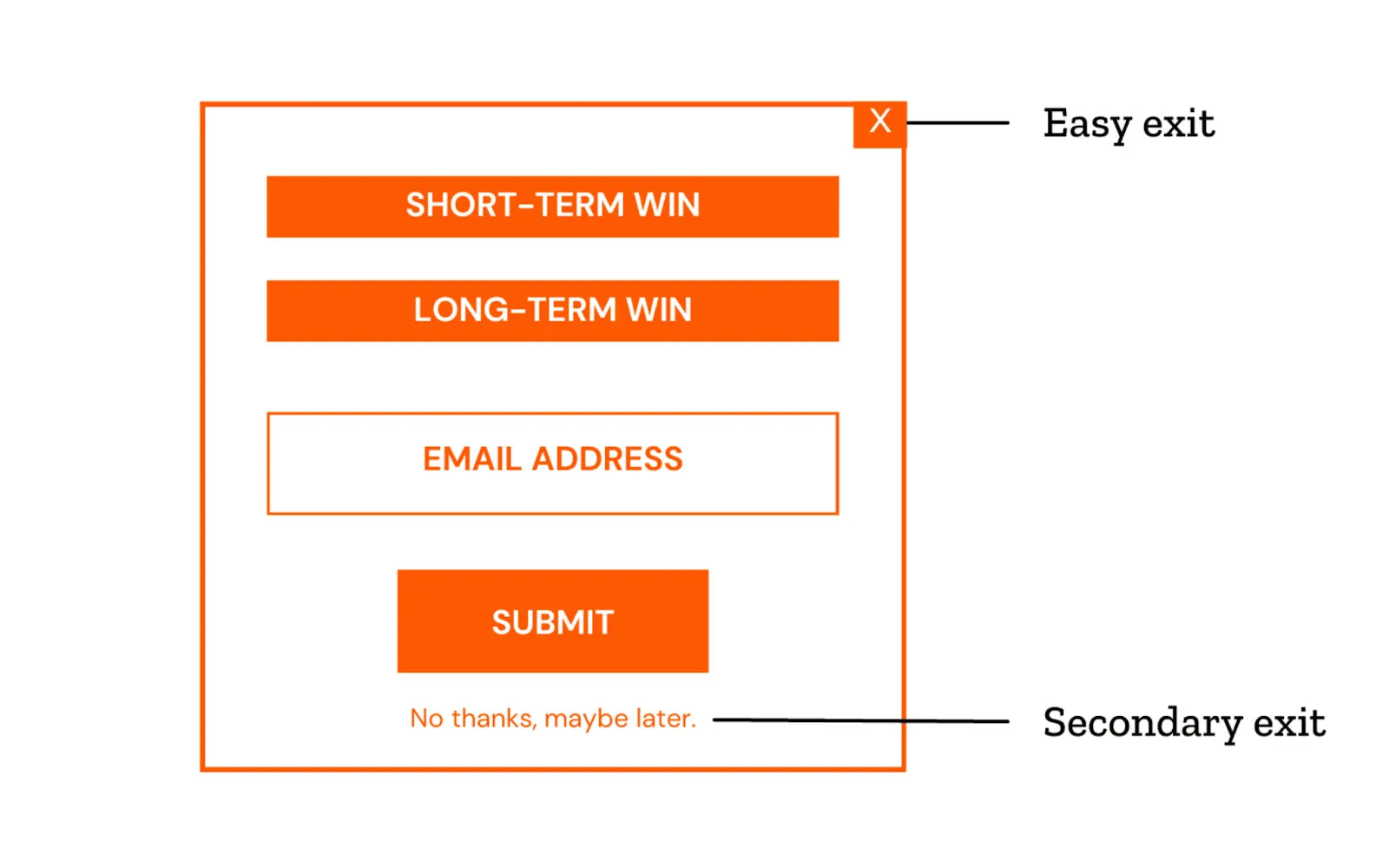
Traditional website popup framework
The majority incorporate all or a mix of the same primary elements:
- An easy-to-locate exit (typically an ‘X’)
- An enticement (more about this in a bit)
- Field(s) for populating email address and/or cell phone number
- Call to action (CTA) button, such as ‘submit’ or ‘sign up now’
- Secondary exit (optional, such as ‘no thanks’)
Size and Location of a Popup
How much prominence do you want your popup to have?
The “big and bold” variety is a good starting place. It screams, “You will notice me!” and is just as it sounds — a large-sized popup in the middle of the screen.
Our vote goes for a large version, but we caution against making them full-screen. You risk scaring away those who don’t have patience for a site that compromises their navigational control.
 Pittman & Davis goes the traditional “big and bold” route
The less popular style is the “on the border” popup — a strategy worth considering if you’re worried about interrupting the site experience and triggering higher bounce rates. It typically means sliding in a smaller-sized popup from one of the sides, top or bottom. Ensure it doesn’t cover key site areas or interfere with other apps, such as a chatbot.

Hodinkee’s email capture popup slides in from the lower right corner of the site
The big and bold variety usually converts at a higher rate because of its prominence; the subtler nature of the on-the-border version may net the more engaged subscribers.
Strategy for the Win
Think of the flood of marketing messages that bombard us daily. Now put yourself in the consumer’s shoes. The constant question is, “What’s in it for me?”
If your shop wants an email address, you’ve got to offer something of value in return.
Do you want to go for the short-term win by providing a discount on the first purchase? Or is showing the long-term value of subscribing in line with your brand’s style (and better for your margins)? In that case, tell them they’ll be the first to know about new product releases.
There’s room for offering both short- and long-term wins. Anna Sui does it succinctly.

GemPages’ customer–Anna Sui takes the minimalist approach while offering short- and long-term wins
Popup Timing
Determining how long to wait before launching a popup is a topic on its own. We’ve written a popup timing article for anyone who wants to explore the intricacies.
TLDR: popup timing is a balancing act dependent on testing, tweaks, and retesting to find the right formula.
There are three general approaches to timing. Pick one of them:
- Wait a certain amount of time so visitors can partially absorb your homepage
- Trigger a popup after a particular percentage of the page — say 50% — is viewed
- Delay the popup until the person visits two or three pages
If you’re just venturing into website popups, we recommend releasing it after 15 to 60 seconds. Let it run for a while before checking the conversion rate and Google Analytics. If performance is lackluster or there’s an adverse effect on the bounce rate, adjust the timing.
3 Ways to Step Up Your Website Popups
Let’s say your brand has got the basics covered. You’re happy with your popup but suspect it can do more. You’re ready to improve beyond timing, incentive, and graphic design tweaks.
We’ve got three advanced approaches to accelerate your email list growth and elevate your Shopify store’s level of sophistication.
Multi-step Popups
Some brands discover that they experience higher conversion rates when they extend the signup journey beyond a straightforward “fill this in and hit submit” approach. According to a HubSpot study, 40% of marketers use multi-step forms and report an 86% higher conversion rate.
Here’s one way to develop a multi-step popup:
- Step 1: State email subscribers will receive 10% off their first purchase; include a CTA of ‘Continue’
- Step 2: Sweeten the deal by offering 15% off for SMS messaging consent
Below is a fantastic multi-step popup example. We like how Tough Mudder’s email list growth strategy leans into its personality, too.

Tough Mudder has a multi-step popup
The step 1 features no-nonsense language, from ‘Don’t just sit there’ to the ‘I am ready’ CTA. Step 2 provides the promised discount code and encourages the new subscriber to linger by looking up events or continuing to the site.
Tough Mudder scores bonus points for employing unique codes versus the generic code (like ‘15off’) that can be shared with and used by anyone.
Our only suggested improvement is to send the code via an automated welcome email.
There are two perks to delaying the reveal. One, you extend the opportunity to shape that first impression. And two, you’re prompting further engagement. Both are fundamental steps toward building trust.
Popups with Tags
Think about what you sell and what you want to know about new subscribers.
Wouldn’t it be great to identify who is interested in apparel for women, men, or both so you can send more relevant emails? Or what product lines speak to which subscribers?
Well, a website popup is a fantastic avenue for doing investigative work. Just add a form field to gauge subscriber preferences. Each new subscriber account receives a tag of their choice.
Buckaroo Bling’s example demonstrates how to use tagging in website popups. Their picklist items are on point. The categories align with the brand’s clientele of “classy cowgirls, boho babes, and cowgirls at heart.”

Buckaroo Bling incorporates an extra field for segmentation
Brands that leverage tagging are setting themselves up for email segmentation. That is, they’re establishing subgroups of subscribers ripe for targeted messaging. Consumers crave personalization.
In fact, it’s a good idea to put segmentation to work immediately. Rather than a generic welcome email, create versions tailored to each possible subscriber choice. It could be as simple as swapping out recommended products.
The odds are you’ll drive more traffic to your site, as segmented emails have a 50% higher click-through rate than non-targeted messages.
Using Multiple Popups
There will be a time when you want to give your email list growth a jolt. A second email capture popup might be the remedy when the first goes ignored.
Of course, tact is necessary, and timing is crucial. You don’t want to drive away visitors with an obnoxious sequence.
The exit-intent popup is the answer. It appears when visitors signal — by cursor movement — that they’re about to close out of the window. Therefore, the
Think of the multi-popup strategy as your last call. You’re asking your visitor, “Do you want to leave before joining our email list?”
We recommend launching the first website popup once the visitor has been on the site for about 15 to 20 seconds. After that, choose your path depending on your comfort level:
- Are you of the mentality that there’s no harm in asking again? Then deploy the exit-intent popup from any page.
- Are you concerned another popup will be too intrusive? Then reserve it solely for the cart page.
As for composition, design the two popups to be different but cohesive. You want a similar vibe, colors, etcetera, to thread the two together. For example, Dailylook built a pair of website popups that complement each other well

Dailylook’s popup duo
The opening popup goes for the win with a full-page takeover (somewhat risky, in our opinion). Props to simplicity and clean photography. Assuring would-be subscribers (in smaller text at the bottom) that they won’t sell their email is also a nice touch.
A smaller and stripped-down exit-intent popup follows. Notice how the font and colors match the first popup. This time, the brand tosses in a $20 discount incentive. As previously mentioned, we’d prefer they disclose the code in a welcome email because it’s an incentive to sign up.
Take Steps to Improve Your Website Popups
It’s easy to allow a website popup to run its course without meddling. Shopify merchants have a lot on their plates, especially if operations fall to a solopreneur or a few employees. Monitoring popup performance is understandably low on the priority list in those cases.
But directing periodic attention to your popup is a worthwhile endeavor. Remember the nuances of timing and the need to experiment?
Follow this game plan to make the process as painless as possible:
- Record your subscriber count before the popup goes live.
- Check the count about a week later. If you’re converting 1 to 10% of site visitors, super. If not, maybe a few polishing touches will do the trick. Or perhaps your incentive doesn’t resonate.
- One or two weeks later, inspect your bounce rate. Extend the popup’s time delay if it jumps drastically.
The steps above are an ideal starting point for maximizing your popup’s capabilities. Monitor the metrics from time to time. We’re sure you’ll uncover areas for improvement along the way.
And if you want to aim higher, switch up your popup to reinforce campaigns, tie your brand into the season or hype an upcoming event like Black Friday.
Periodically making tweaks to your popup — whether it’s a function of design, strategy or timing — will keep your email list growth rate on an upward track.
 Tracy Puckett
Tracy is the Content Manager at Seguno Software, the top-rated email marketing platform built exclusively for Shopify. Seguno’s Popups & Exit Intent app enables the creation and management of website popups—whether for boosting lead generation or providing a great visitor experience—right within Shopify.


![Shopify Flow — The Complete Guide on Shopify Workflow Automation, Templates & Examples [2026]](http://gempages.net/cdn/shop/articles/Shopify_flow_-_thumbnail_1_7ae9e33a-0ea2-4fae-822d-0e81bb1bba5c_480x480.png?v=1780040989)


