


 Facebook Community
 Change Log
 Help Center


- What is a “Website Color Scheme” in Shopify/eCommerce?
- 15 Best Shopify Color Scheme Examples [Real Shopify Stores]
- Best Colors Palettes for Shopify Stores [Based on Brand Types]
- Why is Color Scheme Important in eCommerce?
- What Should You Consider When Choosing the Color Scheme?
- Final Thoughts on Color Schemes for eCommerce
- FAQs about Color Schemes in Shopify


15+ Best Shopify Color Schemes + Color Palette Ideas [2025]
![15+ Best Shopify Color Schemes + Color Palette Ideas [2025]](http://gempages.net/cdn/shop/articles/Best_colors_for_shopify_store_96083372-b137-4da7-b9d4-9970a432c216_1024x1024.webp?v=1762771627)
The color scheme is a crucial element of branding — an element that helps give your brand its identity and voice.
However, you can’t just choose any random colors of your choice and make them part of your branding. Choosing the color scheme has to be a well-thought-out and strategic decision.
So, what are the best Shopify color schemes, and how to choose which colors are most appropriate for your brand?
In this blog post, we’ll guide you on all the essential aspects — including the importance of a color scheme, the best color palettes for Shopify/eCommerce brands, and the key things to consider while choosing the colors.
Let’s get started!
What is a “Website Color Scheme” in Shopify/eCommerce?
In Shopify, a color scheme is a theme setting where you can define the primary and secondary colors that can be applied to different theme elements throughout your online store.
To update or change your color scheme in your Shopify store, you can go to Shopify admin and then go to Online Store > Themes. Click on the Customize button to open Shopify’s theme editor, and then click on the settings icon to open the color schemes.

In the broader context of eCommerce, a color scheme (also known as a color palette) is a combination of colors used to brand any digital assets. Thus, the color scheme isn’t just limited to your theme elements.
It goes into every visual aspect of your shopify brand colors such as your brand logo, product packaging, social media profiles, email newsletter, and so on.
15 Best Shopify Color Scheme Examples [Real Shopify Stores]
Here are 15 beautiful ecommerce website color schemes:
- Urban neutral
- Bold black and gold
- Playful pastel
- Coastal
- Bold and grounded
- Festive yet modern
- Vintage neutral
- Cool-toned and retro
- Slate and ivory
- Soft and warm
- Lively mint
- Cozy complementary
- Autumnal
- Vibrant neonSubtle white
Pro tip: Create a special landing page for your flash sale promotion. You can use GemPages to create Conversion-Focused Page Builder using its AI-powered feature, templates, or drag-and-drop visual editor. Don't miss out on grabbing an exclusive 20% OFF this Black Friday with GemPages today!
Let’s review some of the popular Shopify stores that have done a great job at implementing an impressive shopify color picker schema:
1. Turtle Beach
Turtle Beach is a gaming accessories brand that manufactures professional and tournament-grade gaming headsets and headphones that are designed for Xbox gaming.

Looking at the color scheme for website of Turtle Beach, especially on its homepage, it’s clearly evident that the brand is focused on its target customers — i.e., gaming enthusiasts.
And that’s why the brand uses dark colors — almost giving the feel as if you’re watching a video game. The best thing about the dark color scheme is that it allows texts to pop up on your screen.

Use GemPages to bring your store design and colors to life. GemPages offers you professionally designed templates, an AI-powered Image-to-Layout feature, the most intuitive drag-and-drop editor, and much more to help you design your Shopify store smarter and faster.
2. Heinz
Heinz is the perfect example of a product-based color scheme. As you might already know, Heinz is a food processing company that sells various food items such as tomato ketchup, gravy, mustard, sauces, and more.
Since tomato ketchup is their superstar product, guess what dominates their website design? That's right, it's a sea of red!

The main color you'll spot on Heinz's homepage is vibrant red. It takes center stage, creating a bold and eye-catching presence.
In addition to red, Heinz incorporates two other captivating colors into their brand palette: sunny yellow and cool blue. These hues complement the vibrant red perfectly, creating a harmonious and eye-catching trio.


3. ColourPop
ColourPop is a beauty and cosmetics brand that offers high-quality products, and its main target customers are women. That’s why they've decked out their website with shades of red and rose pink—two colors that women just can't get enough of.
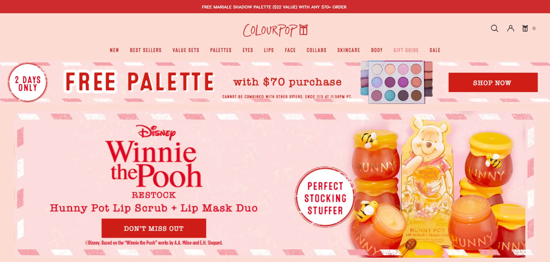
Apart from the above two main colors, it also uses a light shade of lavender color on its product pages - which again is a choice for its target customers.

4. Heatonist
Now, let's turn up the heat with Heatonist. The brand is all about hot sauces, and their website is sizzling with red and yellow.

The header and footer area have used dark black, which makes the other colors shine brightly on the homepage. Also, as you can see in the below image, different colors have been used to categorize the “heat” of their products:

The red color is used by the brand to symbolize the most spicy products.
5. Doona
Okay! So, we’ve seen some brands with awesome bright and vibrant color schemes.
Now, let’s take a look at Doona — a brand that sells tricycles, car seats, strollers, and accessories with a mission of making parenting simple. The brand uses a soft color scheme, and it has a charm of its own.

Doona's website is a treat for the eyes, with a gentle and soothing color scheme. It's clear that they've chosen these light and soft colors intentionally. It's like a warm, reassuring hug from a brand that understands parents.
These colors aren't just easy on the eyes; they're also smart for highlighting their range of products, most of which are sleek and black. So, it's a win-win – a comforting vibe and a great product showcase.


6. Lucy & Yak
Here comes another awesome brand with an aesthetic online storefront design. Lucy & Yak is a brand that designs colorful and comfy clothing items in Britain and then produces them in India.
What makes Lucy & Yak stand out is its color scheme, which seems to draw inspiration from its mission – creating wonderful products that spread happiness while taking care of our planet. What better way to express that than through a delightful blend of pink and green?
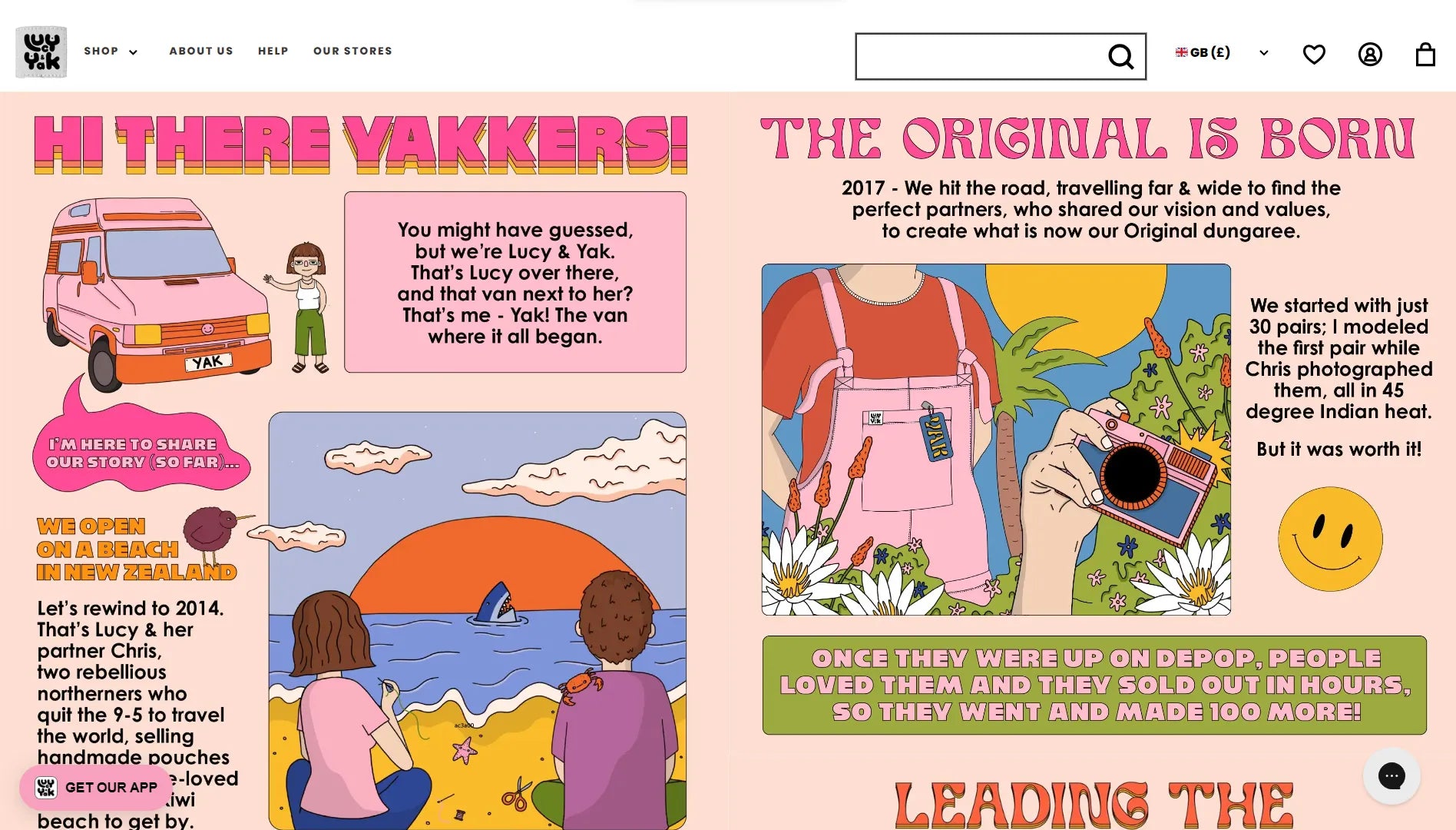

You can experience this eco-friendly and cheerful color scheme throughout their website, from their "Our Story" page with its natural hues like light pink, tomato orange, green, blue, and light peach to the various product pages that feature different variations of these colors. Lucy & Yak has truly made sustainability look stylish and fun!

7. Death Wish Coffee
As the name suggests, Death Wish Coffee is a bold and strong coffee brand. Their color scheme mirrors this spirit perfectly by combining black and red.

When it comes to web design, most brands tend to avoid using red for their call-to-action buttons since it's often associated with errors or cancellations.
However, Death Wish Coffee takes a daring approach. They've strategically integrated a dark black and red color scheme not only on their homepage but also throughout their product pages and CTA buttons. It's a testament to their confidence and commitment to delivering a robust coffee experience that stands out from the rest.

Learn more: Brand Typography Explained: How Fonts Shape Your Brand Identity
8. Tentree
Tentree is a sustainable clothing and apparel brand with a great mission of planting one billion trees by 2030. Since the brand is heavily focused on the environment, its color scheme is based on earthy colors.

As a primary color, the brand has used different shades of green.

Also, the isabelline (pale grey-yellow) color in the background makes the design feel cool and soothing. Especially on the product pages, this background color scheme allows the product images to stand out.

9. Wild
Wild is a sustainable body care brand offering refillable natural deodorant, body wash, soaps, and shampoo bars. The brand mainly uses pink, green, and yellow colors.

One of the interesting things we observed on the Wild’s website was that the footer section has a yellow background color. You’ll hardly find a website with a yellow background color in the footer section. Thus, it creates a unique impression.

Your website’s color scheme is not just about the colors you set for your theme sections/elements (header, footer, blocks, etc.) but you should also consider the images you upload. Try to create and upload images that are matching with your brand colors.
10. Red Bull Shop US
Red Bull—the energy drinks brand—is one of the most popular brands in the world. Its eye-catching red and blue color scheme has become its brand identity. No wonder the same color scheme is found on its website - Red Bull Shop US.
On this Shopify-powered store, the brand sells its clothing, apparel, and accessories.

The great thing about this brand’s color scheme is that it only uses its primary color (red and blue) along with a simple plain white background throughout the website.

Best Colors Palettes for Shopify Stores [Based on Brand Types]
Now, let us share some color ideas that we’ve curated for you — depending on the type of brand. You can use the color hex codes to implement these colors or their variations. When used strategically, these palettes don’t just look good — they also help establish a clear visual hierarchy that guides your customers' attention across your Shopify store.
1. Beauty & Cosmetics Brands
If you’re a beauty & cosmetics brand, we can assume your main target audience would be women. Women typically like pink and red colors more as compared to other colors.
Here’s one of the color scheme ideas for your brand:


Hex Color Codes: #CDB4DB #FFC8DD #FFAFCC #BDE0FE #A2D2FF
2. Fresh or Vegetarian Food Brands
The color green is associated with nature. Especially when you think of fresh vegetables, the first color that may come to your mind is green.


Hex Color Codes: #38A3A5 #57CC99 #80ED99 #C7F9CC #22577A
3. Computers, Smartphones, or Electronics Brands
The color blue is associated with trustworthiness, and that’s one of the reasons you’ll find many brands in these segments using the blue color. Computer brands like Dell, Intel, and HP also use blue as their primary color.
Apart from blue, black and grey are also commonly popular colors among such brands. These shades work well in creating a clean, professional look — especially when combined with modern fonts & typography styles that reflect innovation and clarity. Choosing the right font weight and spacing can enhance readability and strengthen your brand’s tech-forward identity.


Hex Color Codes: #00A6FB #0582CA #006494 #003554 #051923


Hex Color Codes: #F8F9FA #E9ECEF #ADB5BD #6C757D #343A40 #212529
4. Home Essentials Brands
For home essentials such as furniture, kitchen items, or decorations, you could go with a variety of color schemes. However, two of the popular colors in this category are blue and orange.


Hex Color Codes: #8ECAE6 #219EBC #023047 #FFB703 #FB8500
5. Sports Equipment Brands
The color yellow is considered a symbol of enthusiasm and cheerfulness. Also, it’s a great color to grab the attention of the visitors. Similarly, the color red is considered to be a bold and competitive color.
Thus, yellow and red are popular colors for sports brands. Also, black color can be a great choice as it symbolizes power.


Hex Color Codes: #282A3E #8D99AE #CFD11A #EDF2F4 #EF233C #D90429
6. Clothing & Apparel Brands
For clothing and apparently brands, it’s hard to definite 1-2 color schemes because this category consists of multiple different sub-categories or niches within its umbrella.
However, based on popular color schemes, here are some of our recommendations to make your creative juices flow:
6.1 Earthy Color Scheme


Hex Color Codes: #264653 #2A9D8F #E9C46A #F4A261 #E76F51 #E0FBFC
6.2 Bright Color Scheme


Hex Color Codes: #17FFC4 #CC17FF #6917D0 #FF1791 #17FFEE #262626
6.3 Modern Look


Hex Color Codes: #E63946 #F1FAEE #A8DADC #457B9D #1D3557
7. Fast Food Brands
Colors can not only influence our emotions but hunger as well. Yes, the color red triggers hunger and that’s one of the reasons you’ll see it used a lot in the fast food industry.
On the other hand, the color yellow is associated with happiness and friendship. So, these two colors are definitely a great choice for this category.


Hex Color Codes: #D40000 #E12C2C #FFA500 #FFD700 #F8FFE5
Helpful Resource:
We’ve created these color palettes and visuals using an amazing tool — Coolors — which lets you generate, explore, and visualize color palettes. We’re not affiliated with it, but we just wanted to share it so that it can be helpful.
Why is Color Scheme Important in eCommerce?
Here are some reasons why the ecommerce color palette is vital:
-
Helps create your brand identity
When someone says, Nike, the first thing that may come to your mind would be its black-colored swoosh. When you go to Nike’s website, you’ll find its major color scheme is black too.
That’s how the brand creates its unique identity. When you’re using a consistent color scheme, people can recognize your brand even by just looking at the colors.
Learn more: Website Branding in eCommerce — a Complete Guide + Examples & Best Practices [2025]
-
Increases your conversion rate
Shopify color palette can influence 85% of customers' buying decisions, and thus, your conversions. Here’s an interesting study done by HubSpot:
When HubSpot ran a test with two different CTA button colors — green and red — with over 2,000 website visits, it was found that the red button outperformed the green button.
Yes, 21% more visitors clicked on the red button as compared to the green button.
Just because something worked for a brand doesn’t mean it should work for you as well. It’s crucial to set the right color for the CTA button depending on the overall color palette for ecommerce website. Make your CTA button stand apart from the entire page. Also, run an A/B test to see which button works the best for conversions.
-
Express emotion to better convey your message
When you convey your message by spoken words, you can convey your tone easily. But when you need to convey something in a text or visual form, colors play an important role in expressing the emotions or feelings behind the message.
For example, red color is used to express love. If your brand is selling products that are intended to be sold to romantic couples, the color red could be a great choice for your primary brand color.
What Should You Consider When Choosing the Color Scheme?
-
Target Audience
For anything related to marketing, the target audience/customers is the biggest factor that drives any strategy. Consider who your ideal customers are and use the color scheme accordingly.
In one of the color studies, it was found that men prefer bright colors significantly more than women. On the other hand, women prefer soft colors.
-
Cultural Aspects of Your Target Market
If your brand is focused on a specific country or region, you may want to consider the cultural aspects associated with colors.
For example, red is considered a symbol of love in many countries; however, in China, the color red is considered auspicious and a symbol of celebrations and prosperity.
-
Type of Products
The product type is also one of the crucial elements in defining your brand’s color scheme. As we saw in one of the above examples, if you’re selling healthy and vegetarian food items, green color and its related shades would be more suitable to your brand.
It goes without saying — this criterion is applicable when you’re focusing on selling just one or a few products. If you’re a general store selling hundreds of different products, this does not apply to your business.
-
Your Competitors
Competitor research comes into the picture for choosing your color scheme as well. Choosing a different color scheme from your competitors can help you stand apart from them. But again, this might not be applicable in all cases, and you may have certain similarities if you’re following an industry-specific color scheme.
Even if you decide to follow certain types of colors according to the industry, you can still add your own creative element to the color scheme. For example, you can add a different secondary color in your color palette that can differentiate your brand from others. After all, the idea is to make your unique brand identity. So, be creative.
-
Color Combination
You’ll need more than one color in your palette to design your store. Thus, it’s important to choose colors that look good when used together.
While there are some colors that go well together, there are also certain color combinations that might not look good together. For example, red and purple, red and green, or pink and green may not make the best color palette.
Final Thoughts on Color Schemes for eCommerce
Your brand’s color scheme is a great medium to showcase your brand’s personality and convey the message in the right manner.
The good thing about the color scheme is that it can be changed in the future if needed. But it is not to say that you should change the color scheme regularly.
It takes time to create and build an image of your brand in your customers’ minds. You can’t just keep changing it. So, invest some time to research, brainstorm, and finalize your brand’s color scheme.
FAQs about Color Schemes in Shopify


