What is a Product Comparison Table and Step-by-Step Guides to Create
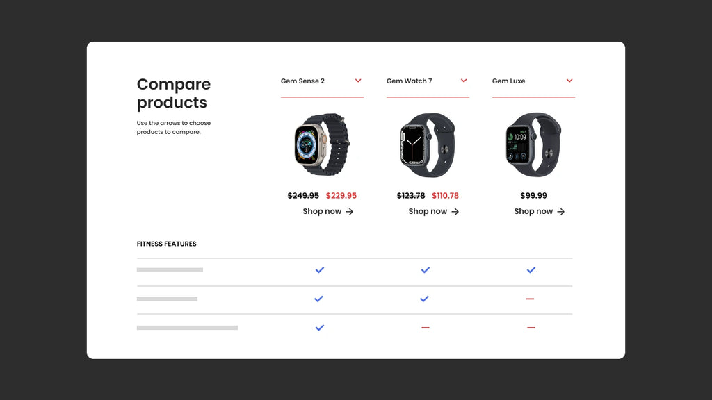
Determining which product has superior features or which service provides the best value for money can be challenging. Numerous questions often need to be clarified in the decision-making process. However, a product comparison table can simplify this process by allowing users to easily compare and contrast different options.
In this article, GemPages will guide you through the step-by-step process of designing a product comparison table and discuss some best practices to ensure the table is accessible and visually appealing. Carefully consider these suggestions because they can help you increase conversion rates as well as attract potential customers.
Introduction to the Product Comparison Table
Product comparison table is a visual representation that allows users to compare multiple products side-by-side. When making decisions about what to buy, which service provider to use, or which loan to apply for, comparing the criteria is crucial.
Product comparison table allows you to evaluate the pros and cons of different options by showcasing their common features or characteristics in a clear and easy-to-understand format.
Typically, elements need to be considered, including price, available features, benefits, and drawbacks. After providing an overview of each option and highlighting their similarities and differences, a comparison table helps you make an informed choice that aligns with your specific needs.
Types of Product Comparison Table
There are essentially two categories of product comparison tables that can be employed in an online eCommerce store, including:
Static Product Comparison Table
Static comparison table is a straightforward table that presents information in a fixed format. The data within the table remains constant, and the user does not have the ability to modify or alter the displayed information. Static tables are helpful because there is little chance of frequent changes to the data being compared.
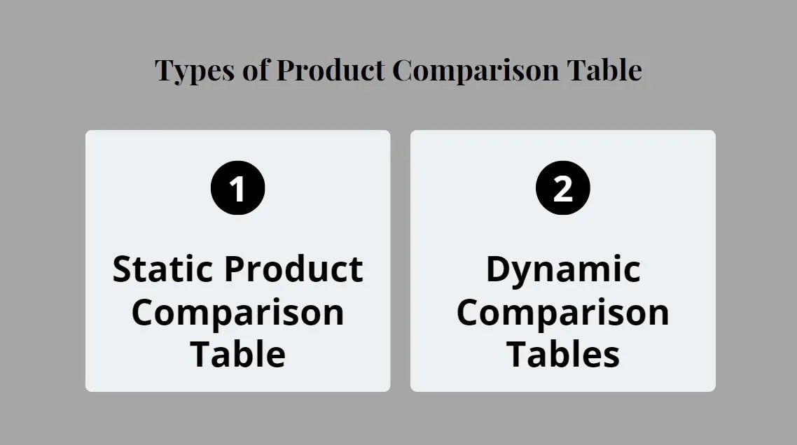
There are two main types of a product comparison table
Dynamic Comparison Tables
In contrast to the static comparison table, the user has the authority to choose which criteria they want to compare in dynamic comparison tables. There are two methods to determine the selection of products, including:
- Products List
Present a comprehensive list of all options so that the user can handpick the fields that pique their interest. Position a prominent "Compare" button on the page, either at the top, bottom, or alongside each product. Make sure that the product list stands out with an eye-catching color or font.
- Product Page
Incorporate a "Compare" button on every product page. Upon clicking, the product comparison table will open in a new window without altering the layout of the original page.
Find out more: Product pages are the lifeblood of an online store. A well-crafted product page provides potential customers with a visual representation of the product. Read a complete guide on The A-Z Guide to Creating Effective Shopify Product Pages.

Why Should You Use a Product Comparison Table?
Attracting Visitors to the Website
In order to compare the features of multiple products, users typically have to visit each product page and review the product descriptions. This often leads to confusion, as users have to constantly switch between multiple open pages to make comparisons. As a result, the research process becomes slow, time-consuming, and even somewhat lacking in professionalism, which may ultimately discourage potential buyers.
On the other hand, with a product comparison table in a structured manner, all relevant data for decision-making can be gathered quickly and reasonably. This approach not only saves time but also provides a clear overview of the products being compared.
Read a complete guide on Important Website Optimization Factors for Seasonal Sales
Improved the Customer Experience
The usability, simplicity, accessibility, and utility of a website greatly influence the customer experience. One effective way to meet these requirements is by adding a product comparison table. These tables are designed to be easily comprehensible, enable quick interpretation of information, and help in the decision-making purchasing process more easily. Thus, the inclusion of a product comparison table is an essential component for any online store.

Use a product comparison table to improve the customer experience
Direct Conversion Capabilities
Including a call-to-action (CTA) in the product comparison table can greatly enhance conversion rates. For instance, you can incorporate a button labeled "Add to Cart" beneath each item. This approach effectively guides the buyer towards the next step without requiring them to navigate back to the product page.
How To Create A Comparison Table Using The Row Element
Step 1: Access to GemPages Dashboard
Get started, go to the https://app.gempages.net/dashboard/ and choose a page. Once you have selected the page, click on the "Edit" button to enter the editor.
Step 2: Find A Row Element And Drag & Drop
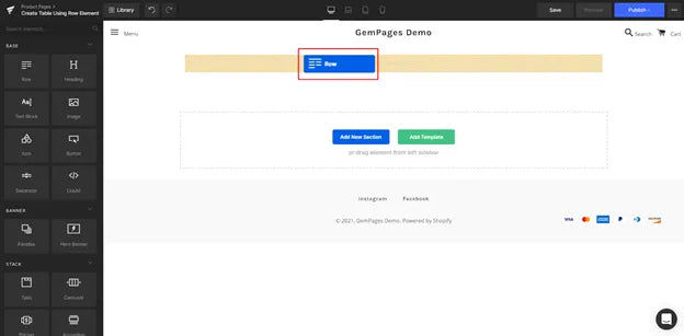
Navigate to the left sidebar and locate the Row element. Then drag and drop this element onto your page.
Adding the row element, you are creating an outer container that will house all the elements that make up the table. This container also allows for easy adjustment of the size as needed.
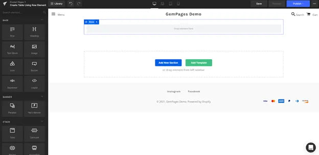
Find a row element and drag and drop
Step 3: Add Another Row Element And Place It Inside The Initial Row
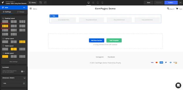
Add another Row element and place it inside the initial Row to create a nested structure. This nested Row element will serve as the first horizontal row of your table.
To construct a nested structure, add another row element and position it inside the first row
Step 4: Define Which Columns Will Be Vertical In A Table
Decide the number of vertical columns your table requires. Then, choose the appropriate layout for the nested Row element from the Settings tab on the left sidebar.
In the given example, there are 4 rows.
Step 5: Determine How Many Rows And Duplicates
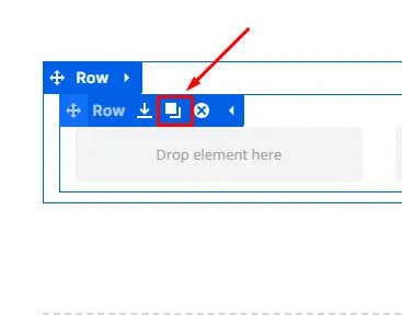
Determine the number of rows your table needs and duplicate the nested Row accordingly. To do this, select the nested Row and expand the options by clicking on the arrow, then click on the "Copy" icon.
Once done, the outcome should resemble the following:
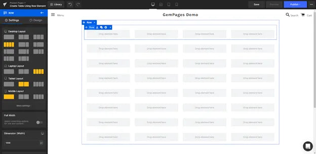
Determine how many rows and duplicates
Pro tip: In numerous instances, the content of the table may exhibit similarities across different rows. In such situations, it is advisable to populate one or a few horizontal rows initially before duplicating them, as this can significantly reduce the time required for editing.
Best Suggestions for the Product Comparison Table
The effectiveness of a product comparison table is heavily dependent on its quality and determining the outcomes you can attain. Implementing these suggestions will help you offer customers a clear and easy-to-understand table product comparison.
Consistency
Making sure there is consistency in the content of a product comparison table is crucial. The primary objective of this extension is to offer complete and useful information for customers. A comparison table that contains empty cells and lacks data serves no purpose whatsoever. To limit this, it is essential to maintain consistency in your product descriptions.
Relevant Features
When creating a product comparison table, focus on offering the essential features of the products. Lengthy tables can be overwhelming and difficult to read, potentially confusing the buyer without providing any useful value.
However, this task can become more challenging when dealing with products that have complex features. In such cases, it will be better to provide users with the ability to select the criteria that interest them. By letting them decide which information they want to display and compare.
On the other hand, incorporating interactive rows that customers can expand or collapse according to their preferences will give them the flexibility to choose the level of detail and features they wish to compare.
Learn more: Unlocking the Potential: Boosting eCommerce Average Order Value
Item Quantity
A product comparison table typically consists of approximately five items on average. As the number of items increases, it becomes increasingly challenging to effectively convey information. In cases where the selection is larger, it is advisable to utilize filters to refine the options.
It is especially advised to use fewer items for static tables. Add no more than five similar products. Permit users to eliminate comparison points that they deem unnecessary. This will make the table easier to use.
Using Color Codes and Shading
Comparing products is quite a tough task. To assist your customers in reducing the time and effort required to process information, it is recommended to eliminate unnecessary elements from the product comparison table and opt for a clear layout.
For lengthy tables, anchor the column headers to ensure their visibility at all times. In addition, the use of color codes and shading in the cells can greatly enhance readability and facilitate the distinction between different elements.
Besides, to facilitate quick data searches for users, employ simple phrases with concise sentences and relevant keywords; the text is evenly distributed within the cells; and the spacing is accurate.

Store Examples Using a Comparison Table
Smartpaw
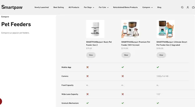
Smartpaw is an online business that offers accessories and smart equipment for pets with multiple pricing options.
Because there are many items in the catalog with functions and instructions on how to use them, Smartpaw has designed a product comparison table to make it easier for users to refer to more information about each product.
Thanks to this comparison table, the retained customer rate will be higher and the conversion rate will be better.
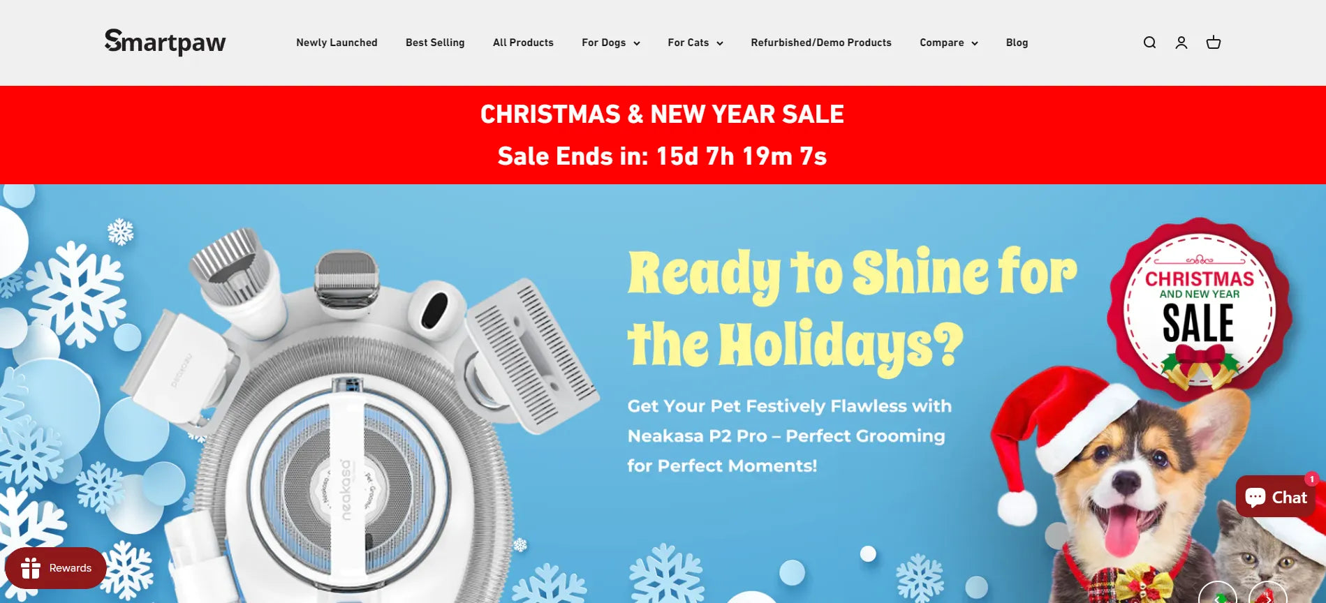
Pro tip: Customers may find Smart Paws above the fold section attractive and informative, as they use a countdown timer to remind viewers about their Christmas and New Years' sales. Try GemPage's countdown timer element to own the same out-standing event banner.
Fitbit
Fitbit is a renowned company that specializes in providing fitness products aimed at keeping you motivated and enhancing your overall health through activity, exercise, and food tracking.
On their product page, Fitbit effectively showcases the diverse features of their offerings using vibrant and visually appealing charts.
Additionally, they use product comparison tables to help users quickly grasp the differences between products, thereby making faster purchasing decisions.
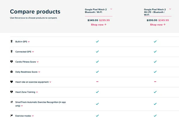
Fitbit.com uses a feature comparison table to offer information about pricing plans
In particular, as a dynamic comparison table, customers can choose more products to have more comparisons and choices for themselves.
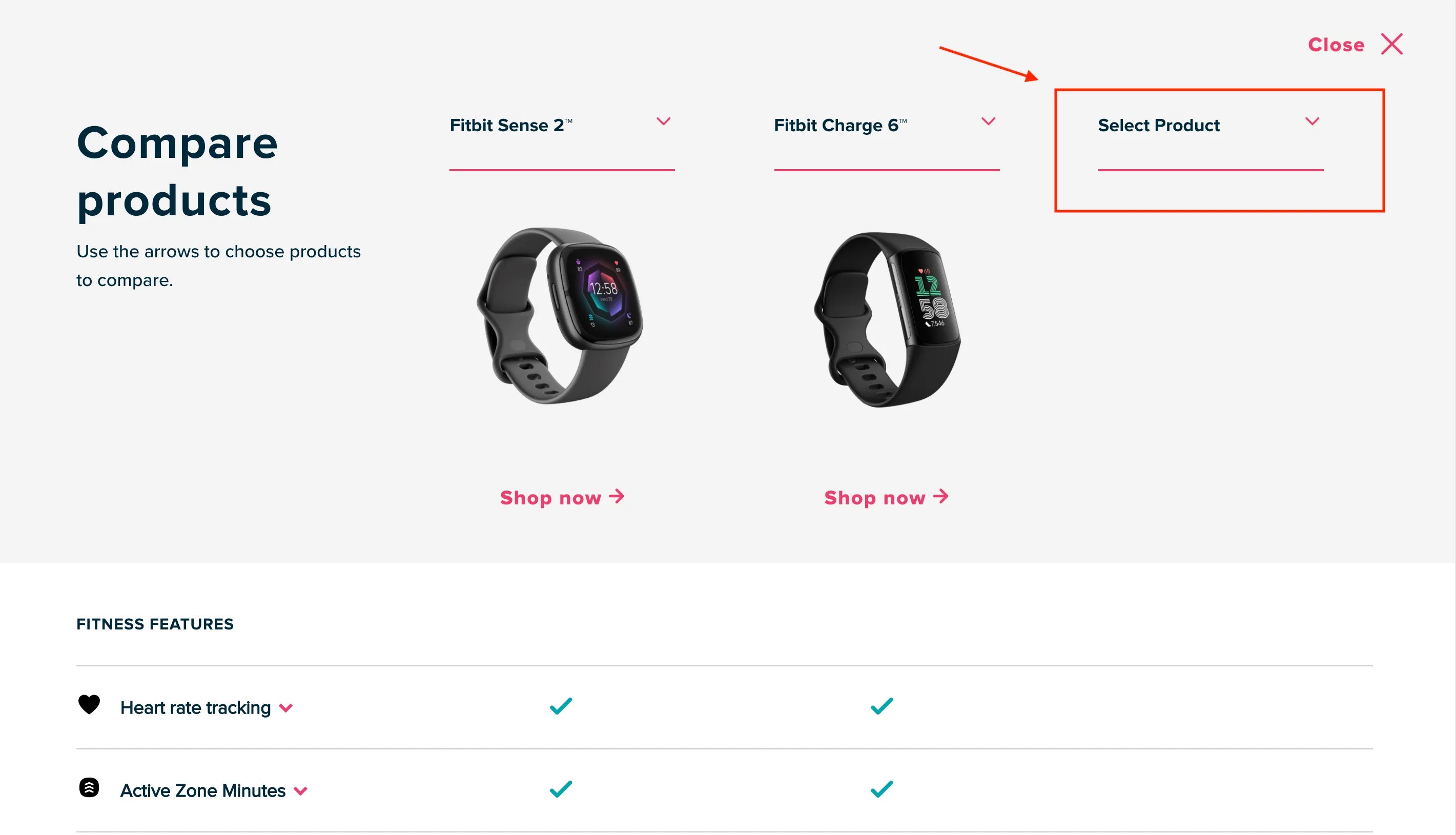
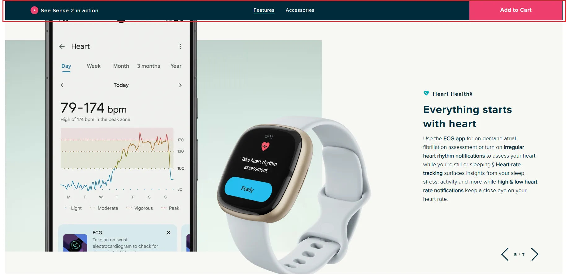
Pro tip: Besides using comparison tables, Fitbit also added elements to convert customers' purchase rates, such as the sticky add to cart bar - a CTA bar that is always in the customer's sight. Using GemPages's Sticky-Add-to-Cart to convert your store.
Wrapping Up
To sum up, a product comparison table is a time-saving tool that makes it easy for users to approach information and make choices between different products or services. Whether you opt for a static or dynamic design, the key is to present reliable information in a compelling manner.
Through adhering to the step-by-step guides and best suggestions in this post, you can totally guarantee that your comparison table is user-friendly and simplifies the decision-making process for customers.


 Facebook Community
 Change Log
 Help Center


