


 Facebook Community
 Change Log
 Help Center


eCommerce UI: Top Tips to Boost Your Conversion Rates
The user interface (UI) is crucial in any website setting. For eCommerce, the importance of this design is tenfold. An intuitive eCommerce UI equals a smoother shopping experience, which is the key to higher conversion rates. Let’s check out which UI facets are must-haves for a successful eCommerce store, how the design process works, and practical instances with us.
What is UI in eCommerce?
UI, short for user interface, is the design of a website or application that constructs the visual elements on the screen and how users navigate around the site.
This feature covers the smallest details, namely the placement of the search box or the size of a button.
In an eCommerce setting, the UI determines how your customers interact with your website. If the interface is intuitive and conducive, the user experience will be greatly improved, and vice versa. As a result, higher or lower conversion rates will occur accordingly.
Let’s get down to the nitty-gritty in the next chapter.
Must-have UI Elements to Improve Your eCommerce Store
There is a wide array of UI components that complete your eCommerce store, depending on your specific needs. That said, it all boils down to the most seemingly basic, but efficient details. Below are the most essential design elements that fit most eCommerce websites across different industries.
Learn more: GemPages Exciting Updates: Faster, Smoother & Closer to “Built for Shopify”
Site search option

Visitors will instantly know what this icon represents when they come to your eCommerce site.
The first step of having a helpful search option: make the search bar visible.
The simple magnifying glass icon will be your best friend, due to its wide recognizability. The search box should be placed in a prominent place, such as your top navigation bar, and ideally follow users as they scroll.
Search prompts, trending queries, and search history are details that are worth incorporating into your site search for better usability. On top of that, search filters are incredibly handy when shoppers want to look for specific items or organize products by price/relevancy.
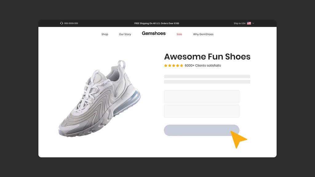
Eye-catching CTA buttons
Your eCommerce UI designs should be purposeful. An evident Call-to-action button helps shoppers take the appropriate actions and interact with on-screen content. When they are guided in the right direction, that is when sales are driven and conversion occurs.
A good rule of thumb for effective CTA buttons is to use short commands (i.e Download, Shop Now) in contrasting colors from the other content. The placement is also noteworthy, as it should not stray away from the main information on the page.
Breadcrumb navigation
Customers navigate your website by clicking on different links and going page to page. A helpful tool that helps customers locate themselves is breadcrumb navigation.
This feature makes use of a hierarchical structure to mark shopper’s locations, guide them back to the previous pages, and show your store’s product system. The last point is especially valuable since customers can quickly discover other relevant items within the breadcrumb trail.
Not only is this tool beneficial to the user experience, it can improve SEO as well. Search engines love a well-structured website and a clear path for crawlers to follow. When breadcrumbs are in effect, your store’s ranking will possibly be boosted.
The F-shaped pattern
The F-shaped pattern refers to the common eye-scanning pattern in reading content. This represents the typical path users’ eyes follow when scanning for information:
- Horizontal movement across the top: Users are immediately drawn to the top section, absorbing key elements like logos, navigation bars, and prominent headlines.
- Vertical scan down the left: Attention shifts to the left side, where they seek out key information like categories, product listings, and calls to action.
- Scanning specific areas within content: Users then selectively scan specific areas within the content based on their interest and the visual hierarchy you’ve created.
- Understanding the F-pattern empowers you can strategically place website elements to grab better user attention, guide navigation, ensure clear and concise category listings and menus on the left side, structure content effectively.
Keeping this in mind, you should have an idea of where and how to position your content, especially with a text-rich website. When you create content for easy scanning, the interface will get better accordingly.
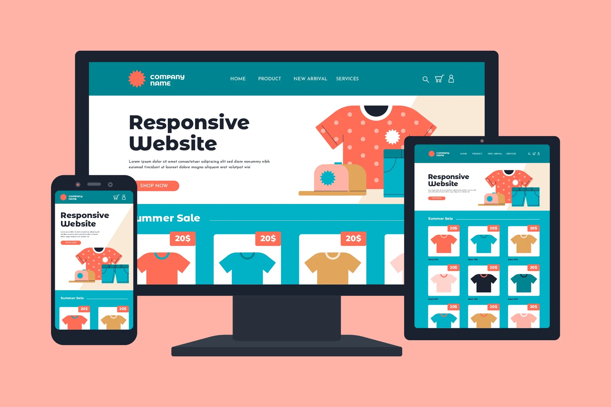
Mobile responsive design
Crafting an e-commerce UI that thrives across all devices is no longer a luxury, it’s a necessity. A mobile-first design is what every website owner should take note of, given the staggering projected number of 7.49 billion mobile users in 2025. Mobile device dominance in shaping today’s digital world is undeniable, and ignoring this audience means missing out on significant revenue opportunities.
Mobile first design demonstrably enhances several key metrics, fostering a competitive edge for online retailers. Not only SEO algorithms prioritize mobile-friendly websites, propelling your store to higher visibility in search results, organically attracting more customers. But also, mobile first design minimizes user frustration arising from cumbersome interfaces, demonstrably reducing cart abandonment rates and boosting conversion rates.
Smooth checkout screen
To convert leads into sales, a seamless checkout process is not to be undermined. This is your chance to implement up-selling and cross-selling, promote free shipping, and instill trust in your customers with different payment gateways.
All these features should be hosted by a well-designed checkout page with minimal steps. You want the last interaction of shoppers with your store to end on a high note.
The eCommerce UI Design Process
Having a fitting UI design process is the key to a responsive eCommerce website.
Giving your online store a makeover does not happen overnight. This eCommerce website UI design process can be a useful benchmark for you to begin your journey.
1. Define your brand’s identity
First, start defining your brand’s identity. The essence of your business lies in its mission, purpose, and overall vision. Visualize your store in its completion, which key functionalities it will have, and where each component will go - this is when you will have a list of features that are unique to your brand’s identity.
The initial design process will cater to each UI feature from this point onwards.
2. Understand your target audience
Get to know your customers. Who are they? What are their buying habits and preferences? What is their common feedback about your website? The worst-case scenario is having a website with a plethora of state-of-the-art features but none of them fit your audience’s needs. Thus, employing customer-based insights is critical to achieving a top-notch eCommerce UI.
3. Establish a clear information architecture (IA)
An information architecture (IA) focuses on organizing and structuring content effectively. For an eCommerce business, a well-thought-out IA helps customers find products and services in a quick manner. By having a clear IA, your store will be more user-friendly.
4. Design interactive prototypes
Prototypes are utilized to simulate the interaction between a user and a website’s UI. This step is not to be neglected, as these usability tests are preventive measures to control extra costs and time for businesses.
5. Check out your competitors
You know what they say, keep your enemies close. Well, they are not your “enemies” per se, but competitors are worth keeping an eye on. By checking out similar stores, you can have a clear understanding of what their strengths and weaknesses are, and what exclusive features they have. Taking notes after each R&D session can help you pinpoint your own setbacks and improve them to create a better UI.
6. Conduct A/B testing
A/B testing is a highly advised practice to ensure your website runs smoothly. After the initial launch, doing A/B testing can quickly identify issues and unfitting elements on your eCommerce site. From that point, start implementing the necessary changes for a better user interface and experience.
3 eCommerce Stores With Brilliant UI Designs
1. Milk
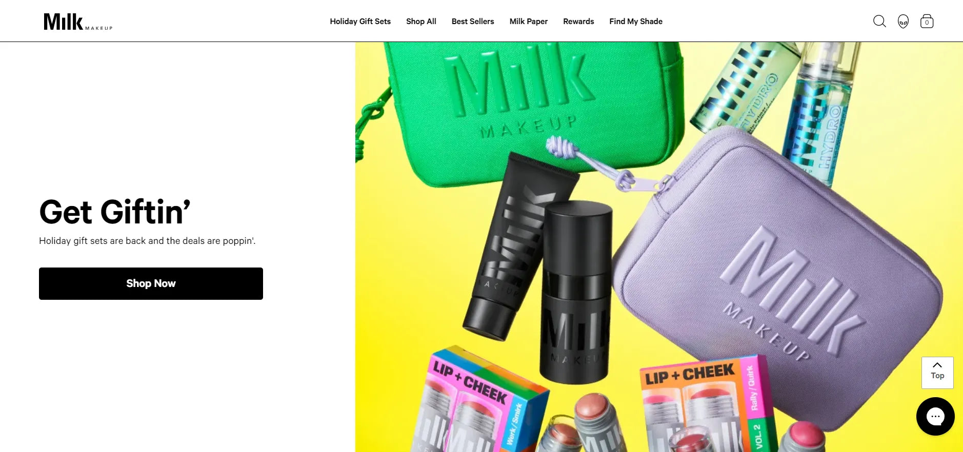
Shop the hippest makeup products from Milk’s intuitive website.
There is a lot to love about Milk’s website. Within the first few seconds of landing on the store, users are greeted with a visually striking promotion video. The store employs a paper-white background, with a contrasting text color. The top menu is limited to six components, with three essential icons: Search, Profile, and Your Bag.
Every line of text on Milk’s website is clear, with a coherent breadcrumb trail. Visitors can navigate the site with ease, which ends with a seamless checkout page.
2. Sheep Inc.
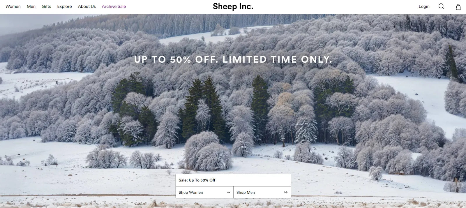
Sheep Inc. ensures a pleasant shopping experience the moment visitors land on its store.
Sheep Inc. makes use of scenic photographs to their full ability. The brand’s use of text is noticeably limited, but each one is purposeful. The top navigation bar is reserved for the main information regarding their products and their story. Options to shop their on-sale products by gender are prioritized above the fold, from which customers will come across a collection page with brilliant search filters.
Though their products are simple looking, the company has built a vivid online store by incorporating clever design choices and a user-first navigation system.
3. Sheertex
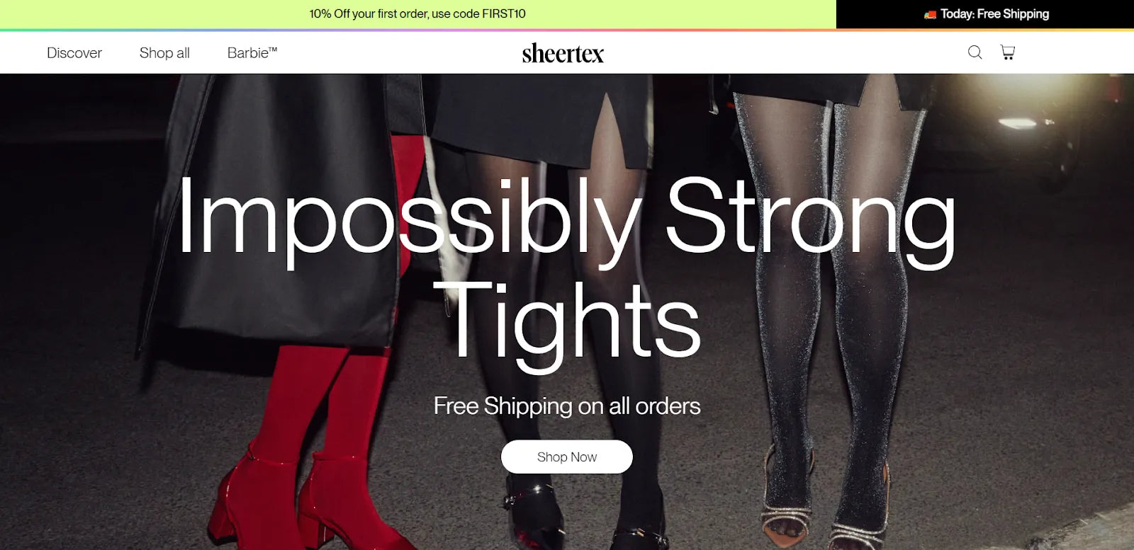
Sheertex simplifies its interface to showcase its best assets.
Sheertex knows how to build a powerful website. Every detail is stellar, from the minimal navigation menu, aesthetic hero image, smart product badges, visible CTA buttons, and so on. Being a one-product business, this brand sure knows how to advertise their products with dynamic photographs, while providing shoppers with a straightforward navigation system for an excellent user experience.
Over To You
UI in eCommerce has its exclusive features, but at the end of the day, it all amounts to one goal: to create better-looking websites. We at GemPages have compiled these top tips for you to zhuzh up your online stores, just in time for a new year. Now it’s over to you to put your best foot forward and bring these practices to life.
FAQ About eCommerce UI


