


 Facebook Community
 Change Log
 Help Center


The Best Mobile Website Design Examples to Learn in 2025
Website design no longer surrounds what is on the computer screen. People can web-surf from the comfort of their bed or sofa via an illuminated, vertical screen - their mobile device.
No matter which type of website you own, mobile website design should be among your top priorities. Only when this tactic is factored in, is your website completed. The user experience will be greatly improved as a result.
In this article, we will touch on some of the most well-crafted mobile versions of websites across different industries. While each has its flairs, we guarantee that you will find valuable assets in every example.
Why is Mobile Website Design Important?
Since Google has recently moved towards mobile-first indexing, having an optimized mobile website is a must if you want to improve your site’s ranking.
In this era of digital natives where almost everyone owns a hand-held device, mobile websites are even becoming more favored, from our perspective. According to a recent study, mobile devices accounted for nearly 57% of website traffic. This proves that mobile website design is not a future topic, it is more relevant now than ever before.
Elements of a Mobile-Friendly Website Design
Conspicuous CTA buttons
CTA, or Call-to-Action buttons, are mobile web design that prompt a specific action from users. This feature is highly advised on both computer and mobile screens, especially in the eCommerce sector. A strategically placed button can help gather leads and drive sales.
On mobile devices, these buttons need to be big enough to catch users’ attention, but not too big to avoid a disproportionate layout. The number of buttons is also important, as you don’t want users to miss or be bombarded by them.
Simplified navigation menus
Dropdown menus are excellent for computer sites, but a nightmare for mobile screens. Thus, it’s best to simplify your menu to only keep the essentials. If appropriate, tuck them away under the hamburger menu. This way, the top bar is reserved for your logo only. This will give your website a sleek and polished look.
Optimized images and videos
Images and videos are crucial visuals, so of course you would want to spice up your mobile website design with eye-catching media. However, don’t be hasty to sacrifice your website’s load time for images and videos. If your website doesn’t load, all these pretty visuals are for nothing.
Instead, make sure to compress your media and prioritize portrait photographs and videos to deliver a better user experience.
Thumb-friendly website layout
People navigate mobile websites with their fingers, more specifically, their trusty thumbs. Taking this perspective in mind, your mobile content should be placed where users are more likely to reach and click on. This change seems small, but it could make or break your website.
15 Examples of Mobile Website Design to Inspire You
1. Planned Parenthood

Planned Parenthood put their consulting services right on their mobile home page.
Planned Parenthood is one of the best mobile websites. It is a trusted healthcare provider and avid advocate for sexual health literacy in the U.S. With an organization that empowers such an influential mission, Planned Parenthood has done an amazing job with a user-first mobile website.
Visitors are greeted with a search filter on the home page to book an appointment with them. Scrolling down, there is nothing short of convenient, with buttons calling visitors to learn more and chat with the team. The top bar showcases handy icons and corresponding titles, without crowding the page. Planned Parenthood has mastered its mobile-first website design for a business that aims to offer resources.
Pro tip: Create a special landing page for your flash sale promotion. You can use GemPages to create Conversion-Focused Page Builder using its AI-powered feature, templates, or drag-and-drop visual editor. Don't miss out on grabbing an exclusive 20% OFF this Black Friday with GemPages today!
2. Linear

Linear’s excellent website gives users a smooth mobile experience.
Linear deserves a spot on our mobile website design inspiration list, all due to its avant-garde website design and lightning-speed load time. The company specializes in building software for businesses of all sizes, with attention to detail in mind at all times. This vision has been reflected perfectly on their mobile website. No flashy colors and special fonts needed, Linear’s website shines through their intuitive layout, user-friendly navigation, and interactive elements. You will know exactly what their service is by the very first impression.
3. Frans Hals Museum

Stay updated with Frans Hals Museum by scrolling through their neatly designed mobile website.
Frans Hals Museum is an art museum based in The Netherlands. If you are looking to give them a visit, this website is the perfect platform to get all the necessary information. The mobile version is incredibly well-designed: large titles, a pleasing color scheme, a sticky navigation bar, etc. Frans Hals Museum keeps their website hip and fresh, which is in-tuned with their spirit in person.
4. Mammut

Clothes that empower your outdoor adventures, all can be found on Mammut’s mobile website.
Mammut’s clothing line is designed for outdoor enthusiasts, especially those with a knack for mountain exploration.
Right as you enter their mobile site, you are met with a hero image of a traveler repping their fits among breathtaking scenery. Without scrolling down, you can start shopping by choosing one of the two options or clicking on the hamburger menu to explore further. All the components on Mammut’s mobile store are coherent and flow well together. Their CTA buttons are strategically placed, not at all in the face, and overwhelming. The high-quality lifestyle photographs also give users an idea of how their clothes look on real people, rather than just products under studio lighting.
5. Apple
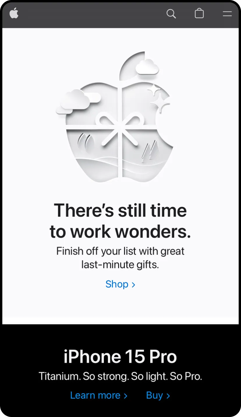
Apple is a textbook case of a mobile website done phenomenally.
Everybody knows Apple as the tech giant, which is understandable when their mobile website examples stands among the best.
The company keeps it classic with the black and white color combo, and a short-length homepage to reduce excessive scrolling for mobile users. The navigation bar is minimally designed, on which visitors can find information regarding all the Apple products in the hamburger menu on the right. Since Apple is a world-renowned brand, there is no introduction needed. This is a classic case of responsive website design on mobile, where every detail is accounted for and optimized.
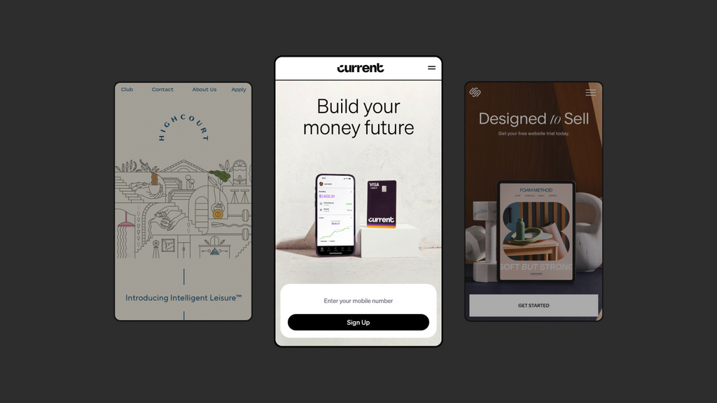
6. Current
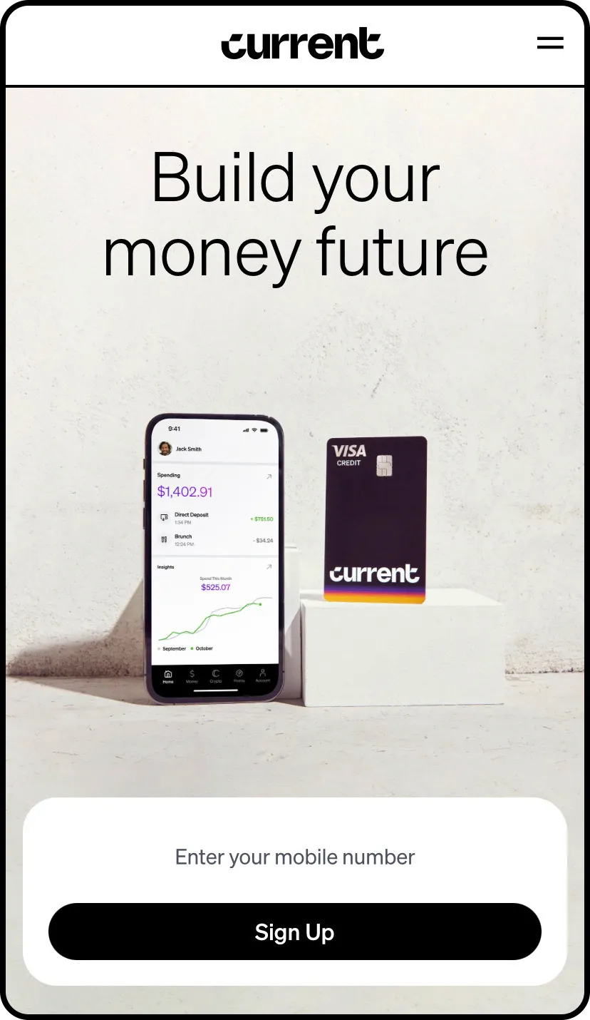
Current’s mobile website showcases their service perfectly.
Current’s mobile website embodies their mission through a striking hero image and concise statement. To build a better banking system, the company proudly displays them on the website to ensure their visitors know all about their services. While the home page is packed with information, the navigation menu is simplified to the utmost. This way, the website looks balanced and sleek.
7. Squarespace
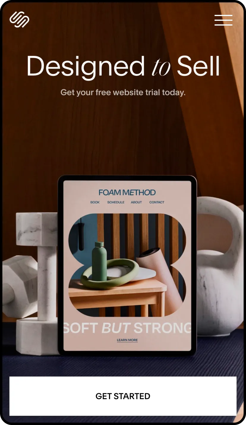
Squarespace takes note of every little detail on their mobile website.
Squarespace helps you build websites, which means their own work is no less than spectacular.
Upon visiting their mobile website, visitors are encouraged to get their free trial by clicking on the “Get Started” button. As their product is pretty self-explanatory, Squarespace’s website is reserved to promote their templates and exclusive features. A neutral background and uniform text ties together every element.
8. Breda

Breda proves that they are more than just a watch company with their aesthetically pleasing mobile website.
Saying Breda’s website is a visual feast is an understatement. By peculiarly presenting their products, visitors will not have difficulty remembering this brand.
Breda’s mobile website is sectioned into different categories to advertise their most relevant pieces. They decided to keep their CTA buttons clean and simple, which fits right into their aesthetic. This approach is ideal for fashion and makeup brands who want to possess an effortless presence.
9. Gumroad
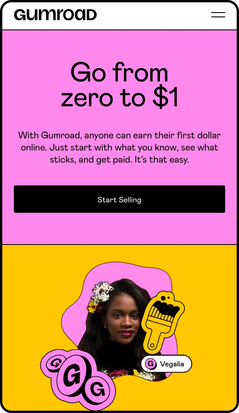
Gumroad optimized their mobile website to advertise their service efficiently.
This eCommerce platform offers a frictionless onset for startups, and their mission is conveyed neatly right on the front page of their mobile site. Visitors are fully informed of what Gumroad provides just by spending a mere minute on their site.
What we love about Gumroad’s mobile website is not only the vibrant colors or the abundance of details but also the fun and unique doodles that are placed throughout the site. These elements give this company personality galore and help instill a sense of brand identity in customers.
10. Hims
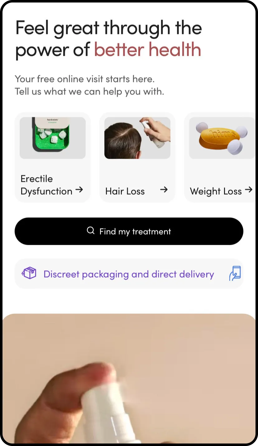
Pinpoint your concern and get the answer you need on Hims’ mobile website.
Hims is more than a skincare or supplement store for men. Their goal is to give customers a better experience with their bodies and minds.
Having a versatile array of products and services calls for a unique website layout. Hims understands that it would be a lot more accessible for their customers to shop by concerns, that’s why the first feature on their mobile site is a nifty search filter.
The brand prioritizes usability on every page, with content-rich sections to effectively convey their message and vision.
11. Crumbl Cookies

Crumbl Cookies went all out with a tasty product video on their homepage.
Crumbl Cookies rose as a baked good sensation ever since their introduction in 2017. Their online store is visually dazzling, as they do not shy away from incorporating mouth-watering images and videos to showcase the best angles of their cookies. On mobile, the hero video is optimized for a vertical screen, which still possesses the same visual effect. Want to find a physical store or place an online order? The sticky bar with these two options that follow you as you scroll is quite hard to miss.
12. Uniqlo

Start shopping right on your mobile phone with this inviting layout by Uniqlo.
Uniqlo is a casual clothing brand from Japan. The company is widely recognized, with numerous locations around the world. If you have visited their physical store, you would know that it is incredibly well-sectioned. The same can be said about their online store.
Uniqlo’s products are separated into four main categories for quick and easy shopping. The main page is reserved to advertise their current deals, most sought-after pieces, new arrivals, etc. The three icons at the bottom are basic, yet crystal clear.
For a clothing brand's mobile site, Uniqlo takes the cake as one of the best.
13. Typeform
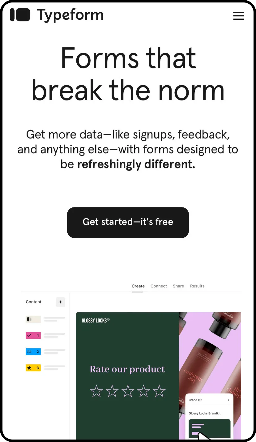
Typeform’s simplistic approach with their mobile website works wonders.
Typeform is the definition of less is more when it comes to web design. As the name suggests, the company provides forms that are personalized for your business. Since the practice is straightforward, no grant visuals or over-explanation are needed. Everything you need to know about Typeform can be found under the hamburger menu on the top right. Their home page is clean and bright to look at, which are brilliant qualities for a mobile-friendly website design.
14. Highcourt Leisure Club

Highcourt’s enticing mobile website gives you a virtual tour of their leisure club.
Highcourt Leisure Club is a gem in the middle of New York, and to us, their website is also a gem in mobile website design. The more you explore their website, the more it feels like a virtual tour of the actual club. The use of fine-lined illustrations over a pleasant neutral tone gives Highcourt an extravagant feel, while still looking authentic.
The aesthetic translates to usability as well, as visitors can easily navigate through the website with the help of the conspicuous navigation menu.
15. Serious Eats

Satiate your eyes with Serious Eats’ recipes of many colors.
This list would not be complete without Serious Eats - a recipe blog for food lovers. If you find other food websites to be overwhelming and text-filled, then Serious Eats could be what you need to brainstorm the next dinner idea.
At first sight, you can see that the highlighted recipe cleverly doubles as the site’s hero image. Fancy browsing recipes by categories or exploring food science tips? Keep that thumb scrolling to find exactly what you need (or didn’t know you needed). Everything about Serious Eats gives off a food magazine vibe, with no shortage of arresting photographs and content-rich pages.
Start Creating Your Mobile Website Design With GemPages
Are you feeling inspired and ready to start your mobile website design? If you are not already owning a mobile site, this is the perfect time to start joining the game. Alleviating your concerns and ease this process with a powerful page builder like GemPages is always a good idea to kickstart your journey.
FAQ About Mobile Website Design