


 Facebook Community
 Change Log
 Help Center


Splash Page: Definition, Differences, Benefits, and How to Create One

Most websites treat the first interaction as a welcome message. High-performing eCommerce brands treat it as a decision point, and that’s the role of a splash page.
It’s not a pop-up. It’s a filter, an offer, a message, a direction shown, or any purpose welcome that can be tailored differently based on intent: first-time shoppers, returning customers, age-restricted buyers, or promo-driven visitors.
If you’re asking how to set up a successful splash page that improves conversions without interrupting the experience, GemPages has prepared this guide to go through everything you need to know about splash pages, especially for eCommerce stores, and evaluate real examples that work, and why timing, simplicity, and clarity matter more than effects or visuals.
What Is Splash Page?
A splash page is a short, standalone page that appears before a visitor enters your main website or landing page. It can be considered a small introduction screen that directs, informs, or filters your users before they dive into your full site experience.
In eCommerce, a splash page isn’t meant to sell an entire product line the way a landing page does. Instead, it focuses on one clear message or action: confirm their age, choose their region, highlight a time-sensitive offer, or introduce something important about your brand. Here are the most common types used in eCommerce:
- Welcome Splash Page: A simple greeting page that introduces the site and sets expectations. It helps new visitors understand what the brand offers before they continue.
- Promotional Splash Page: Used to highlight a product launch, discount, or special offer. Often paired with a clear CTA to drive sign-ups or immediate conversions.
- Captive Portal Page: Typically used in physical locations offering WiFi. Users must enter basic information to connect, giving businesses valuable data for future marketing.
- Age Verification Page: Essential for stores selling age-restricted products like alcohol, CBD, or vapes. Visitors must confirm their age before proceeding.
- Login Splash Page: Appears before gated content, useful for membership sites or stores offering exclusive perks to logged-in customers.
- Coming Soon Splash Page: Builds anticipation around an upcoming product or service by sharing teasers or collecting emails ahead of launch.
- Maintenance Splash Page: Lets visitors know the site is temporarily unavailable due to updates. It keeps communication clear so users aren’t met with a blank or broken page.
- Error Splash Page: Appears when something on the website isn’t working. It should briefly explain the issue and offer a next step, such as returning to the homepage.

A website uses splash page to verify user age before allowing them to enter. Source: AgeChecker
Where it becomes valuable for online retailers is in timing and relevance. A splash page can help:
- Personalize the shopping flow by asking users to pick a country or currency.
- Comply with regulations by confirming age for alcohol or vape products.
- Drive short-term conversions by showcasing a flash sale or free-shipping offer before shoppers get distracted.
- Launch campaigns like Black Friday, brand collabs, drops, or pre-orders with a full-screen announcement.
Rather than being a constant barrier, a splash page should feel purposeful, a quick, meaningful stop that supports your brand and the user’s journey, not an interruption.
How Splash Page Differs
1. From Landing Page
At first glance, a splash page vs a landing page might seem interchangeable, but their roles are quite different in the eCommerce journey.
A splash page appears before users explore your site. Its purpose is narrow and immediate: confirm age, choose store location, agree to cookies, or highlight a limited-time offer.
It’s brief, visual, and focused on a single yes/no or enter/continue action. For example, an online wine shop may display a splash page that asks visitors to confirm they are over 18 before entering the store.
A landing page, on the other hand, is a full, standalone page built to persuade, educate, and convert. It usually serves a specific marketing campaign, such as promoting a new product line, collecting emails for a waitlist, or offering early access to a seasonal drop.
How it works is visitors arrive there through paid ads, social media CTAs, or email links, rather than encountering it by default.

A splash page vs a landing page example. Source: GemPages
For example, if you are a Shopify store running Meta ads for a Valentine’s Day jewelry collection, clicking the ad leads shoppers to a landing page that explains the offer, showcases products, and includes a sign-up or “Shop Now” CTA.
|
Feature / Focus |
Splash Page |
Landing Page |
|
Primary Purpose |
Deliver one message or requirement before users enter the website |
Drive a conversion tied to a specific marketing goal |
|
Content Depth |
Minimal, often one visual, one message, one button |
Detailed, benefits, social proof, product info, form, CTAs |
|
Traffic Source |
Seen when entering the site directly |
Users arrive from ads, email, social, or campaign links |
|
Action Expected |
Enter, confirm, choose |
Sign up, buy, register, download, join waitlist |
|
Ideal Use Case in eCommerce |
Age verification, region selection, flash promo |
Product launches, lead generation, campaign-specific offers |
Learn more: How to Create A Striking Landing Page on Shopify
2. From Homepage
A homepage is designed for exploration.
It offers multiple navigation options, highlights product categories, and provides a broad introduction to the brand. Shoppers can scroll, browse, compare, and decide their next step based on interest.
A splash page limits the choices. Instead of offering several directions, it focuses attention on a single priority, such as selecting a location, acknowledging age eligibility, or viewing a high–value promotion the brand doesn’t want visitors to miss.
In the comparison of splash page vs homepage, the homepage serves as an open gateway that encourages browsing, the splash page acts as a brief checkpoint that helps guide visitors more intentionally before they enter the full experience.

A splash page vs a homepage example. Source: GemPages
|
Feature / Focus |
Splash Page |
Homepage |
|
Role in the Journey |
Brief checkpoint before browsing |
Core hub for brand and navigation |
|
Message |
Highly focused and single-purpose |
Multiple messages and pathways for users |
|
Navigation Options |
Minimal or none |
Full menu, collections, links, and content |
|
Content Scope |
Short, visual, action-based |
Broad overview of brand, products, and value |
|
Ideal Use Case in eCommerce |
Highlight urgent or compliance-related info |
Introduce your store and guide shopping behavior |
Learn more: How to Create a Homepage Design That Captivates and Converts
Why Splash Page Is Important (For eCommerce Owners)?
A splash page gives you control over one of the most decisive moments in the customer journey: the first impression.
It captures a visitor's attention before they even enter your website. So, instead of letting them land and immediately choose their own path, you can strategically guide their attention, communicate an essential message, or tailor the experience, even before they explore your store.
This is especially impactful in eCommerce, where timing, relevance, and clarity influence conversion far more than a banner hidden mid-scroll.
In short, a splash page is important because it can:
- Highlight time-sensitive offers without relying on visitors noticing them later.
- Remove friction by personalizing the experience (location, currency, language).
- Support legal compliance for age-restricted or regulated products.
- Communicate urgent updates such as shipping delays or policy changes.
- Strengthen brand storytelling with visuals that set tone and expectation.
- Direct users toward a specific path that improves conversion or engagement.
Learn more: How to Do Landing Page Testing for Your eCommerce Store
How To Set Up Your Own Splash Page
A splash page establishes the first decision point of the customer journey, defining how users are routed, segmented, and engaged before they enter the store. It sets the expectation, communicates the priority message, and directs the action that drives the next step in the conversion path.
Therefore, to set up your own splash page, here are some key implementations:
- Introduce a message that matters before browsing begins, whether compliance, segmentation, or promotion.
- Set expectations for the shopping experience ahead and reduce possible friction later.
- Present your focused action.
- Build trust by reinforcing brand identity from the very first moment.
- Create the momentum that leads deeper into the store, rather than delaying it.
Now that the goal is clear, let’s break down what turns that objective into execution.
Well-designed splash pages typically share several characteristics that align user intent with business goals:
- Copy that communicates purpose instantly, reducing cognitive load and confusion.
- A simple, focused layout designed to attract attention to what matters most.
- Visual consistency with the brand to reassure new visitors and welcome returning customers.
- A CTA positioned as the natural next step, supported by clear value or context.
- Optional elements are added only when they serve the funnel, such as forms, countdowns, or bypass links.
Learn more: Top 9 Mobile Landing Page Designs for Inspiration in 2025
With the fundamentals established, the final step is learning how to bring these elements together into a page that’s practical to build, flexible to update, and effective to test.
If the above steps sound effort-taking, you can refer to these tips for splash page building:
- Use a page builder when speed and control matter, especially during campaigns, product drops, or seasonal sales. If you are a Shopify owner, use landing page builder tool like GemPages to enable teams to build splash pages visually, apply mobile-first templates, and deploy built-in CRO components like countdown timers, badges, and bundles without relying on development cycles.

Use Shopify Landing Page Builder tool to set up your own splash page with a few drags-and-drops. Source: GemPages
- Don’t focus on function, but on creating a CTA that reflects intention and benefit. “Reveal Offer,” “Unlock Early Access,” or “Continue as Guest” outperforms vague labels because they describe the outcome.
- Test and optimize continuously; image formats, CTA copy, value framing, and segmentation logic all impact conversion differently. With tools like GemPages Shopify landing page builder, duplicating layouts, previewing variants, and updating designs requires little to no effort during the optimization cycle.
When executed with purpose and supported by flexible design tools, a splash page is a strategic advantage that sets the tone for the entire shopping experience.
5 Successful Slash Page Examples (For eCommerce)
1. Fossil - A Purpose-Built Splash Page That Converts at the Entry Point

Example of splash page with direct conversion. Source: Fossil
Fossil’s splash page works because everything on the screen directly supports its goal: collecting emails for a discount.
The 15% offer is stated as the headline in large type at the top, so users don’t have to search for the reason behind the form. The only required action is entering an email address, with no extra fields or steps, which shortens the decision and increases sign-up likelihood.
The background image shows Fossil products in use, reinforcing relevance and reminding users what the discount applies to without extra text. The CTA button sits directly under the input field, making the flow linear and reducing the chance of abandonment. Users also maintain control through a visible opt-out, which reduces frustration and bounce rates.
Learn more: 12 Shopify Landing Page Examples from Top Brands
2. InspiredGo - A Multi-Step Splash Page Built for Practical Conversion
InspiredGo’s Shopify splash page uses a three-step sequence to increase conversion rates. The first screen focuses solely on the offer, “Get FREE Delivery!,” as the main headline, instantly communicating value and reducing the need for additional copy.
The subtext reinforces the benefit by tying it to the first order and explaining that the discount code is applied immediately, removing uncertainty and encouraging action.

Example of promotional offer splash page. Source: inspiredgo
When users click “Yes! I Want Free Delivery!”, the window updates rather than redirecting, keeping users in the same visual space and preventing abandonment from page jumps. The email field appears only after users agree to the offer, making the request feel like a natural next step rather than an upfront demand.
The CTA button uses offer-focused language rather than generic text, which aligns with the incentive displayed.
The final step, showing the code in the same window, provides instant gratification and avoids forcing visitors to check email or wait, which helps convert faster on first-time visits.
3. Fabletics - A Splash Page Used as a Navigation Shortcut
Fabletics uses its splash page to guide visitors into the right shopping path immediately. Instead of presenting a discount or email capture, the page asks one simple question through action: What are you here to shop for?
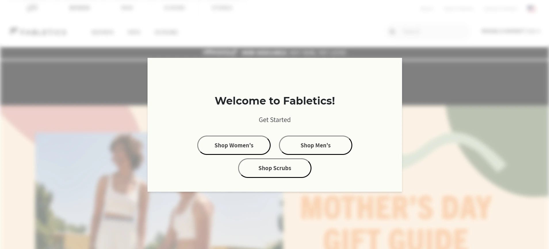
Example of a splash page for tailored shopping experience. Source: fabletics
The three CTA buttons, Shop Women’s, Shop Men’s, and Shop Scrubs, are like quick filters before the customer reaches the homepage.
The blurred background helps isolate the modal and ensures the visitor’s attention stays on the choices in front of them.
Each button is large, rounded, and spaced apart, which creates a low-pressure, easy-to-tap experience, particularly useful for mobile users. This saves visitors from having to navigate menus or scroll to find the correct collection, reducing steps and speeding up product discovery.
From a practical conversion standpoint, Fabletics removes early friction, shortens the browsing journey, and directs traffic toward the most relevant collection before the visitor has a chance to get distracted or drop off.
4. YETI - A Splash Page Built to Direct Customers to the Right Store
YETI uses its splash page to direct visitors to the store that matches their location, offering options for the U.S. and Canada right upfront.

Example of splash page for location setting. Source: yeti
The headline, “Select Your Store,” communicates the purpose directly, and the supporting text explains why the visitor is seeing the message (“you are on a different store compared to your location”), which reduces confusion and prevents drop-offs caused by uncertainty.
The visual presentation strengthens clarity.
The U.S. and Canada options are represented with large flag graphics, making the choice recognizable at a glance without reading. The flag design also takes up primary visual space, guiding attention to the action rather than the background.
5. Pierre-Louis - A Splash Page Built as a Creative Self-Introduction
Pierre-Louis Labonne is a creative freelancer and designer based in France, and his splash page serves as a digital introduction before visitors access his portfolio.

Example of splash page for personal introduction. Source: Pierre-Louis Labonne
Instead of using text-heavy bios or traditional landing screens, he uses an interactive “power-on” style interface that reflects creativity from the first click.
The purpose of this splash page is clear: to introduce who he is and set expectations for the style and personality of his work. The prompt to “CLICK” turns the introduction into an action rather than a paragraph.
Once clicked, the screen transforms into a dashboard-like layout where users can explore his skill areas, Graphic & Webdesigner, Motion Designer, and Webflow Expert, through simple toggles.

What happens after you press ‘Click’ on Pierre Louis Labonne’s splash page. Source: Pierre-Louis Labonne
Conclusion
A splash page is effective when it has a single purpose, communicates it clearly, and helps visitors move forward without confusion, through a promotion, a direction, a navigation, or simply, a personal/brand introduction. Their impact comes from being focused, brief, and aligned with the goal of the visit, allowing users to instantly understand the benefit of clicking to the splash page and what to do next.
For Shopify merchants who want to build splash pages with that level of control, GemPages offers a practical advantage. You can design focused entry screens, test variations, and align them with campaigns, all without coding, turning the first click into an effortless movement. Explore us now!
FAQs about Splash Pages


