


 Facebook Community
 Change Log
 Help Center


- TL;DR — Top A/B Testing Ideas
- What is A/B Testing and How Does it Work?
- Why A/B Testing is Important in eCommerce?
- 20+ Best A/B Testing Ideas to Enhance Your Shopify Store
- 1. Homepage > Above the Fold > Visual Design
- 2. Homepage > Above-the-Fold Copy
- 3. Homepage > Above the Fold > CTA Buttons
- 4. Homepage/All pages > Popups
- 5. Homepage > Footer > Email/SMS Signup Box
- 6. Homepage > Quiz
- 7. Homepage/All Pages > Above the fold > Announcement Bar
- 8. Product Page > Above the fold > Product Title
- 9. Product Page > Above the fold > Primary Product Image
- 10. Product Page > Bundle or Subscription Offer
- 11. Product Page > Above the fold > Social Proof Placement
- 12. Product Page > Above the fold > CTA Button
- 13. Product Page > Above the fold > Trust Badges
- 14. Product Page > Product Description/Copy
- 15. Product Page > Below the fold > Product Reviews
- 16. Product Page > Below the fold > Other Content Elements
- 17. Product/Post-Purchase Pages > Upselling & Cross-selling Offers
- 18. Blog Post Page > Newsletter Signup Box
- 19. Blog Post Page > Lead Magnet Promo
- 20. Blog Post Page > Product Promotions
- 21. Overall > Color Scheme
- Final Thoughts on A/B Testing Ideas for Your Shopify Store
- FAQs about A/B Testing in eCommerce


Top 20+ A/B Testing Ideas You Should Try [2026]
![Top 20+ A/B Testing Ideas You Should Try [2026]](http://gempages.net/cdn/shop/articles/connected-apparel-ab-testing-example_1024x1024.webp?v=1776322979)
One word that’s almost synonymous with eCommerce is “experiments”.
If you want to improve and scale your business, with consistency, you must experiment with various elements of your Shopify store. The goal is to constantly optimize every aspect to the best extent.
And how do you do that? A/B testing — the solution to experiment with various elements of your eCommerce store and figure out the best versions that drive the desired results.
So, in this article, we’ll share some of the best A/B testing ideas you should try to increase your store’s conversion rate.
Let’s get started!
TL;DR — Top A/B Testing Ideas
|
Sr. # |
Store Page |
Webpage Section |
Element to A/B Test |
|
1 |
Homepage |
Above the fold |
Visual Design |
|
2 |
Homepage |
Above the fold |
Heading & Sub-Heading Copy |
|
3 |
Homepage |
Above the fold |
CTA Buttons |
|
4 |
Homepage/All Pages |
NA (Not specific to a certain section) |
Popup |
|
5 |
Homepage |
Footer |
Email/SMS Signup Box |
|
6 |
Homepage |
NA |
Quiz |
|
7 |
Homepage/All Pages |
Above the fold |
Announcement Bar |
|
8 |
Product Page |
Above the fold |
Product Title |
|
9 |
Product Page |
Above the fold |
Primary Product Image |
|
10 |
Product Page |
NA |
Bundle or Subscription Offer |
|
11 |
Product Page |
Above the fold |
Social Proof Placement (E.g., Review/Rating) |
|
12 |
Product Page |
Above the fold |
CTA Button (Add to Cart/Buy Now) |
|
13 |
Product Page |
Above the fold |
Trust Badges |
|
14 |
Product Page |
Below the fold |
Product Description/Copy |
|
15 |
Product Page |
Below the fold |
Product Reviews |
|
16 |
Product Page |
Below the fold |
Other Content Elements (E.g., images/copy conveying product benefits, use cases, UGC ) |
|
17 |
Product/Post-Purchase Pages |
NA |
Upselling & Cross-selling Offers |
|
18 |
Blog Post Page |
NA |
Newsletter Signup Box |
|
19 |
Blog Post Page |
NA |
Lead Magnet Promo |
|
20 |
Blog Post Page |
NA |
Product Promotions |
|
21 |
Overall |
NA |
Color Scheme |
What is A/B Testing and How Does it Work?
A/B testing — also known as split testing — is a technique in which two (or more) versions of the same webpage are created and displayed to different visitors to decide which one performs better for a defined business goal.

In simple terms, here’s how it works:
Using an A/B testing tool like GemX, you can divide your website traffic into equal portions and send them to each variant of your webpage or landing page. Then, measure and analyze which variant gets more conversion.
Learn more: A Complete Guide to Shopify A/B Testing – GemPages
As a CRO and A/B testing expert in the Shopify ecosystem, we’ve created the GemX: CRO & A/B Testing app with our years of experience.

GemX is a powerful A/B testing tool that can help you test your Shopify store pages, landing pages, and even dropshipping products.

Why A/B Testing is Important in eCommerce?
Before you jump on to performing A/B tests on your eCommerce store, you might want to know why it is worth doing in the first place.
Here are the key benefits of A/B testing in eCommerce:
-
Conversion rate optimization:
One of the key goals of A/B testing is to enhance the website to increase the conversion rate. Basically, you want to optimize the website in a way that makes all the elements more appealing, conversion-focused, and meet customer expectations.
-
Better user experience (UX):
A/B testing is not necessarily used for the benefit of the business owner only. It can/should be used to enhance the user experience of your website visitors. For example, you can A/B test navigational elements of your website to identify which are most convenient for your website visitors.
-
Reduce bounce rate:
If your eCommerce website has a high bounce rate, you may use A/B testing as a tool to identify the root cause and find a solution. For example, if your original landing page does not have social proof, you can create another version with social proof — and run an A/B test to see if it can fix the high bounce rate issue.
-
Increase your sales and revenue:
With a better user experience and higher conversion rate, it’s evident that your sales and revenue figures will have a positive impact. You can use this positive traction to grow and scale your business.
20+ Best A/B Testing Ideas to Enhance Your Shopify Store
Now, let’s go through the various A/B testing ideas that you can practically implement on your Shopify store to boost conversions, engagements, and sales.
Side note: Throughout this list of ideas, we’ll share some examples from different eCommerce brands just to give you the context of what can be tested and how.
1. Homepage > Above the Fold > Visual Design
The above-the-fold section is one of the most important parts of your website. It can either hook your website visitors into exploring more on your website or make them bounce off.
Now, there are multiple aspects you could A/B test in your above-the-fold section on your website’s homepage. One of them is the visual design — and even within this element, there could be multiple aspects that can be A/B tested.
For example, if you’re using a hero image, what you show in the image could be tested — it could be an image of your best-selling product vs an image with a buyer persona.
Here are some more examples:
-
Slideshow vs a single hero image
-
Small font size vs bigger font size
-
Lifestyle image vs product-only image
Pro tip: When testing different elements, there could be many different possibilities. To make a robust decision on what elements should be compared, you should use inputs such as customer feedback, historical data, heatmap observations, etc.
2. Homepage > Above-the-Fold Copy
Your website copy is crucial to persuade your website visitors, especially the heading and subheading copy on your above-the-fold section. It must represent the strongest aspect of your brand and something that entices them to explore more on your website.
Pro tip: Consider your brand’s “Unique Selling Proposition (USP) & Value Proposition (VP)” when writing the above-the-fold copy. So, you can A/B test two versions of your USP and VP and measure which one turns out to be more effective.
Some brands like to promote a discount offer in the above-the-fold copy. That’s an opportunity to perform an A/B test with two different versions of the offer copy.
3. Homepage > Above the Fold > CTA Buttons
Most website homepages have more than one CTA button in the above-the-fold section. Thus, it becomes important to evaluate the design and placement of those CTAs.
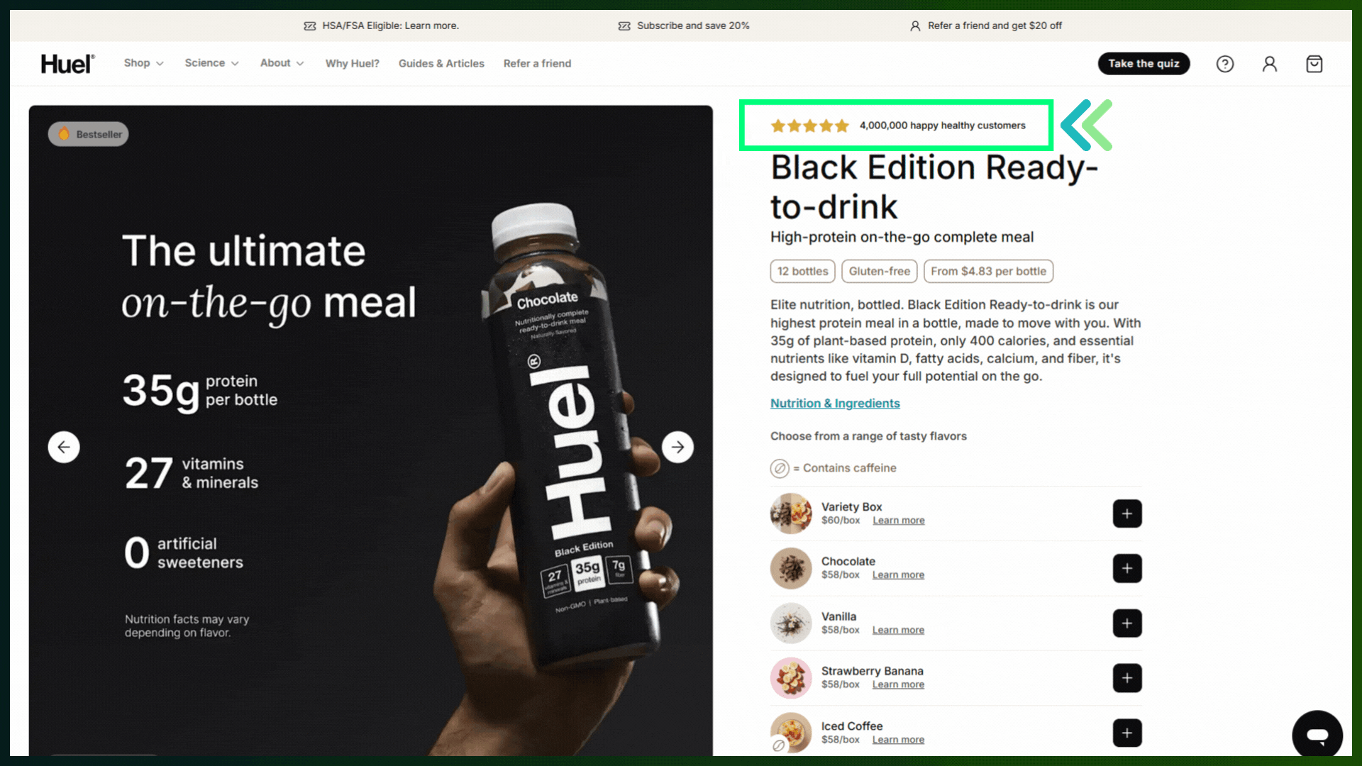
For example, as you can see in the below example, Huel has three main CTA buttons in the above-the-fold section of its website homepage. The brand has strategically placed the “Take the quiz” CTA button twice because it plays a crucial role in its quiz funnel strategy.

However, as you can see, the close CTAs have different design styles — one popping out with a dark black background and the other one with the border only. Huel has an opportunity to A/B test the placement and design of these CTAs.
Learn more: Shopify Quiz Funnel — Guide, Examples, and Apps
4. Homepage/All pages > Popups
Almost all eCommerce brands use popups on their websites. After all, they not only entice customers to shop with an attractive discount offer but also help build your email and SMS marketing subscribers.
For example, The Sports Edit has an amazing pop-up on its website homepage. This pop-up also collects additional information about customers' preferences for product categories. The brand is taking care of one of the most popular eCommerce trends, i.e., hyper-personalization.

But let’s assume the brand is not getting as many email signups as expected. In that case, the brand may want to trim down the form fields. Too many fields or even having a phone number field can make customers hesitant to sign up.
Perform an A/B test with different form fields, discount percentages, etc.
Here are some more ideas for pop-up A/B testing:
-
Header with % discount offer vs $ amount discount offer
-
Phone number as a mandatory field vs keeping it optional OR no phone number field at all
-
CTA text ideas: E.g., “GET MY DISCOUNT” vs “I LOVE DISCOUNTS”
-
Popup with countdown timer vs “Limited Time Offer” banner
5. Homepage > Footer > Email/SMS Signup Box
For any eCommerce brand, email and SMS marketing have become an integral part of the overall strategy. Thinx is a great example of a brand that promotes its email and SMS channels. The brand has given signup boxes for both channels in its footer section.

As a hypothetical scenario, the brand may perform an A/B test to move up the SMS signup box to the top of the footer section to increase SMS signups — and maybe move the newsletter signup box somewhere in the middle of the homepage.
Similarly, there are a couple of other A/B testing opportunities:
-
Different color schemes for email and SMS signup boxes to make them stand out
-
Simple copy — “Sign up for SMS” vs a creative copy like, “Get updates in real time”
6. Homepage > Quiz
We already checked out how Huel uses CTA buttons in its above-the-fold section for the quiz funnel. But it could be done in other ways, too.
Let’s take Encircled, for example — the brand promotes its quiz in the middle of the homepage as well as through a dedicated popup (apart from the CTA button in the sticky header).

Now, if quiz funnel is a major strategy for you, like these brands, you can perform an A/B test to find out the best way to go about it.
7. Homepage/All Pages > Above the fold > Announcement Bar
An announcement bar is a good element to promote enticing offers and increase your store’s conversion rate. For example, you can experiment with different promotional offers displayed in the announcement bar.
Here are some more examples:
-
Moving announcement bar with multiple text fields vs static announcement bar with a single text field
-
Testing with two different color schemes: Mild color scheme blending with the hero section vs bright color scheme making the bar stand out from the rest of the visuals
-
Simple/static announcement bar vs expandable announcement bar
8. Product Page > Above the fold > Product Title
The product title is one of the first things website visitors notice when landing on a product page. You could A/B test the product title to see which one leads to better conversions.
9. Product Page > Above the fold > Primary Product Image
When selling online, product images are an incredibly important factor. Customers may take a decision based on the product images.
Now, you may have multiple product images on your product page, but the primary image gives customers the first impression of your product. That’s why you may want to A/B test to decide which image should be placed as the primary image. Here are some examples:
-
Lifestyle image vs product-only image
-
While background vs colored background
-
Product-only image vs infographic image
10. Product Page > Bundle or Subscription Offer
Apart from the pricing for an individual item, some brands also choose to display bundle offers, e.g., buy 3 with 10% off and buy 5 with 20% off. On the other hand, if the product is frequently used by customers, you can also display a subscription offer.
But if your product is suitable for both types of offers and you want to decide which would generate the best conversions, you can A/B test the bundle offer vs the subscription offer.
11. Product Page > Above the fold > Social Proof Placement
There are different ways you can display the elements of social proof on your product page.
For example, Huel displays the social proof above the product title by displaying the huge number of customers using the product.
Now, you can either A/B test with a similar social proof element or with its design and placement.
12. Product Page > Above the fold > CTA Button
The main CTA buttons on the product page are “Add to Cart” and “Shop Now” or “Buy Now”.
However, you can experiment with:
-
Different wording: “Add to Bag” vs “Add to Cart”
-
Placements
-
Different Design elements, especially the color scheme.
You can also A/B test with two CTA buttons (Add to Cart + Shop Now) vs a single CTA button (Buy Now) only.
13. Product Page > Above the fold > Trust Badges
Trust badges create a sense of security in customers. If you’re noticing a huge problem of customers leaving the cart abandoned, trust badges could be one of the elements that could be tested.
For example, if you don’t have trust badges on your product page, you can create another version with nicely designed trust badges — and perform the A/B test with both versions.
14. Product Page > Product Description/Copy
Product description helps customers make the buying decision. But it’s a task of its own to understand which is the best way to deliver the message in the language of your target customers.
You can leverage A/B testing to play around with different product copy, style of writing, tone of voice, or formatting.
15. Product Page > Below the fold > Product Reviews
Many customers like to go through the product reviews before making a buying decision. In some cases, if you’re selling products like clothing or accessories, they may even want to see photo reviews.
How you display those reviews on your product pages can be A/B tested.
16. Product Page > Below the fold > Other Content Elements
Apart from the images and details shown in the above the field section of your product page, you can also A/B test other content elements such as comparison images (before and after), additional images and copy supporting the qualities of the product, e.g., images/copy conveying product benefits, use cases, UGC (User-Generated Content), etc.
17. Product/Post-Purchase Pages > Upselling & Cross-selling Offers
Upselling and cross-selling promotions can help you increase your average order value and overall revenue and profits. But the way you promote those upselling and cross-selling offers can impact your store’s conversions. That’s where A/B testing comes to rescue.
The thing here is that you can promote such upselling and cross-selling offers on multiple pages, including product pages and post-purchase pages.
18. Blog Post Page > Newsletter Signup Box
First of all, if you don’t have a dedicated CTA on your blog post pages, you should have one.
If you have a blog in your marketing strategy, you must have an email newsletter, too. Both of these strategies could go hand in hand.
This is also one of the reasons most brands place a newsletter signup box on their blog posts. Now, let’s say you’re getting a good amount of traffic on your blog posts, but those visitors aren’t turning into email subscribers. In that case, you may want to A/B test the design and placement of the newsletter signup box.
For example, if you have the newsletter signup form at the bottom of the blog post page, you may create another variant with the form placed at the top of the page (between the title and intro).
19. Blog Post Page > Lead Magnet Promo
Apart from a newsletter signup form, another great way to capture leads through your content is to promote a lead magnet. For example, promoting an eBook for a how-to guide on your blog posts.
Again, you can A/B test the design and placement of the lead magnet promo.
20. Blog Post Page > Product Promotions
It could be leading to a specific product, collection, or any other landing page that’s relevant to the blog post. For example, you could place product or collection promotions within a blog post.
Let’s take a look at this blog post from Connected Apparel — “6 Spring Dress Trends for Women Over 40”.

The brand has placed various collections/products based on the topic. With A/B testing, you can find out the best place to display these product promotions to ensure you don’t overwhelm customers..
21. Overall > Color Scheme
Color scheme is an essential part of brand identity. It’s defined in the initial stage of the brand, and re-branding may take a long time.
So, A/B testing the color scheme may not be a very frequent A/B testing scenario. But it’s definitely one of the critical use cases.
A brand can use A/B testing in the event of re-branding to identify which color scheme is more effective in attracting its target audience.
Final Thoughts on A/B Testing Ideas for Your Shopify Store
For eCommerce brands, A/B testing ideas are endless. There could be hundreds of elements on your eCommerce store that could be tested.
However, you don’t necessarily need to test everything. As we mentioned earlier, you need to consider a data-driven approach. On top of that, consider what are the most critical elements that have the highest impact on your business, and prioritize them in your A/B testing strategy.
To learn more about other eCommerce marketing strategies, trends, and best practices — check out more resources on the GemPages Blog. Also, join the GemPages Facebook community to network and learn from like-minded entrepreneurs and experts.
FAQs about A/B Testing in eCommerce


