


 Facebook Community
 Change Log
 Help Center


Types of Website Design: 15 Styles Every Business Should Know in 2026

Choosing the right type of website design is no longer just a design decision. It directly affects how users interact with your site, how easily they find what they need, and whether they take action or leave.
Many businesses focus on how a website looks, but overlook how different design styles serve different purposes. A layout that works well for a blog may not perform for an ecommerce store. A visually rich design may attract attention but slow down performance. Without the right structure, even a well-designed website can struggle to convert.
In 2026, the landscape is even more complex. Mobile usage dominates, user expectations are higher, and businesses need websites that are not only visually appealing but also fast, functional, and conversion-focused.
This guide breaks down the 15 most common types of website design, along with when to use each one and what to consider before choosing. You will also learn how to match your design approach with your business goals so your website does more than just look good.
What Is Website Design?
Website design is the process of planning and creating how a website looks, feels, and functions for users. It goes beyond visual appearance. It includes layout, structure, navigation, content placement, and how users interact with each element on the page.
At its core, website design combines two key aspects:
-
User Interface (UI): how the website looks, including colors, typography, images, and overall visual style
-
User Experience (UX): how the website works, including navigation, usability, and how easily users can complete actions
A well-designed website ensures that users can quickly understand what the site offers and move through it without confusion. This includes:
-
Clear structure and logical page flow
-
Easy-to-use navigation
-
Responsive layouts that work across devices
-
Fast loading performance
-
Consistent design elements across pages
It is also important to distinguish between website design and website development. Design focuses on the experience and interface, while development focuses on building the functionality using code.
In modern ecommerce and digital marketing, website design is closely tied to performance. A website is not just a digital brochure. It is a tool that should guide users toward specific goals such as making a purchase, signing up, or engaging with content.
Because of this, choosing the right type of website design is not only about aesthetics. It is about creating an experience that supports your business objectives and improves results.
Why Choosing the Right Type of Website Design Matters
Not all websites are built for the same purpose, and that is why the type of website design you choose has a direct impact on how your site performs.
A design that looks good but does not match your business model or user intent can create confusion, slow down navigation, and reduce conversions. On the other hand, the right design helps users understand your offer quickly and take action without friction.
Below are the key reasons why choosing the right type of website design matters.
It shapes how users interact with your website
The structure of your website determines how users move through it. A single-page layout guides users in a linear flow, while a multi-page structure allows deeper exploration.
If the design does not match how users expect to navigate, they may feel lost or leave the site. Choosing the right type ensures that the experience feels natural and easy to follow.
It directly impacts conversion rates
Different website types are built for different goals. For example:
-
Landing page design focuses on driving one action
-
Ecommerce design focuses on product discovery and checkout
-
Blog design focuses on content consumption
If your design does not align with your goal, users may not take the action you want. The right design reduces distractions and guides users toward conversion.
It supports your business model
A portfolio website, an online store, and a corporate website all require different structures.
For example, an ecommerce store needs product pages, filters, and checkout flows, while a service-based business may need lead capture forms and case studies.
Choosing the right design ensures your website supports how your business operates.
It improves user experience across devices
Modern users browse on mobile, tablet, and desktop. Some design types are better suited for responsive behavior than others.
If your design does not adapt well across devices, users may struggle to interact with your site, leading to higher bounce rates and lower engagement.
It affects scalability and future growth
A design that works for a small website may not work as your business grows.
For example, a simple single-page design may become difficult to manage as you add more products or content. Choosing a scalable design type early helps you avoid major changes later.
It influences brand perception
Your website is often the first impression users have of your brand. The design style you choose communicates your positioning.
-
Minimalist design can feel modern and clean
-
Corporate design can feel professional and structured
-
Creative design can feel bold and expressive
Aligning your design with your brand identity helps build trust and consistency.
Choosing the right type of website design is not just a visual decision. It is a strategic one. When your design aligns with your users, goals, and business model, it becomes a tool that supports both user experience and performance.
Core Elements of Modern Website Design
Before choosing a specific type of website design, it is important to understand the core elements that make any website effective. A well-designed site is not just about visuals. It is a combination of structure, usability, performance, and content working together.
These elements shape how users perceive your website, how easily they navigate it, and whether they stay or leave. When applied correctly, they improve both user experience and search visibility.
Layout

Layout defines how elements are arranged on a page. It determines what users see first, how they scan content, and how they move through the site.
A clear layout helps guide attention toward key areas such as headlines, products, or call-to-action sections. If the layout is cluttered or poorly structured, users may feel overwhelmed and leave quickly.
Research shows that a large percentage of first impressions are influenced by design. This makes layout one of the most critical factors in capturing attention and keeping users engaged.
Color
Color plays a major role in how users feel about your website. It communicates mood, builds brand identity, and helps create visual hierarchy.
Different colors can trigger different responses. For example, bold colors can create urgency, while softer tones can create a calm and minimal feel.
When choosing a color scheme, consider:
-
Your target audience
-
Cultural context

-
Contrast and readability
A consistent and well-planned color system helps users navigate your site more easily and reinforces brand recognition.
Graphics
Graphics include images, icons, illustrations, and other visual elements. They help communicate ideas quickly and make your website more engaging.
A page without visuals often feels heavy and difficult to read. On the other hand, well-used graphics can:
-
Highlight key messages
-
Show products in context
-
Support storytelling
The key is relevance. Every visual should support your content and add meaning, not just fill space.
Navigation

Navigation is how users move through your website. It includes menus, links, and structural pathways.
Clear and intuitive navigation allows users to find what they need without effort. If users struggle to locate information, they are more likely to leave.
Good navigation design should:
-
Be simple and easy to understand
-
Work well on both desktop and mobile
-
Keep important links accessible
Many users check navigation as soon as they land on a site, which makes it one of the most important elements for usability.
Whitespace
Whitespace, or negative space, refers to the empty space around content and elements.
It improves readability, separates sections, and helps highlight important elements. Without enough whitespace, a page can feel crowded and difficult to scan.
Using whitespace effectively creates a balanced layout and allows users to focus on what matters most.
Responsive Design
Responsive design ensures that your website works well across different devices and screen sizes.
Users today access websites from desktops, tablets, and smartphones. A responsive site adapts automatically to provide a consistent experience on all devices.
Without responsive design, users on mobile may struggle with navigation, readability, and interaction, leading to higher bounce rates.
Loading Speed
Page speed directly affects user experience and performance.
If a page takes too long to load, users may leave before interacting with your content. Even a few seconds of delay can significantly increase bounce rates.
To improve loading speed:
-
Optimize images and media
-
Reduce unnecessary scripts
-
Use efficient layouts
A faster website keeps users engaged and supports better conversion rates.
Content
Content is what users come to your website for. It provides information, answers questions, and drives engagement.
Effective content should be:
-
Clear and relevant
-
Structured for easy reading
-
Aligned with user intent
Content also plays a key role in search visibility. Well-structured content with the right keywords helps your site rank higher and attract more traffic.
Branding
Branding creates consistency and recognition across your website.
It includes elements such as:
-
Logo
-
Typography
-
Color palette
-
Visual style
Strong branding helps users remember your site and builds trust over time. A consistent design system makes your website feel more professional and cohesive.
SEO
Search engine optimization is an essential part of modern website design.
A well-designed website should be built with SEO in mind, including:
-
Proper heading structure
-
Optimized content
-
Fast performance
-
Mobile compatibility
Websites that are optimized for search engines are easier to discover, which increases traffic and growth potential.
These core elements form the foundation of any successful website. No matter which type of website design you choose, these principles ensure your site is usable, engaging, and effective.
15 Types of Website Design (With Use Cases)
There is no single “best” type of website design. Each type serves a different purpose, depending on your business model, content, and user behavior.
Understanding these design types helps you choose the right structure for your website instead of relying on trends or assumptions. Below are the most common types, starting with the foundational ones.
Static Website Design

A static website is built using fixed content. Each page is created manually and does not change unless a developer updates the code.
This type of design is simple and lightweight. It delivers the same content to every visitor without any real-time updates or personalization.
Key characteristics:
-
Fixed layout and content
-
Fast loading speed
-
Minimal functionality
-
No database or dynamic content
When to use:
-
Small websites with limited content
-
Personal portfolios or basic landing pages
-
Businesses that do not need frequent updates
Advantages:
-
Fast performance due to simple structure
-
Lower development and hosting costs
-
Easy to deploy for basic use cases
Limitations:
-
Difficult to scale as content grows
-
Requires manual updates for any changes
-
Limited interactivity and personalization
Static website design works best when simplicity and speed are the priority, but it may not be suitable for businesses that need flexibility or frequent updates.
Dynamic Website Design

Dynamic website design allows content to change based on user behavior, data inputs, or system logic. Instead of serving fixed pages, the website pulls information from a database and renders content in real time.
This is the foundation of most modern websites, especially ecommerce stores and SaaS platforms. Product listings, user accounts, recommendations, and personalized experiences all rely on dynamic systems.
How it works:
-
Content is stored in a database
-
The server processes requests and delivers customized pages
-
The interface updates based on user actions or conditions
Common use cases:
-
Ecommerce stores with product catalogs and filters
-
Membership platforms with user dashboards
-
Blogs or content sites with categories and search
Why it matters for businesses: Dynamic design enables scalability. You can manage hundreds or thousands of products without manually editing each page. It also allows personalization, such as showing recommended products or tailored content based on user behavior.
Key advantages:
-
Easier content management through CMS or backend systems
-
Personalized user experiences
-
Supports automation and integrations
Challenges to consider:
-
Requires more complex setup and maintenance
-
Performance depends on optimization and hosting
-
Needs proper caching and speed improvements
For Shopify merchants, dynamic design is essential. Product pages, collections, and customer journeys rely heavily on dynamic content to function effectively and drive conversions.
Responsive Website Design

Responsive website design ensures that your website automatically adjusts to different screen sizes and devices. Whether a user visits from a desktop, tablet, or smartphone, the layout adapts to provide a consistent experience.
This is no longer optional. Mobile traffic now accounts for a significant share of ecommerce visits, and users expect seamless browsing across all devices.
How it works:
-
Uses flexible grids and layouts
-
Images and elements scale proportionally
-
CSS media queries adjust design based on screen size
Key characteristics:
-
One single website that adapts to all devices
-
Fluid layouts instead of fixed widths
-
Consistent content across screen sizes
Why it matters: A non-responsive website creates friction. Users may struggle to read text, click buttons, or navigate menus on smaller screens. This directly impacts engagement and conversion rates.
Search engines also prioritize mobile-friendly websites, which means responsive design supports both SEO and user experience.
Best practices:
-
Design with a mobile-first approach
-
Use scalable images and flexible components
-
Keep buttons large enough for touch interaction
-
Simplify navigation for smaller screens
Business impact: Responsive design improves retention, reduces bounce rates, and increases conversions. For ecommerce, it directly affects how easily users can browse products and complete purchases on mobile devices.
Adaptive Website Design
Adaptive website design takes a different approach from responsive design. Instead of one flexible layout, it uses multiple fixed layouts designed for specific screen sizes.
When a user visits the site, the system detects their device and serves the most appropriate layout.
How it works:
-
Predefined layouts are created for different screen sizes
-
The server or browser detects the device
-
The website loads the layout that best fits that device
Typical breakpoints:
-
Desktop
-
Tablet
-
Mobile
Key characteristics:
-
Multiple versions of the same page
-
Device-specific optimization
-
More control over design on each screen
Advantages:
-
Allows precise control over user experience per device
-
Can deliver highly optimized layouts for specific screens
-
Useful for complex interfaces where layout precision matters
Limitations:
-
Requires more design and development effort
-
Harder to maintain multiple layouts
-
Less flexible than responsive design
When to use: Adaptive design is suitable for projects that require tailored experiences for different devices, such as enterprise platforms or highly customized web applications.
Responsive vs Adaptive: Key Difference
-
Responsive design adjusts one layout fluidly across all screen sizes
-
Adaptive design uses multiple fixed layouts for specific devices
In most cases, responsive design is the preferred approach for modern websites due to its flexibility and ease of maintenance. However, adaptive design can still be useful when precision and device-specific optimization are required.
For Shopify and ecommerce stores, responsive design is generally the standard, ensuring consistent performance and user experience across all devices without increasing complexity.
Single Page Website Design
A single page website design places all content on one continuous page instead of splitting it across multiple URLs. Users navigate by scrolling or clicking anchor links that jump to different sections.
This approach is commonly used for landing pages, product showcases, and campaign-focused websites where the goal is to guide users through a clear, linear journey.
How it works:
-
Content is divided into sections (hero, features, testimonials, CTA)
-
Navigation uses anchor links instead of separate pages
-
Users scroll vertically to explore the entire experience
Best use cases:
-
Product launches
-
Marketing campaigns
-
Portfolio or personal websites
-
Simple service-based businesses
Advantages:
-
Creates a focused, distraction-free experience
-
Keeps users moving in a controlled flow toward conversion
-
Easier to maintain and update
Limitations:
-
Not ideal for large or content-heavy websites
-
SEO can be more challenging due to limited page structure
-
Performance can slow down if the page becomes too long
For Shopify merchants, single page design works well for campaign landing pages, such as product drops or seasonal promotions, where the goal is to drive a specific action.
Multi-Page Website Design
A multi-page website design organizes content across multiple pages, each with its own purpose and URL. This is the most common structure for business websites and ecommerce stores.
Users navigate between pages through menus, links, and categories, allowing for a more detailed and scalable content structure.
How it works:
-
Content is divided into separate pages (home, product, blog, contact)
-
Navigation menus connect different sections
-
Each page targets a specific purpose or topic
Best use cases:
-
Ecommerce stores with multiple products
-
Corporate websites
-
Blogs and content platforms
-
Service-based businesses with multiple offerings
Advantages:
-
Scales easily as content grows
-
Stronger SEO potential with multiple indexed pages
-
Allows deeper user exploration
Limitations:
-
Requires more planning and structure
-
Navigation must be well-designed to avoid confusion
-
Users may drop off if the journey is too complex
For Shopify stores, multi-page design is essential. Product pages, collection pages, and content pages work together to create a full shopping experience and support long-term growth.
Minimalist Website Design
Minimalist website design focuses on simplicity by removing unnecessary elements and emphasizing only what matters most. It relies on clean layouts, limited color palettes, and clear typography.
The goal is not to make the website look empty, but to make it easier for users to focus on key content and actions.
Core characteristics:
-
Clean layout with minimal elements
-
Strong use of whitespace
-
Limited color palette
-
Simple typography and visual hierarchy
Best use cases:
-
Premium or luxury brands
-
Portfolio websites
-
Product-focused landing pages
-
Brands that want a modern, clean identity
Advantages:
-
Improves readability and clarity
-
Reduces cognitive load for users
-
Highlights key messages and calls to action
Limitations:
-
Requires strong design discipline to avoid looking plain
-
Less room for detailed content
-
Needs high-quality visuals to stand out
Minimalist design often works well for ecommerce brands that want to create a premium feel. By reducing distractions, it helps guide users toward important actions such as exploring products or completing a purchase.
Flat design is a visual style that removes unnecessary decorative elements such as shadows, gradients, and textures. It focuses on simplicity, clarity, and usability by using clean shapes, bold colors, and straightforward typography.
This approach became popular as websites shifted toward faster loading times and mobile-friendly interfaces. By reducing visual complexity, flat design helps users focus on content and actions without distraction.
Core characteristics:
-
Clean, two-dimensional elements
-
Bright, solid color palettes
-
Simple icons and typography
-
Minimal use of effects or depth
Why it works: Flat design improves readability and speeds up page performance. Without heavy visual effects, pages load faster and feel more responsive, especially on mobile devices.
It also supports clear visual hierarchy. Buttons, headings, and sections are easier to distinguish when the design is not overloaded with styling.
Best use cases:
-
SaaS and tech websites
-
Mobile-first platforms
-
Brands that prefer a modern, clean look
Limitations:
-
Can feel too plain if not executed carefully
-
Lack of depth may reduce visual guidance
-
Requires strong typography and spacing to remain effective
Flat design is often combined with subtle enhancements like micro-interactions to balance simplicity with usability.
Learn more: Top Best Minimal Shopify Themes 2026
Material Design
Material design builds on flat design but adds depth, motion, and interaction cues. Originally developed by Google, it introduces a system where elements behave like physical materials with layers, shadows, and movement.
The goal is to create a more intuitive and realistic user experience while maintaining a clean and structured interface.
Core characteristics:
-
Use of shadows and elevation to create depth
-
Layered interface elements
-
Smooth animations and transitions
-
Grid-based layouts
Why it works: Material design helps users understand how elements interact. For example, buttons appear clickable, cards feel layered, and transitions guide users through actions.
This makes the interface more predictable and easier to use, especially for complex websites or applications.
Best use cases:
-
Web apps and dashboards
-
SaaS platforms
-
Mobile applications
Advantages:
-
Clear visual hierarchy with depth cues
-
Improved usability through motion and feedback
-
Consistent design system across devices
Limitations:
-
Can feel too structured or rigid for some brands
-
Requires careful implementation to avoid clutter
-
More design effort compared to simple flat design
Material design is ideal when you need both clarity and interaction, especially in feature-rich environments.
E-commerce Website Design

E-commerce website design is focused on selling products online. Every element is structured to guide users from discovery to purchase as efficiently as possible.
Unlike general websites, ecommerce design must handle product presentation, filtering, checkout flows, and trust signals all within one system.
Core components:
-
Product pages with clear images and descriptions
-
Collection or category pages for browsing
-
Search and filtering systems
-
Cart and checkout experience
-
Trust elements such as reviews and guarantees
Why it matters: Ecommerce design directly impacts revenue. Small changes in layout, product presentation, or checkout flow can affect conversion rates significantly.
A well-designed ecommerce site reduces friction and helps users make decisions faster.
Best practices:
-
Use high-quality product visuals
-
Highlight key information such as price, benefits, and reviews
-
Simplify navigation and filtering
-
Make checkout fast and easy
-
Ensure mobile optimization
Challenges:
-
Managing large product catalogs
-
Balancing design with performance
-
Maintaining consistency across pages
Portfolio Website Design
A portfolio website is built to showcase work, skills, and creative output. It is commonly used by designers, photographers, developers, and freelancers who need to present their projects in a visually compelling way.
Unlike other website types, the focus here is not on selling products directly but on demonstrating expertise and building credibility.

Core characteristics:
-
Strong visual presentation of projects
-
Case study sections with context and results
-
Minimal distractions to keep attention on the work
-
Personal branding elements
What makes it effective: A good portfolio does more than display images. It tells the story behind each project. Explaining the problem, process, and outcome helps potential clients understand your value.
Best practices:
-
Highlight your best work first
-
Use high-quality visuals and clean layouts
-
Add short descriptions or case studies
-
Include a clear contact or inquiry call to action
Common use cases:
-
Freelancers and creative professionals
-
Agencies showcasing client work
-
Personal branding websites
A portfolio website works as a digital proof of skill. When structured well, it can directly lead to client inquiries or job opportunities.
Corporate Website Design
A corporate website is designed to represent a company, communicate its identity, and provide essential information to stakeholders such as customers, partners, and investors.
It focuses on credibility, clarity, and structure rather than heavy visual storytelling or aggressive selling.
Core characteristics:
-
Clear company overview and messaging
-
Structured navigation across multiple pages
-
Sections like About, Services, Careers, and Contact
-
Professional and consistent design
What makes it effective: Trust is the priority. Visitors should quickly understand who the company is, what it offers, and why it is reliable.
Content should be clear, well-organized, and aligned with the brand’s positioning. Visual design should support professionalism without overwhelming the message.
Best practices:
-
Keep navigation simple and logical
-
Use consistent branding across all pages
-
Highlight key services and value propositions
-
Include trust signals such as testimonials, partners, or certifications
Common use cases:
-
B2B companies
-
Service-based businesses
-
Enterprises and organizations
A strong corporate website builds credibility and supports long-term business growth by acting as a central source of information and trust.
Blog / Content Website Design
A blog or content website is built to publish and organize articles, guides, and resources. The primary goal is to attract traffic, provide value, and build an audience over time.
Content is the core driver, so the design must support readability, discoverability, and engagement.
Core characteristics:
-
Article-focused layouts
-
Category and tagging systems
-
Search functionality
-
Clean typography for easy reading
What makes it effective: Users come for information. If content is hard to read or navigate, they will leave quickly. A well-designed content site makes it easy to scan headings, find related topics, and continue exploring.
Best practices:
-
Use clear heading hierarchy (H1, H2, H3)
-
Keep paragraphs short and readable
-
Add visuals to break up text
-
Include internal links to guide users to more content
Common use cases:
-
SEO-driven blogs
-
Media and publishing websites
-
Brand content hubs
Content websites also play a major role in organic growth. When combined with strong SEO and consistent publishing, they can become a long-term traffic and lead generation channel for businesses.
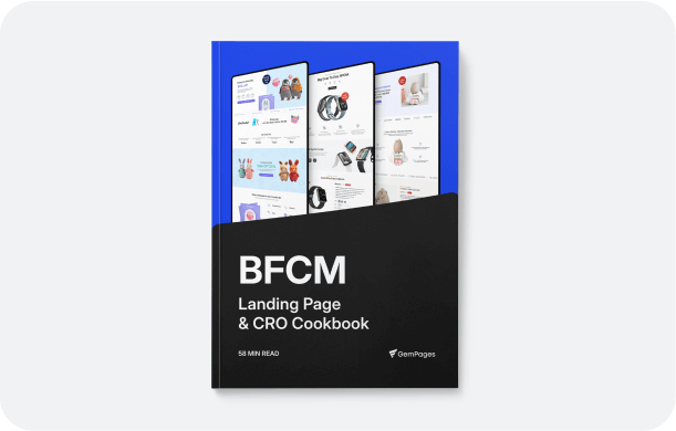
Landing Page Design
Landing page design focuses on one goal only: getting users to take a specific action. That action could be making a purchase, signing up, or downloading an offer. Unlike full websites, landing pages remove distractions and guide users through a focused conversion path.
Core characteristics:
-
One clear objective per page
-
Minimal navigation to avoid distractions
-
Structured flow from headline to call-to-action
-
Strong visual hierarchy
What makes it effective: A high-performing landing page is built around clarity and intent. Every section exists to move users closer to conversion. Headlines capture attention, visuals support the message, and calls-to-action are placed strategically to drive clicks.
The structure often follows a proven flow:
-
Hero section with a clear value proposition
-
Benefits that explain why the offer matters
-
Social proof to build trust
-
A strong call-to-action
Best practices:
-
Keep messaging direct and easy to understand
-
Use visuals that support the offer, not distract from it
-
Remove unnecessary links or elements
-
Highlight urgency or incentives where relevant
For Shopify merchants, creating effective landing pages is critical for campaigns, product launches, and paid traffic. With GemPages, you can design conversion-focused landing pages visually, customize every section without limitations, and align each page with your campaign goals without relying on rigid theme structures.
Conversion-Centered Design
Conversion-centered design is a strategic approach to building pages that guide users toward a specific action. Instead of focusing only on aesthetics, it prioritizes behavior, decision-making, and measurable outcomes.
It is not a type of page. It is a framework applied across landing pages, product pages, and entire funnels.
Core principles:
-
Focus attention on a single goal
-
Reduce friction at every step
-
Use visual hierarchy to guide actions
-
Reinforce trust through proof and consistency
What makes it effective: Conversion-centered design works because it aligns design decisions with user intent. Every element on the page has a purpose, whether it is guiding attention, reducing hesitation, or reinforcing value.
Instead of adding more content, it removes what does not contribute to conversion.
Key applications:
-
Optimizing product pages to increase purchases
-
Improving landing pages for paid campaigns
-
Enhancing funnel performance from click to checkout
Best practices:
-
Use clear and action-driven CTAs
-
Highlight benefits instead of just features
-
Add trust signals such as reviews and guarantees
-
Continuously test and refine based on data
For Shopify stores, applying conversion-centered design can significantly improve performance. With GemPages, merchants can build pages that follow these principles, control layout and user flow, and test different variations to understand what drives better results across their store.
Modern Website Design Trends in 2026
Website design continues to evolve alongside user behavior, technology, and performance expectations. In 2026, the focus is no longer just on how a website looks, but how it performs, adapts, and engages users across different touchpoints.
Below are the key trends shaping modern website design this year.
Mobile-first
Mobile-first design is now the default approach, not an afterthought. Most users browse and shop directly from their phones, which means websites must be designed for smaller screens first, then scaled up for larger devices.
Designing mobile-first forces clarity. You prioritize essential content, simplify layouts, and remove unnecessary elements. This often leads to better user experience across all devices.
Key shifts include:
-
Simplified navigation and sticky menus
-
Larger tap targets for better usability
-
Vertical-first layouts optimized for scrolling
For ecommerce, mobile-first design directly impacts conversions. If users struggle on mobile, they are unlikely to complete a purchase.
AI-assisted design
AI is becoming part of the design workflow, helping teams move faster from idea to execution. Instead of starting from scratch, designers can generate layouts, content structures, and variations based on goals and data.
AI-assisted design supports:
-
Faster page creation and iteration
-
Data-informed layout suggestions
-
Content generation aligned with user intent
For Shopify merchants, this means less time building and more time testing what works. The focus shifts from creating pages manually to refining performance based on insights.
Interactive elements
Modern websites are becoming more interactive to keep users engaged. Instead of static pages, users now expect dynamic experiences that respond to their actions.
Common interactive elements include:
-
Hover effects and micro-interactions
-
Scroll-based animations
-
Quizzes and interactive forms
-
Dynamic product previews
These elements help guide attention, create engagement, and make the browsing experience feel more intuitive. However, they need to be used carefully. Too much interaction can slow down performance or distract users from key actions.
Speed & performance focus
Performance is now a core part of design, not just development. Users expect websites to load instantly, and even small delays can lead to drop-offs.
Search engines also prioritize fast websites, making speed a critical factor for visibility.
Key priorities include:
-
Optimized images and assets
-
Lightweight layouts
-
Efficient code and scripts
-
Fast hosting and delivery
A fast website improves user experience, reduces bounce rates, and increases the likelihood of conversion. In ecommerce, speed can directly affect revenue.
Conclusion
Choosing the right type of website design is not about following trends. It is about aligning your design with your business goals, user expectations, and growth plans.
Each design type serves a different purpose, from simple static pages to complex dynamic systems and conversion-focused layouts. At the same time, core elements such as layout, navigation, content, and performance remain essential across all designs.
As website standards continue to evolve, businesses that focus on clarity, usability, and conversion will stay ahead. Whether you are building a new site or improving an existing one, the goal is always the same: create an experience that helps users take action with confidence.
FAQs