


 Facebook Community
 Change Log
 Help Center


 Shopify
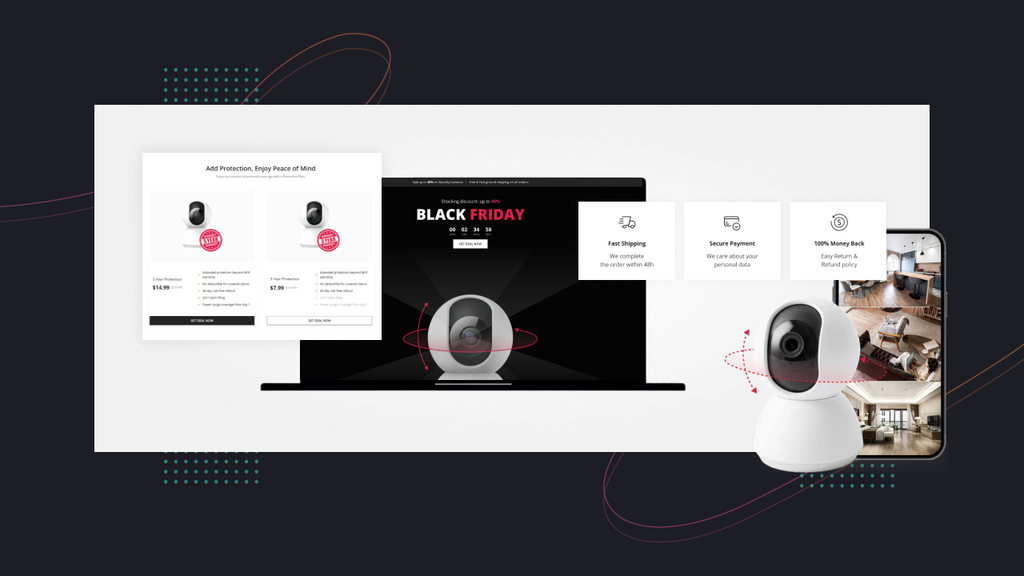
15 Inspiring Giveaway Landing Page Examples & How to Create Yours (With Shopify + GemPages)
Shopify
15 Inspiring Giveaway Landing Page Examples & How to Create Yours (With Shopify + GemPages)
15 Inspiring Giveaway Landing Page Examples & How to Create Yours (With Shopify + GemPages)
Want to generate leads, boost engagement, or grow your email list?
Running a giveaway is one of the most effective strategies, but the key to success doesn’t lie in the prize itself. How you present it makes all the difference. That’s where a dedicated giveaway landing page comes in, helping you capture attention, drive participation, and maximize results.
This blog will explore the essential components of a high-converting giveaway page, show you 15 inspiring giveaway landing page examples, and guide you through creating one yourself. Right now, let’s get into it!
Understanding Giveaway Landing Page
What is a giveaway landing page?
A giveaway landing page is a type of landing page designed to promote a contest, giveaway, or sweepstakes. It includes details about the prize, entry instructions, and a form to submit the contact information, all of which are well-structured to make the process as simple as possible. The finalized goal is to capture leads, increase brand awareness, and improve conversion rates.
What to include in a giveaway landing page?
Most best giveaway landing page examples share several key elements that work together to maximize performance and drive customer engagement at first time. Below is our breakdown:
1. Attention-grabbing copy
Your headline and subheadings should instantly communicate the value of the prize to capture visitors' attention. Remember to ensure clear, concise, and exciting copy to motivate visitors to enter, such as “Win a Year of Free Coffee” or “Enter Now for a Chance at a Dream Vacation.” Also, create a sense of urgency, such as “Don’t Miss Out,” “Only X Left,” and “Limited for XX.”
2. High-quality visuals
To make the giveaway tangible and desirable, it’s recommended that eye-catching images or videos of the prize be included. All of these visuals help visitors quickly understand what they could win and increase engagement. You should also use colors that reflect your brand identity.
3. Simple entry forms & sharing options
The entry form should be as short and straightforward as possible, as too many fields can reduce participation. Let’s ask for the most essential information, such as an email address, name, phone number, and age. After a user enters, you should provide easy-to-use sharing options that incentivize them to share the giveaway with their relatives, often for extra entries.
4. Clear benefits of participating
Beyond winning the prize, what other benefits does a participant get? Let’s try to make it clear. These could include joining an exclusive newsletter for future deals, getting a discount code, or simply being part of a fun but helpful community. This aims to establish a long-term relationship.
5. On-brand hero banners
Keeping hero banners intensely involved in brand identity and the excitement of the giveaway. You need to use bold, branded colors, consistent fonts, and hero banner imagery that aligns with your style. Also, include subtle motion elements like animated confetti or glowing buttons.
Learn more: Create A Book Landing Page in Minutes: 5 Easy Steps (+6 Real Examples)
15 Inspiring Giveaway Landing Page Examples To Consider
#1. Jago
-
Category: Financial Services/ Partnership
-
Goal: Drive new user sign-ups and promote a partnership with CGV Cinemas
-
Prize: 40% Cashback, Up to Rp10,000 & Min of Rp 25,000
The hero banner ultilizes the branded color of yellow for its background and highlights the text in 2 key contrasting colors: purple and black. This makes the hero copy clear and easy to scan. Jago uses the large-sized typography for “40% Cashback” and bold “QRIS Jago” so that potential visitors can clarify the discount when buying CGV tickets. The conditions to use, the date, and the time are also included at the bottom of the banner in a smaller yet still legible font.

Jago giveaway landing page example highlights cashback offer with bold typography
What to learn:
-
Use of Visual Hierarchy: Branded colors, contrasting text, and large typography guide visitors’ attention to the most important information first (the discount and key terms).
-
Clarity of Value Proposition: Concise, strong copy communicates the offer instantly.
-
Supporting Details Placement: Secondary info is displayed smartly without distraction.
#2. KitKat
-
Category: Food & Beverage
-
Goal: Increase product sales and brand engagement through a fun campaign
-
Prize: Various relaxation tickets, vacation packages, and vouchers.
The following giveaway landing page example is from KitKat. Its branded red color, used in the hero banner with “WIN” and “100s prizes,” instantly captures visitors’ attention. Every detail is designed professionally, and visuals also illustrate most of the prizes that customers could get. On the right side of the banner, a “Feedback” tab helps build trust from follow-up participants. Notably, the following sections clarify prizes in detail: types, benefits, conditions, and numbers.

KitKat giveaway page stands out with a red hero banner to showcase prizes.
What to learn:
-
Strong Brand Presence: The red hero banner, with a clear headline and subheadlines, engages customers while reinforcing KitKat’s brand identity.
-
Visual Engagement: Prize visuals are displayed prominently, clarifying what’s at stake.
-
Trust Through Transparency: A detailed breakdown of the giveaway programs and honest feedback is especially crucial to reducing doubts and encouraging attendance.
#3. L’Oreal Paris
-
Category: Health & Beauty
-
Goal: Promote a new product line and leverage influencer partnerships
-
Prize: L’Oreal Paris beauty products.
L’Oreal Paris stands out by offering an entry form directly to audiences, requiring only 5 key information: Name, Email Address, Preferred retailer, Category, and Submit button. After that, you can get random giveaways from L’Oreal Paris for fun or reviewing (like influencer marketing). This landing page also claims “Subscribe to L’Oreal Paris Emails” as optional, making visitors feel free to start. If you have any questions, click “Ask Me Anything” at the top.

L’Oreal Paris giveaway page features a simple entry form and optional email opt-in.
What to learn:
-
Simplicity Wins: A short entry form with essential fields encourages more sign-ups.
-
Optional Opt-In: Making email subscriptions optional improves user experience.
-
Interactive Support: Features like “Ask Me Anything” make users feel supported.
#4. Olive Young
-
Category: Health & Beauty
-
Goal: Increase website traffic, promote seasonal products, and increase AOV.
-
Prize: A free ticket to Korea
This giveaway landing page example starts with a clear headline, “Win a Free Ticket to Korea”, and an attention-arresting and high-quality header image with a famous destination of Korea.
Compared to widely used banners, Olive Young used portrait size so that it easily connects to the next section, where visitors can find three steps with specific copies and illustration images. Also, the marketers display 3 CTA buttons properly to navigate visitors and boost conversions.
However, as participants need to provide reasonable proof to get a chance to join this program, many buyers admit that the entry process is time-consuming. Thus, someone decided to leave.

Olive Young comes with a travel-themed banner on its landing page example
What to learn:
-
Eye-Catching Design: A destination-based hero image for a strong emotional appeal.
-
Smooth User Flow: Portrait layout connects to detailed instructions and multiple CTAs.
-
Balance Simplicity & Validation: While proof-based entry is required to ensure fairness for attendees, lengthy processes may discourage participation and reduce conversions.
#5. Hilton
-
Category: Travel & Hospitality
-
Goal: Engage customers and increase revenues from higher bookings.
-
Prize: Win 5 nights for 5 years
This giveaway landing page example is especially valuable for businesses in the restaurant, accommodation, or travel services. Hilton strategically combines its booking section with the giveaway promotion on a single landing page, making customer participation more seamless.
The headline, “Win the Vacation of a Lifetime”, is highly engaging, while the subheading, “Book an event for the chance to win five nights for five years”, reinforces the offer’s uniqueness. The contrast between “booking once” and a five-year reward makes the incentive feel extraordinary.

Hilton giveaway landing page combines hotel booking with contest entry.
What to learn:
-
Seamless Integration: Merging the booking section with the giveaway lowers friction.
-
Compelling Messaging: A strong headline paired with a clear subheading for values.
-
High-Value Incentive: Framing a small action against a big reward makes it attractive.
#6. Coca Cola
-
Category: Food & Beverage
-
Goal: Engage customers with games and grow a customer email list.
-
Prize: Norwegian Cruise Line & other mini prizes
Unlike other giveaway landing page designs, Coca-Cola left visitors with a curiosity first: “Up for an Instant Win?” instead of highlighting the headline with what to get. Many people are more likely to click “See If You’ve Won” to be directed to a log-in tab, and Coca-Cola receives emails. Generally, Coca-Cola displays a fun, summer-vibe hero, with essential items for summer travels.

Coca-Cola giveaway page offers a curiosity-driven headline and summer visuals
What to learn:
-
Curiosity hooks: Questions like “Up for an Instant Win?” drive clicks.
-
Engagement drives emails: Interactive steps encourage sign-ups.
-
Seasonal visuals: Fun, themed images make the page appealing.
#7. Citron
-
Category: School essentials
-
Goal: Grow a customer email list and build the brand identity
-
Prize: A free Citron bundle & a £100 Next voucher
The headline “BACK TO SCHOOL GIVEAWAY” is direct, making visitors feel clear immediately. Following this is the detailed prize description and a short registration form: Name and Email. The marketers also include the section “Terms & Conditions” and the box “I agree to the Terms & Conditions”, ensuring high transparency and creating a professional impression with visitors.

Citron's back-to-school giveaway page comes with a direct headline and short form.
What to learn:
-
Clear, direct headline: Visitors understand the offer instantly.
-
Simple entry form: Minimal fields increase sign-ups.
-
Transparent details: Including terms builds trust and credibility.
#8. Nestle
-
Category: Food & Beverage
-
Goal: Promote a new product line and increase sales.
-
Prize: Family holidays and 1,000 cash prizes
This giveaway landing page example, featuring a Superman-themed hero, leverages brand partnerships between Nestle and Superman Cinemas to drive customer engagement effectively. Notably, the headline uses title-case typography and bold styling to clearly showcase the prizes, instantly capturing Superman fans’ attention. The page is built in a colorful and energetic way.
Moreover, Nestlé lists out 3 categories of prizes in the sections below with high-quality images. From that, customers can precisely know what will be included for each and evaluate its value.

Nestlé Superman-themed giveaway landing page showcases colorful prize categories
What to learn:
-
Brand partnerships: Collaborations can boost engagement and appeal to target fans.
-
Bold, clear headlines: Typography that highlights prizes grabs attention immediately.
-
Thematic visuals: Colorful, energetic designs help enhance audience excitement.
#9. Superdrug
-
Category: Health & Beauty
-
Goal: Drive app downloads and engagement.
-
Prize: 60 Free Tickets for the Hairspray UK Tour
Superdrug's giveaway for "Hairspray the Musical" is a clever way to promote its app using a popular event. The key goal isn't collecting emails; it's getting users to download and engage with the Superdrug app. This landing page example is simple but effective with the large-sized headline “60 TICKETS UP FOR GRABS!”, colorful elements, and a solid-colored background. Also, it includes a description of how to use these tickets and a guide for entering this giveaway.

Superdrug giveaway page design promotes app downloads with bold, colorful design.
What to learn:
-
Event tie-ins: Leveraging popular shows or tours creates excitement and relevance.
-
App-focused strategy: Giveaways can drive downloads beyond email sign-ups.
-
Simple layout: Bold headlines and straightforward guides keep the page easy to follow.
#10. Addidas
-
Category: Apparel & Shoes
-
Goal: Celebrate an anniversary, build a sense of community, and download the app.
-
Prize: Adidas products, often exclusive or limited edition
For their "Originals 1000 Giveaways" campaign, Adidas featured a clean yet powerful giveaway landing page example. The page features a hero banner with a high-quality image of their iconic sneakers, a CTA “Participate Now On The App”, and the direct headline “1000 GIVEAWAYS”. The focus is on the scale of the giveaway, "1000 giveaways," which creates a sense of high probability of winning, together with a detailed, visual four-step guide for first-time participants.

Adidas landing page example utilizes the power of numbers to engage visitors
What to learn:
-
Powerful use of numbers: Highlighting a large number or prizes makes the contest feel more accessible and exciting, increasing a visitor’s motivation to download and enter.
-
Strong app CTA: An action-driven button boosts conversions toward the brand’s goal.
-
Step-by-step clarity: A clear, visual guide reduces barriers for first-time participants.
#11. M&M
-
Category: Food & Beverage
-
Goal: Celebrate the partnership with ASDA and increase sales
-
Prize: A MINI Cooper and 100s of other mini prizes
The two-sided hero banner layout clearly showcases the giveaway collaboration between ASDA (on the green-colored left side) and M&M’s (on the right side). Notably, M&M emphasizes exclusivity with the copy “Exclusive to ASDA.” The page also includes an FAQ section where you can find topics about what you can win, how winners are notified, and how to claim prizes.

M&M’s ASDA giveaway page features a split-layout banner and FAQ section.
What to learn:
-
Split-layout design: Two-sided banners highlight both brands equally in a collaboration.
-
Exclusivity messaging: Copy like “Exclusive to ASDA” adds urgency and appeal.
-
Clear FAQs: Providing answers upfront reduces confusion and builds trust.
#12. Ritz
-
Category: Food & Beverage
-
Goal: Drive summer sales and brand engagement.
-
Prize: A $50,000 prize and Summar Swag Prizes
Ritz’s “Golden Summer” giveaway landing page example is designed to evoke a sense of warmth, fun, and relaxation, while enhancing the brand engagement of classic RITZ crackers.
The headline and visuals capture a summery vibe, making the campaign instantly relatable. Shoppers are immediately drawn to the bold figure “$50,000” in the second sentence, alongside clear instructions such as “Earn entries by logging in daily and play for chances” and the assurance “NO PURCHASE NECESSARY.” This combination of a big, estimated prize, easy daily participation, and fairness messaging makes the campaign both exciting and accessible.

Ritz features the value of the prize with bold typography to capture visitor’s attention
What to learn:
-
Seasonal branding: Aligning visuals and copy with summer boosts emotional appeal.
-
High-value prize callout: Prominently displaying the big reward grabs attention quickly.
-
Fairness matters: Essential phrases build trust and encourage broader participation.
#13. Toyota
-
Category: Automotive
-
Goal: Drive brand visibility and celebrate 2 years of the Toyota Relax line.
-
Prize: A 251 Toyota C-HR Plug-In Hybrid
Toyota's "Relax Car Giveaway" is a prime example of a high-ticket giveaway landing page. The page is professional and sleek, featuring high-quality images of the car as the prize you can win. The copy focuses on the car's features and the benefits of winning. The marketers don’t leave a form to sign up, but leave 2 CTA buttons: “Learn About Toyota Relax” or “Book Your Service”. This not only promotes the giveaway but also drives customers deeper into Toyota’s ecosystem.

The Toyota landing page clearly offers benefit-driven copy to direct to CTAs effectively
What to learn:
-
Premium design: High-quality visuals and sleek layout match the value of the prize.
-
Benefit-driven copy: Focusing on features and lifestyle appeal strengthens desirability.
-
CTA strategy: Replacing forms with strategic CTAs directs visitors toward core goals.
#14. Oreo
-
Category: Food and Beverage
-
Goal: Engage with a younger audience and encourage product sales.
-
Prize: Gaming consoles, games, and movies
Oreo's "Taste, Play, Win" giveaway landing page example targets a specific demographic. The page is a vibrant, gaming-themed journey that connects the fun of eating Oreo cookies with the excitement of winning a game console. The CTA is direct: enter a code from a product package.

Oreo uses game characters on its landing page to connect with its target audience
What to learn:
-
Targeted prize and theme: The prize and the page theme perfectly align with the target market of gamers and young adults, highlighting the importance of clarifying audiences.
-
Unique Value of Proposition: Summarize the interest of joining this giveaway with Oreo through three strong, short verbs: Taste, Play, and Win, making it memorable.
#15. Marshield Farm
-
Category: Food and Beverage
-
Goal: Build email lists and drive brand loyalty.
-
Prize: A year’s supply of ice cream with LW Theatres
The final giveaway landing page example today features a warm, rustic, and authentic feel that reflects the local brand’s identity as a family-run farm in the UK. The prize, “A year of free ice cream,” is highlighted directly in the hero headline, instantly capturing attention. Entry is simple, requiring only a click on “Enter prize draw” and a quick form with the visitor’s Name and Email.
Notably, the marketers also include promotional sections showcasing their best-selling ice creams below, ensuring visitors are exposed to the products even when they don’t win the prize.

Marshield Farm extends the page with a promotion section to boost sales chances
What to learn:
-
Authentic branding: Design aligned with brand identity for an emotional connection.
-
Straightforward entry: Simple forms reduce friction and boost participation.
-
Cross-promotion: Featuring products with the giveaway boosts sales opportunities.
Creating A Giveaway Landing Page with Shopify + GemPages
Now that you’ve seen inspiring giveaway landing page examples, it’s time to create your own. By combining Shopify’s robust platform for eCommerce stores with the intuitive, drag-and-drop editor of GemPages, you can generate a high-converting landing page without any coding skills.
Why is Shopify + GemPages great for your giveaway landing page?
Shopify is one of the best eCommerce platforms for both B2B and B2C businesses. It offers sellers an all-inclusive website builder with a range of free, powerful functions to drive revenues. However, while Shopify gives you the backbone for secure payments, product management, and customer data handling, its theme collection and editor are limited to specific design needs. That’s why sellers need an expert landing page builder like GemPages to support their creation.
With GemPages, you can easily customize every design element of your giveaway landing page effortlessly with a drag-and-drop editor. You can add high-quality images, embed videos, insert countdown timers, and create custom entry forms. You can also ultilize the AI-powered Image to Layout feature to convert any reference page you might prefer into an editable layout in a snap.
Furthermore, GemPages offers 200+ pre-built designs that can be used as a starting point, saving a lot of time. And, to experiment with different versions, GemPages has you covered:
-
GemX CRO: A/B Testing helps you identify which landing page version performs best.
-
GemPages Sales Funnel Builder allows for optimizing sales and post-sales steps.
Steps to launch a high-converting giveaway landing page
Step 1: Create a Shopify account + Install GemPages
If you don’t have one, sign up for a Shopify account and register for a Shopify pricing plan.

Click Start for free to sign up for a new Shopify account
In the Shopify Admin Dashboard, navigate to the Shopify App Store and install GemPages.

Click Install to add GemPages to the Shopify Admin Dashboard
Then, enable GemPages' access rights to be directed to the GemPages Dashboard.
Step 2: Identify ideas to structure your page
Before designing, it’s recommended to plan your page's layout with as many details as possible.
And, think about the user journey:
-
What do they see first?
-
What information do they need to know before they enter?
-
Where will the call to action go?
Then, consider choosing a proper GemPages giveaway landing page or designing from scratch.
Step 3: Design your giveaway landing page
In the GemPages editor, you can select, add, and arrange elements to satisfy your demands. Otherwise, you can use the AI-powered Image-to-Layout to copy the layout and modify it later.

Use AI-powered Image-to-Layout to save time and generate a layout from scratch
Step 4: Preview and go live
GemPages also allows you to preview and edit your giveaway landing page for different devices, which ensures your design is truly responsive on smartphones, tablets, and desktops. Next, click “Save” and “Publish” to make your landing page live and ready to collect entries.
Step 5: Test and track your giveaway page performance
It’s also recommended that A/B testing be run first before having any official launch for a period. That’s when you can take advantage of Gem X to identify which design elements, headlines, CTAs, or entry forms drive the highest conversions, so your giveaway page performs at its best.
Last but not least, you need to monitor conversion rates, traffic sources, and bounce rates. These insights help understand what's working and what can be improved for future campaigns.
Learn more: How to Do Landing Page Testing for Your eCommerce Store
Conclusion
By examining successful giveaway landing page examples from top brands, we hope you’ve gained insights into what makes a landing page effective. The 3 outstanding takeaways are: write benefit-driven copy, showcase the prize with clear visuals, and simplify the entry process.
That said, every campaign has unique goals, so stay flexible and adapt these principles to fit your audience and brand identity. To go even further, visit the GemPages blogs today to explore practical tips, in-depth guides, and inspiration to help optimize high-converting landing pages.
FAQs


