- What is a Mobile Landing Page?
- Why is Mobile Landing Page Important?
- Important Factors & Best Practices to Design Mobile Landing Pages
- Top 9 Mobile Landing Page Designs for Inspiration
- Build Your Shopify Mobile Landing Page with GemPages
- Ready to Design Your Own Mobile Landing Page?
- FAQs about Mobile Landing Page Design
Top 9 Mobile Landing Page Designs for Inspiration in 2025

Creating mobile landing pages is not just another strategy but it has become a necessity!
With an increasing amount of smartphone shoppers, user experience on mobile devices just cannot be ignored. It’s just too costly of a mistake!
If you’re looking to increase your sales and conversions through mobile landing pages, this guide is created just for you!
This blog will help you with the important factors, best practices, and the Shopify app you need to design mobile landing pages. On top of that, we’ve got some examples of mobile landing page designs for inspiration.
What is a Mobile Landing Page?
A mobile landing page is a web page made for mobile users. It shows up when someone clicks on a search result or ad on their phone. The page should have one main goal, one clear action button, and an easy-to-use design. Its purpose is to encourage the user to take a specific action.
The primary goal of a mobile landing page is to convert mobile users by enticing them to take a certain action, which mostly would be to have them buy something.
That said, there could be many different purposes for a mobile landing page such as having someone become a member of the program, join a webinar, book a consultation call, sign up for the newsletter, and the list goes on and on.
Why is Mobile Landing Page Important?
According to Statista, mobile devices drive nearly half of the web traffic at a global level. In the last quarter of 2022, mobile devices contributed about 60% of website traffic worldwide.
Here’s an even more interesting finding:
On average, nearly 44% of internet users worldwide purchase a product or service via their mobile phones EVERY WEEK.
Considering these mindblowing stats, you definitely don’t want to miss the huge opportunity of driving sales and conversions through mobile buyers.
It is a fact that a mobile landing page is essential to connect with your target audience, most of whom are on mobile devices. Social media ads often drive traffic from mobile users, so your page needs to offer a smooth, user-friendly experience that matches the quick, scrollable nature of social media.
Optimizing for mobile is crucial for a fast, hassle-free experience. Unlike desktop pages designed for larger screens, mobile users want quick actions with little thought.
For best results, a mobile landing page should have a responsive design, fast load times, clear, engaging content, and simple navigation.
Benefits of Mobile Landing Page
-
Expand your reach: Mobile landing pages can help you reach out to the target customers who mostly prefer to use mobile devices for browsing and shopping.
-
Boosts your conversions: A well-designed and mobile-optimized landing page can help you increase your conversion rates.
-
Generate valuable insights: You can use mobile landing pages to generate valuable insights about your target audience and their interests in mobile browsing.
- Increase Mobile Traffic with SEO: A mobile landing page that’s optimized for keywords and quick loading speeds can help you appear higher in mobile search results. This means more people can find you directly from their mobile search, bringing more visitors to your landing page.

Important Factors & Best Practices to Design Mobile Landing Pages
There are several factors that you need to consider while designing mobile landing pages. Some of the essential elements may apply to designing any landing page in general; however, you need to take care of certain aspects differently while designing mobile landing pages.
Here are some mobile landing page best practices to create your next mobile landing page design:
Use a Landing Page Builder
First things first, you need to ensure you have the best tool possible to design your mobile landing page.
And there’s more than one reason to do so. Your landing page must have a striking design to make a solid first impression. Also, you don’t want it to be slow and cause poor user experience. A good landing page builder not only helps you create stunning landing pages but also makes your job so much easier to keep creating landing pages for your various needs and occasions. Because the thing is, you’ll most likely need to create landing pages more than just once.
Use a landing page builder app like GemPages so that you can create visually appealing and high-converting mobile landing pages. GemPages provides you with more than 200+ mobile-friendly landing page templates to help you create stunning landing pages in no time.

GemPages helps you create mobile as well as desktop landing pages for your Shopify store.
Write Mobile-Friendly Copy
Now, you might be wondering that you’ve heard about mobile-friendly design before, but what is a mobile-friendly copy?
By mobile-friendly copy, we mean to say that your copy should be concise and to the point. And honestly, it’s not as easy as it may sound. When you have to convey a compelling message in the least words possible, the job becomes even more difficult.
You can hire a professional copywriter to write mobile-friendly copy curated for your target customers.
Pro Tip: On average, only 20% of people read the copy after the headline part. The remaining 80% read only the headline. Create a captivating headline that makes readers continue reading after the headline. How to do it? Engage them with a solid hook in the headline and ignite some curiosity that makes them read the remaining content.
Create and Place Your CTAs Carefully
Call to Action (CTA) is one of the most essential parts of your entire landing page. After all, it’s the one button that you want your landing page visitors to hit.
From the color to placement to the style of your CTAs - everything matters in how your CTA can perform on mobile landing pages.
A study by HubSpot on more than 330,000 CTAs has found that personalized/smart CTAs have 202% better conversion results than the default/basic versions of CTAs.
Eliminate the Barriers to User Experience (UX)
User experience is crucial and must be paid the required attention. Of course, there’s so much you want to convey with your landing page and you might be tempted to include all of that information, images, and videos.
However, you can’t compromise on the user experience. You may put a ton of great content on your landing page but if you don’t optimize the user experience and load speed, people may just bounce off of the page without taking any action. Also, make sure that you mobile landing page has mobile-friendly and responsive design.
Before sharing the link with your audience, it’s advisable to test your landing page by yourself on your mobile device and see if there are any issues that may impact the UX, and eliminate those issues.
Add a Click-to-Call Button if Feasible
Since you’re targeting mobile users and they’ll be accessing the landing page on their mobile devices, there’s a good chance that the potential customers may like to call someone from your team.
By placing a click-to-call button, you can bring those potential customers a step close to converting.
This can be a helpful and strategic move especially when you are selling high-ticket items or if your landing page content is of a bit complex nature. So, if that’s the case and you have the bandwidth to manage incoming call inquiries, this could really increase your chances of conversions.
Optimize for Speed
If your mobile landing page takes a long time to load, chances are high that your bounce rate would also increase. It’s crucial to enhance the load speed of your landing page.

Be mindful about using images and videos. Use them as necessary but don’t overstuff your landing page with too many images and videos. Also, makes sure that the images you’re using are compressed to reduce the file size.
Learn more: Shopify Speed Optimization: 11 Effective Ways
Top 9 Mobile Landing Page Designs for Inspiration
If you’re looking to get some inspiration, here are some mobile landing page examples along with the details on key highlights of these mobile landing pages.
1. GemPages
Okay! So, please don’t get us wrong. This ain’t our self-promotion.
As a landing page builder app for Shopify, we gotta be leading by example! And that’s what we’re trying to do here.
Please feel free to check out our mobile landing page for inspiration.

GemPages’ mobile landing page covers all the important information that customers would be interested to know and it can be helpful to them in making a firm decision.
Key Highlights of GemPages’ Mobile Landing Page:
CTA on Top with a Sticky Header:
The placement of the CTA button is one of the most crucial aspects of any landing page. We’ve kept one of the CTA buttons at the top right corner. Also, it’s a sticky header. So even if the user is scrolling down the page, the CTA button always remains visible to the user.
Strong Value Proposition
The page uses strong claims like "increase CR & AOV" and showcases impressive statistics (e.g., 18% upsell CR, 212% sales increase). While specific attribution is missing, these bold statements aim to build confidence and attract potential users.
Re-order Columns/Content on Mobile
Re-ordering columns on mobile is a key feature for improving user experience. On desktop, columns are displayed horizontally, but on mobile, they stack vertically, which can sometimes cause content to appear in the wrong order.
By reordering the columns, you can control the sequence of information on smaller screens, ensuring that the most important content is seen first. This simple adjustment makes navigation easier, helps visitors find what they need faster, and ultimately boosts engagement and conversions.
Accordion
While not explicitly shown in the provided image, using accordions (or collapsible sections) to present detailed information would be highly effective. This allows users to easily access in-depth details on specific features without cluttering the page. For example, expanding on the features of the page builder (A/B testing, analytics, etc.) using accordions makes it easier for visitors to engage deeply with what matters to them, without the visual distraction of all the features laid out at once.
Trust badges
Your customers must feel safe and secure before taking any action on your landing page. Trust badges help make them feel secure. These are small icons or logos that show your website is safe and trustworthy, like secure payment logos, or customer review badges.
By adding trust badges to your page, you’re letting customers know their information is protected. Placing them near buttons like "Buy Now" or on checkout pages can help increase your chances of turning visitors into buyers.
Social Proof
Social proof shows people that others trust your business and have had good experiences. For example, mentioning "60,000+ users" or sharing a success story like the sales boost for "An Act of Dog" can help build trust. But to make it even stronger, you can add more details, like showing a percentage increase in sales or revenue. This makes your social proof more convincing and helps visitors feel confident in your business.
Contact Information
Having clear contact information on your page helps people feel more comfortable. When you show your physical address, email, and phone number, it lets visitors know you’re a real business and easy to reach. This makes people trust you more and increases the chances they’ll buy from you.

2. 24 Style
24 Style offers various jewelry items such as necklaces, bracelets, rings, and earrings. It also has fantastic theme-based jewelry collections. 24 Style’s mobile landing page has some great aspects from which we can learn and get inspired.

24 Style is one of the valued GemPages users. 24 Style’s mobile landing page has many positive aspects to learn from, especially its visually appealing design.
Key Highlights of 24 Style’s Mobile Landing Page:
CTA button with a Sticky Header:
24 Style has also done a great job with a CTA button on a sticky header. The green “ADD TO CART” button in the top right corner is one of the first things to be noticed on the page.
Stunning visuals with the Product Images:
The product images on this landing page look so aesthetically pleasing. More importantly, it showcases someone wearing the jewelry pieces, which makes the potential buyers imagine how it would look on them.
Trust badges with the CTA:
The other CTA available in the body content is designed to drive attention and encourage the potential buyers to take action, i.e., Add to Cart. This CTA has the trust badges for a 100% Money Back Guarantee, Easy Returns, Secure Ordering, and 30 Day Money Back Guarantee.
Display Brand Credibility through the “As Seen On” Banner
The “As Seen On” banner displays that the brand has been noticed by famous media companies like People, Time, Forbes, and BuzzFeed. This adds credibility and social proof to the brand.
3. Flexary
Flexary is a brand that's on a mission to help its customers look beautiful and feel confident. Flexary’s mobile landing page covers some key elements that can help increase the conversion rate.

With its enticing offers and social proof, Flexary’s mobile landing page straight away gets into action.
Key Highlights of Flexary’s Mobile Landing Page:
- Intriguing Announcement Bar:
Flexary makes good use of the announcement bar to increase the excitement of potential buyers by offering a 30% discount and free shipping offers. Also, they didn’t miss to specify that it was a limited-time offer.
Trust Badges above CTA:
Just above the CTA button, Flexary showcases the trust badges for worldwide free shipping, “26,000+ Units Sold”, and “1 Year Warranty”.
Social Proof with Photo Reviews:
Social proof plays a huge role in customers’ buying decisions. Customer reviews along with photos give an idea about how the product actually looks and about the experience of previous buyers.
4. 1212 Sleep
Here's another example of a mobile landing page that consists of some great elements that can help enhance conversions. 1212 Sleep offers Bluetooth Sleep Masks with advanced Bluetooth technology.

When you present your product with a well-designed landing page, like 1212 Sleep’s mobile landing page starts with a nicely written headline copy that emphasizes the product benefits and has some other positive aspects that can enhance the conversion rate.
Key Highlights of 1212 Sleep’s Mobile Landing Page:
Concise Headline Copy:
For any landing page, the headline copy is one of the most critical aspects. This landing page from 1212 Sleep emphasizes the key benefit of their product through a oneliner headline, “Designed for optimal rest and relaxation.”
Discount Offer with a Countdown Timer:
1212 sleep’s landing page displays the discount offer along with the countdown time which entices customers to complete the purchase due to FOMO (Fear of Missing Out).
Customer Testimonial:
1212 Sleep has included a customer testimonial that speaks about the product and how their customer - Heather Mills - feels about using their product.
Frequently Asked Questions (FAQs):
Questions can stop your potential buyers from clicking on that ‘Call to Action’ (CTA) button. By answering the important questions in FAQs, 1212 Sleep helps its potential buyers to complete the purchase.
5. Mixpanel
Mixpanel is a product analytics software company that enables its customers to get insights from their user data to help them create winning products.

With aesthetic design and content elements, Mixpanel’s Mobile landing page definitely makes a solid impression. Especially the CTA button in the center really pops out amazingly.
Key Highlights of Mixpanel’s Mobile Landing Page:
Clean and Minimalist Design
Mixpanel’s landing page looks so simple yet so attractive due to its clean and minimalist design. It helps the CTA buttons stand out.
Logos of Big Brand Customers
When you have big companies like DocuSign, Uber, GoDaddy, Yelp, etc. as your customers, it enhances the credibility of your business. Mixpanel proudly showcases these big companies’ logos on its page to display its authority.
Great Headline Copy
Within just a few words, Mixpanel has nicely summarized the major benefits of their software. Mixpanel’s 3-word tagline, “Build Better Products” kicks things off with a solid punch.
6. Blue Microphones
Here’s one more great example of how you can optimize your landing page for mobile. Blue Microphones produces premium USB microphones, mics, headphones, and other accessories for streaming, recording, and podcasting.

One of the best things about Blue Microphone’s landing page is that it’s optimized for mobile as well as desktops and it looks great on both types of devices.
Key Highlights of Blue Microphone’s Mobile Landing Page:
Highlight Recognitions for the Product:
On the product image, Blue Microphones displays the awards and recognitions received for the product including PC Gamer Award, 2020 Best of Gizmodo, and Wirecutter Pick 2021. By the way, it’s not necessary that your product need such big awards. For example, you can even highlight the total number of 5-star reviews that your product has received.
Include the Social Media Element:
Blue shows different Instagram customer stores shared by customers who purchased their product - Yeti - with #MyYetiStory. Mobile users are more likely to engage with content that has a social media element because people mostly access social media through their smartphones.
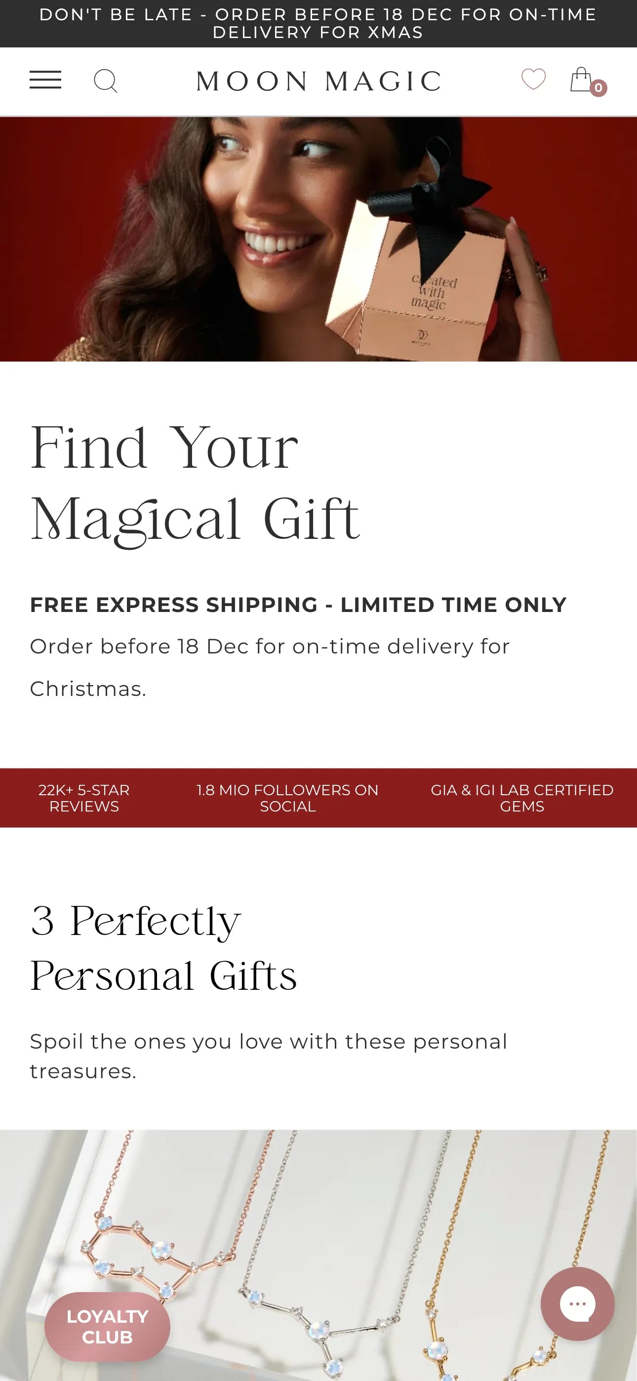
7. Moon Magic
Moon Magic stands out as one of the best mobile landing page designs for inspiration in this compilation. As the festive season of Christmas and New Year approaches, the store introduces a specialized landing page named "Jewelry Gift Guide Xmas", meticulously optimized for mobile users, aiming to inspire individuals to purchase thoughtful gifts for their loved ones. Let's delve into the key highlights of Moon Magic's mobile landing page:

Key Highlights of Moon Magic's Mobile Landing Page:
- Impressive Call to Action (CTA): The mobile landing page features compelling CTAs, for example – "Give them energy" which is strategically placed in the section showcasing energy gemstones. This approach serves as an effective way to express and prompt customers to click, propelling them forward in their purchasing journey. Noteworthy is the store's dedication to customizing CTAs on the mobile landing page, tailoring them to each specific section for a more targeted impact.
- Guarantee Section: Selling jewelry and gemstones comes with its challenges, particularly concerning the assurance of quality. Moon Magic addresses this concern by prominently featuring a guarantee section on the landing page. By showcasing their commitment to quality assurance, the store aims to instill trust in potential customers, potentially enhancing their credibility.
- Testimonial Section: Strategically positioned just below the guarantee section, Moon Magic includes a testimonial segment. This thoughtful placement serves as a powerful move to emphasize the store's claim of providing high-quality jewelry. By presenting customer testimonials, Moon Magic not only reaffirms their commitment to quality but also provides tangible proof of customer satisfaction, further bolstering their brand trust.
Pro tip: GemPages' Image-to-Layout feature can help you create guarantee or testimonial sections easily and fast. With just a click, your uploaded reference can be seamlessly converted into a customizable layout.
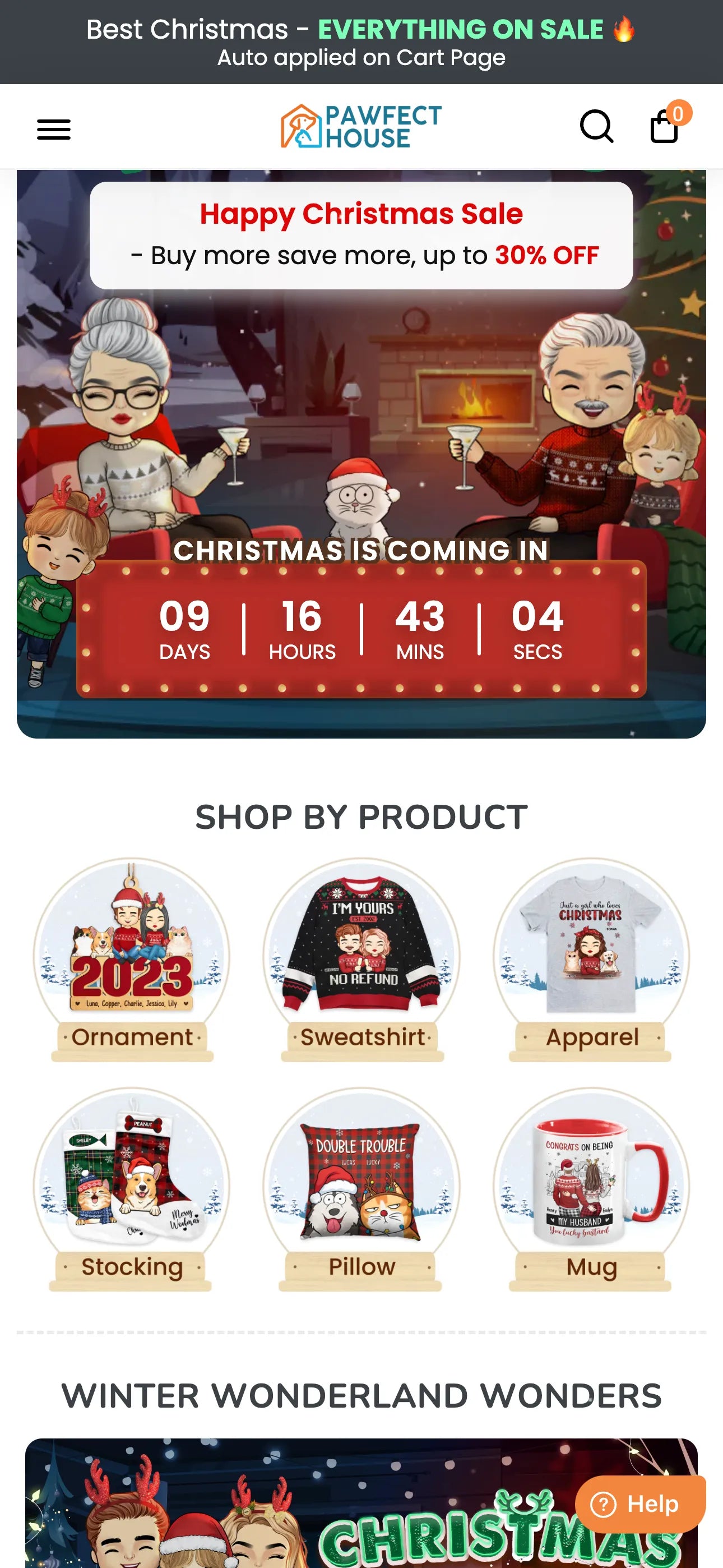
8. Pawfect House
Running a print-on-demand (PoD) business centered around pet products? Take a cue from Pawfect House. With its dedicated landing page for Christmas, the store adeptly highlights its products in a spectacular manner, featuring unique visual design and consistent branding throughout. A standout landing page should boast an intriguing above-the-fold section, a quality exemplified by Pawfect House's mobile landing page.

Key Highlights of Pawfect House's Mobile Landing Page:
- Visual-Striking Countdown Timer: Positioned on the hero banner above the fold, a visually striking countdown timer immediately captures your customer's attention at first sight.
- Categorized Collections by Purposes: The landing page employs a thoughtful categorization of collections based on specific purposes. This strategic approach aids customers in swiftly finding their desired products, contributing to a time-saving shopping experience.
- Consolidated Theme Across the Landing Page: Aligned with the Christmas spirit, Pawfect House maintains a cohesive snow and pine tree theme across all elements of the landing page. This thematic consistency not only creates a festive and inviting atmosphere but also motivates visitors, enhancing the overall mood and encouraging them to make a purchase for the festive occasion.
Pro tip: GemPages' templates library consists of 100+ seasonal templates that can complement your sales ideas. You can explore some ideas here.
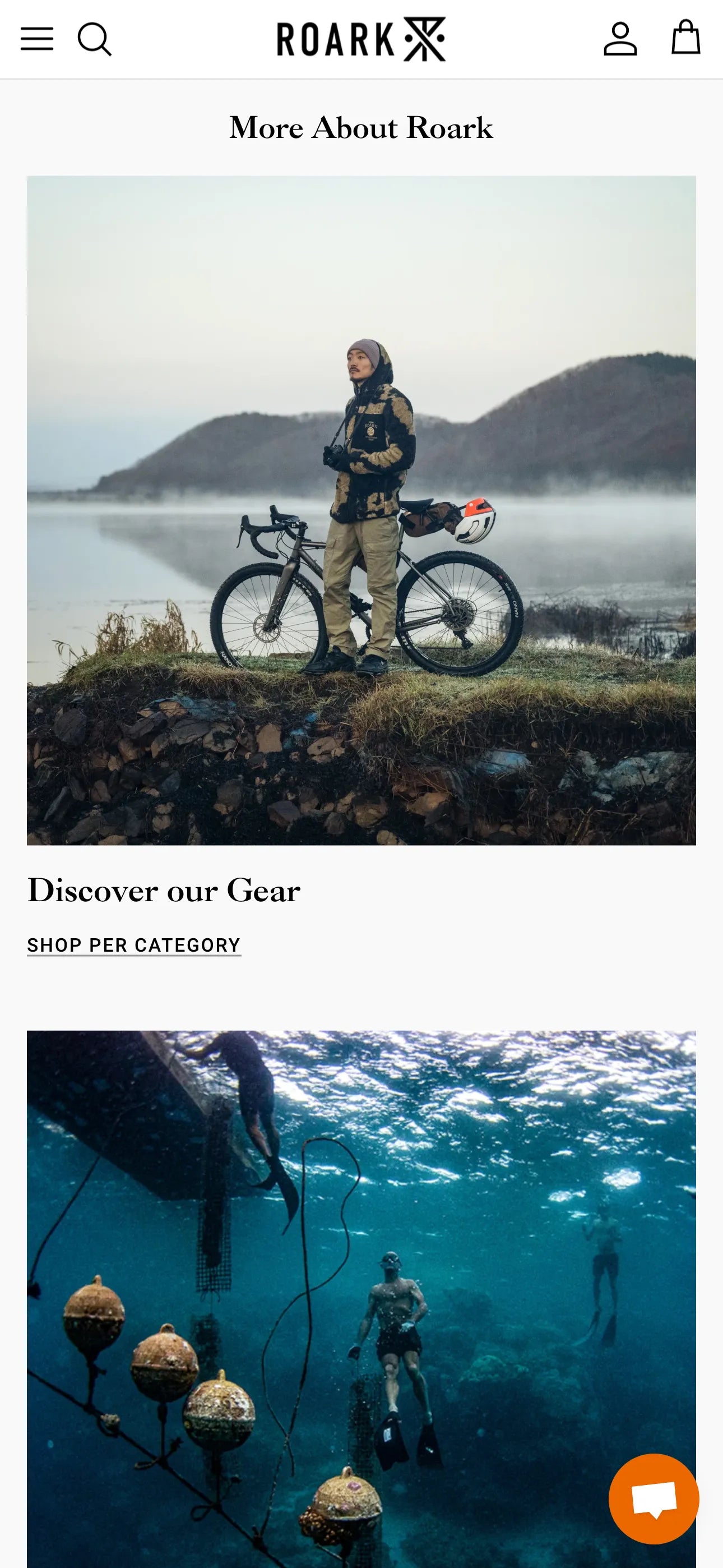
9. Roark Revival
Roark Revival's Revivalist Club landing page differs from the previously mentioned types. Unlike traditional sales-centric landing pages, this page aims to encourage people to join the club for a richer real-life experience with the store's products. Consequently, the designed elements on the landing page focus more on showcasing the reasons to join the club, coupled with real-life stories to provide a convincing approach. For valuable insights on creating a long-term landing page for your store, consider the following features:

Key Highlights of Roark Revival's Mobile Landing Page:
- Simple Design with Straightforward Information: The store offers an excellent experience for first-time visitors by presenting basic elements in the right order. The hero banner is prioritized to explain the page's purpose, followed by an introduction to the club, a registration form, testimonials, and additional information.
- Stylish Testimonial Images: Given the minimal showcase on the page, incorporating stylish testimonial images is an effective approach. The images maintain a consistent vibe and color tone with the store's branding, enhancing the overall visual appeal.
- Connections with Other Pages: The landing page seamlessly integrates with other pages, including blogs, about us, and collection pages. This strategic linkage eliminates the need for users to expend extra effort navigating the menu bar, allowing them to easily transition to the buying journey.

Build Your Shopify Mobile Landing Page with GemPages
Shopify App Store has many apps that help you to create mobile landing pages.
If you’re new to Shopify and trying to figure out the best Shopify app for mobile landing page design, your search ends here!
Check out GemPages Landing Page Builder to design your mobile landing pages and store pages using the intuitive drag-and-drop editor and professionally designed templates.

With over 3,000 shining 5-star reviews and a stellar overall rating of 4.9, GemPages is loved by thousands of Shopify merchants all over the world.
Ready to Design Your Own Mobile Landing Page?
A mobile landing page is a great tool to present your product with style.
By creating a dedicated landing page for mobile users, you can ensure that your product or service gets the focus and attention that it deserves.
If you use the right tools and strategies to create well-designed and mobile-optimized landing pages, you can see positive results in your Shopify store’s conversion rates.
Now, let’s create some great mobile landing pages that convert!


 Facebook Community
 Change Log
 Help Center


