


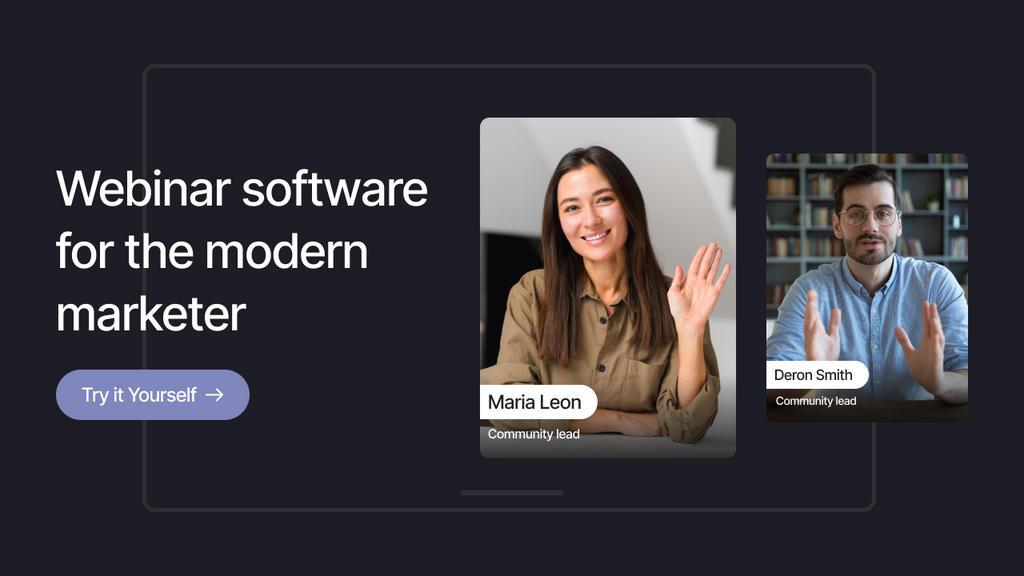
 Facebook Community
 Change Log
 Help Center


Discover 25 Best Webinar Landing Page Examples and Design Tips from Experts
If you want to engage your potential audience, build authority, and generate leads, why don’t you think about promoting webinars? However, a great webinar involves more than the content. The landing page is the first impression that convinces visitors to sign up for your webinar event.
Many marketers looking for inspiration can learn a lot from webinar landing page examples used by top brands, such as Google, HubSpot, and Shopify. These pages highlight design techniques that drive conversions, from powerful headlines to interactive layouts. By analyzing these pages, you’ll discover why some designs outperform others and how to apply these insights effectively.
This blog explores the 25 best examples of webinar landing pages and ends with a guide on how to create on how to make your own with Shopify and GemPages. Right now, let’s get into it!
What is a webinar landing page?
A webinar landing page is a standalone landing page designed to persuade visitors to register for a specific webinar (a type of online event). The top webinar landing page examples often use compelling copy, professional highlights, clear CTAs, and visuals that communicate values. They don’t try to overload visitors, but give essential content to capture their attention and trust.
By driving higher conversions and brand credibility with valuable insights, these web pages can:
-
Capture crucial information about attendees for follow-up communication activities.
-
Create a sense of anticipation and excitement around upcoming webinars.
-
Build a solid audience base for personalizing your products and services.
-
Showcases long-term values that the brand can bring to its potential customers.
25 Best Webinar Landing Page Examples To Inspire
#1. Google
Why do we love this webinar landing page?
One of the best webinar landing page examples on our list today is powered by Google: The “Tech Bytes: Secure Enterprise Browsing” webinar. It stands out with a professional design. The page is concise, scannable, and focuses on key takeaways, making it incredibly easy to grasp the value and register. The use of a right-sided countdown timer helps add urgency effectively.

Google's Tech Bytes webinar landing page uses a countdown timer to create urgency.
Pros
-
Clean, professional design with ample white space
-
Clear headings and subheadings that immediately convey the webinar's value
-
Branded illustration in the hero image enhances brand recognition
-
"We’ll explore" section outlines key takeaways, setting expectations
-
Clarify the information about the speakers or their credentials.
Cons
-
Limited interactive content for deep engagement
#2. CFA Institute
Why do we love this webinar landing page?
This webinar landing page example instantly grabs attention with a concise Title Case headline in the hero section. Notably, when visitors scroll to explore more details about the webinar, the “Register for free” button section moves along with the page, helping keep it visible at all times. As a result, CFA Institute ensures you can register effortlessly without having to scroll back up.

Sticky ‘Register for Free’ CTA follows users as they scroll on the CFA Institute’s page.
Pros
-
Clear Title Case headline grabs attention.
-
Sticky “Register for free” button aids conversions.
-
Concise overview and bulleted key discussion points.
-
Credible speakers featured and open-access content.
Cons
-
Lack interactive elements and social proof
-
No speaker bios or direct links.
#3. Hubspot
Why do we love this webinar landing page?
HubSpot makes this page stand out with a striking headline, video teasers, and speaker photos to engage visitors and build anticipation. Multiple CTAs enhance conversion, and the focus on exclusive digital advertising insights sets it apart, making the user experience more compelling.

HubSpot webinar landing page example blends video teasers to boost engagement
Pros
-
Brief video teasers and speaker photos offer a preview, building trust and interest.
-
Multiple CTAs to ensure any scroll point is actionable.
-
Event details (topic, timing, speakers) are clearly laid out for quick skimming.
Cons
-
Minimal urgency drivers (like countdown timers or limited seat notices).
-
Page design prioritizes form over storytelling or engaging visuals.
#4. Slack
Why do we love this webinar landing page?
Slack’s Agentforce webinar page makes an impression with a minimalist banner, bold headline, and a registration form wisely positioned to support instant signup. The layout balances rich details of speakers and key benefits inspired by the webinar, with a strong CTA for action. Also, the web page flows naturally from pain points to solutions, targeting time-poor decision makers.

Slack’s minimalist layout emphasizes pain points, solutions for instant action
Pros
-
Quick overview of pain points and benefits for the target audience.
-
Speaker names and roles add authority.
-
Persuasive copy focused on business results, not just features
Cons
-
Minimal visual interactivity or demo previews.
-
Speaker bios and agendas could be more detailed.
#5. Shopify
Why do we love this webinar landing page?
Shopify’s “Commerce Unified” webinar page organizes content into 3 sections: About the Event, Meet the Speakers, and Explore the Summer ’24 Edition. Each section includes a CTA button, guiding visitors to the most relevant preview and helping them clarify what the webinar provides.

Shopify’s landing page breaks content into clear sections with stunning visuals
Also, the use of high-quality visuals and a balanced color scheme against the black background makes the page visually engaging. These design choices make this Shopify webinar page one of the high-converting webinar landing page examples that SaaS businesses should emulate.
Pros
-
Simple, intuitive design with a clear CTA
-
Engaging visuals that resonate with the target audience
-
Concise copy that highlights the benefits of attending
-
Well-structured layout for easy navigation.
Cons
-
Lacks a countdown timer to create urgency
-
Minimal social proof or testimonials to build trust.
Learn more: Shopify Tutorial: Everything for Success
#6. Salesforce
Why do we love this webinar landing page?
Salesforce’s landing page for their AI-powered agent feature update takes a pared-down yet practical approach, prioritizing clarity and attendee support. The web page offers easy access to registration with a short form: Name, Job Title, Email, Phone, Country/Region, and Employees. Furthermore, visitors can summarize what they will learn through the bulleted points in the copy.

Salesforce landing pages showcase key takeaways and an AI chat for instant support
Pros
-
Include a visible short-form registration to “Access the webinar now”.
-
List the key benefits under bulleted points in the copy
-
Capture visitors with a strong, specific headline
-
Enable an AI-powered chat box in a horizontal layout.
Cons
-
Lack the details of speakers, multimedia teasers, and high-quality visuals
-
The hero section is not compelling at first sight.
#7. Hootsuite
Why do we love this webinar landing page?
This webinar landing page example, powered by Hootsuite, highlights clarity over flashy visuals. The two-sided layout allows the visitor to read a detailed description on one side while having the registration form right next to it. This reduces friction, making sign-ups straightforward. Also, the inclusion of a “Share this webinar” button encourages organic promotion across platforms.

Hootsuite’s split landing page layout makes registration frictionless
Pros
-
Clear, detailed descriptions of the webinar agenda and value
-
Side-by-side layout keeps the registration form visible at all times
-
Includes related resources that deepen the topic context
-
Social sharing buttons for extended reach
Cons
-
Text-heavy design may not engage specific visitors
-
Lack speaker bios for enhanced credibility.
#8. Facebook
Why do we love this webinar landing page?
Unlike standard webinar landing page designs, Facebook’s page often includes a range of upcoming events related to a specific topic or field so that audiences can have a clear pathway. In fact, you will know the general outcomes from joining these webinars with the description, and it does not seem detailed enough to capture your attention. However, try to click the More Details under the headlines to check a short summary before navigating to the “Enroll” button.

Facebook’s webinar landing page keeps multiple webinars accessible in one place
Pros
-
Keep relevant webinar registration sections within a landing page
-
Display a clear time zone, date, topic, language, and instructor’s name
-
Instruct how to register these events with four steps
-
Capture attention with “Choose an upcoming event” before moving the key section.
Cons
-
Lack essential, well-structured illustrations for each webinar
-
Don’t clarify the instructor’s information or profile link, except for names.
#9. Mintel
Why do we love this webinar landing page?
This webinar landing page example works well because it’s visually clean, professional, and highlights the essential details upfront. The headline is specific, immediately telling visitors what the webinar is about. The strong CTA button (“Register Here”), paired with a concise summary, makes it easy for users to understand the value this webinar delivers and the subsequent steps.

Mintel highlights its value proposition and CTA with a clean, professional design.
Pros
-
Clear, engaging title with a strong value proposition.
-
Prominent call-to-action ("Register Here") in a contrasting color for visibility.
-
Concise explanation of the topic, trends, and benefits for attendees.
-
Key details (date, time, location) are easy to find and visually distinct.
Cons
-
Limited use of social proof (e.g., past attendee numbers or client logos)
-
The image background feels generic and could be more personalized to the theme.
#10. Calendly
Why do we love this webinar landing page?
The Calendly landing page is modern and easy to navigate, reflecting Calendly’s brand identity. It clearly communicates the webinar's topic and outcomes by highlighting key feature updates upfront. The registration form is straightforward and placed prominently for quick sign-ups, while the addition of speaker photos and roles in the following section helps boost trust and credibility.

Calendly's page uses detailed speaker profiles to communicate value instantly.
Pros
-
Bulleted feature highlights make the key takeaways easy to digest.
-
A prominent, well-placed signup form with minimal fields reduces friction.
-
Speaker photos and titles humanize the event and add authority.
Cons
-
Lacks specific time/date information on the top section (forces scrolling/searching).
-
The page feels text-heavy in places and could benefit from visual icons or graphics.
#11. LinkedIn
Why do we love this webinar landing page?
LinkedIn's webinar landing page is all about professional development and building skills. It instantly establishes authority by leveraging a clear, structured learning path with a detailed description of what registrants will learn. With each skill in this webinar program, you can select the Time Zone, clarify the Date, and Space Left for the number of participants before registering.

LinkedIn presents webinars as part of a professional learning path to engage visitors
Pros
-
Include the “Register” button for the whole pathway or separate webinars
-
Clarify the general outcomes with detailed descriptions
-
Structure the webinar information in a table for easy follow-up.
Cons
-
Don’t display the speaker's/instructor's profile
-
Lack engaging visuals, previews, or related resources.
#12. Zoom
Why do we love this webinar landing page?
Zoom's landing page for its "The Impact of AI on SMBs" webinar is a great example of a clear, modern design. It uses a clean layout, strong visuals, and a logical flow of information that guides the user toward registration. The on-brand visuals also remind visitors of Zoom's role in the webinar space. Many Zoom webinar landing page examples also apply similar techniques.

Zoom uses a modern layout with tech-focused visuals and personalization fields.
Pros
-
Uses a minimalist color palette paired with a dynamic, tech-forward hero image.
-
Highlights key insights effectively through bulleted lists.
-
Includes an “Additional information related to your business” field for personalization.
Cons
-
Mentions the speaker’s “Zoom Webinar Team” without providing specific details
-
Lacks urgency-driving elements (e.g., limited-time messaging or countdowns).
List for adding Banners List for adding Banners 100% 10 C5
#13. Microsoft Azure
Why do we love this webinar landing page?
The minimalist layout, combined with a bold header and clean registration form, makes this webinar landing page easy for visitors to understand the event details and take action. It also includes accessibility features like multiple closed captioning languages, ensuring inclusivity. The agenda, with clear time zones, helps every global participant quickly identify their session.
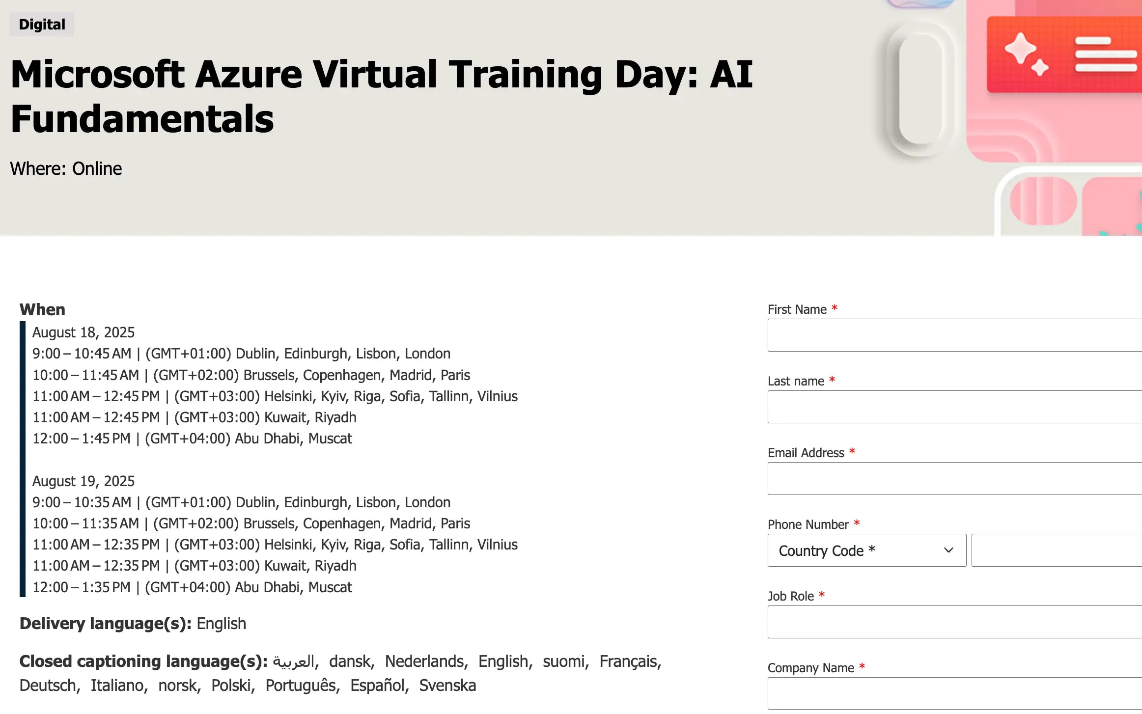
Microsoft Azure displays multiple time zones visually to appeal to a global audience.
Pros
-
Multiple session times are listed, making it convenient for a global audience
-
Clean, well-structured registration form that captures essential details
-
Detailed description copy to provide a clear preview of the webinar
-
Accessibility emphasis with closed captioning in multiple languages.
Cons
-
Lacks urgency-driving and visual elements
-
No speaker details, which could reduce credibility and connection with the audience.
#14. GM Business Growth Hub
Why do we love this webinar landing page?
Instead of driving visitors to the description instantly, the GM Business Growth Hub’s webinar landing page example displays the headline, date, location, theme, and the Register button first. This helps visitors consider whether they can join this event at the first preview. In the following sections, you can discover more about the webinar criteria, agenda, speaker profile, and more. Moreover, the page published the “Free Order” section and a “Register” button below for action.

GM Business Growth Hub repeats the “Register” buttons at the beginning and end
Pros
-
Clear and concise event title and theme
-
Specific date, time, and location details are prominently displayed
-
Speaker information and a detailed agenda are included
-
Additional value with fully funded support and networking opportunities
-
Display 2 “Register” buttons at the start and the end of the page.
Cons
-
Limited use of visual elements (images, icons) to break up text.
#15. Shopee
Why do we love this webinar landing page?
With this landing page, the design itself is kept quite simple, so there isn’t much to highlight visually. However, what makes it interesting is the inclusion of a Google Slides URL, allowing visitors to preview the webinar content beforehand. This gives them a clear idea of what will be covered and helps them decide whether it’s worth registering, which allows visitors to save time.

Shopee adds transparency by sharing the webinar’s presentation deck on the page
Pros
-
Share the deck upfront for trust and transparency
-
Clearly lists what attendees will learn for scanning
-
Simple and direct CTA with the red “Register” button at the hero section.
Cons
-
Look plain, with minimal visual hierarchy and engaging elements
-
Lack of social proof and information about the speakers.
#16. Amazon
Why do we love this webinar landing page?
This Amazon Business webinar landing page example embraces a professional experience. The headline clarifies the audience (government and local authorities), while the video duration (18 minutes) makes the offer more approachable.
The registration form is easily found on the right side, and clear bullet points outline exactly what participants will learn from this webinar. Overall, it balances simplicity with informative details to effectively engage experts and visitors.

Amazon’s page highlights its audience (government sector) and session length upfront
Pros
-
Clear target audience and purpose
-
Concise session length highlighted
-
Well-structured bullet points for easy scanning.
Cons
-
Heavy reliance on text, with limited engaging visuals.
#17. Cisco
Why do we love this webinar landing page?
Cisco grabs attention with a large, bold headline that instantly communicates the webinar topic. This makes it easy for visitors to decide if it’s relevant to them. The short-form registration section is easy to fill out, with “*” marking required fields for clarity. The description is structured logically, moving from pain points to solutions, helping establish values and motivate sign-ups.

Cisco leads with a bold headline and a concise registration form
Pros
-
Strong, topic-specific headline
-
Visible, action-oriented registration form
-
Clear description flows from problems to solutions.
Cons
-
Lacks visuals or engaging design elements
-
Long bullet points are harder to scan quickly.
#18. Canva
Why do we love this webinar landing page?
This high-converting webinar landing page example ticks all the boxes of a well-optimized page. From its clean layout and simple registration form to a focused headline with compelling copy, Canva ensures visitors instantly understand the value of attending. Beyond the fundamentals, it highlights detailed speaker profiles to build brand credibility and visitors’ trust, includes sharing buttons for easy promotion, and adds a strategic CTA to try Canva Teams to drive conversions.

Canva uses a clean layout, speaker details, and CTAs to promote webinars effectively
Pros
-
Clean, professional design with a clear headline
-
Speaker profiles add trust and authority
-
Extra CTA promotes Canva Teams for conversion opportunities.
Cons
-
Visuals should be more interactive with teasers or videos.
#19. Sprout Social
Why do we love this webinar landing page?
This Sprout Social’s webinar landing page stands out for its clean, modern design and focus on value. The bold headline highlights Duolingo’s Zaria Parvez, instantly establishing credibility and drawing interest. The 45-minute session is displayed as approachable yet impactful, suggesting that attendees would walk away with meaningful takeaways without a major time investment.

Sprout Social’s landing page example balances clarity and brevity with a striking title
Pros
-
A prominent form on the left for attendees’ details
-
Strong value proposition with an attention-grabbing title
-
Clear, outcome-focused bullet points that highlight practical benefits
-
A claim to “Register for a free webinar” in the registration section.
Cons
-
Limited visual elements beyond text and headshots
-
The CTA button should be strengthened with a contrasting color.
#20. Monday
Why do we love this webinar landing page?
Monday includes a strong headline in the hero section and repeats it in the registration section. This makes visitors feel more focused on what they will get inspired by from this webinar event. You can also find a navigation bar on the left side, where you can easily navigate to other tabs like catalog, lessons, learning paths, certifications, demos, and articles for more helpful insights.

Monday expands a resource-rich navigation sidebar beside the key landing section
Pros
-
Likely presents a simple, focused layout that prompts quick registration
-
Double “headlines” across the hero section and registration section
-
Display key benefits and an agenda under a bulleted list
-
Cover a user-friendly navigation bar.
Cons
-
The outline seems a bit generic
-
Lack engagement elements and credibility boosters.
#21. Notion
Why do we love this webinar landing page?
This Notion webinar landing page example stands out by focusing on leveraging brand identity. Instead of using typical visuals like teaser videos or promotional images, it displays the Notion logo at the center, reinforcing brand trust and recognition. The hero section is straightforward, featuring a concise headline and a Register button that directs users to the sign-up form below.

Notion focuses on brand consistency with a centralized logo-driven hero section
Pros
-
Strong brand reinforcement with a central Notion logo
-
Clear headline and direct registration pathway
-
Flexible event scheduling enhances user convenience.
Cons
-
Minimal visuals could feel too plain for some visitors
-
Lack of detailed session highlights may limit initial engagement.
#22. Adobe
Why do we love this webinar landing page?
Adobe’s webinar page draws attention to its long, prominent sign-up form, making it clear that the main goal is to capture registrations quickly. At the same time, it provides the necessary details about the webinar, including what participants will learn and who the key speakers are.

Adobe features a long-form registration, reinforcing quick action and detailed insights
Pros
-
Visitors are directed straight to the sign-up form for quick action
-
Clean, professional design that builds credibility with potential attendees
-
All essential webinar information is easy to find.
Cons
-
The long form may feel overwhelming to some visitors at first glance.
#23. Gartner
Why do we love this webinar landing page?
Besides a bold, concise headline introducing the webinar topic, this landing page stands out by requiring only a work email for registration. This shorter form saves time and reduces friction. Gartner also displays their work email, making it easy for attendees to reach out with questions.

Gartner reduces friction with a short form and includes direct contact info for support.
Pros
-
Displays relevant upcoming webinars to encourage further participation
-
Simple registration form reduces barriers and improves conversions
-
Provides contact info for any attendee questions, enhancing trust and support.
Cons
-
Lack the details about the webinar host
-
No visuals are included to capture visitors’ attention.
#24. Uber Merchants
Why do we love this webinar landing page?
Uber Merchants’ webinar landing page example is extremely simple, focusing solely on the registration form and the webinar topic. This minimalist approach allows visitors to understand the purpose, select the right participation time, and then take action quickly without distractions.

Uber Merchants keeps the layout ultra-simple, focusing on the essentials for sign-ups
Pros
-
Extremely straightforward, minimizing friction for users to register
-
Quick loading and easy to navigate due to minimal content
-
Focuses attention entirely on the main goal: webinar registration.
Cons
-
Lacks additional information about the webinar, such as the agenda or speakers
-
No visuals or design elements to engage visitors or build credibility.
#25. Coursera
Why do we love this webinar landing page?
Today's final well-performing landing page example is from Coursera, one of the leading platforms for providing online courses with reliable certifications. We found its design similar to Salesforce's, with a detailed description and a registration form on the right side. Coursera also highlights the speaker profiles in detail, including name, fields, position, companies, and images.

Coursera highlights speaker bios and balances text with a right-aligned form.
Pros
-
Balanced layout with detailed information and an accessible registration form
-
Comprehensive speaker profiles enhance credibility and engagement.
-
Straightforward design reflects Coursera’s brand authority and reliability.
Cons
-
The page may feel text-heavy for visitors who prefer a quick overview
-
Limited visual variety beyond speaker images.
How to Build A Shopify Webinar Landing Page Using GemPages
Why do you need GemPages for your landing page design?
GemPages is one of the leading landing page builders for eCommerce merchants, especially those running Shopify stores. With its intuitive drag-and-drop, no-code editor, GemPages allows anyone, from beginners to experienced marketers, to create high-converting pages effortlessly.
Once you’ve drawn inspiration from the leading webinar landing page examples, you can explore GemPages’ extensive library of 200+ pre-built pages, created to boost conversion rates. This makes it easier to start your page with a proven framework and tailor it to your demands.
GemPages recently introduced the AI-powered Image-to-Layout feature, which transforms any design inspiration link or uploaded image into a fully functional landing page layout in seconds. This feature automatically generates responsive, customizable pages that reflect your creative design vision while maintaining best practices for user experience and conversion optimization.
You can also try other solutions of the GemPages ecosystem: Gem X for advanced A/B testing and GemPages Sales Funnels Builder to create complete, conversion-driven sales funnels. Together, these tools simplify your workflow and help design a high-performing Shopify store.
4 Steps to create a high-converting webinar landing page
Step 1: Install GemPages into your Shopify Admin
In your Shopify Admin Dashboard, click the +App tab under the Apps section.

Click the +Add tab to navigate to the Shopify App Store
Then, type “GemPages” in the Search bar of the Shopify App Store and select GemPages.

Type “GemPages” in the search bar and select the app in the suggestions
Next, click the Install button and check GemPages’ policies before confirming installation.
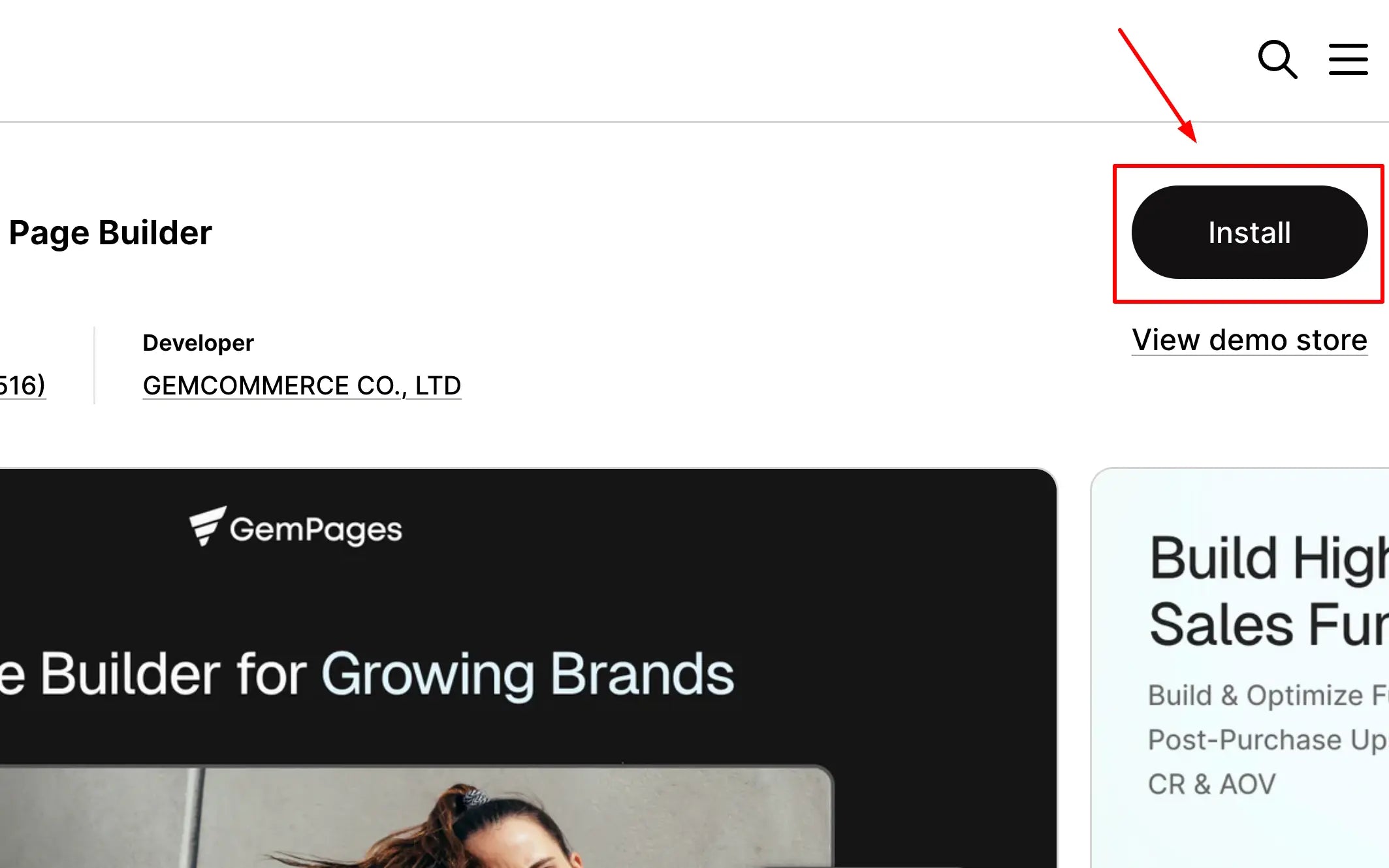
Click the Install button to add GemPages to your Shopify store
Step 2: Consider the method to start
First, click the Pages tab under the GemPages Builder section and select the Landing tab.

Then, click the Add landing page to open the Create New Page section and select one of these methods:
1. Design from scratch
design from scratch

Select the webinar landing page design from scratch method
2. Use GemPages templates

Select the GemPages template to start
3. Use AI to convert a reference page into an editable page

Click the "AI-powered Image to Layout” in the GemPages Editor to enable AI design
Step 3: Design your webinar landing page
You need to ultilize GemPages' drag-and-drop editor to add crucial elements, such as:
-
Headline: Craft a compelling headline that clearly conveys the value of your webinar.
-
CTA button: Place a prominent CTA button encouraging visitors to register.
-
Countdown timer: Add a countdown timer to create urgency.
-
Speaker bios: Include information about the speakers to build credibility.
-
Testimonials: Showcase testimonials or social proof to instill trust.
Step 4: Preview and publish your page
Once satisfied with your design, preview the page to ensure it looks great and then publish it.
Advanced, you can use GemX to run Shopify A/B testing and find the design version that works best.
You can ultilize GemX to conduct A/B testing directly from the GemPages interface
Conclusion
As we've explored, the best webinar landing page examples from brands like Google, HubSpot, Shopify, and Canva share common traits: clear value propositions, well-structured layouts, engaging visuals, and strong CTAs. Whether you're aiming to boost sign-ups, build authority, or convert cold traffic into warm leads, a high-performing landing page is key to webinar success.
Ready to build your own? Tools like GemPages make it easier than ever to create stunning webinar landing pages for Shopify merchants. Also, visit GemPages blogs for more insights.
FAQs


