


 Facebook Community
 Change Log
 Help Center


- What Is A Contact Us Page?
- Why Do You Need A Contact Us Page?
- What Should A Contact Us Page Include?
- How To Create A Contact Us Page On Shopify?
- The Best Shopify Contact Us Page Examples To Learn From
- Shopify Contact Us Page Tips and Tricks
- Build Your Contact Us Page With GemPages’ Pre-made Templates
- How Shopify Sellers Utilize Our Templates
- The Bottom Line
- FAQs About Shopify Contact Us Page


How to Create A Contact Us Page on Shopify (+ 5 Inspiring Examples)

Imagine your eCommerce store reaches its all-time high. Page visits are increasing, sales are booming, and you get super busy but in the best way.
This certainly sounds like a business owner’s dream.
But with great power comes great responsibility. The more customers you have, the more pre-sales and after-sales services are required to give your buyers the support they need.
But how do they acquire that kind of service?
This is when the unsung Shopify Contact Us page comes into play.
Among the other Shopify pages to consider when setting up your website, a Contact Us page might not be one’s top priority. When profits and brand-building are in mind, a well-constructed About Us page and a glaring product page often outshine a Contact Us page.
In this blog post, we will let you in on the assets of this simple but powerful element for your website that hopefully will inspire you to give it the attention it deserves. Spoiler alert: it is the key to customer satisfaction and building a strong bond with your customers.
What Is A Contact Us Page?

This is an example of a Shopify Contact Us page
A Contact Us page is a place on your website where visitors and customers have the option to reach out to you to have their questions fulfilled, whether via email addresses, forms, phone numbers, social media channels and/or your store location. It can typically be found in the navigation menu of your site.
Not much information is seen on this page, apart from the essential means and blank spaces for customers to fill out their inquiries. Thus, a Contact Us page should include clear instructions and the same design that flows with the rest of the store.
Why Do You Need A Contact Us Page?
Similar to browsing at the mall, more often than not, the determining factor that prompts you to buy at this store but not the other when the two carry the same line of products is the staff’s attentiveness to your questions.
By providing your customers with a means of communication with your store, trust will be established naturally. This gives you an upper hand over your competitors.
This methodology can be applied to both potential customers and existing ones.
During pre-sales, visitors will be more likely to finish the checkout process if their concerns about your products are answered promptly. With after-sales, any issue regarding your customers’ purchases will be reported to you more efficiently through a contact form.
Consequently, you will be able to find a resolution more quickly. This is also an effective prevention of a bad review.
What Should A Contact Us Page Include?
As mentioned, a Contact Us page doesn’t need to be glammed up to catch the visitor’s attention. Usually, they decide to check out this page because they have a question in mind.
Below are a few suggestions on what information you could include in your Contact Us page.
All The Essential Contact Information
This goes without saying, but a Contact Us page is basically useless if there are no real ways for your customers to contact you.
As an online store without a physical location, offering mediums so that your customers can reach out to you virtually is a must. This includes email addresses, a business phone number and any active social media channel.

An example of a Contact Us page that includes all the essential information.
A Contact Form
There are many ways to go about your Contact Us page. Adding a form where your customers can fill in without having to make the effort to manually send an email simplifies their whole experience.
If you decide to integrate a form in your Contact Us page, be sure to keep it straightforward and fuss-free. Try omitting redundant fields and use drop-down menus for a quick and smooth process. After all, the most important subject that both you and your customers care about is the actual problem/question that they have.
Depending on how your business is operated, if an order can be easily found with an order number, it’s a good idea to put it as an optional field in the contact form.

A simple contact form with a drop-down menu.
An FAQ Section
Each customer navigates your store differently. One might have a question and stumble across the Contact Us page before the FAQs. As they are about to fill in the form or call your business, a FAQ section can come in clutch and save both parties a lot of time.
As your business progresses, you will be able to observe and compile a list of similar questions that many of your buyers have. This is a good foundation to build a FAQ page of your own.
You can either merge the Contact Us and FAQ page together, or have a separate FAQ page and link it along with your contact information.

A FAQ section is placed at the bottom of this store’s Contact Us page.
The above instance breaks down their FAQs into different categories, from shipping to types of products. This way, customers can find exactly what they look for in the moment without having to wait for a response.

A note to check their FAQ before moving on with the form.
A simple note at the top of this business’s Contact Us page with the link to their FAQ is a good tactic to help customers self-serve and prevent futile questions.
Learn how to build your own FAQ page with GemPages here: How to create an FAQ page
Useful Links
We mentioned the versatile FAQ section above, but there is a whole ‘nother bunch of conducive links that you can incorporate into your Contact Us page.
If you offer more than one means of customer support, it’s a good call to inform your customers of these features.

Useful links are placed strategically alongside this store’s contact information.
Add A Google Map
This feature is incredibly convenient if you have a physical address. With products such as scented candles or cosmetics, most customers prefer to try them out in person before making a purchase. With the inclusion of the store address and a virtual map, you can provide your potential buyers with the option to buy the products in-store and receive instant support from you or your sales staff, in lieu of contacting you via email.
With a click of the mouse (or mobile speaking, a tap of the finger), your buyer is informed of your store location and how to get there.

This store adds a Google Map at the bottom of their Contact Us page.
How To Create A Contact Us Page On Shopify?
Below is a condensed guide on how to add a Contact Us page on Shopify, as instructed on the official Shopify Help Center.
- In the Shopify admin dashboard, go to Online Store > Pages.
- Click Add page.
- In the Title box, add a title for your contact page (Contact Us, Help, Support, etcetera).
- In the Content box, type any text that you want to appear above the contact form or leave this section blank.
- In the Online store section, choose ‘Contact’ from the Theme template drop-down menu and click Save.
Learn more: How to Create a Shopify Contact Us Form with GemPages
The Best Shopify Contact Us Page Examples To Learn From
Now, let’s see what the cool kids are doing. We will go through 5 Contact Us page examples on Shopify and highlight what we dig about them.
How to Cake It

How to Cake It keeps it simple and straightforward with their Contact Us page.
Yolanda Gampp is a multi-talented self-taught baker and cake designer who owns an award-winning YouTube channel named ‘How to Cake It’, and she built her own eCommerce store on Shopify with GemPages. The whole website gives off a refreshing, colorful vibe, and the Contact Us page is certainly not left out. By keeping it short and sweet with two email addresses and links to their social media channels, Yolanda and her team are able to offer support without any other unnecessary information getting in the way.
Having two separate email addresses for different purposes is a brilliant move on saving time to sort out their emails.
Sticker Phantom

Sticker Phantom makes sure that the customers will get the support they need. The message gives off a sincere feel, while the form is kept concise with radio buttons and reCaptcha. All the essential information is placed right alongside the form, with a FAQ section at the bottom of the page.
Design-wise, they are on theme with keeping a nice contrast between the texts and the background with two main color components.
Brew Blue Tea
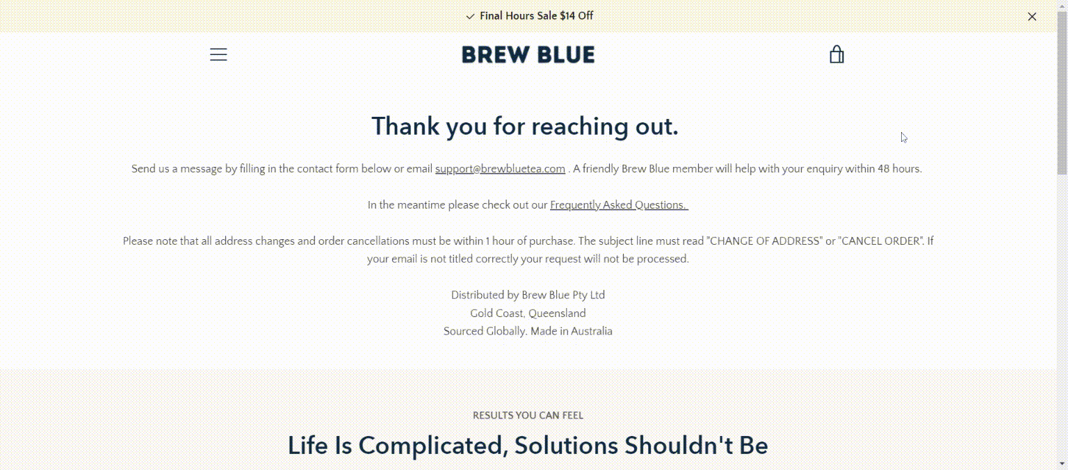
Brew Blue Tea incorporates visual elements and clear CTA buttons into their Contact Us page.
Brew Blue Tea also eliminates the use of a contact form and decides to add a note on the top of their Contact Us page that encourages the customers to send them an email and/or check the FAQ and instructs them how to do it.
They mix in a striking visual component, coupled with a CTA button to their product. This makes the Contact Us page more appealing, while still keeping it chic and in cahoots with the rest of the store.
BoldCube
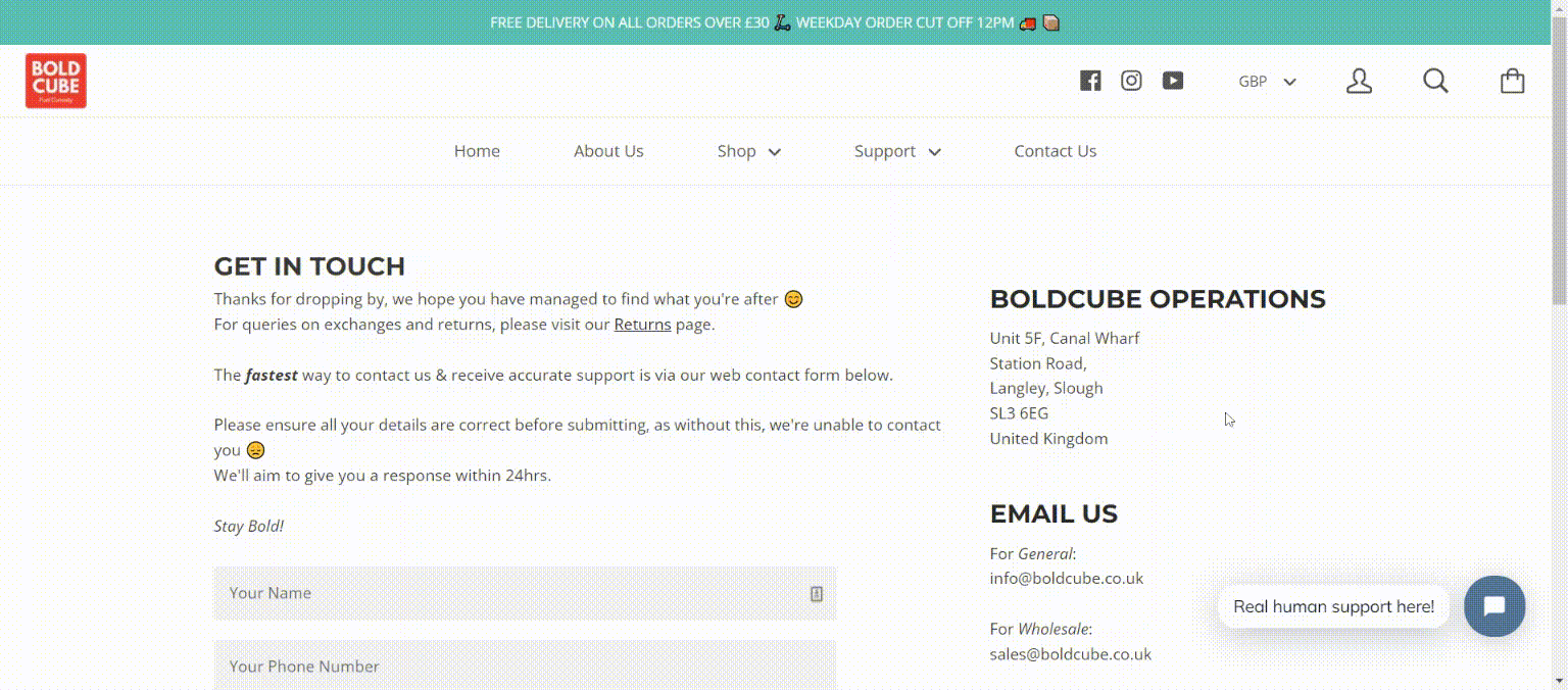
BoldCube offers a personal message on the top of their contact form with various options to reach them.
BoldCube offers a wide range of children scooters, but they know their target audience is adults. Oftentimes, they are parents who have questions and concerns before/after purchasing the products for their kids.
The company provides various ways to contact them, via a form, emails, live chat, and social media channels.
The contact form has a unique ‘I’m feeling…’ segment with a drop-down menu. This is a clever tactic to comb through a high volume of emails and categorize them.
Esse Studios

Esse Studios chose a minimal approach for their Contact Us page.
By staying true to their brand, Esse does not try to cram every piece of information into their Contact Us page. Instead, they opt for a minimal feel, which oozes beaucoup style.
All the necessities are included: their email address, contact form, and head office location. The form is also kept as succinct as possible, with only two fields to fill in.
If your brand has a similar vibe to Esse, you can learn from them and add your flair to building your own Contact Us page.
Shopify Contact Us Page Tips and Tricks
Now that you are aware of the know-how on starting a Contact Us page, let’s dive right in and elevate it further. Of course, you do not have to follow the below tips to a T, as they are just suggestions. At the end of the day, you are the one who knows your business best.
Place It In An Easy-to-see Place
The end goal of a Contact Us page is successful customer support. Unfortunately, the support will not be able to reach them if they can’t find the page in the first place.
Looking at the website design as a whole, every page should be easy to explore and navigate around. You don’t want to hide them under weird titles and several layers of a hidden menu.
Placing the page on the header or a footer of your store under “Contact Us”, ”Support”, or “Help” is the rule of thumb.

Bhu Foods places their Contact page on the header.
If you opt for a more minimal web design with less visible text on the homepage, the Contact Us page can be placed in a hamburger menu, usually at the top left or top right on your navigation bar.
Incorporate Call-to-action Buttons
The information on the Contact Us page is pretty succinct in itself. However, first-time visitors may still encounter troubles while getting around your online store. To keep this to a minimum, do include CTA buttons so that your customers know exactly where to go and what to click on.

Ohsnap! puts clear CTA buttons and instructions on their Contact Us page.
This store tells their customers precisely what to do while utilizing clear-as-day CTA buttons for the most common issues and useful links. There is a distinct contrast between the colors of the texts and the background, which makes it unmissable.
Keep in mind, the customers might come to this page with an irate attitude already, the last thing you would want to do is to make their experience more difficult and confusing. Guide them with genuine words and simplify their journey as much as possible.
Double-check Your Information
A slip-up of a number in your business mobile phone, or a missing character in your email can have a detrimental consequence on your brand. An agitated customer who has an issue with their product now has another one with your support system.
While managing a one-person business, you may find yourself overwhelmed with the amount of work to do. Thus, mistakes are bound to happen whether we want them or not. We are just humans after all (thank God AI hasn’t gotten a hold of how to run an eCommerce on its own, phew!).
However, these gaffes can be diminished if you form a habit to double, or rather, triple-check all the information before and after it has been published on your site. Dot all the I’s and cross all the T’s is highly recommended.
If you are a non-native English speaker who operates an eCommerce business in an English-speaking country, tools such as Grammarly and Hemingway can greatly improve your language skills and help you write in a more natural tone.
Consider A Mobile-friendly Design
A few months back, we published an article on mobile optimization and emphasized how m-Commerce is not a thing of the future any longer, but the present. Transforming your website with an eye for mobile optimization is what will set you apart from the average Joe’s.
This applies to every page of your site, Contact Us included. A mobile phone screen is only a fraction of a computer screen, sizewise. People also hold it vertically and do everything with their trusty thumbs and index fingers. Therefore, your Contact Us page needs to adapt to this change as well.
For instance, a contact form requires manual typing from your customers. If there were many fields to fill, it would be troublesome for your buyers to complete it on a virtual keyboard.
Our advice to you would be to lessen the number of form fields, enlarge the font, use drop-down menus and radio buttons, and place your CTA buttons strategically to catch your customers’ attention. Less is more with mobile optimization, especially with features that require your buyers’ actions.
Build Your Contact Us Page With GemPages’ Pre-made Templates
We talked a lot about what a well-designed Contact Us page can do for you, and we won’t leave it at that. To relieve the workload off merchants’ shoulders (we know you’ve got your hands full with a bazillion other tasks), GemPages presents to you our Shopify Contact Us page templates and customizable blocks.
A Multifaceted Template for Every Need

This template has everything you need to create your own Contact Us page.
From the look of it, this template packs a punch, and it sure does. There is a place to fit in every information that you want your customers to see. A full-screen header image allows you to showcase what your business is all about, with a customizable text box on top. We’ve put the contact form and your information side-by-side to minimize extra scrolling. The included FAQ section is ready to go as soon as you have done the honor of filling it up.

The FAQ section can be found on the same page as your contact information.
This all-around template also contains a section to bring your visitors’ attention to your social media content and of course, a Google Map at the bottom for easy search up if you are also a brick-and-mortar business owner.
If this template seems right up your alley, click here to have a preview of our desktop, laptop, tablet and mobile versions!
A Template That Shows Your Appreciation

Your customers can quickly navigate your store’s location with this template.
Our second template has similar elements with the first one, with a map, essential contact information, and simple contact form. However, it also has a special block for you to exhibit your customers’ feedback while using your products in picture form, like a mini version of Instagram.

Your brand’s personality can shine through with this feature.
Adding customer reviews and testaments is an old, but always effective business strategy. There is more than one way that one can go about as to where to put this section. The Contact Us page is definitely an amazing and relevant corner to mix it in. After all, it’s a perfect display to show your customers that you care about their opinions.
Any certificate and badge also has a mention at the bottom of this template.
Level up your eCommerce game with this handy Contact Us template here!
More Options to Explore with Our Customizable Blocks
We value versatility in our products, therefore, our templates are not only for building a separate page that provides your business’s contact information to your customers. We also have a collection of so-called ‘mini design’ options in our library.
How do these differ from our main templates above? In a nutshell, they are small sections of a complete Contact Us page (contact form, map, social media channels, etcetera).
These sections can either 1, be added to an existing page (i.e About Us Page), or 2, replace a similar section in the two main templates that you have chosen.
With these blocks, you can switch and change around or remove any part that you feel does not vibe well with your brand. The recipe for your perfect Contact Us page is right at your fingertips. Head over to our GemPages library to have a closer look.

These blocks are just what you need to elevate your Contact Us page further.
How Shopify Sellers Utilize Our Templates
A dazzling template gives more character to your Contact Us page, the stores below used our available templates and customizable blocks to transform their Contact Us pages. Let’s see how they did it.
Show Your Physical Business Location
We have highlighted the use of Google Maps in assisting customers who prefer to shop in person. This design is one of the few in the GemPages library that makes adding a map to your Contact Us page easy.
You are also free to put any information that fits your need into the remaining space next to the contact form.
This template is perfect for your brick-and-mortar store.

This store adapts our template to show both their virtual and physical contact information.
Go Classic with A Two-block Design
Your customers will be less likely to be drowned in a wall of texts with this simple template. If your online is in its starter phase, this concise template and its adjacent is a handy sidekick to convey all the essential information in a clear-cut manner.

Keep it simple with minimal information and a contact form.
Go The Minimal Route
If you want to showcase your brand’s personality via an aesthetically pleasing visual element and basic information, this template could be the chosen one.
With our customization option, you have full control over what to exhibit and what fields to include and omit.

Add your personal touch to the Contact Us page with this template.
The Bottom Line
Making your customers feel welcome even before they get the help they need lays the cornerstone for great customer service. People tend to trust the professionals or the newcomers that do it right. No matter which stage of the entrepreneurial journey you’re on, you can start building (or improving) your Contact Us page today. GemPages aims to assist you in achieving the best Shopify Contact Us page, so what are you waiting for?
FAQs About Shopify Contact Us Page


