10 Killing Shopify Homepage Examples to Learn in 2026

Your homepage reflects the overall style, personality, and story of your brand.
It gives your customers a clear idea of what your brand has to offer and the reason to buy from you. Especially for new customers, who’ve never purchased from your brand, your homepage could be the deciding factor in whether or not to make a purchase.
But what makes the best Shopify homepage?
Well, there are many aspects that go into building a great homepage for the Shopify store.
This blog will help you explore the key elements and best practices of a great homepage along with some awesome examples of Shopify homepage designs for inspiration.
Key Elements of Any Great Shopify Homepage
Create an Impactful Hero Section
The hero section (also known as above-the-fold content) is the key section on any website. When any customer visits your website, this is the first section they’ll see on your website before scrolling down or clicking on any other page, link, or button.
Apart from the fundamental elements like the brand logo and navigation bar, the hero section should have three other important elements:
- The hero image
- Your brand’s Unique Selling Proposition (USP) through a headline and sub-headline copy
- Call-to-action (CTA) button

My Happy Flo’s hero section is a great example that covers a nice hero image, solid headline, sub-headline as well as a CTA button.
Optimize it for Desktop as well as Mobile
While designing your home page, keep a broader audience in mind, including desktop as well as mobile users. This will help you with your store’s mobile conversion optimization.
Consider all these important points coming straight from Google:
- Mobile-friendly websites rank higher in search results.
- More than 50% of searches on Google are mobile searches.
- If your website isn't optimized for mobile, it’s five times more likely that visitors may leave your website.
Prioritize the User Experience (UX):
User experience is one of the crucial factors that can impact your Shopify store’s conversion rate. The logic is simple. Poor user experience can increase your bounce rate, meaning less potential for conversion.
Create a smooth and seamless experience for your visitors by making it easy for them to find what they need. Make sure that your header menu is properly structured so that customers can navigate easily. Also, page load speed is a crucial factor for the UX. Follow all the best practices to compass images and upload videos by embedding YouTube or Vimeo links.
Learn more: Ecommerce UX: Best Practices For 2026
Style it with the Right Color Scheme and Fonts
You must’ve heard about color psychology, right?
Colors have the power to evoke emotions in people. Your brand’s color scheme represents your brand’s style and personality. Your color scheme should not be limited to the logo design only. Your homepage design should also have a consistent and cohesive color palette.
Consider your target customers as well as the type of products when choosing the color palette for your homepage design. Also, do not overlook the usage of appropriate fonts. Fonts also play a similar role just like your color scheme to convey your brand’s emotions.
Learn more: Shopify Fonts 101: How to Find the Best Font Combinations for Your Shopify Store

Vinokilo is a vintage fashion brand. The color scheme as well as the fonts used in its homepage design matches the brand's style.
Highlight Your Value Proposition Clearly & Consicely
Express your value proposition within 10 seconds and gain attention from your visitors for several minutes.
Yes! According to Nielsen Norman Group, visitors usually leave a webpage within 10 to 20 seconds; however, a clear value proposition is useful to keep their attention for a much longer time.
A clear value promotion should communicate how your product fulfills a need, what is the key benefit, and why your product is better than any competitors in the market.
Don’t Neglect the Importance of Footer
People may easily overlook the importance of the footer section. However, the footer is the section that contains some critical information that customers may require to go through before making a buying decision.
You can include the following key aspects in your footer section:
- Brand Logo
- Store’s Policies: Privacy Policy, Terms of Service, Shipping Policy, Returns Policy, and Refund Policy.
- Frequently Asked Questions (FAQs)
- Social Media Icons (with links)
- Contact Form/Details
- Newsletter Sign Up Form
- Copyright Notice
- A Short About or Mission Statement
- Sitemap
You don’t necessarily need to include all of the above things but see what is required for your business and what might be helpful to your customers.
Showcase the Social Proof
While shopping online, customers consider social proof as one of the most important factors. In fact, according to TrustPulse, 97% of customers go through the reviews before buying, and 88% of customers trust product reviews more than ads.
However, keep in mind that social proof is not limited to just customer reviews. You can even highlight the endorsements from any well-known influencer, celebrity, or expert. Also, you can mention any press or magazine that has covered a story or review about your brand.

ELEGOO creates products that are highly regarded in the 3D printing industry, maker communities, and STEM classrooms. On its homepage, ELEGOO has displayed various press reviews mentioning the benefits of its products.
Make Appropriate Usage of Media
Media elements like images, slideshows, videos, and animations make your homepage content more appealing and it quickly grabs the attention of your store visitors. If you want, you can also add GIFs to the Shopify homepage.
Apart from the hero image section, you can also add banner images to highlight specific content and make it visually appealing along with a compelling copy. But again, make sure that you keep the user experience in mind and ensure that your media elements do not negatively impact your Shopify store’s speed.
10 Best Shopify Homepage Design Examples
It’s time to explore some of the best Shopify homepage examples. We’ve noted down the things that we liked the most about these homepages and the areas of improvement, in our opinion.
1. Kokada

Kokada’s homepage looks as delicious as its products.
Yes, Kokada's homepage design is full of vibrant colors and eye-pleasing imagery. Kokada offers high-quality and health-conscious products made with natural ingredients that taste great, too. And its homepage surely conveys why customers should buy their products.
What makes this homepage impressive:
- Let customers know why they should buy: Kokada highlights the key aspects of their products in an effective and visually appealing way. They’ve created a dedicated section that explains how their products are Simple, Delicious, and Sustainable.

- Driving customers to explore more: You don’t need to give away everything about your brand on the homepage itself. But when you have more things to share, you can highlight them on the homepage, as Kokada does with its “Many Ways to Enjoy” section. You can just give an overview of the topic and then add a CTA button for the customers to explore more if they want to.

What could’ve been done better:
- Headline and CTA in the Hero Section: While the looping video background in the hero section looks very cool, it does not have a headline and CTA button in the hero section. Most brands use a CTA button within “above the fold” content because it can help enhance the conversion rate.
2. Fluxies

Fluxies' homepage design is one of the great examples of how you can design conversion-oriented homepage sections. Throughout the homepage, Fluxies has given various types of CTAs, including the enticing one for customers to take the quiz to find out their style. All these can elements can make the homepage very interactive and engaging for customers.
What makes this homepage impressive:
- Highlighting the benefits for customers and the planet: Fluxies highlights its Earth-first approach in one of the homepage sections. It explains how their products are not only reducing the carbon footprint but also saving money for customers. The following statement from Fluxies shows the positive impact of the brand - "Together, with our customers, we've already saved over 40 million disposables from going to landfill."

- Well-organized footer section: Fluxies has done a really great job at designing the footer section. It starts with a Fluxies brand logo and the newsletter sign-up form. Footer menus are well-organized into three different categories - Help, Our Company, and Learn.
Also, social media icons and payment options are perfectly aligned in the bottom center.

What could’ve been done better:
- Focusing the Key Benefit in the Headline Copy: Fluxies headline copy - "Switch to period pants & save money" - could've been improved by emphasizing the key benefit. While saving money is definitely "one of the benefits", the copy could've focused on how their period pants and leak-proof underwears help women stay carefree all day long. They did convey this in the second slideshow image but it should be in their primary headline.
3. Amoris Beauty

Amoris Beauty has done its homepage design with beauty just like its name. The entire homepage is designed with clean and aesthetic design elements. As soon as you land on Amoris Beauty’s homepage, the “Bye Bye Flyaways” headline clearly conveys the benefit of their product, a hair styling wand.
What makes this homepage impressive:
- Cohesive and aesthetic color scheme: Amoris Beauty’s color scheme throughout the homepage is consistent. No unnecessary distractions. Also, the use of mild colors is a smart choice to make it very pleasing and attractive for women who are their target customers.
- Hero CTA: The entire hero section works as a CTA button. If you click anywhere on the hero image, it’ll lead you to the product page for its Hair Styling Wand.
What could’ve been done better:
Link to the About Page: Nowadays, customers have become more brand conscious than ever before. They want to know the story behind the brand from which they are buying anything. While Amoris Beauty has mentioned a short and one-sentence detail about the brand, they could’ve created a dedicated section to introduce who they are as a brand and link it to the About page
4. Relevant

Relevant’s homepage built with GemPages Shopify page builder
Right from the hero image section, Relevant has shown its connection with nature. Relevant has nicely used different product carousel sections to showcase its popular and single products. Also, they have used some other important sections to show the brand’s credibility as well as social media posts.
What makes this homepage impressive:
- Presenting the Unique Selling Proposition through Founders: Relevant conveys why their brand is not just another beauty brand. It compels the visitors to know more about why Christian and Mads, the founders of Relevant and ex-athletes, created this brand. This section helps create a bond between customers and the brand.

- Using video to show how the product is made: Relevant uses a video section on its homepage to explain how and why it chose to be the world’s first ocean plastic deodorant. They have embedded a Vimeo link to display the video, which is helpful for Shopify speed optimization.

What could’ve been done better:
- Headline Copy above the CTA: While Relevant has nicely taken care of the copy throughout the homepage, the headline copy in the hero image section could’ve been better than just mentioning - “Responsible Skincare”. They could’ve used a main headline along with a sub-headline about how the world's first ocean plastic deodorant can benefit not only the customers but also the environment.

5. Bangn Body

Bangn Body has created a homepage that attracts attention and keeps customers engaged with its brand. The header section not only has a nicely organized navigation menu but also has a tab to check out its rewards/loyalty program.
What makes this homepage impressive:
- Highlighting the Featured Product with Social Proof: Bangn Body has displayed its award-winning product, firming lotion, as one of the key highlights of its homepage. Apart from the badge showing the product being a finalist in the Marie Claire beauty awards, they have also included the achievement of more than 1500 5-Star customer reviews.

- Highlighting Why Customers Should Buy its Products: Bangn Body proudly shows its customers how its products are natural, vegan & cruelty-free, sustainable, and Australian-made. All these aspects could be significant factors for customers to choose your brand over competitors.

Placement of the CTA button: Ideally, the CTA button on the hero section should be placed in a way that would be visible to customers as soon as they land on the homepage, without scrolling it. Bangn Body’s Shop Now CTA button is placed a bit too low on the hero section that you need to scroll down to see it.
6. Koh

Koh’s homepage has just the perfect design it should have for a brand that offers home cleaning products. Koh’s headline copy conveys the key benefit of its product - “Create a cleaner, happier home with Koh.”
What makes this homepage impressive:
- Highlighting the Bundle Offer with Image Banner: Koh’s ‘The Home Clean Kit’ offer is presented with a visually appealing image banner. Along with the product details, the CTA is placed to entice customers to shop the kit.

- Sharing the Customer Stories from the Koh-mmunity (Community): Customers love when they can see the product being used by other customers. It works as one of the best social proofs. And Koh does that by sharing the stories and experiences of their customers along with tips and tricks from the community members.

7. Smyle

Smyle’s homepage is a great example of how you can create a minimalistic yet impressive homepage design. Smyle has included the key elements of the homepage design such as the headline copy, CTA buttons, social proof, FAQs, etc.
What makes this homepage impressive:
- Highlight the Positive Impact of the Brand: It’s not just about selling your products. Customers want to know what your brand does for society as a whole. Smyle shows the positive impact of their brand by mentioning about more than a million plastic tubes that they have saved so far.

- Addressing the Questions through FAQ: Smyle’s toothpaste is not a regular toothpaste that we’ve been using in our daily life. And thus, it’s important to address any questions that customers might have about the product. Smyle’s FAQ (Frequently Asked Questions) section takes care of the most common questions that customer may have before or while purchasing the product.

What could’ve been done better:
- Organizing the Footer Content: While Smyle's entire homepage design is clean and tidy, the footer section could've been better. In the footer menu, the About column seems to have too many items listed under it. Some of those items could be moved to a separate column. For example, the Privacy Policy, Terms of Service, and FAQ could be moved to a separate column.
Pro Tip: While all these are great examples to get some positive takeaways, you should always stay unique with your own brand style. Go with the necessary elements that are needed to convey your brand’s message and be creative with positioning your product in the spotlight.
8. Aglaia
Aglaia serves as an excellent example of the best Shopify homepage design, particularly for jewelry sales, resulting in a visually appealing storefront from the very first scroll. Upon landing on Aglaia's homepage, you'll notice multiple Call-to-Action (CTA) buttons strategically placed alongside corresponding product blocks.
What makes this homepage impressive:
- An innovative approach to designing the above-the-fold section: Aglaia divides the above-the-fold space into distinct blocks, each showcasing different collections at a glance. This design choice allows customers to grasp the variety of products your store offers with just one scroll, facilitating effortless navigation to dedicated collections.
Discover more: 10+ Best Above the Fold Examples to Get Inspired
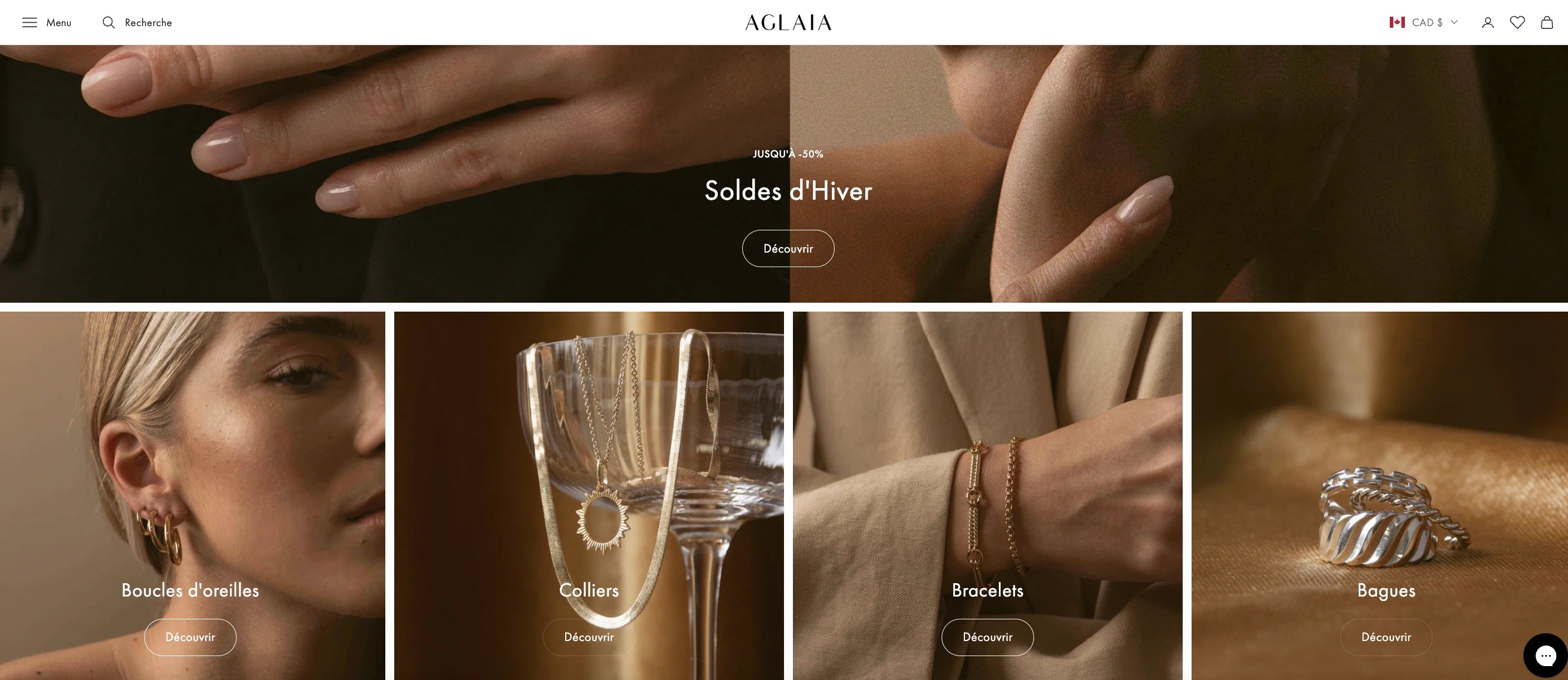
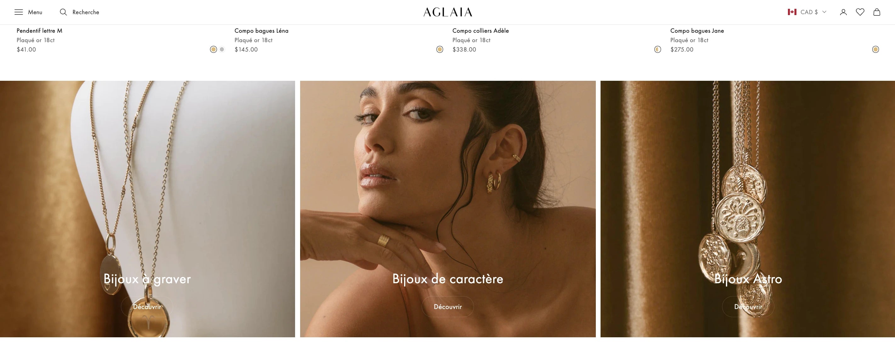
- Brand-identified visuals: As a Shopify jewelry store, Aglaia leverages the advantage of captivating visuals. The store has embraced a stunning golden aesthetic, evident from the top to the bottom of the page. Visual appeal is a key strength.
What could’ve been done better:
Implement a multi-language feature for the store. Despite offering shipping across Europe and neighboring countries, the store currently provides only one language option, French. This limitation can make it challenging for customers to understand and navigate the store.
Pro tips: To create a multi-language store, consider installing GemPages and utilizing translation integration within the landing page app. For instance, you can use the Weglot translate integration in GemPages. This is just one of the numerous integrations available in GemPages, empowering your landing page building and optimization process.
9.Penny Skateboards
Penny Skateboards serves as a fantastic source of inspiration for a one-product store and its homepage. The store, specializing in skateboards and accompanying accessories, effectively presents crucial information with every scroll.
What makes this homepage impressive:
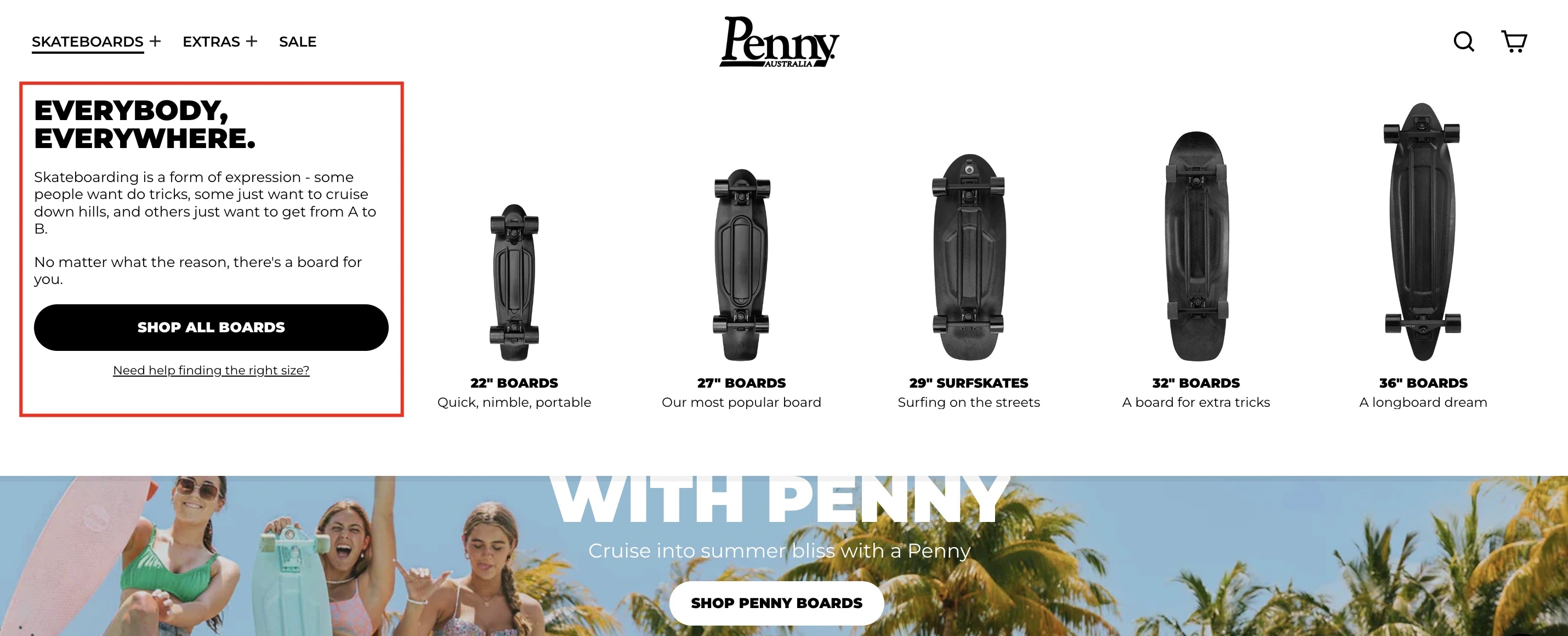
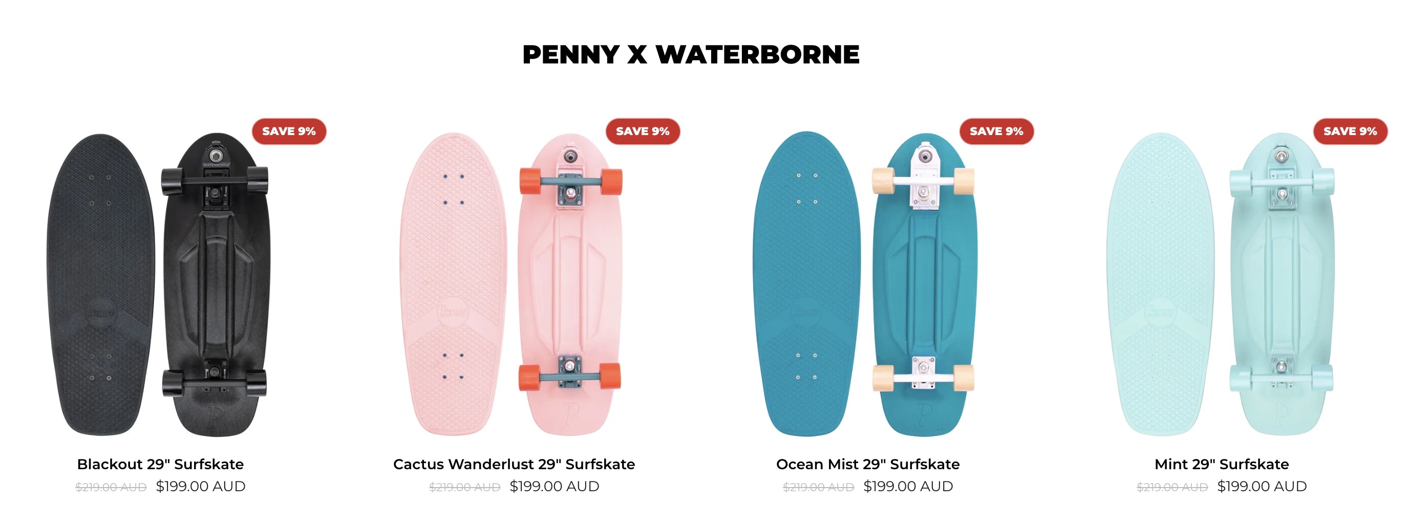
- Captivating product collection description: Diverging from the norm, Penny Skateboards engages visitors with a unique approach to presenting information about their product categories. Instead of placing this information in the hero banner, the store strategically positions it in the top menu, featuring all skateboard sizes at once.
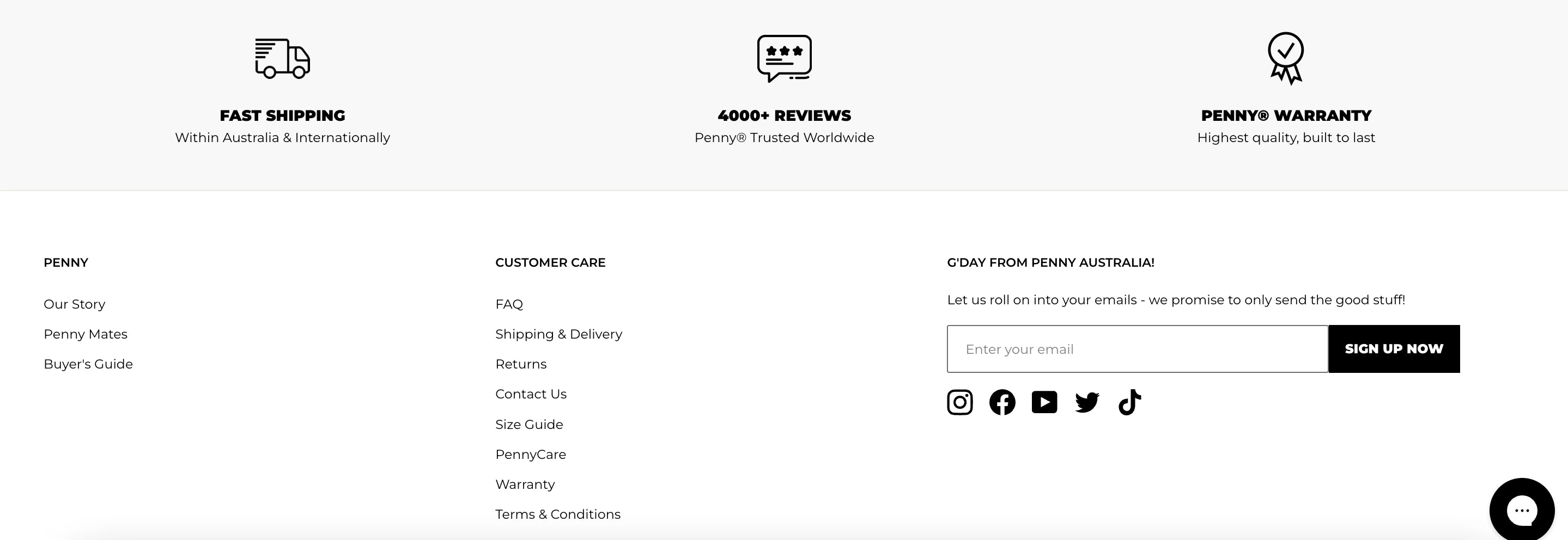
- Informative footer section: The store excels in displaying vital information through a well-designed footer section. Three essential details—free shipping, reviews, and warranty—are highlighted with clickable icons, showcasing an effective strategy for communicating crucial information. This approach is worth emulating if you're seeking innovative ways to present such details.
What could’ve been done better:
Enhanced user-friendliness: To further enhance user experience, it would be beneficial for the store to incorporate a quick-add feature directly on the homepage, accompanied by concise product descriptions. This would streamline the purchasing process for customers, eliminating the need for excessive navigation before making a purchase.
By adopting these improvements, a store can not only draw inspiration from Penny Skateboards but also enhance its user interface for a more seamless and engaging shopping experience.
10. Element Matcha
Element Matcha stands out as another exemplary one-product store on Shopify, boasting a clear and informative homepage design that effectively highlights key product information.
What makes this homepage impressive:
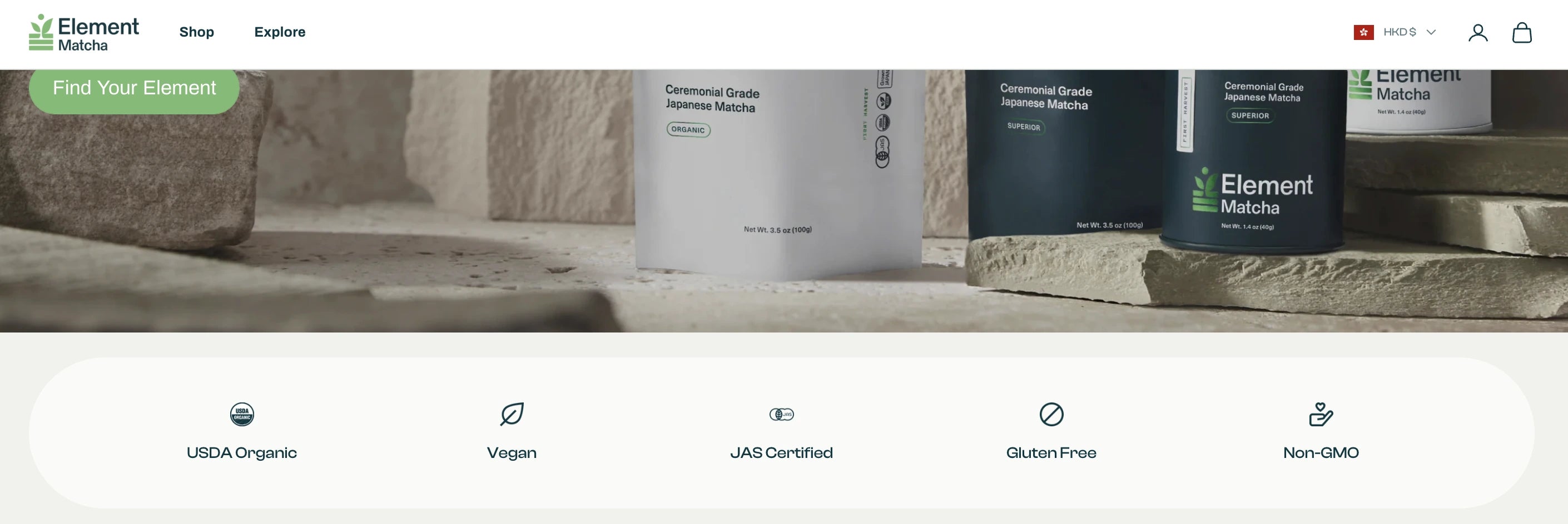
- Innovative badge and certification display: Element Matcha takes a unique approach to showcasing badges and certifications. Unlike other stores that display the actual badges, which might disrupt the overall brand identity, this store customizes the badges and accompanies them with brief descriptions. This customization not only maintains the brand's identity but also adds to the overall vibe and style of the store.
- Strategic placement of social mentions: This store sets an excellent example for incorporating social mentions and hashtags as part of its marketing strategy. Placed just above the footer section, this location is considered optimal for showcasing great pictures and testimonials, providing an effective way to engage customers.
What could’ve been done better:
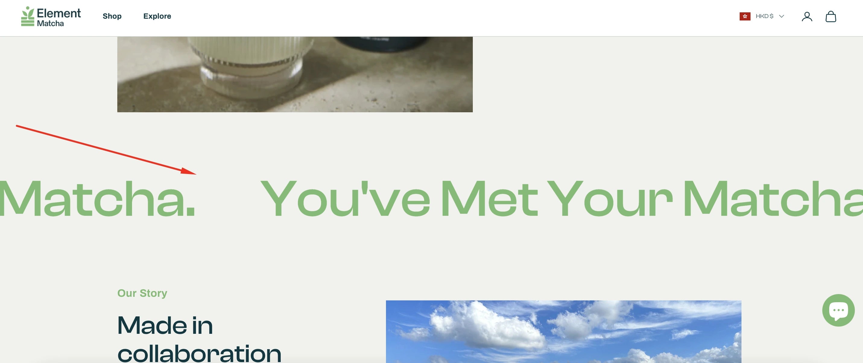
Testimonial section optimization: To enhance the user experience, the store could benefit from allocating space for testimonials rather than utilizing it for a text banner. The current section, ideally positioned for visitors to learn more about the product through customer testimonials, could be optimized to maximize its impact.
Learn more: How to design Testimonial section.


How to Create Gorgeous Shopify Homepage: 3 Ways
There are three different ways to create a Shopify homepage. We will take you through each of them and you can go for the one that best suits your needs.
1. Using Shopify’s Built-in System (The Limited Way)
In this method, you can simply use Shopify’s built-in theme editor if you need just the basic sections available in your Shopify theme.
To customize your theme using the theme editor, go to Shopify admin and click on Online Store > Themes under Sales Channels.

Then, click on the Edit Theme button and you’ll find the Home page template for customization. Using this editor, you can customize, add or remove different theme sections depending on your needs.

Since this is the Shopify in-built theme editor, you have limited options based on the sections available in your theme editor. For example, if you want to add elements like a pricing table, carousel, or number counter, you may not have such options in many themes.
You can read our detailed guide here: How to Customize Your Shopify Theme in The Theme Editor.
2. Using Shopify Liquid for A Higher Level of Customization (Coding Required)
If you have coding experience with Liquid, you can edit the homepage code on Shopify to do a higher level of customization. Alternatively, you may hire a Shopify Expert or freelance web developer to customize your theme to add sections not available in your installed theme.
You can read detailed information on Using Liquid for a Higher Level of Customization.
3. Using GemPages Page Builder (The Easiest Yet Most Effective Way)
If you want to take your homepage customization to the next level without worrying about editing the code, you can use the GemPages Landing Page Builder app.
This way, you won’t have to edit code or hire a developer every time you want to make changes to your homepage. Whether you want to make minor or major changes, you can do it easily using the intuitive drag-and-drop editor.
Step 1: Install the GemPages app
Go to the Shopify App Store and Install the GemPages Landing Page Builder app.

Step 2: Create a New Template for Home Page
Go to GemPages dashboard and click on the "Create new page". Then, click on the Home Page button.

Once you create a new template, you have two options:
- Use a pre-designed template from an extensive template library of GemPages, and
- Create your own template from scratch using various elements that you can simply drag and drop from the sidebar.

If you’re not sure where to start or looking for some cool design inspirations, you can explore the library of professionally designed templates by GemPages. Preview the available templates and pick any template that matches your brand’s style.

Step 3: Customize Your Home Page the Way You Want
One of the major benefits of using GemPages is that you have far better flexibility to customize your home page the way you want.
Even if you’re using a template, you’re not limited to the template design. You can bring in any element to enhance the template design or tailor it to your brand and create a stunning home page.
Step 4: Publish Your Homepage
Once you've saved all of your customizations using the Save button on the top right corner, you can click the Preview button to see how everything may look on your website.
At this point, the homepage that you designed is just saved to the database but not made public yet. Once you're completely satisfied with the final preview, you can hit the Publish button and your homepage will go live.

And that’s it!
It’s that easy to create your own customized homepage tailored to your brand.
The Bottom Line
Designing the best Shopify homepage may take a good amount of time and effort.
But it’s the most visited page on your website and you just can’t ignore its importance. With the right tool like GemPages, you can make the process much easier and create a high-converting homepage design.
Keep in mind that creating a well-designed and relevant homepage is not a one-time process. You may need to make changes, customize the design elements, or bring in new sections altogether in the future to stay relevant to your customers.
We hope this detailed guide has given you the ideas and inspiration to create your own striking and professional homepage design.


 Facebook Community
 Change Log
 Help Center


