- What is a Click-through Landing Page?
- What is The Impact of a Click-through Landing Page on the website conversion funnel?
- What is The Difference Between Click-Through Landing Pages and Lead Generation Landing Pages?
- 5 Tips to Create Productive Click-through Landing Pages
- Examples of click-through landing pages
- Conclusion
- FAQs about Click-through landing page
Click-through Landing Pages: The Art of Improving Your Website Conversion Funnel
Hey there, fellow business enthusiasts! When it comes to rocking your online store, nailing that customer conversion rate is the key to success.
That's why store owners everywhere are diving into the world of website conversion funnel optimization. One game-changing element in this quest is the mighty click-through landing page. If you haven't delved into its incredible potential yet, get ready for a journey that could seriously level up your game with us!
In this article, GemPages will unravel the intricacies of click-through landing pages – a dynamic and strategic approach to lead your customers seamlessly from interest to action.
Let's delve in!
What is a Click-through Landing Page?
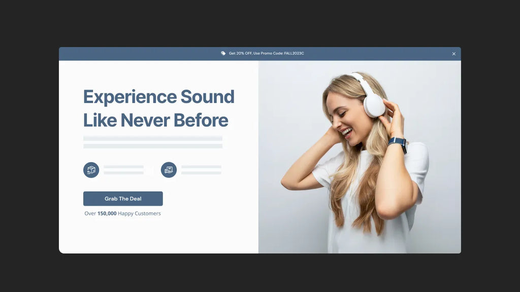
A click-through page is a type of landing page that presents a snazzy call-to-action that, when clicked, takes you to another exciting spot. they're conversion boosters, luring in visitors, turning them into potential customers, and guiding the good vibes of high-quality traffic right into your marketing and sales funnel.

What is The Impact of a Click-through Landing Page on the website conversion funnel?
First of all, a website conversion funnel is a journey that takes customers through many layers on your website, starting from the homepage to completing a purchase on the checkout page.
On that journey, the appearance of click-through landing pages is very important because it can direct customers to real conversion pages based on the conversion orientation of the store owners.
Learn more: How to Create an eCommerce Website Conversion Funnel in 2024
Since your websites, from the home page, product page, collection page, about us page, etc., contain a lot of information for customers to explore. This unintentionally leads to confusion or misleading.
For example, among your hundreds of products, your landing page briefly offers a few best-selling products with attractive price packages and an attractive CTA button for customers to click and move through to the checkout page. That is the value of click-through landing pages.
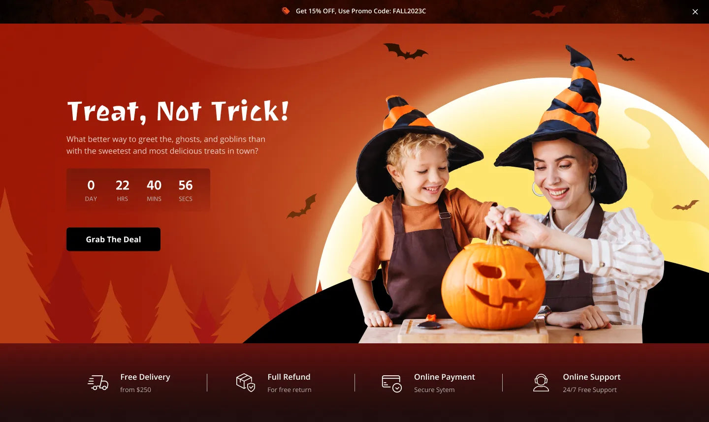
GemPages has many pre-build templates for you to choose from.
You can also design a click-through landing page to send customers to information collection pages to maximize your website funnel. That depends on your purpose.
By intention, these pages show simple, clear instructions that help bring customers' focus back to take action. Creating a landing page tailored to a specific campaign enables you to convey clear messages and successfully convey the campaign's intent.
Learn more: 12 Shopify Landing Page Examples from Top Brands.
What is The Difference Between Click-Through Landing Pages and Lead Generation Landing Pages?
Essentially, the primary purpose of a lead generation landing page is to gather essential lead information, enabling a sales representative to initiate follow-up activities and successfully conclude a sale.
Meanwhile, a click-through page links to a destination page where visitors can convert immediately
These two types of pages are often compared to each other because they play an important roles in the conversion funnel:
- A lead gen landing page represents the beginning of the conversion funnel - where customers enter their information in exchange for a resource.
- Thus, a click-through landing page is the essential door in the conversion funnel to lead customers to a destination page.
Pro tip: Businesses employing email marketing for lead nurturing can gain advantages by incorporating lead generation landing pages. Ensure the optimization of these pages to enhance the effectiveness of your sales-boosting campaign.

5 Tips to Create Productive Click-through Landing Pages
Now that you know the value of a click-through landing page, let's continue with tips to own a high-converting one.
- "Deadly" Headline: Customers first see the page's title. Ensure it is a suitable title, short, clear, and attractive enough to attract customers.
- Attractive, clean content: Do not add cumbersome or confusing words when customers read the entire content. Talk about the customers' value and why they should take the action. Make it simple; make it done.
- Eye-catching visual: Beautiful images, engaging product videos, or hero shots will help customers remember longer than words. So, choose pictures that are bright, clear, and eye-catching.
- Irresistible offer: This is important because when it is irresistible, customers will take action with no doubt
- Speed up your landing pages. Do not waste your consumers' time. While waiting for your page, they might click on others. So optimize your page UI UX to keep users engaged.
- Outstanding Call to Action (CTA) button: Phrases like "Buy now", "Click to Install", "Free trial",... will be the last point where customers land, so this is the key to landing pages. If you want to increase the number of clicks on your CTA, make it eye-catching, have a color that contrasts with the page background, and make sure it is in a prominent position.
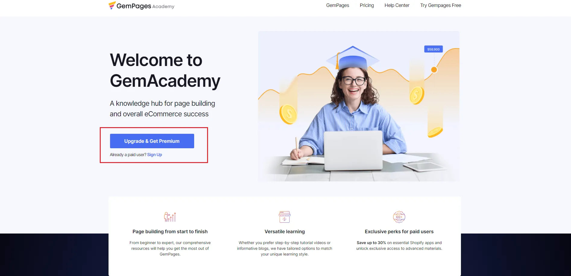
An outstanding CTA button will attract viewers
Pro tip: When trading on the Shopify platform, you can experience working with third-party apps to own quality landing pages, such as GemPages.
GemPages owns 80+ best responsive and high-converting Shopify pre-built templates, and an outstanding feature: AI feature: Image-to-Layout. It can help you turn references into editable layouts in a snap. This is definitely a perfect feature and worth experiencing for store owners.
Learn more: Mastering GemPages' AI Feature: Image-to-Layout

Examples of click-through landing pages
1. GemPages
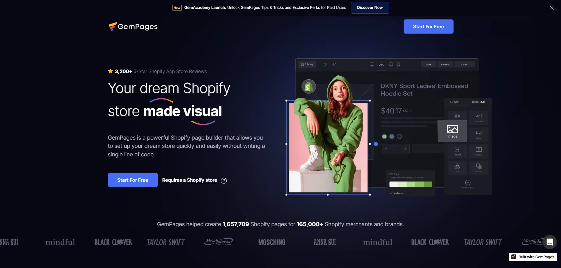
What they have:
- Visual with impressive colors
- Two CTA buttons are placed in eye-catching positions
- The impressive numbers of GemPages' achievements also increase its reputation among visitors
Learn more: Top 9 Mobile Landing Page Designs for Inspiration in 2024

2. Keeps
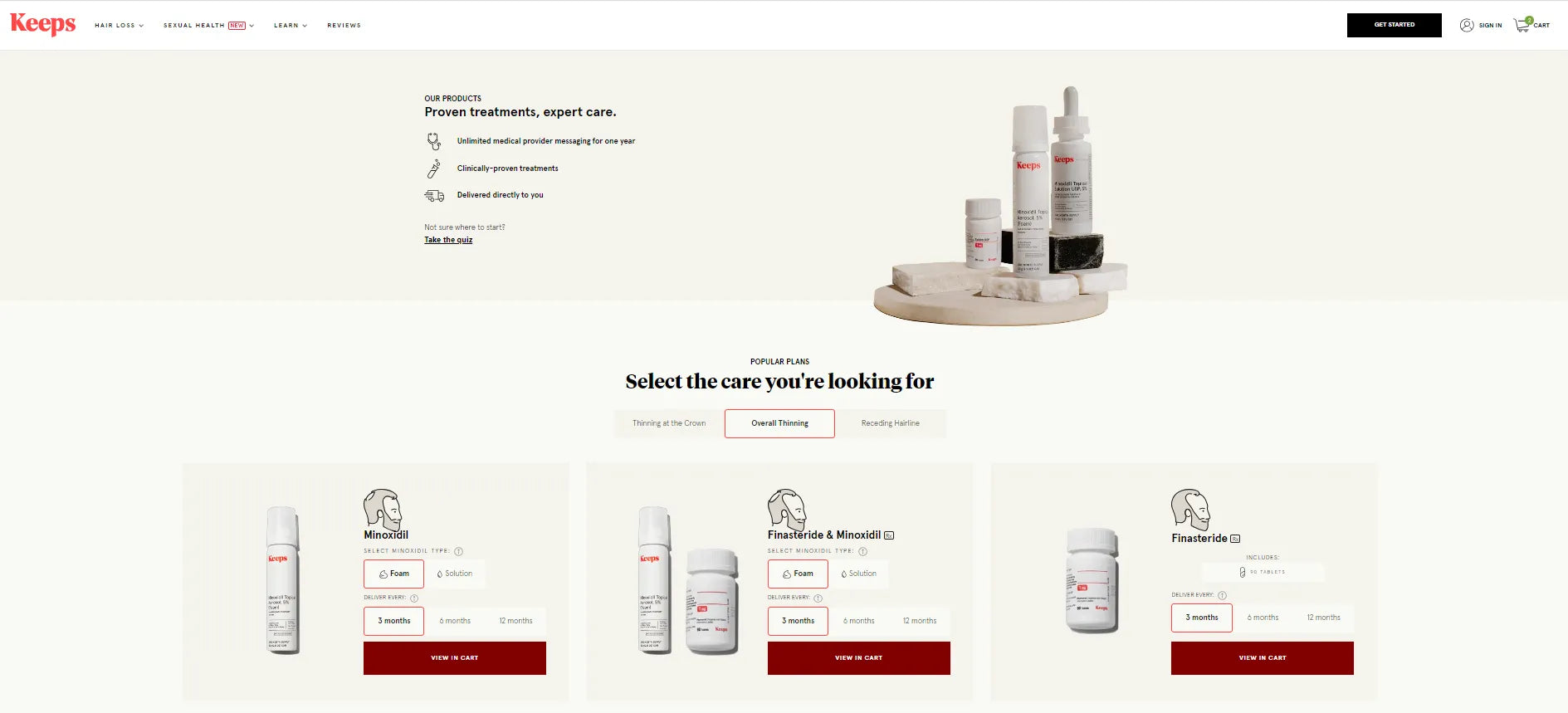
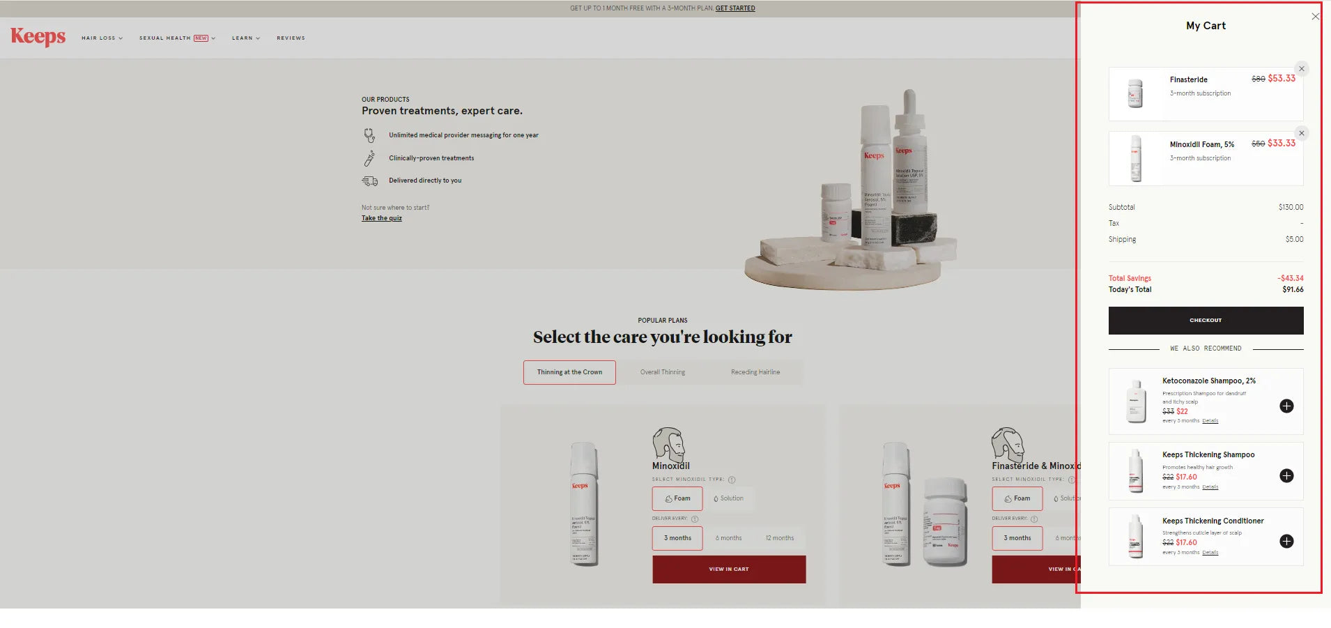
Keeps has a way of thoroughly optimizing click-through pages to convert customers when the destination of this click-through landing page is on the same page
What they have:
- Brief headline.
- Visual creates credibility for treatment products.
- A special point is that they maximize this page when adding products: the checkout frame always appears on the same page, instead of a new checkout page.
Pro tip: If you love Keeps' smooth interface, try designing a similar page with the help of GemPages' new feature: Image-to-Layout. This is a new artificial intelligence technology that turns all references into editable layouts, saving you maximum design time.
3. Dollar Shave Club
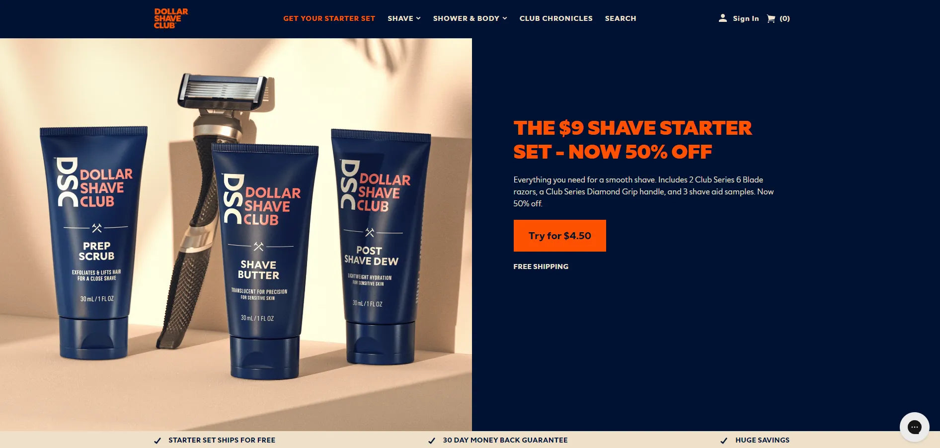
Dollar Shave Club owns an outstanding click-through landing page
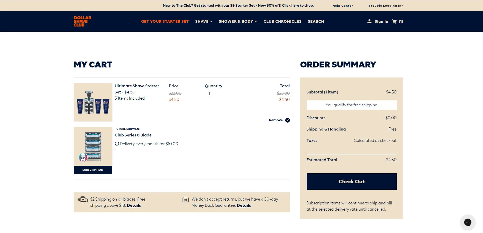
This is the destination of the above click-through landing page by Dollar: Checkout page
What they have:
- A short title that contains the entire content of the offer.
- Attractive offer that cannot be refused.
- Eye-catching colors with easy-to-read fonts.
- The special thing is the CTA button. Instead of general content like "try now", "get start", Dollar puts it very briefly with an attractive offer: "Try for $4.5".
4. Pourri
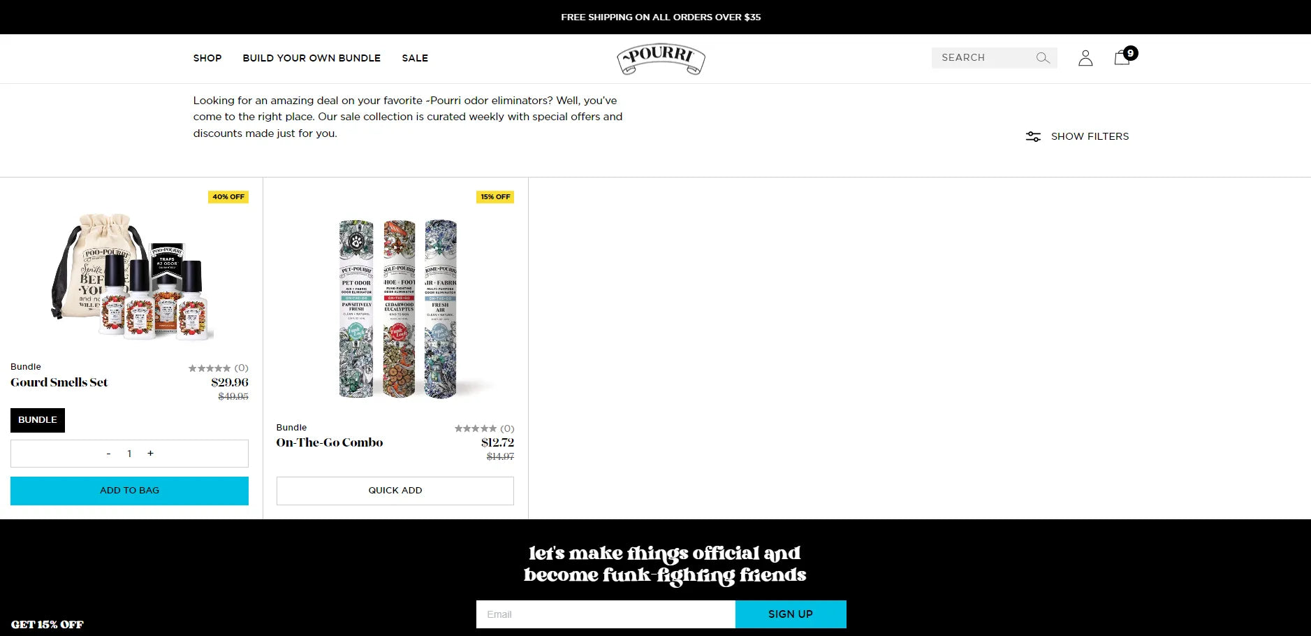
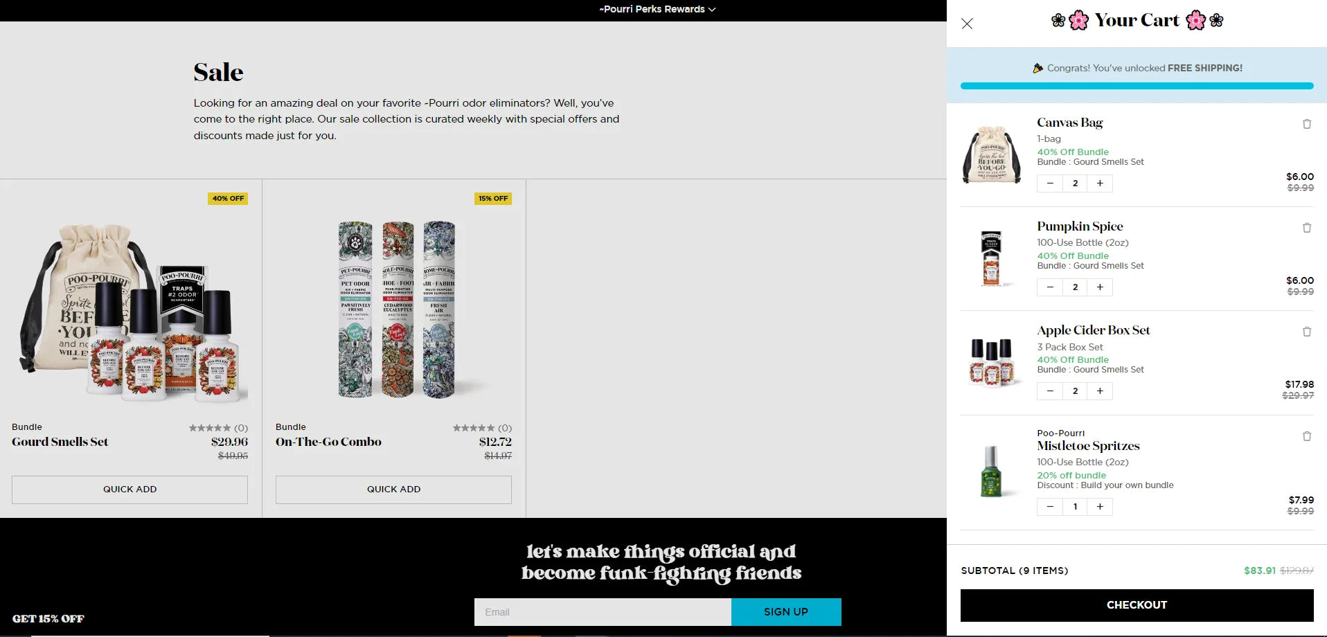
Pourri’s click-through landing page shows its destination page on the same interface, which somehow helps improve user experience
What they have:
- The offer couldn't be more attractive.
- Limiting the number of products helps attract customers' attention.
- Pourri is also very sophisticated in placing the color of the CTA button in complete contrast with the general background color.
Pro tip: The user interface (UI) is crucial in any website setting. Focus on Improving it to enhance user experience (UX) and increase conversion rates.
5. True Botanicals
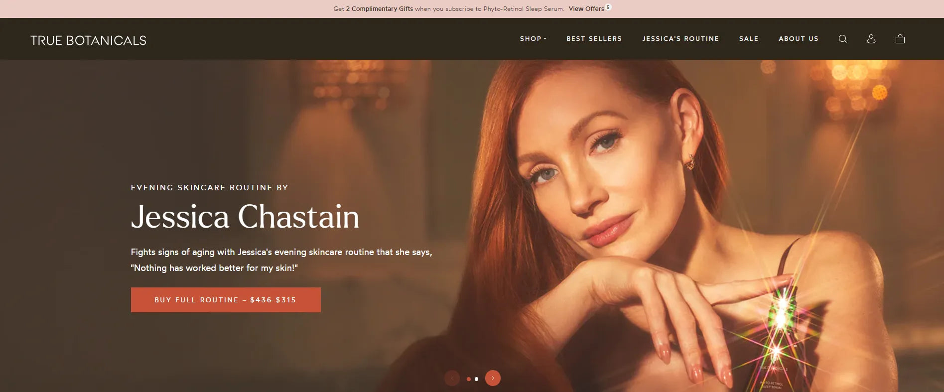
True Botanicals showcases its outstanding header on the click-through landing pages
What they have:
- Stunning visual with a representative image of a famous actress, convincing customers to have the same product experience as them.
- The subheading once again calls on customers to take action by quoting the actress's words.
- They also have an effective CTA button that publicly announces incentives for customers when purchasing the product.
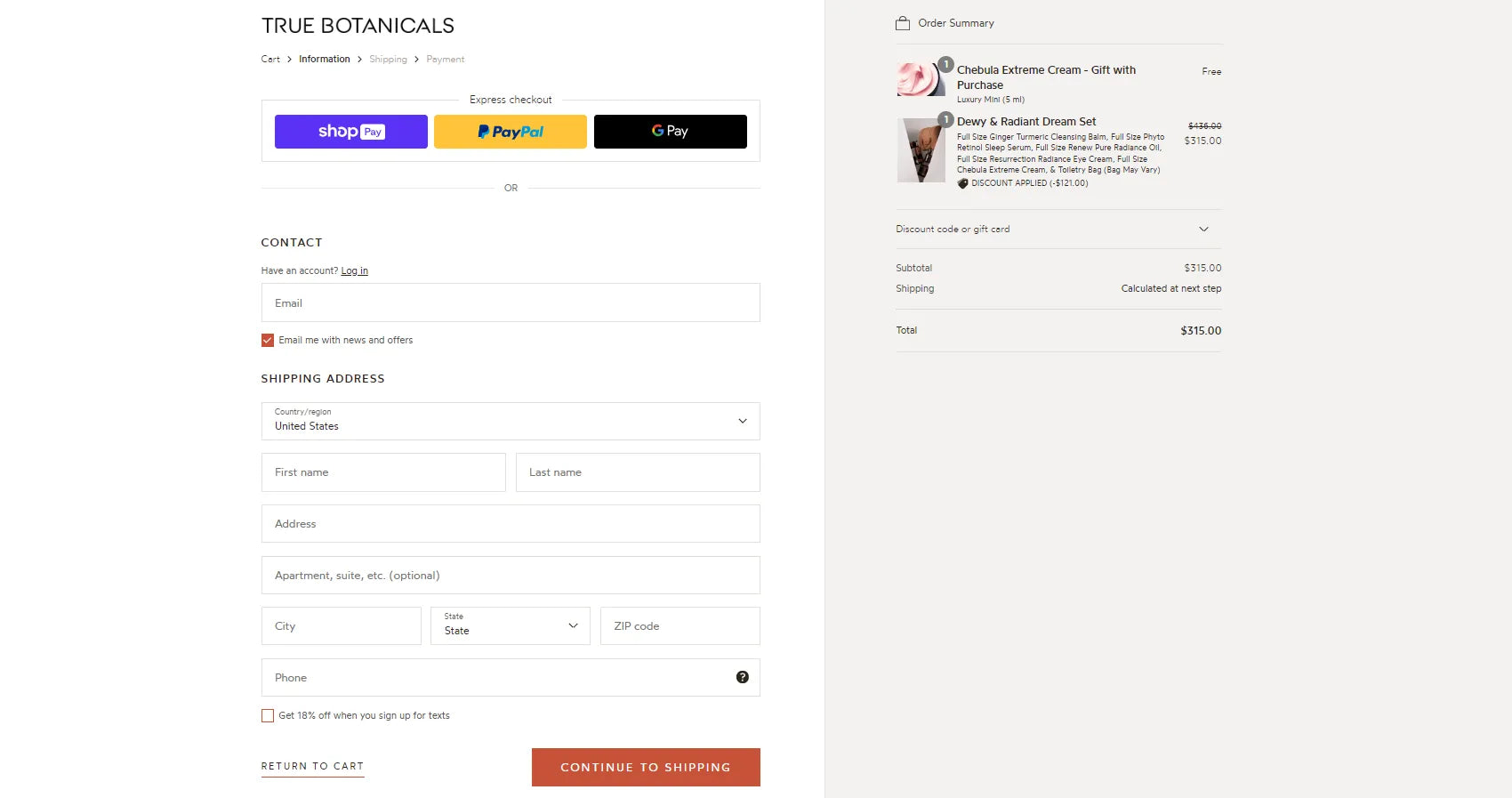
The click-through destination page of True Botanical is the checkout page.
Pro tip: Most stores have a destination page for their click-through landing page, the checkout page, because this is one of the final steps to boost sales with customers. So don't hesitate to spend effort on design to optimize your checkout page.
Learn more: How to Customize Your Shopify Checkout Page in Minutes
Conclusion
In conclusion, the significance of a click-through landing page lies in its ability to seamlessly guide visitors towards a specific call-to-action, fostering a smoother transition through the sales or conversion funnel.
By featuring a compelling CTA that redirects users to the next stage of engagement, whether it be making a purchase, filling out a form, or exploring more detailed information, click-through landing pages enhance user experience and contribute to the overall success of a marketing sale funnel.
With their focused and purposeful design, these pages play a pivotal role in driving conversions and achieving the desired objectives of a marketing campaign.
In the end, we believe that you will discover the keys to boosting buyers' interactions. For more information on mastering eCommerce and Shopify, take a look at GemAcadeny - A knowledge hub for page building and overall eCommerce success.


 Facebook Community
 Change Log
 Help Center


