How to Create an eCommerce Website Conversion Funnel in 2025

From landing on your website to exiting it, customers go through a journey.
Sometimes, this journey could end too soon — without any action or purchase — and sometimes, they end up being your paying customers.
Turning all these website visitors into your paying customers needs a great strategy and a memorable customer journey. And that’s why you need to optimize your website conversion funnel.
In this article, we’ll guide you on how to create an eCommerce website conversion funnel and will share the best practices to help you increase website conversion.
The Basics of Website Conversion Funnel
First off, let’s understand —
What is a website conversion rate?
In simple terms, the website conversion rate is the percentage of website visitors that take the desired action on your website as per “your goal”.
“Your goal” could be anything — a sale, free trial signup, newsletter subscription, membership signup, or any other business goal you’re aiming at through your website.
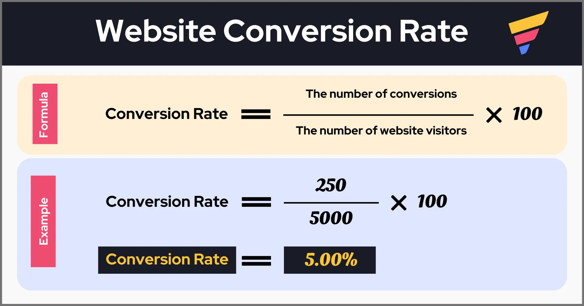
As per the given example, if 250 website visitors out of a total of 5000 website visitors convert (e.g., purchase your product), your store’s website/sales conversion rate is 5%.
Now, the main question —
What is a Website Conversion Funnel?
A website conversion funnel is the strategic design and structure that takes customers through the journey from being a website visitor (or potential customer) to an actual buyer.
Typically, in this customer journey, a customer would go through multiple layers of your website—starting from the homepage to the checkout page—to complete a purchase, and you can even take the funnel to the next level, i.e., encouraging the customer to repurchase from your brand.
The below explanation would make it easier to understand and visualize what we just mentioned.
Learn more: Building an eCommerce Website from Scratch — a Complete Step-by-Step Guide
How Do Website Conversion Funnels Work in eCommerce?
There are different models for conversion funnels (aka marketing funnels); however, we’re going to talk about the model that is inspired by the AIDA model as it’s highly relevant to eCommerce.
The AIDA model has four stages:
AwarenessInterestDesireAction
For an eCommerce website conversion funnel, there’s one more stage, i.e., “Re-engage”. We’ll go over each of these stages in detail.
Stages of an eCommerce Website Conversion Funnel
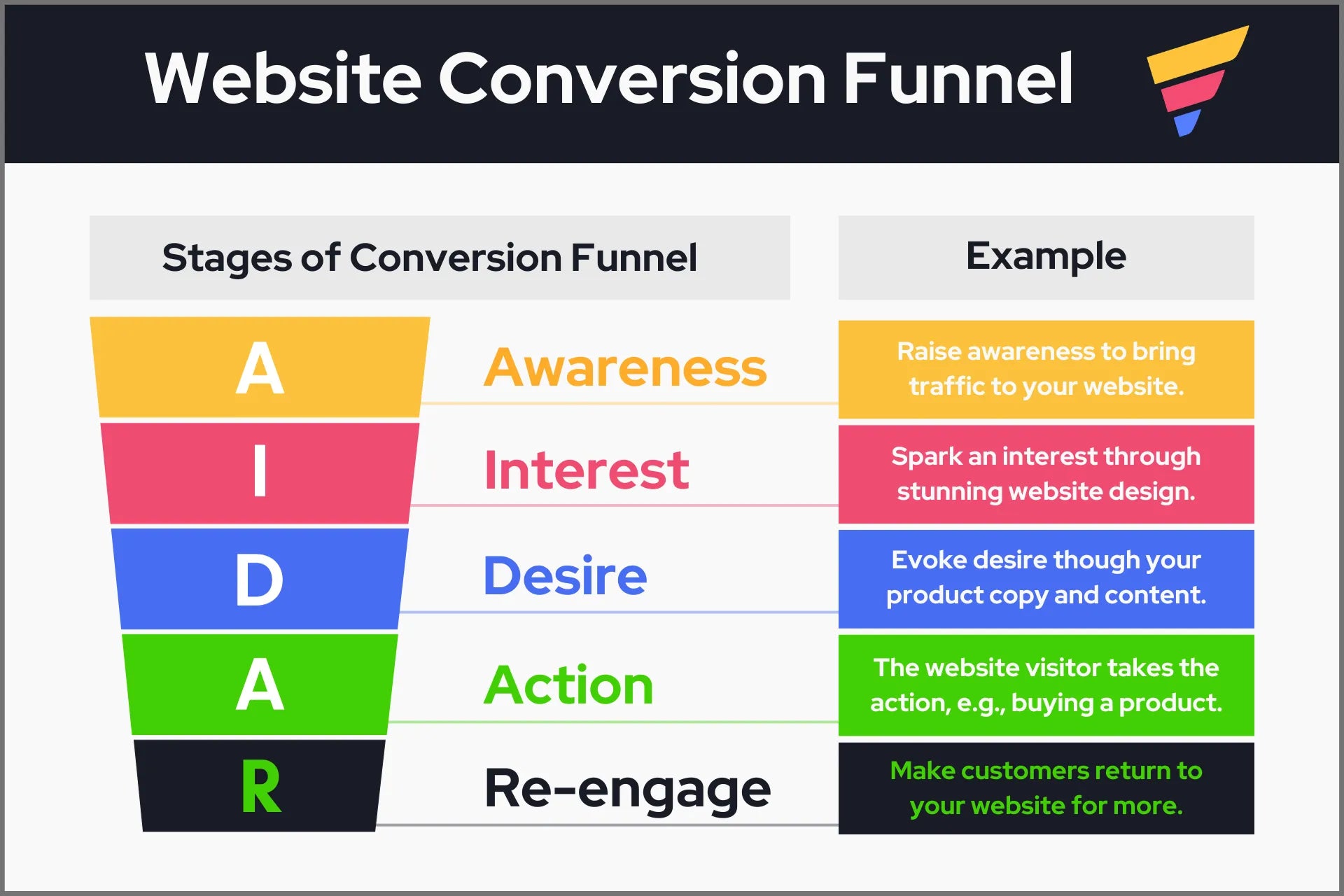
Let’s briefly understand how it works:
- Awareness
This is the first stage where a customer comes to know about your website. A customer may land on your website through any of the channels such as search engines, social media, paid ads, or referrals.
- Interest
Now, the customer reviews the details about your brand through different pages such as the homepage, collection, and product pages — and starts gaining interest in your offering, i.e., your product/service. Your website design plays a significant role here.
- Desire
At this point, the customer is really keen on making a purchase and is just one step away from taking the final step, i.e., to buy your product/service. Some of the crucial elements that help turn your customer’s interest into desire are your product copy, images, social proof, discount offer, etc.
- Action
Finally, after being convinced, the customer would complete the action depending on your offering, e.g., buying your product, becoming a member, starting a free trial, and so on.
- Re-engage
Once a customer has purchased your product, the customer would likely come back to your website for more—as long as you give them a good reason to do so.

What is the average conversion rate for websites?
Littledata's survey which covered 3,223 Shopify stores in September 2022 and the average conversion rate of the Shopify stores was found to be 1.4%.
The average conversion rate in the eCommerce industry is around 2.5% to 3%. But keep in mind — this doesn't mean your conversion rate cannot go above 3%.
Littledata’s survey report suggests a conversion rate of around 3.2% can be considered a good conversion rate for a Shopify store—and with a 4.7% conversion rate, you'll be in the category of the best 10% Shopify stores.
Learn more: Unlocking the Potential: Boosting eCommerce Average Order Value
How to Create a Website Conversion Funnel
Step 1: Define Your Conversion Goal
As we mentioned before, a conversion goal may vary depending on the business strategy or goals. However, when talking of eCommerce, mostly entrepreneurs refer to sales when they mention the conversion rate.
That said, it’s not necessary to only look for sales. You might want to build a community of potential buyers or get newsletter subscribers to level up your email marketing game. Both these goals ultimately lead to more sales.
The point is—you need to be clear about the goal—so that you can design your conversion funnel strategically and specifically for your goal.
Step 2: Research Your Target Customers
Ideally, a business is expected to know its customers; however, we’re not talking about knowing your customers at a superficial level.
We’re talking about researching your customers’ traits and behaviors at a deeper level to build an effective conversion funnel. So, before you proceed further with your conversion funnel, make sure you know your customer as precisely as possible.
For example, you can use a tool like Hotjar or Heatmap to see the user behavior on your website. It allows you to visualize which sections of your website get more attention and which ones are neglected by the visitors.
Also, you can ask your customers, conduct surveys, analyze the store visit data, or any other method suitable to gather information about your customers’ behaviors and preferences.
Step 3: Design a Website Conversion Funnel
Now comes the most important part, and thus, we’ll go into the fine details.
3.1 Visualize an Ideal Customer Buying Journey
An ideal customer journey on an eCommerce website may look like this:
- A customer lands on your homepage.
Most customers will first visit your homepage before going to any other page.
At this point, the customer is in the “awareness” stage. Make sure your homepage copy and visuals are top-notch, and more importantly, it must show what your brand is about.
Especially, the above-the-fold section on your homepage plays a crucial role in making the visitor stay and explore more on your website.
Learn more: 10+ Best Above the Fold Examples to Get Inspired
- The customer clicks on the collection widget.
Collections make it easy for customers to find exactly what they’re looking for. It makes the customer experience smooth. It also helps you move the customer into the “interest” stage.
If you’ve created a specific collection for this category, search engines are likely to prioritize it in results, and that way, you can also reduce one step from the customer journey.
Learn more: Shopify Collections: A Complete Guide
- The customer chooses a product and goes to the product page.
Next, the customer comes a step closer to buying but isn’t ready yet.
Your product copy (description) and images play a significant role in helping the customer make the decision.
At this stage, the customer is still in the “interest” stage and can move to the “desire” stage depending on how well your product page is designed.
How to Create High-Converting Shopify Product Pages
- The customer adds the product to the cart.
If you’re successful in evoking the “desire”, the customer will add the product to the cart, and thus, enters the “action” stage.
But remember — at this stage, you also have the opportunity to upsell or cross-sell your products. Meaning, offer relevant products on your cart page so that customers can add them to their cart and it will help you increase your average order value (AOV).
- The customer goes to the checkout page.
Now, the customer moves toward one of the final stages, i.e., “action”.
Shopify’s one-page checkout can help you reduce the friction at this stage.
It could be beneficial to have at least 2-3 different payment options because different customers may have different payment preferences.
For example, some customers may not trust to make payment to a new website directly from their debit/credit card. But if you offer PayPal, they may feel secure to make the payment.
- The customer lands on the thank-you page post completing the payment.
Once a customer has purchased your product/service, you shouldn’t consider the job done. You still have the opportunity to make them your repeat customer.
For example, on the thank-you page, you can offer a discount coupon or a gift card for future purchases. This way, you can start building loyalty with your customers.
3.2 Use GemPages — the Page Builder App
So, we talked about how all these different pages help move your customers from “awareness” to “action” and then the “re-engage” stage. But your store design is the key factor that helps you get a better conversion.
GemPages helps create all those pages easily, efficiently, and effectively.
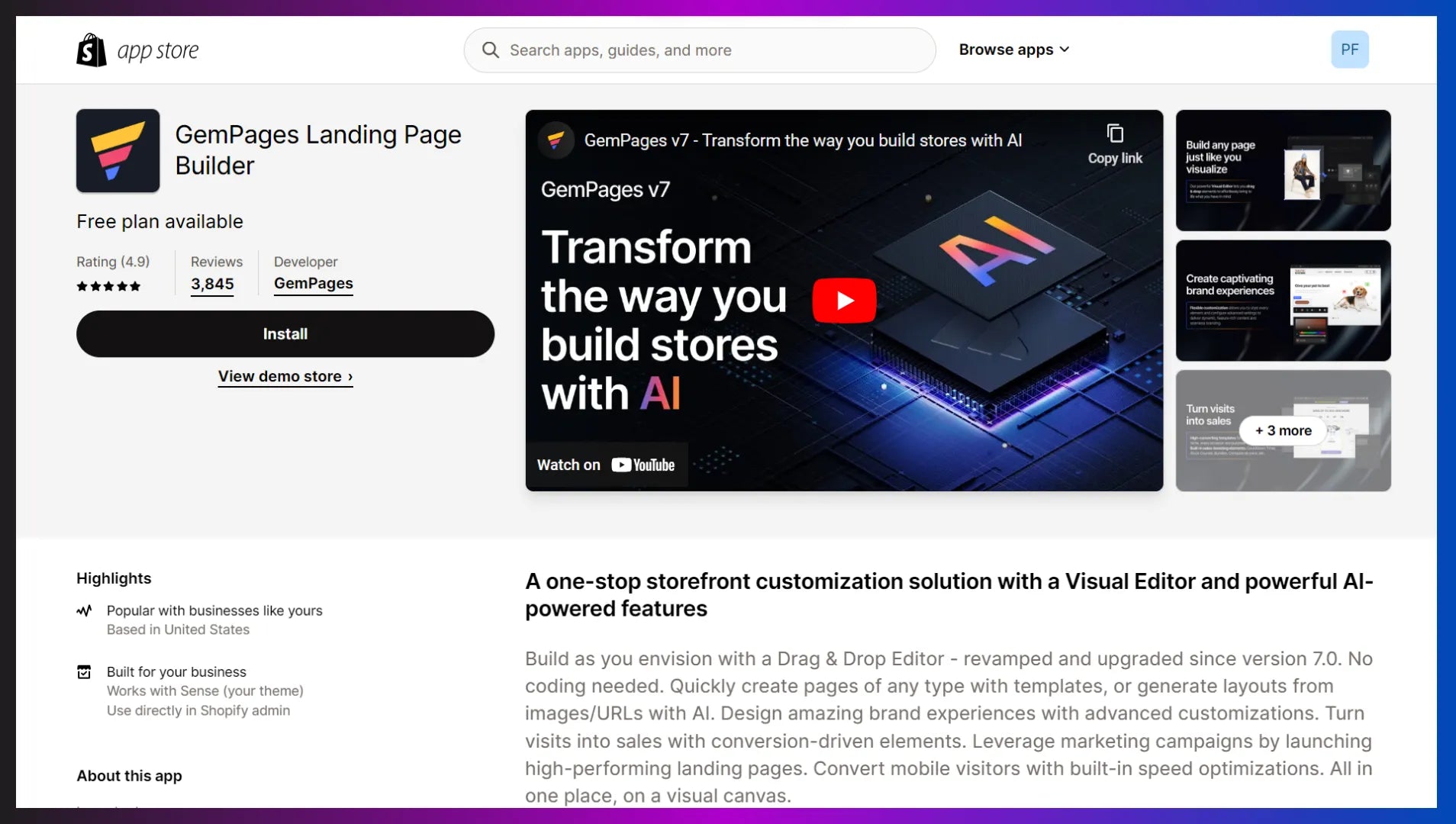
GemPages is one of the most loved Shopify page builder apps with more than 3,800 reviews and an impressive overall rating of 4.9 out of 5 stars.
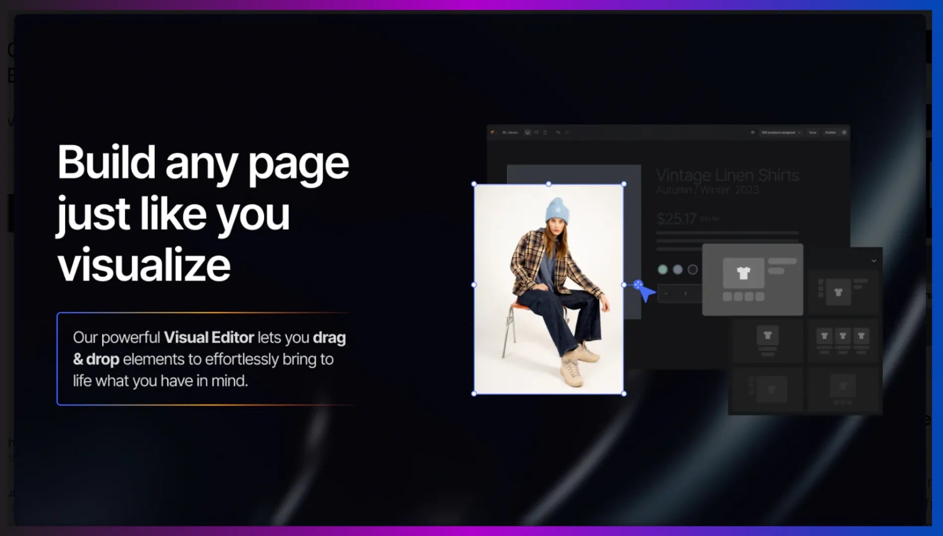
You can use various advanced features such as an AI-powered image-to-layout feature, a visual editor, plenty of design elements, and professionally designed templates as well.
In a nutshell, the one app to design your entire website conversion funnel.

3.3 Create Content to Attract & Conversion
“The ideal customer journey” helps you visualize your conversion funnel; however, customers do not always follow the same journey.
The homepage is not the only page where your customer would land in the awareness stage. For example, let’s say you’ve created a blog and you’re regularly publishing content related to your target customers.
Chances are customers may land on your blog when searching for content relevant to your product. And thus, your blog might help them with awareness of your brand and then move them to the interest stage.
Similarly, the journey from desire to action may require a solid reason to buy from your brand/website. Once again, content plays a crucial role here as well.
For example, while buying expensive products, customers often want to ensure the product has proven results. So, you can create case studies and share your customer success stories. It will help your buyers to move from desire to the action stage.
3.3 Create a Conversion-Oriented Landing Page
Creating a dedicated landing page is a great way to optimize your conversion rate.
But — why have a landing page when you already have an entire website?
Since your website content focuses on several important aspects of your brand, it gives customers so much to explore.
The benefit of a landing page is that it focuses on a specific conversion goal.
For example, let’s say you’re selling beauty and personal care products. Your store might have hundreds of products for customers to choose from.
Now, you can create a bundle offer combining your best-selling and frequently bought together products and offer the bundle as a subscription box offer. By doing this, you can not only entice customers to go for the deal but also increase your average order value (AOV) and recurring revenue as well.
For such a big offer, you can create a landing page that lists the benefits, features, social proof, and everything that can help you get the maximum conversion possible.
Pro tip: Designing a stunning and high-converting landing page may seem like a complex and highly professional skill. But again, you can use the GemPages - landing page builder to design professional and high-converting landing pages with no design or coding skills.
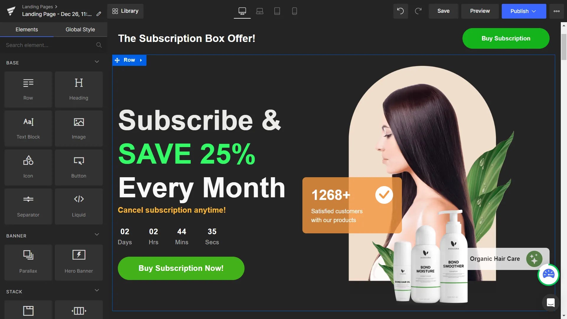
GemPages lets you customize your landing page design with an easy-to-use visual editor. You can select a template from the library and then just drag and drop elements to easily customize the design for your brand.
Step 4: Analyze Your Funnel Performance
4.1 Review and Analyze the Key Metrics & Data Points
Once you’ve optimized your funnel, it’s important to track how it’s performing to keep enhancing it for conversion optimization.
First, analyze all these basic metrics or data points to get an overview of your website performance within a specific timeline:
- Website traffic data/total visitors
- Total conversions depending on your goals:
- Examples:
- Total sales within the given timeline
- Total email subscribers gained
- Total members joined the community
- Page view data
- Browse abandonment and cart abandonment data
You can get this data from your eCommerce store analytics and Google Analytics 4 (GA4). If you’re using Shopify, go to your Shopify admin and click on the Analytics tab on the left sidebar to access these data points.
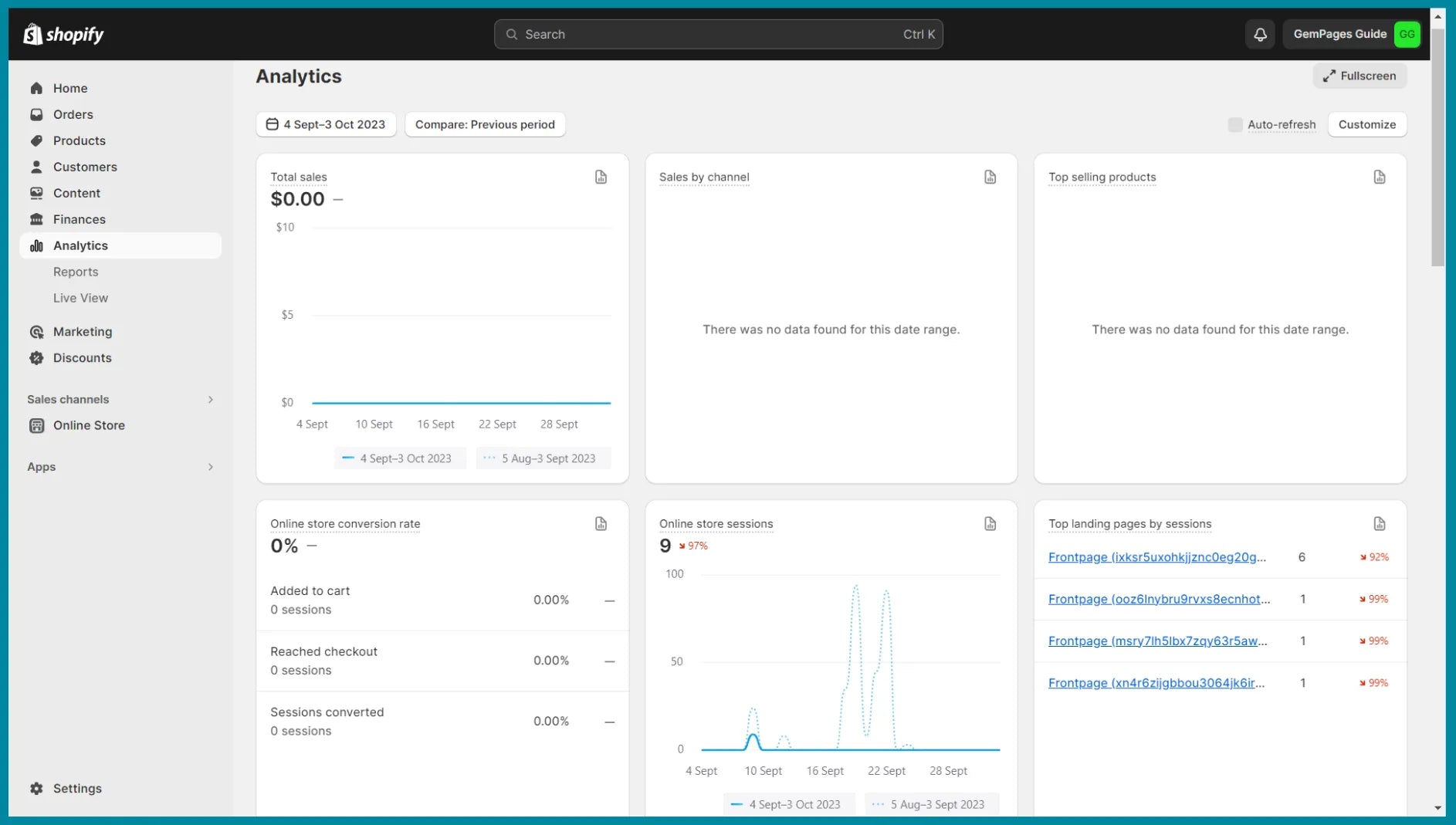
Using the website conversion rate formula that we shared earlier, calculate your website’s conversion rate.
4.2 Review and Analyze the Purchase Journey Report in GA4
Side note: If you haven’t set up GA4 on your store yet, we have a detailed tutorial on how to set up GA4 on your Shopify store.
If you already have everything set up in GA4, go to the GA4 dashboard, and click on the Reports tab in the left sidebar. For this tutorial, we’re using Google’s demo GA4 account with the “GA4 - Google Merch Shop” property.
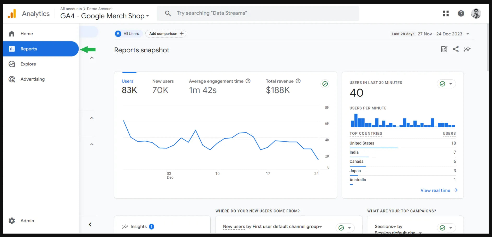
Under the Reports tab, click on Monetisation > Purchase journey. You’ll see the funnel data and graph with 5 steps:
- Step 1: Session start
- Step 2: View product
- Step 3: Add to basket (i.e., Add to cart)
- Step 4: Begin checkout
- Step 5: Purchase
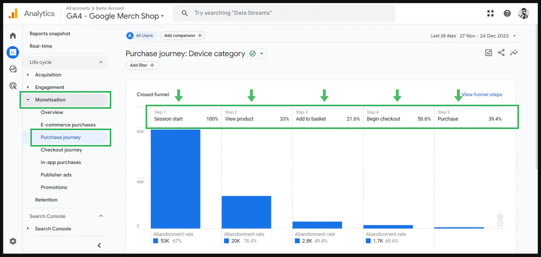
When you scroll down, you’ll find one more helpful report where you can see the data points for the Purchase journey with different criteria such as:
- Device category
- Country
- Region
- Town/City
- Language
- Browser
As you can see in the below image, the Device category dropdown shows you the data points for different devices, i.e., mobile, desktop, tablet, and smart TV.
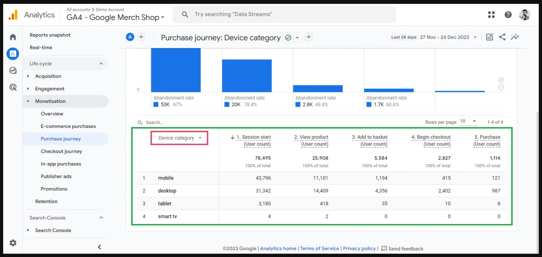
These data insights could be very helpful in seeing how your funnel is performing, and they’ll also help you in the next step when you need to identify and fix any funnel leaks.
You may find this tutorial helpful to understand how to build a custom funnel in GA4:
Step 5: Identify and Fix any Funnel Leak(s)
Based on your review and analysis of your funnel performance, now it’s time to identify any “leaks” in your funnel — meaning, a weak point in your website conversion funnel where your customers are exiting the funnel before taking the “action”.
Let’s say you identified your customers are adding products to the cart; however, they’re not moving forward to the next stage and abandoning the cart. Now, go to your website conversion funnel and check any possible issues or improvement areas on the cart page.
Dollar Save Club — one of the most popular Shopify-powered brands — is a great example of how you can optimize your cart page for conversion.
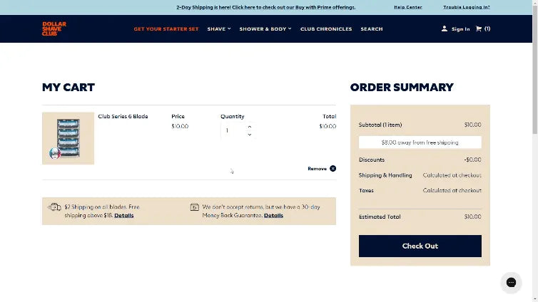
On the homepage, Dollar Shave Club has listed its “Club Series 6 Blade” product for $10. When you add it to the cart, it shows that you can qualify for free shipping by spending $8.00 more, which makes the total of $18.
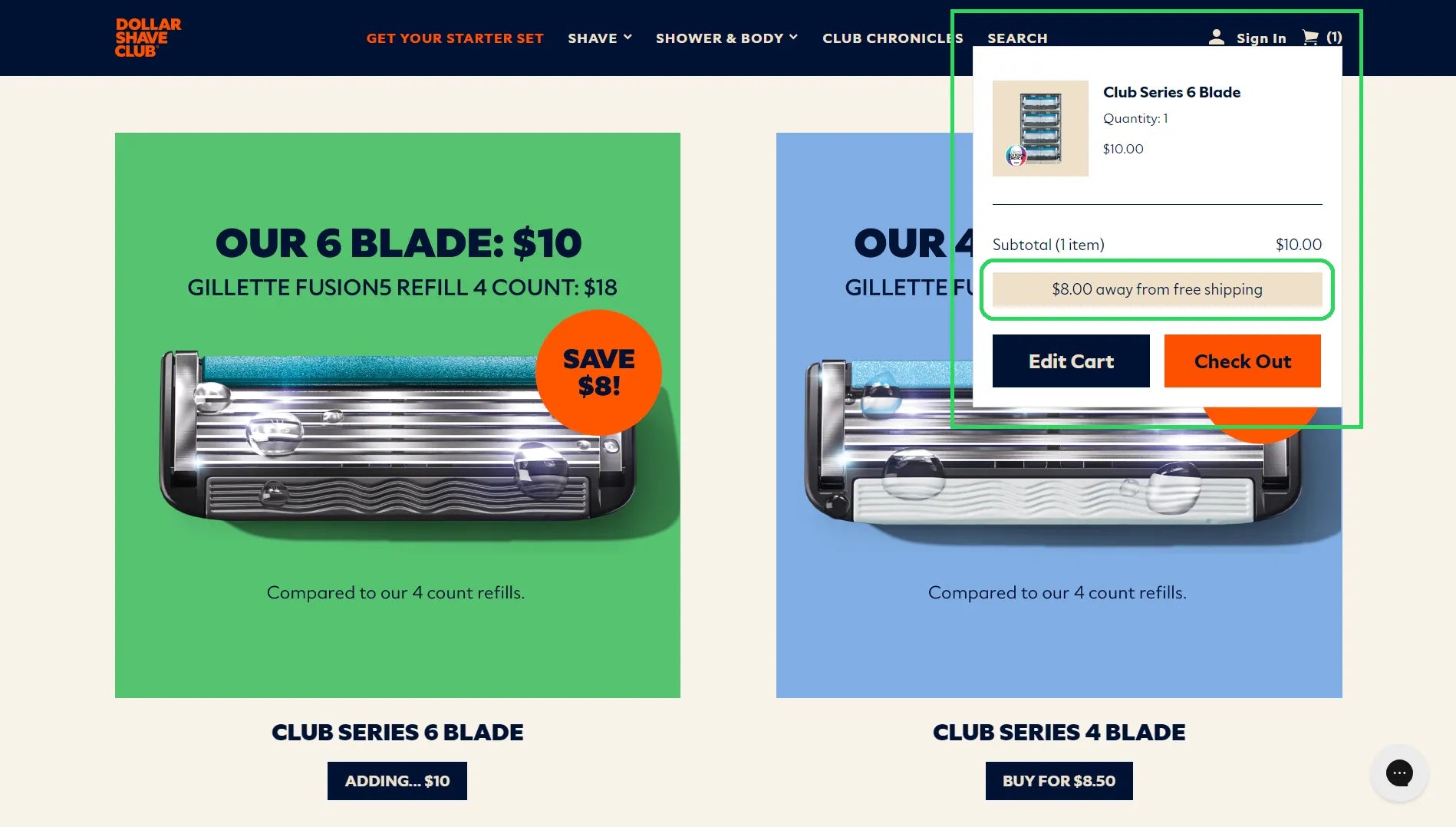
So, if you add two quantities for the item, it displays that your product is qualified for free shipping. This gives an instant boost to customer’s desire to move forward and purchase the product.
Learn more: How to Do Free Shipping on Shopify? (+Evergreen Tips)

Best Practices to Increase Website Conversion
We’ve already covered the most important elements to optimize your website conversion funnel. Now, let’s share some more tips for website conversion optimization.
Showcase the Social Proof
According to the Spiegel Research Center, 95% of buyers read online reviews before making a buying decision. Customer reviews play an important role as social proof in your website conversion funnel.
That said, it’s not necessary that you can use customer reviews only. Here are some other ways you can enhance the social proof in your funnel:
- Press mentions
- Expert recommendations
- Case studies
- User-generated content (UGC)
- Awards and recognitions
Throughout the customer journey, make sure customers can see some form of social proof that can help them make the buying decision.
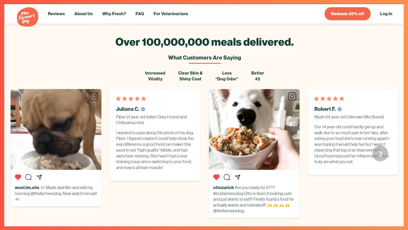
The Farmer’s Dog uses a great combination of user-generated content (through social media posts) and customer reviews on its homepage.
Use Lead Magnet to Provide Value
A lead magnet is a freebie (typically, a digital product, service, or reward) offered by a brand to capture the email and/or other contact details of potential customers.
Here are some of the lead magnet ideas for your eCommerce business:
- Free gift card
- Discount coupon
- Free shipping
- eBook guide
- Quiz
- Free Consultation
Keep in mind — whatever lead magnet you create, it must provide value and it shouldn’t be created just for the sake of getting email subscribers. If your lead magnet doesn’t provide value, you might lose the trust of your customers. A costly mistake, isn’t it?
Care/of is a brand that offers personalized vitamins and supplements on a monthly subscription. It uses a quiz to get to know the customers better and capture the email address to save the recommendations.
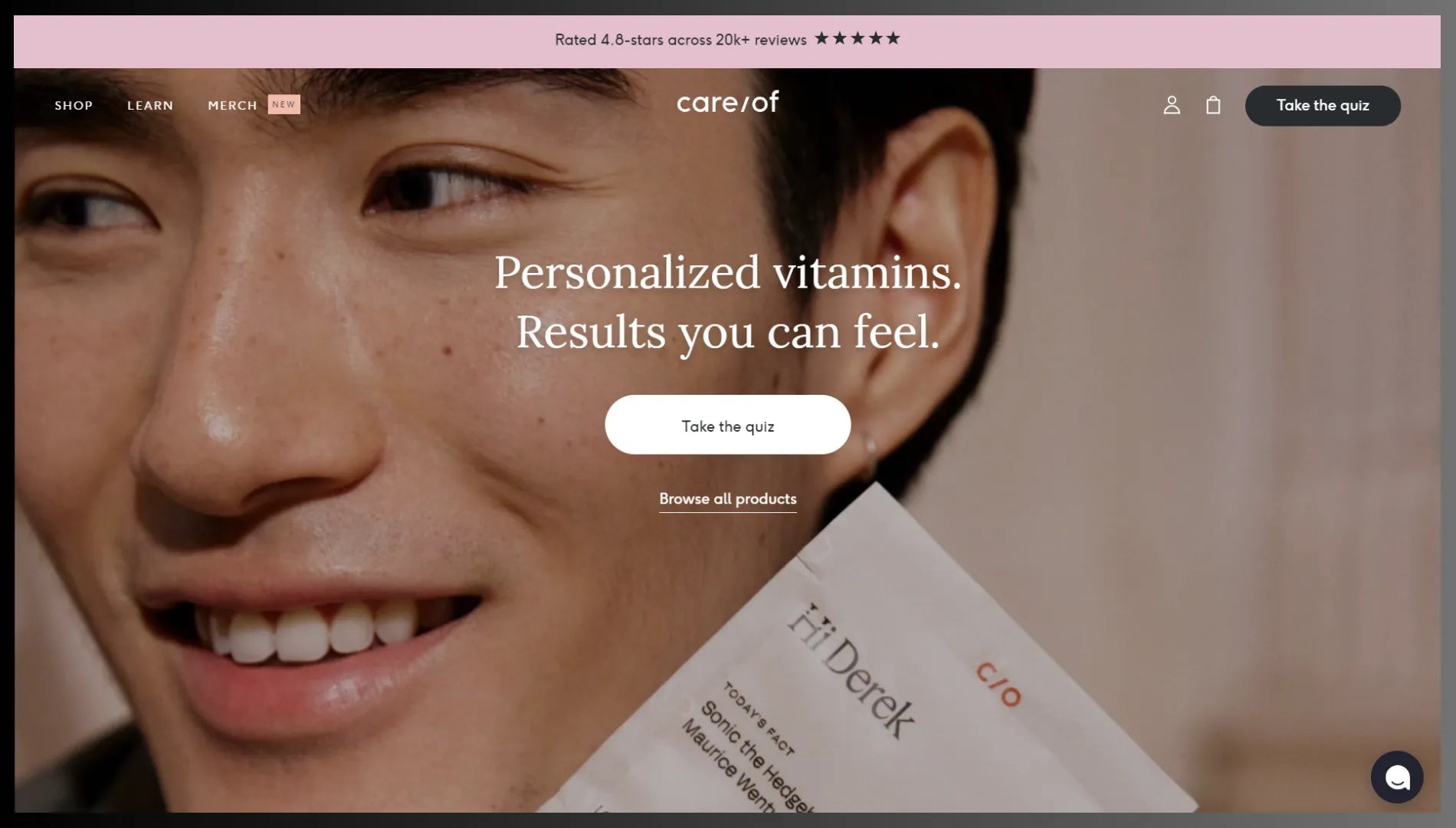
As soon as you land on its homepage, it encourages you to take a quiz to offer you a personalized plan.
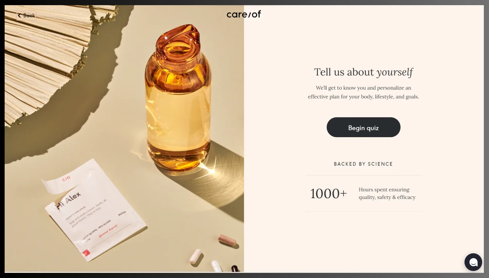
When you go to the quiz page, you’ll also see the information about how the brand is paying attention to quality, safety, and efficacy which helps build trust with customers.
Build a Community in Your Niche
Building a community around your niche gives you a great opportunity to engage with your customers. More importantly, you get more time to entice the community members to become your loyal customers.
Especially if your website’s funnel has a “leak” issue, building a community can help resolve it by getting those customers back in the funnel. Your community members will stay connected with your brand even when they’re not visiting your website.
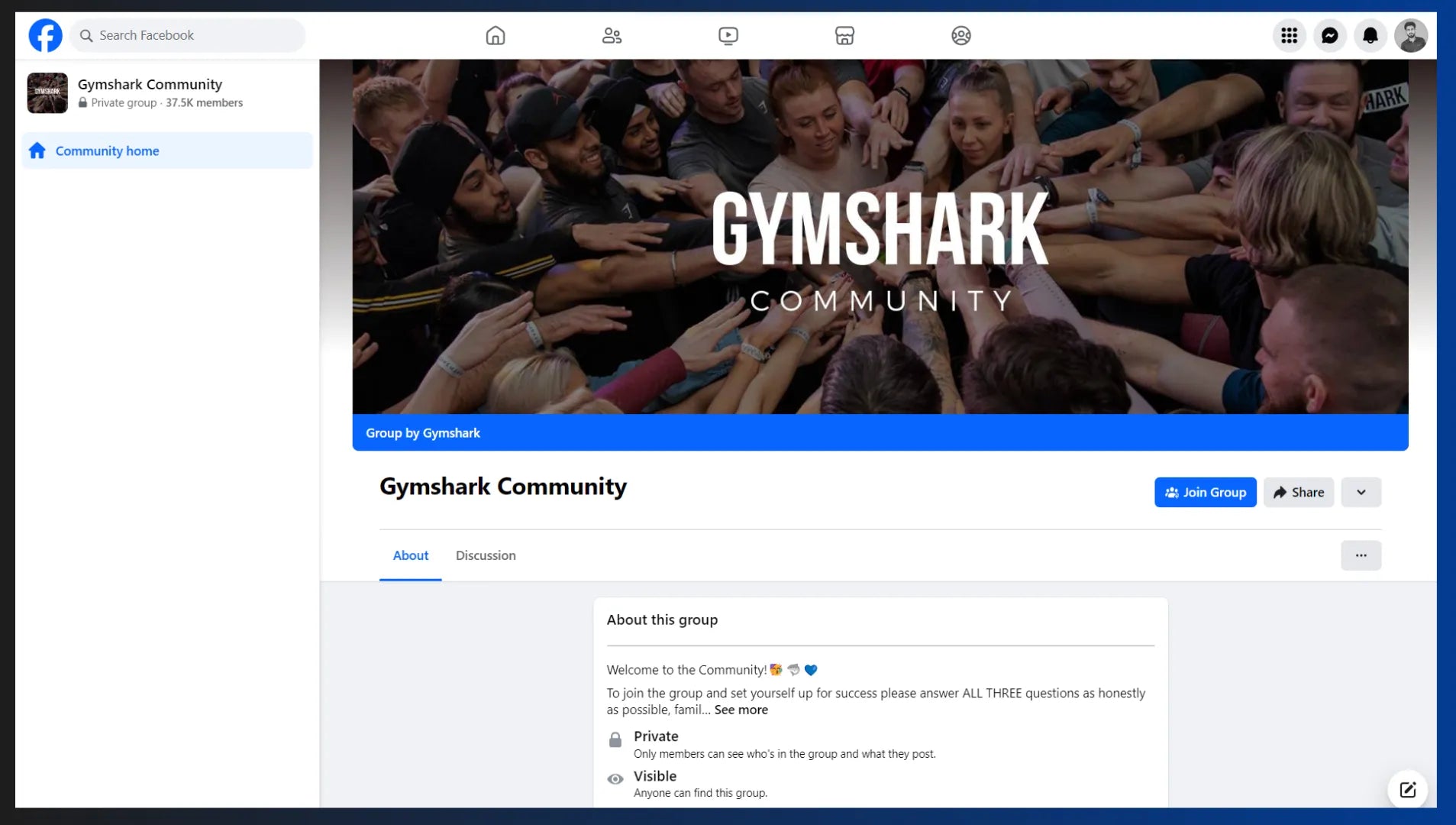
Gymshark — one of the most popular Shopify-power brands — is a great example of a community built by an eCommerce brand. It has a Facebook community with over 37,000 members.
Hire a Professional Copywriter
Although writing your website copy may seem like an easy task, it’s not that easy-breezy! Your copy needs to be personalized and persuasive to drive your customers toward taking action.
Hiring a professional copywriter not only makes your job easier but also adds an element of expertise to your website copy. Also, when hiring a copywriter, make sure to explain your target audience, product, brand style, and conversion goals as precisely as possible.
Optimize Your Website Conversion Funnel Now!
Every single visitor landing on your website is an opportunity for your business.
Make sure your website is ready to take them through a memorable journey along with a great customer experience.
Your website is the key to growing and scaling your business. Design your entire website keeping the conversion funnel in mind.
Start building your website conversion funnel with GemPages now! Join GemPages Facebook community to learn from other entrepreneurs who are thriving their eCommerce businesses through conversion optimization.


 Facebook Community
 Change Log
 Help Center


