


 Facebook Community
 Change Log
 Help Center


The Best B2B Landing Page Examples for You to Emulate Success

Business owners know first-hand that a text-filled, eye-straining landing page might just be the thing that makes your bounce rate skyrocket. That said, what if these pages are not for the everyday shoppers but other online sellers, AKA a business-to-business (B2B) landing page?
We believe that no matter the purpose, every landing page can be visually stunning and informative. And, it is important to direct them to the right audience with clear information
Check out our curated list of the best B2B landing page examples in this blog post.
Introduction to B2B Landing Pages: Everything You Need to Know
Before hopping onto the best B2B landing examples, let’s walk through the basics of a B2B landing page and how to make it work for you.
What is a B2B landing page?

B2B landing pages are a great marketing tactic that boosts B2B relations between enterprises across different fields. Source: Freepik.
A B2B landing page is a standalone webpage of an eCommerce store whose targets are other business owners. This webpage is designed to deliver information about a particular product or service that is made for other merchants.
The ultimate goal is similar to a typical landing page, where clients are guided toward a specific action, such as signing up for an upcoming event or making a purchase.
By optimizing for SEO and utilizing other marketing tactics, B2B prospects can land on your landing page through a search query, social media ads, or a newsletter.
What are the differences between a B2B and B2C landing page?
The primary difference between a B2B and B2C landing page is the type of product itself. While a B2C business carries mainstream and easily accessible products that are used by the average consumer, a B2B’s service is usually more niche and specialized.
However, there are online stores whose products are fitting for a wide array of customers, thus, their landing pages are either more diverse or kept general and simple. It’s all about each business’ preferences.
Below is a run-of-the-mill comparison list between these two common landing page types for your consideration.
|
B2B landing page |
B2C landing page |
|
|
Target audience |
Enterprises and startups |
Individual shoppers |
|
Purpose |
Provide in-depth information and build a long-lasting relationship |
Sell products quickly and improve conversion rates |
|
Language |
Include more technical and advanced terms |
Emotional and casual language |
|
Content |
Content-rich with an occasional use of visual components |
Compelling visuals and eye-catching headlines |
Learn more: How to create a D2C and B2B experience on your Shopify store?
What are the best B2B landing page practices?
Your B2B landing page should house components that are the cream of the crop only. After all, you would not want to invest it all in a webpage just to design it haphazardly, would you?
Check out these B2B landing page best practices to start transforming your online store.
- Compelling value proposition
A value proposition targets your client’s pain points and provides a solution for them. This is the foundation of every landing page.
It is recommended to find a unique aspect of your particular service that sets you apart from the competitors. Once your customers have a solid reason to pick you over other similar stores, that is when you have successfully created an effective value proposition.
Pro tip: Be short and sweet. Make use of the headline to convince the users to stay on your page instead of a lengthy copy.
Learn more: Shopify Fonts 101: How to Find the Best Font Combinations for Your Shopify Store
We understand not all B2B landing pages are suitable for editorial photographs, which is why visuals in this case refer to the hero image, video tutorial, illustrations, and even tidbits of visual details on the page breaks.
For instance, a landing page introducing a newly dropped product should contain visual elements that showcase the product in its glory. Whether it be GIFs, lifestyle photographs, or sneak-peak videos - each visual detail needs to be cohesive with your brand while still keeping a balance with text-form information.
Learn more: Advertorial — Everything You Need to Know
Unlike your homepage where various actions are encouraged to be taken at once, the key to increasing B2B landing page conversion rates is by implementing one clear call-to-action. Your customers should know exactly what to click and where to go next to learn more about your product just by scanning the page. This calls for explicit CTA buttons and a simplified if not completely omitted, navigation menu.
As mentioned, the nature of a B2B product might be hard to fully convey through one single webpage. This is why you need a strong copywriting strategy to deliver informative and compelling content to capture customer’s attention. Unlike B2C landing pages, the use of professional vernacular is not discouraged. That said, don’t overdo it to avoid turning the page into a drawn-out report that bores your customers. Pay attention to structure and hierarchy to make your page flow better.
Always consider new clients a main target when building your B2B landing page, hence the importance of social proof. Magazine endorsements, customer testimonials, and star ratings are ideal additions to a landing page. If prospects are still skeptical, these elements could be the one thing to reel it in and get them to proceed towards conversion.
If you're unsure about where to start, consulting with an eCommerce consulting firm Elogic Commerce can help you implement these best practices effectively
Learn more: The Ultimate Landing Page Checklist You Need in 2024
Top Examples of B2B Landing Pages to Get You Inspired
1. Shopify
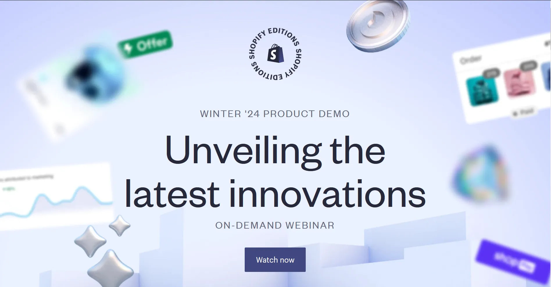
Shopify makes use of a minimalist landing page to promote its upcoming webinar.
Shopify is no stranger to B2B marketing since it is one of the most reputable eCommerce host platforms in the market. With experience in handling both sides of the eCommerce industry, Shopify knows how to appease casual customers as well as store owners. Its B2B landing page is solid proof of how to utilize this marketing tool to the company’s benefit.
Aiming to reach merchants in its ecosystem, this landing page advertises Shopify’s upcoming webinar that focuses on the latest Winter Edition product launches. The page is to the point while still managing to deliver all the much-needed information. The omission of the navigation bar and Shopify’s signature color scheme help users take in the information more effectively, with a subtle cue to show that this is a Shopify Editions special event.
To us, this one takes the cake for one of the most well-crafted event landing page examples.
2. Omnisend
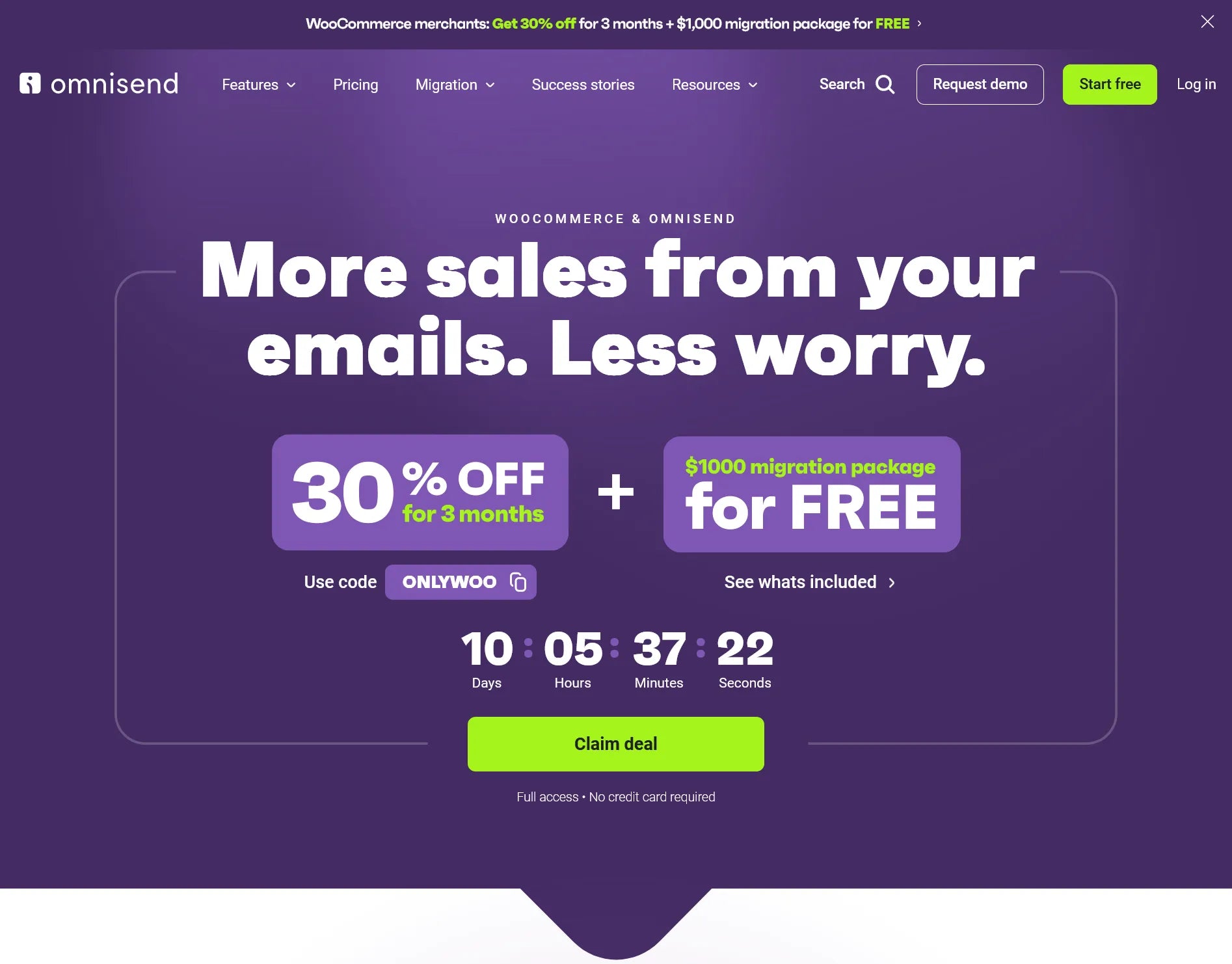
WooCommerce merchants are the target audience of this package deal from Omnisend.
How can one resist such an enticing tagline from Omnisend? In regard to the attention-grabbing factor, this B2B landing page is nothing short of brilliant. This page is dedicated to WooCommerce users, and Ominisend has done a great job at promoting this exclusive deal. Without scrolling down, clients are met with all the information needed to proceed to the next step. The countdown timer is the icing on the cake to impose a sense of urgency.
Want to learn more? A full list of features, different plans, and a tutorial video await you right below the fold, with another hard-to-miss CTA button at the very bottom as a finishing touch.
3. Typeform
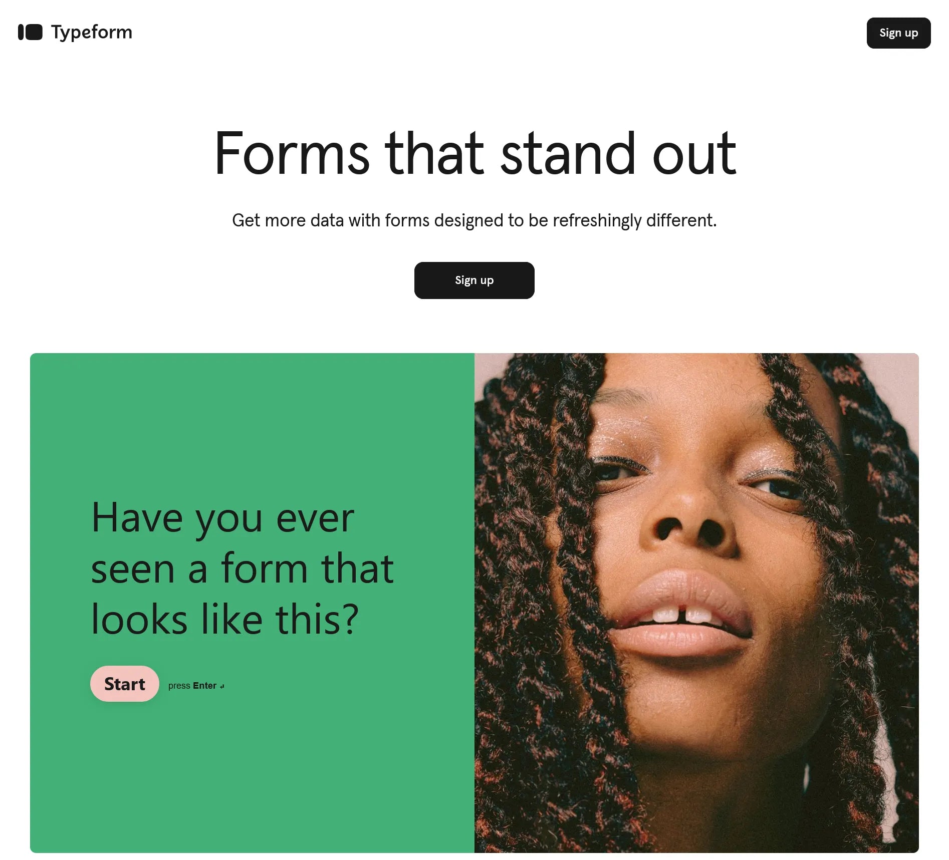
Make amazing commercial forms with Typeform - an enterprise-level form builder.
Who said a B2B landing page has to be an eyesore of overflowing text? Typeform’s snazzy landing page will prove them wrong.
Every detail flows well with each other, all while being supported with a pleasant font and color combination. The page follows a Z-shaped reading pattern, hence creating a natural eye path while scrolling. Proudly flaunting the big brands that are using its service is a smart marketing move, while showing a resounding number of integrations further instills a sale-driven decision in the visitor’s minds.
With a visually humble product like a business form, creating stunning visuals might seem like a difficult task. However, Typeform has done a flawless job at putting snippets of images along the way to give the landing page a more personable feel.
4. Asana
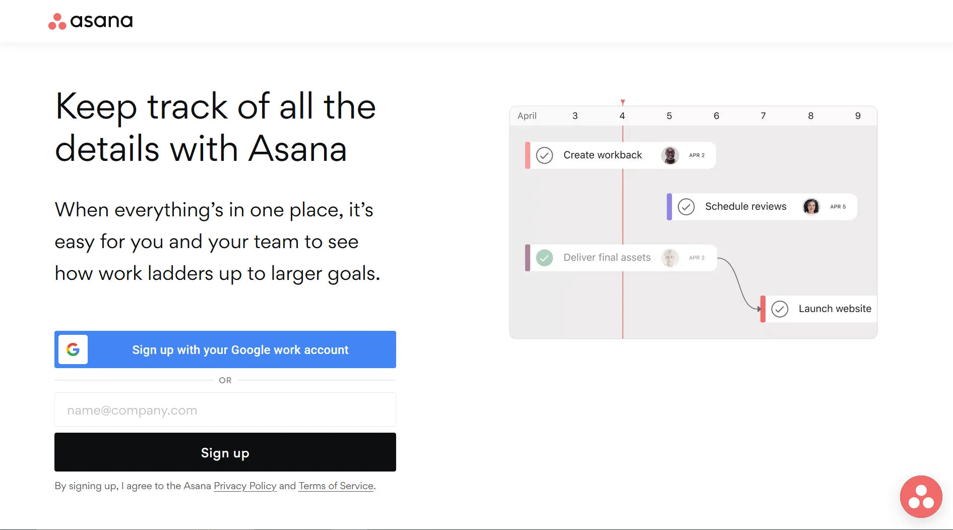
Asana advertises its service through a concise and informative landing page.
Sometimes the best B2B landing pages are all about simplicity. Asana is no exception. Stemmed from the idea of making team coordination easier, the brand’s landing page embraces the same spirit.
The page is concise, where only the most necessary information is featured: an input box to sign up, social proof, and useful statistics. Although sporting a professional, corporate-approved page layout, Asana’s language is not one bit robotic. From a glance, this might not look like an award-winning landing page, but its efficiency is not to be underestimated.
5. Datadog
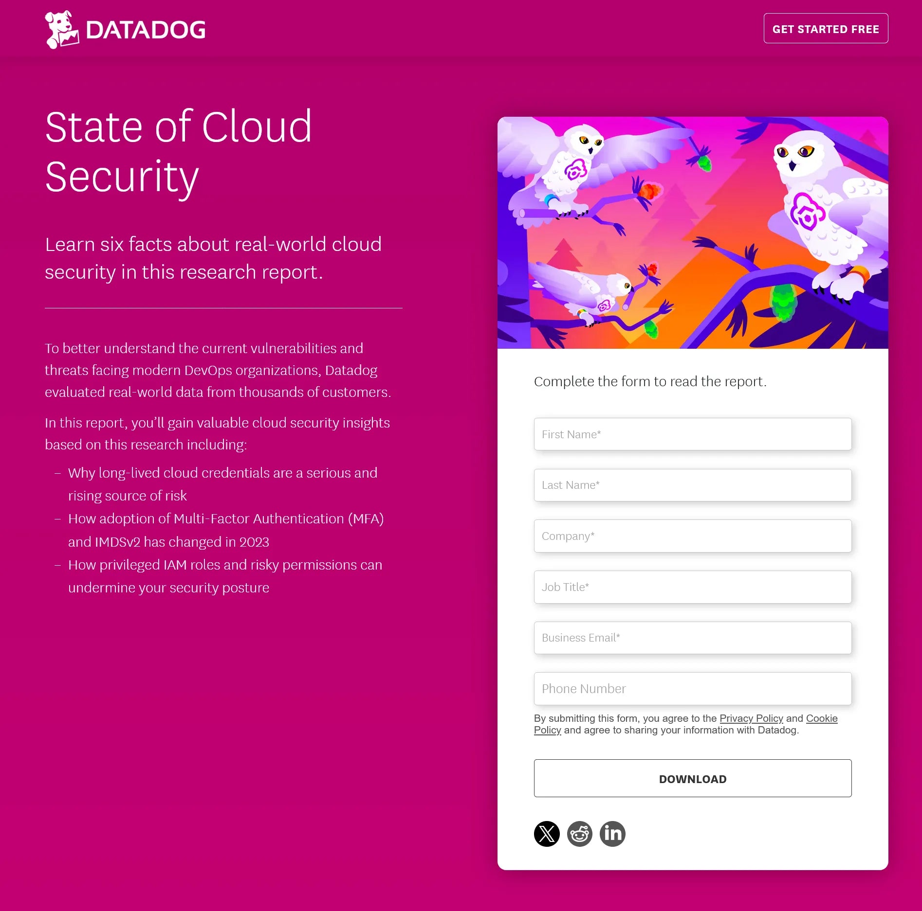
Datadog built a simple landing page to spread the word on the company’s latest curated report.
If you are not well-versed in this technical jargon, you will have a hard time grasping the concept of Datadog’s landing page. With years of experience as a security platform for cloud applications, the company specializes in making comprehensive reports that provide practical insights into the industry.
This is one of the targeted B2B landing pages from the company that aims to provide the needed knowledge for its clients to make an informed, conversion-driven decision. Being so niche and explicit is what makes this example one of the best. The simplicity of the color combination, page layout, font choice, and to-the-point copy language are what will get visitors to proceed to the next step.
6. Clover
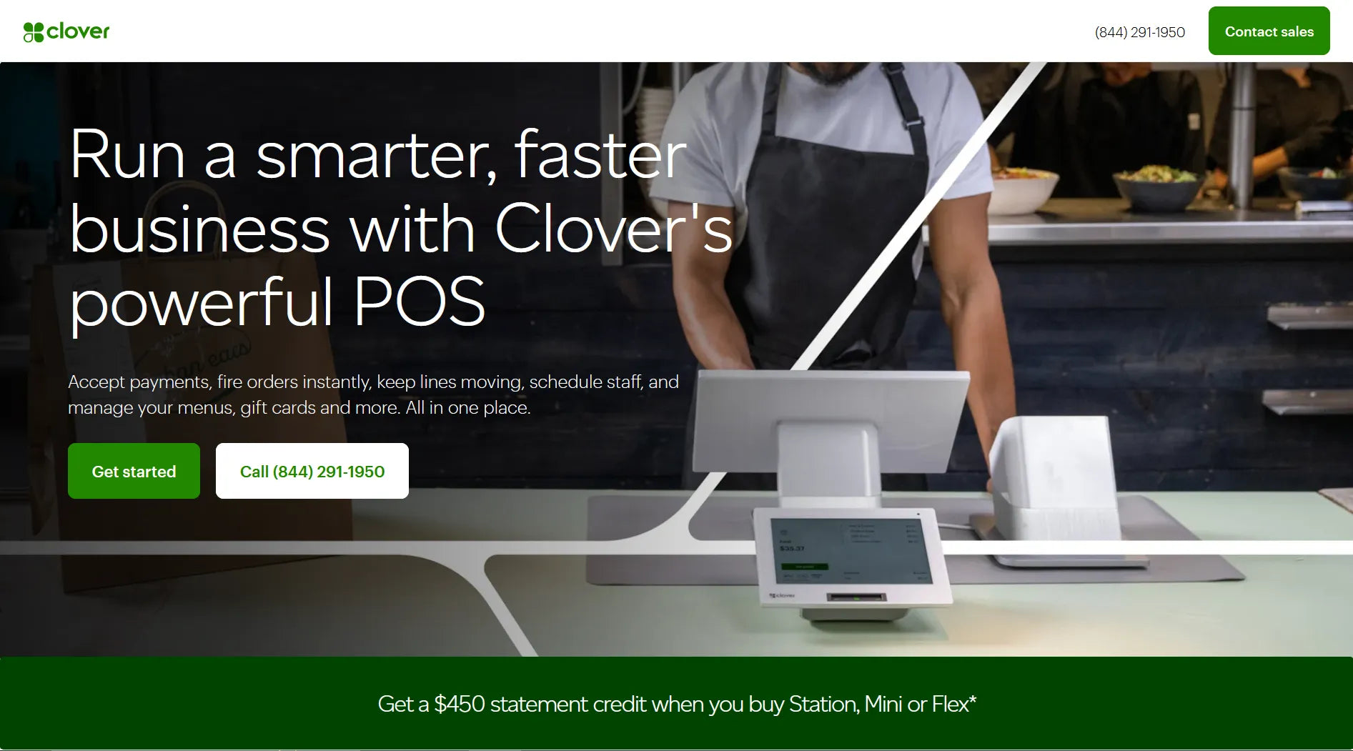
This advertisement from Clover is composed of everything an F&B company needs.
Point of sale (POS) system is a must-have for F&B businesses, and Clover offers just the thing This B2B landing page from this California-based company left no room for question. Alongside a clean top menu, clear-cut headline, on-brand hero image, and compelling copy, Clover sprinkles in clever components that complement the page well. Clients can have a peek at the comparison chart, submit a form to get more info on products, talk to a local expert, or simply read the FAQ section to make an informed decision. Despite leaning towards a content-rich landing page, Clover’s use of page breaks and lifestyle images keeps the page fresh and interesting. This instance is a good source of inspiration for businesses in the same industry.
7. Hootsuite
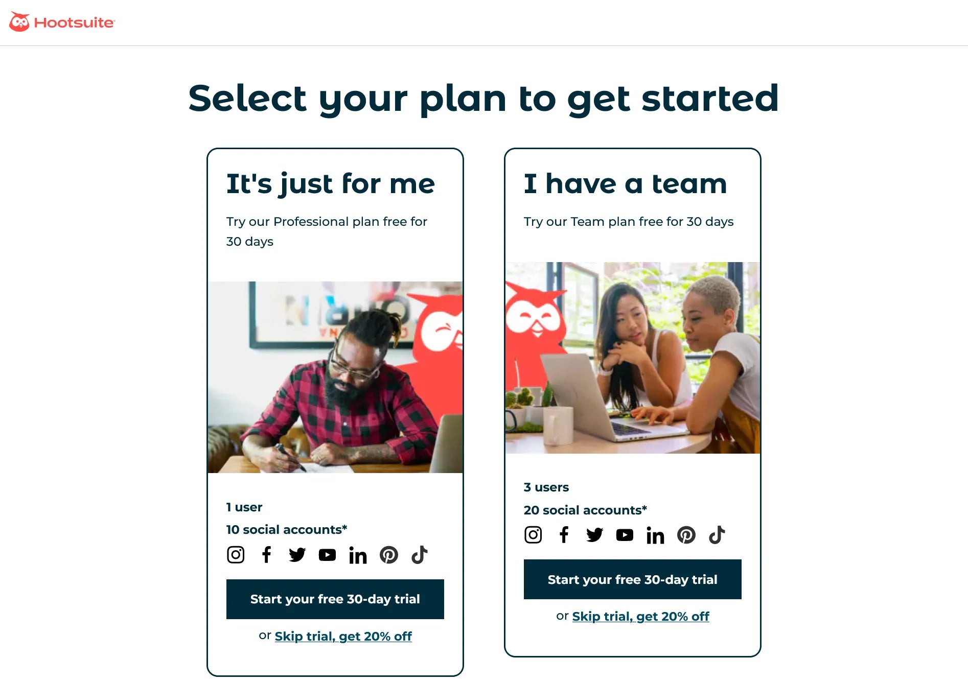
Get to know Hootsuite’s products through this user-friendly landing page.
Hootsuite makes social media management easier for both individual and company clients. With an undeniable reputation, they don’t have to go all out with an elaborate B2B landing page to get the point across. With a click-through page design, Hootsuite smoothly guides visitors toward conversion. Simply pick one of the two options to create an account and start exploring the company’s service without infinite scrolling and distracting elements on the page. This is a remarkable company landing page, sans excessive and advanced web design.
8. Airbnb
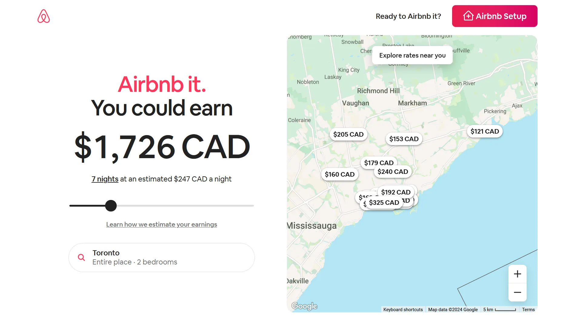
Airbnb put clever marketing tidbits on its landing page to appeal to its B2B clients.
Airbnb has become a go-to website for travelers around the globe when it comes to finding affordable, indie homestays. If you are on the other side of the hustle, turning your home into a moneymaking hub is equally easy.
With this B2B landing page, Airbnb shifts the focus to the most important aspect for hosts: making profits. The slider bar is the star of the show in helping visitors visualize their estimated earnings based on their locations. Other details are all purposeful, from the feature summary, and comparison chart, to the handy FAQ and an option to talk with a Superhost. Airbnb relies on a strong copy and intuitive layout to create a minimalist yet informative B2B landing page.
9. LinkedIn
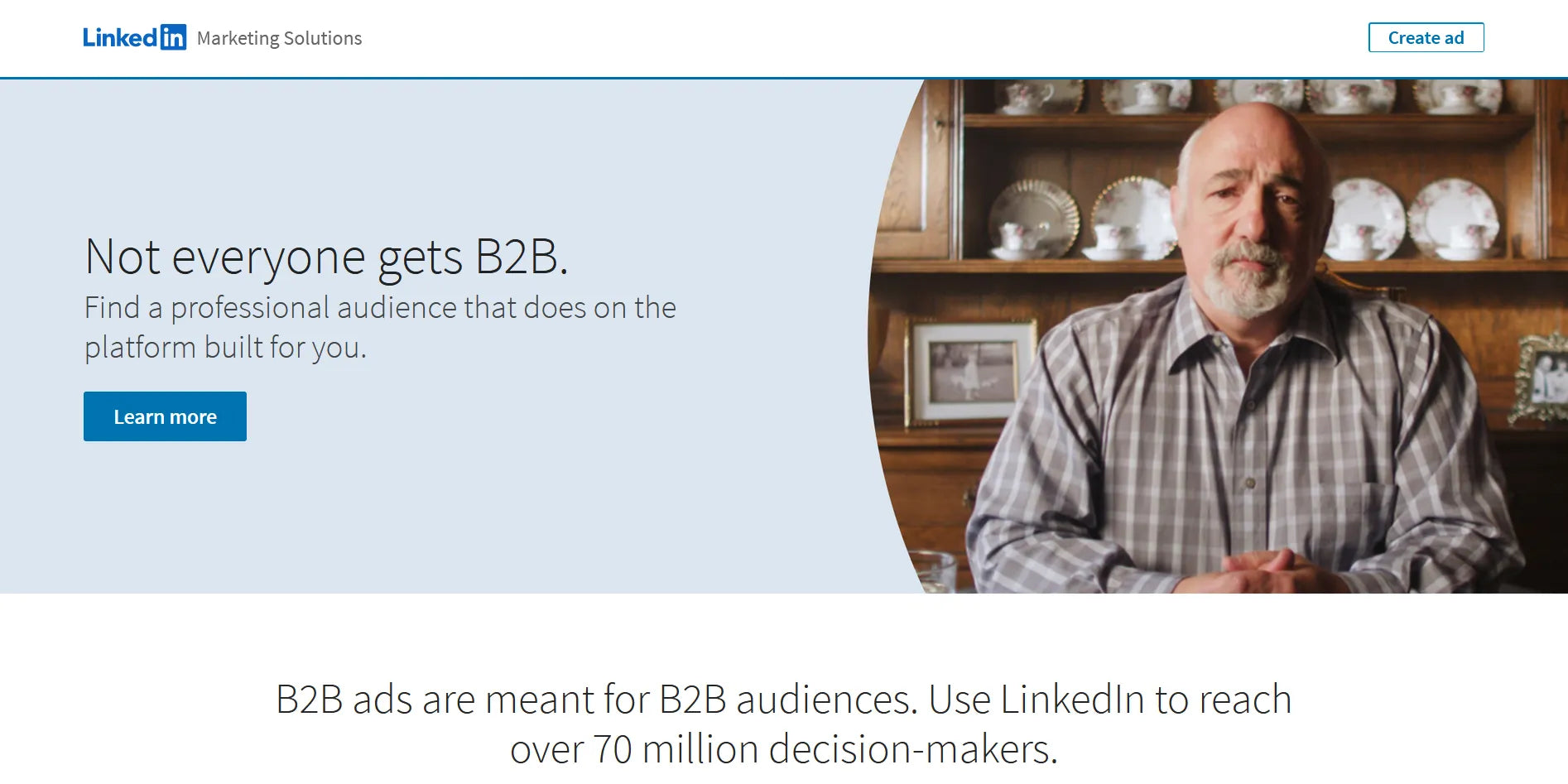
LinkedIn cements its position as the hotbed for worldwide recruiters with a simple yet effective landing page.
LinkedIn gained its reputation as the most popular network-building platform for jobseekers and recruiters. The landing page captured above is the textbook example of an efficient B2B landing page from this website. It is dedicated to giving B2B ad makers a platform to reach their intended audience (we know this sounds meta since we are on the topic of B2B landing page).
The page has it all: an alluring headline, a good mix of visuals and copy, and an introduction video - all accompanied by the classic LinkedIn color combo. Simple, but incredibly impressive.
Learn more: 10 B2B Marketing Campaign Ideas You Should Never Miss in 2024
10. Serviceform
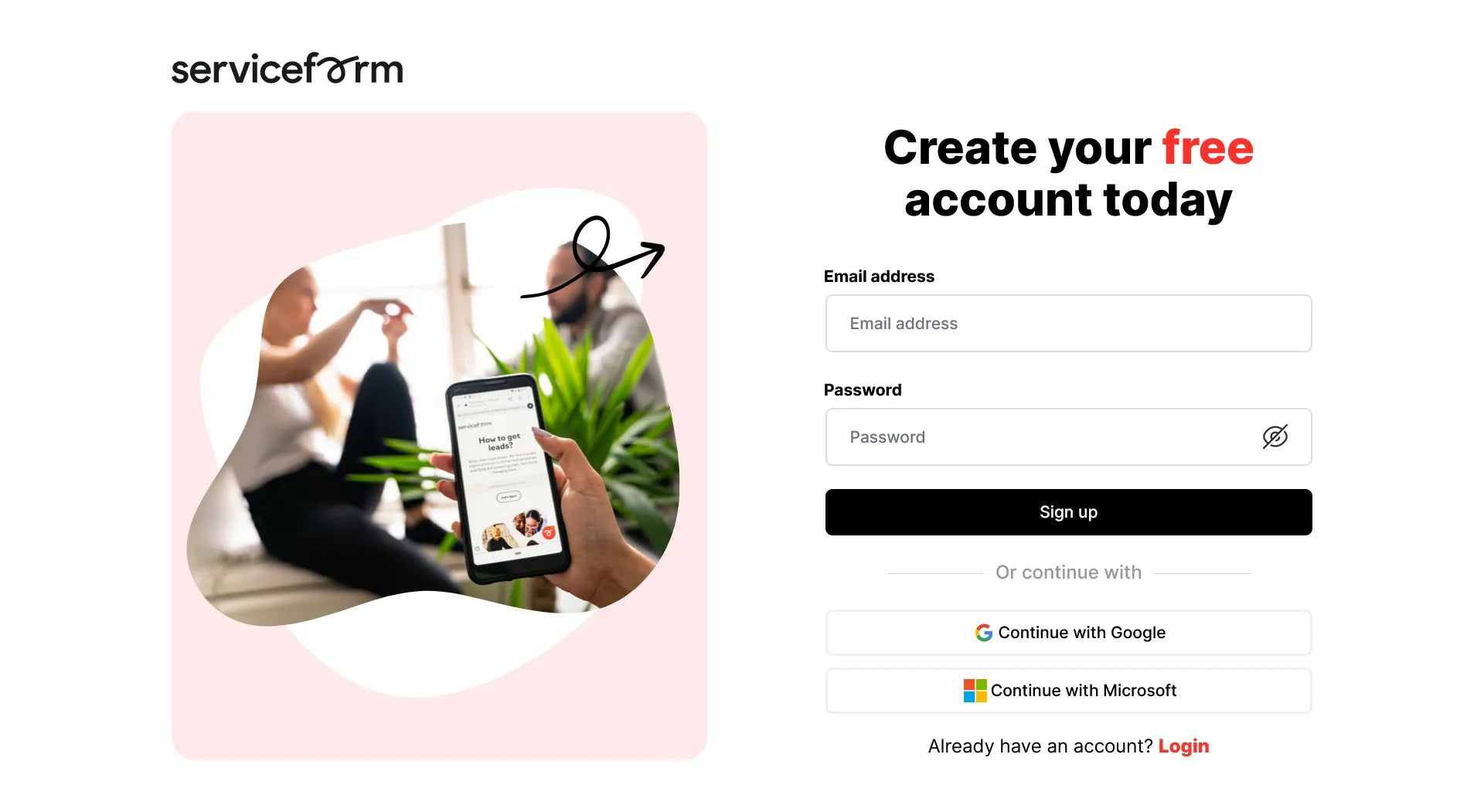
Serviceform goes to show that an effective landing page does not need an overcomplicated design.
Serviceform’s B2B landing page is as minimalist as it could be, what you see is what it is all about. Despite the risque approach, this kind of landing page works best as a social media ad where the brand focuses on directing prospects to a secure page to sign up for its service. There is no need for additional information when there is one singular purpose for this B2B landing page. If you are looking for a clean and to-the-point design, Serviceform is a good example to build your landing page.
11. Printify
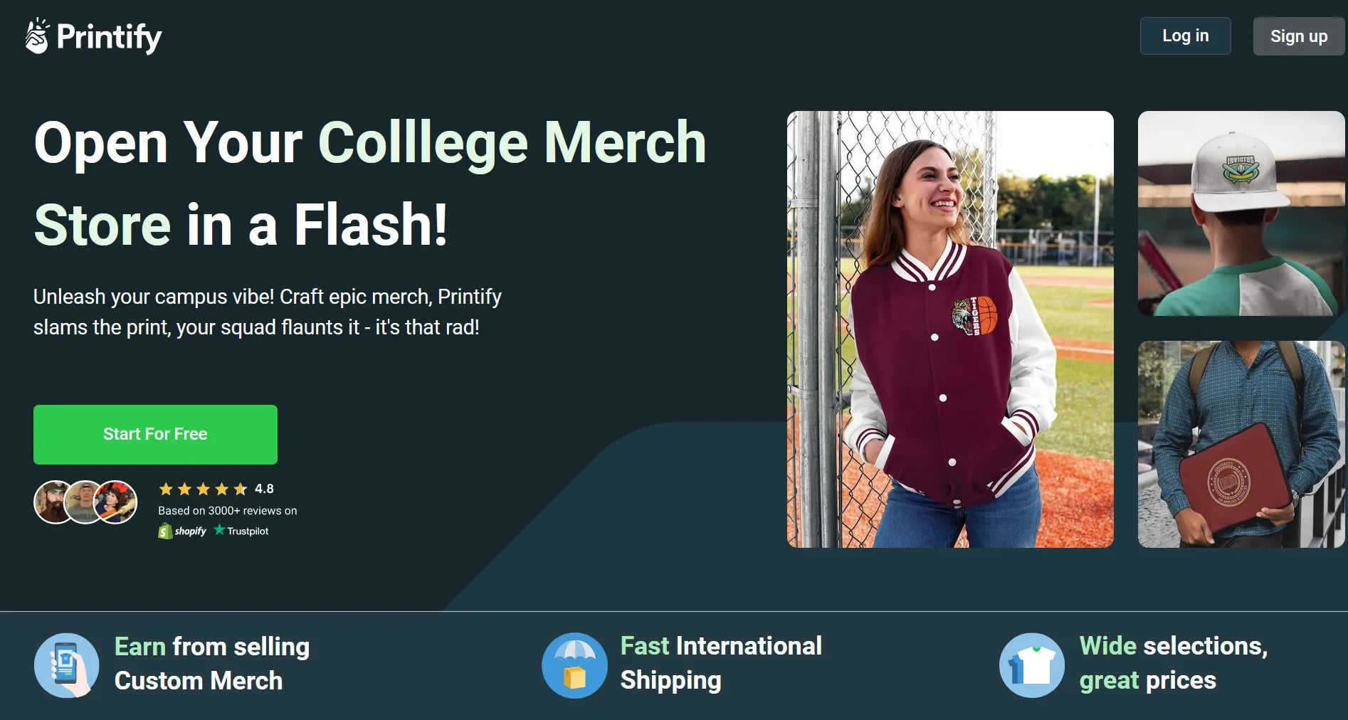
Printify’s service calls for an in-depth landing page where no information is withdrawn.
Printify is a familiar name in the Print on Demand eCommerce niche, and its B2B landing page is what you would expect from such a recognizable brand.
Instead of generalizing its product, Printify targets college students and alumni who want to boast their university merch. The page has a simplified top menu, eye-catching headline, and compelling content that is aptly sectioned for easy scanning. For a standard B2B landing page, this one is a good example to copy from.
12. Emotive
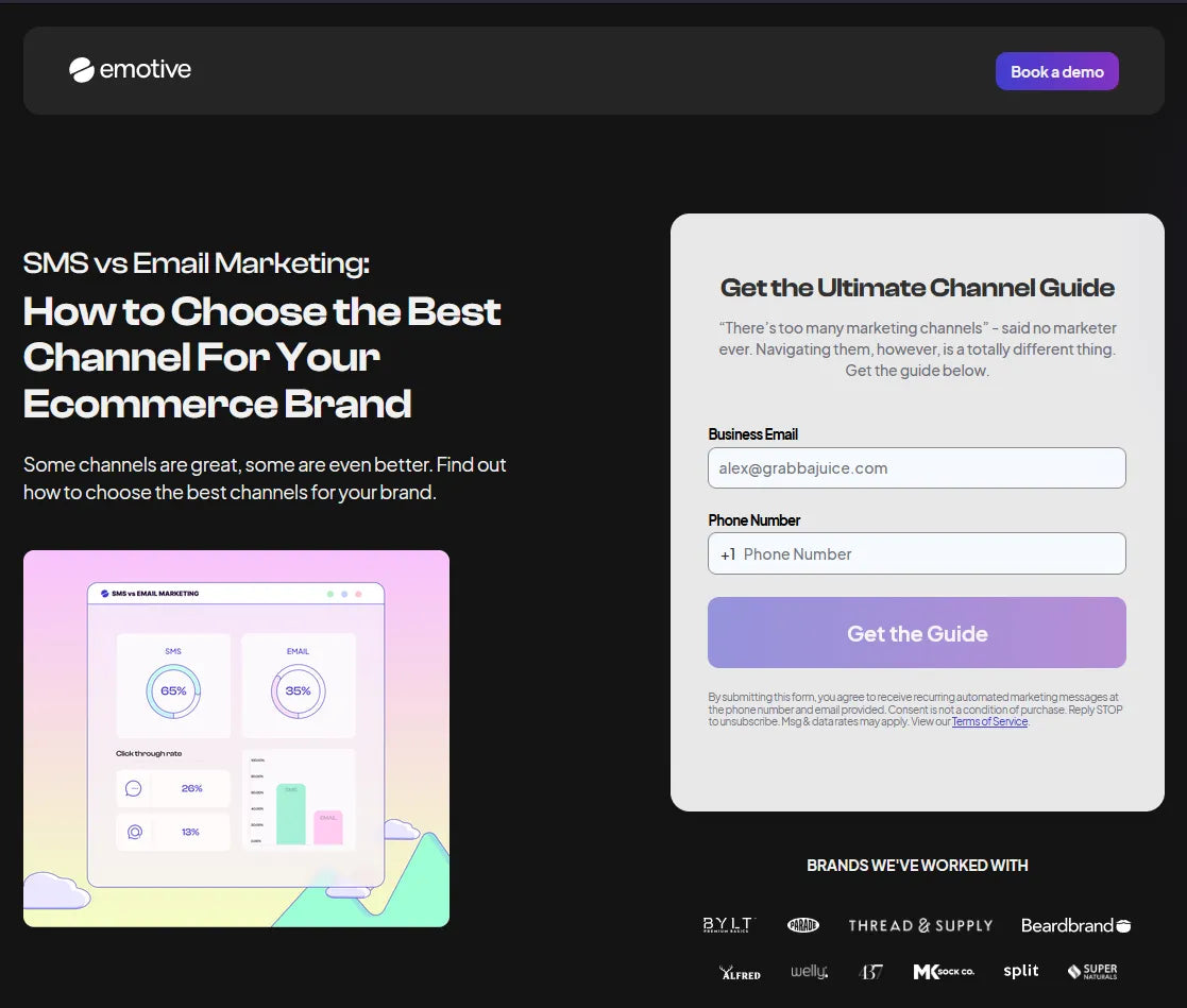
Reach new heights with a professional SMS marketing service from Emotive.
SMS marketing has never gone out of style, especially with the surge of eCommerce. With integration into every eCommerce platform giant out there, Emotive stands firmly among the best marketing tools for online merchants.
This B2B landing page’s main objective is to provide clients with an in-depth channel guide, in exchange for their business email and phone number. The layout is straightforward, with the same color scheme as the rest of the pages on Emotive’s website. There is social proof, an overview of features, and other helpful tidbits across the page. A sticky “Get the Guide” CTA bar is a nice addition to help guide customers toward conversion faster.
13. Squarespace
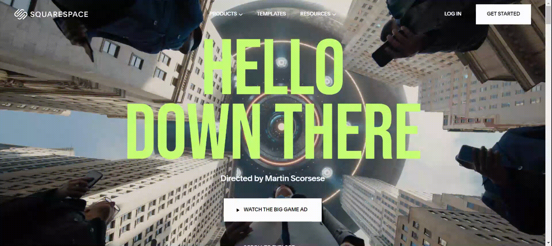
This striking landing page is dedicated to Squarespace’s one-of-a-kind project.
Squarespace is a relatively new but widely trusted website builder. Its modern and intuitive interface is what draws both casual clients and enterprises to the brand.
This B2B landing page is the odd one out on this list, due to its purpose and presentation. The legendary director Martin Scorsese teamed up with Squarespace to create an incredible Super Bowl ad that humorously depicts human nature in this digital era. Thus, this landing page is among several marketing strategies that go into promoting this unique project.
Squarespace didn’t forget to add meticulous details, including a special edition template, online store, courses, and the like surrounding this campaign. As a result, the page is full of out-of-this-world (literally) details while still keeping the essence of an efficient B2B landing page.
14. NordVPN
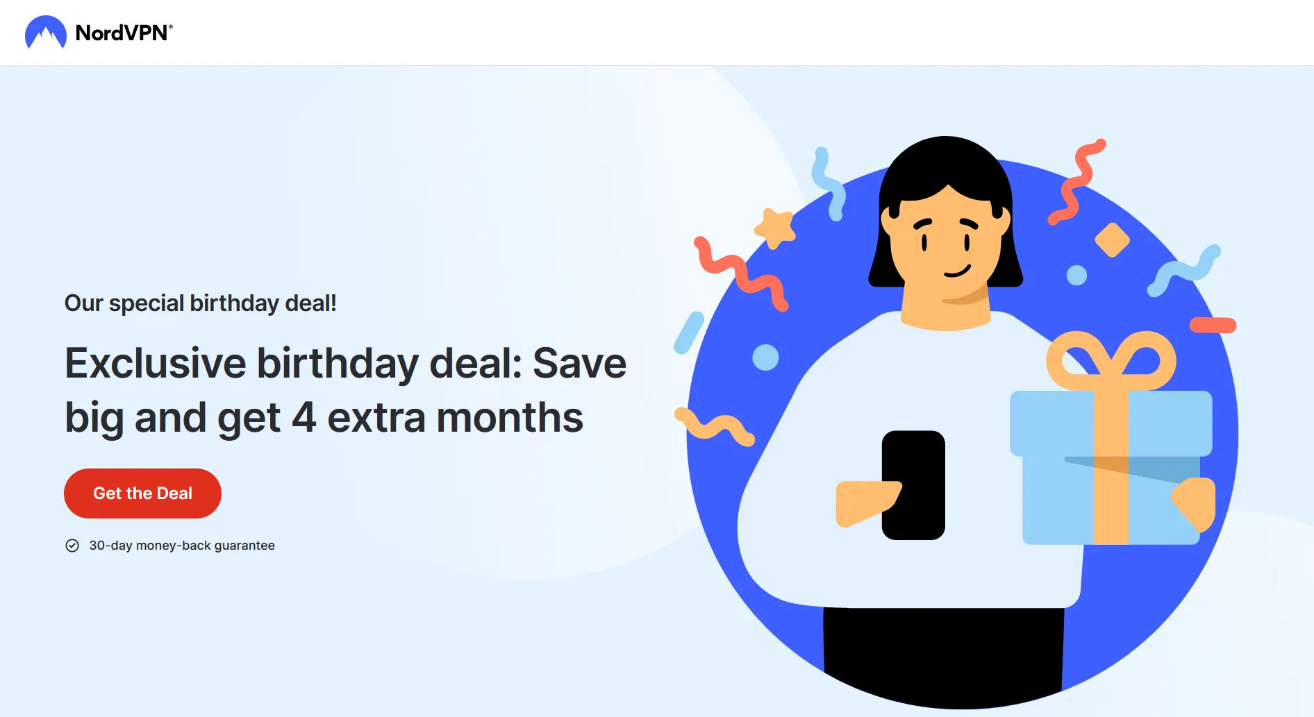
This B2B landing page promotes NordVPN’s special birthday deal, alongside useful data to get clients to make an instant purchase.
If you have looked for safer ways to surf the web, the name NordVPN has definitely crossed your path. Specializing in online security for both individual consumers and companies, NordVPN’s services are user-friendly and versatile.
This landing page from the brand is used to promote its exclusive birthday deal. The value proposition is apparent right as visitors enter land on the page. The highlights include several social proof sections, a nifty comparison chart, cleverly-spaced CTA buttons, and the consistent use of original illustrations. Overall, NordVPN has done amazing with this B2B landing page.
15. Gusto
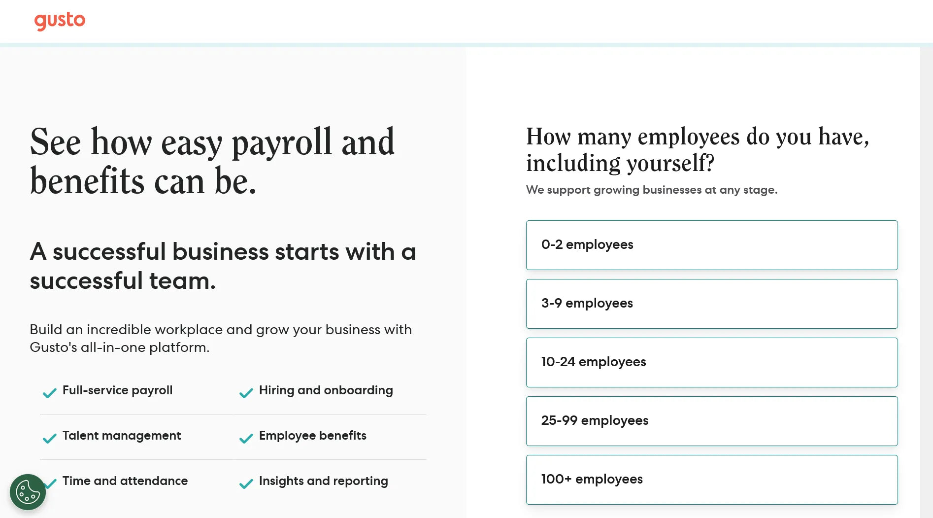
B2B customers can get to know Gusto’s service better with a simple form on its landing page.
Gusto’s services cover automated payroll and HR solutions for small businesses. Its motto is People First, hence the simplistic but powerful message that can be spotted on its B2B landing page.
By keeping nothing but the brand’s logo on top, Gusto’s landing page pulls the customer’s attention towards its content below. From then on, a 3-step form is all one needs to do to begin exploring its service. The information is well presented without the use of excessive visuals.
16. GemPages
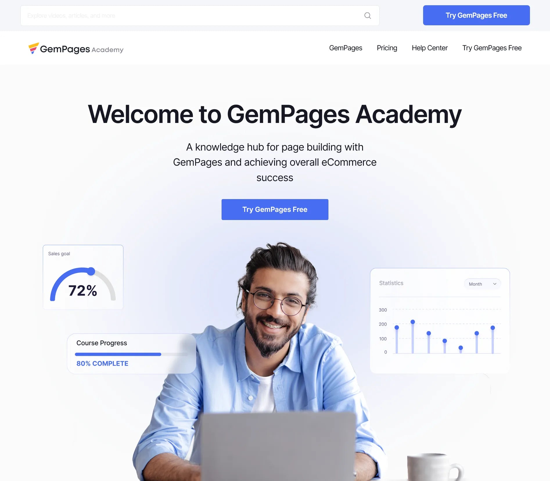
GemPages equips your brand with the right tools to get started, which can be found on our landing page.
The last one on the list is GemPages. With 7 years in business, we always strive to be the go-to page-building solution for Shopify users. Online merchants are our target customers, hence the need to constantly perfect our B2B landing pages.
With this one, we aimed to equip sellers with all things GemPages, AKA to create a knowledge hub for Shopify page building. We filled the page with useful data, introduction videos, and categorized blog posts for easy browsing. By embracing the original color palette and making use of different visual elements, our landing page is guaranteed to not bore you off.
To Conclude
Our curated list proves that building a landing page can be anything but mundane. With a powerful page builder tool and a well-established strategy on hand, you can create the most stunning B2B landing page without breaking the bank. Looking to have more work taken off your shoulders? Hop over to GemPages’ template library for the best template to build the landing pages that embody your brand perfectly.
Learn more: AI Shopify Store Builder: Everything You Need to Know
FAQ about B2B Landing Page Examples


