Ecommerce UX: Best Practices For 2026

The user experience (UX) design can make or break a website. In eCommerce, this element is the backbone of every online store. When the user experience is optimized, customers tend to come back for more, thus, more sales are made.
Some eCommerce trends might change every year, but the most crucial UX practices remain evergreen. Let’s get down to the basics and learn all about the eCommerce UX best practices in this article.
What is eCommerce UX?
The user experience (UX) in its simplest form refers to the process of creating the most intuitive experience for website users through the way they interact with it.
In eCommerce, the UX caters to how the users see the products, navigate through the store, and achieve a frictionless shopping experience as a whole.
Though user experience and user interface (UI) are often conflated, the UX design covers more than just the initial layout of a website. Navigation, loading time, mobile functionality, and accessibility are a few factors that make up a user experience in an eCommerce setting.
The next chapters will give you a better picture of what this factor can do for your business.
What UX Can Do For Your eCommerce Business

UX design is an integrated part of any eCommerce website.
Create a complete user experience
This factor is the core eCommerce UX design, as it is the ultimate goal of all the practices combined. Customers keep a business alive, and a brilliant UX design keeps them returning for more.
A complete user experience begins when visitors haven’t even entered your store yet. The first step starts with the Search Engine Results Page (SERP), a social media ad, a landing page link, etc. Off-site content is as important as on-site content.
Once the user has landed on your website, how you present your store will determine the bounce rate and conversion rates. If every page of your website is easy to navigate, trustworthy, intuitive, and seamless, visitors will not be too hasty to leave. On the flip side, a business will lose a potential lead if even one detail is not properly designed.
Drive sales
A better user experience means customers will feel more inclined to purchase more. After all, why bother going elsewhere when this store provides them with an outstanding shopping experience every time?
Moreover, the power of word-of-mouth marketing cannot be undermined. When customers see something worth boasting about, they will share it with their families and friends. Only when you have built a noteworthy website that offers a thorough UX from A-Z, will your customers make repeated purchases and talk about it. As a result, the conversion rates will be naturally boosted and sales will grow.
Improve search engine ranking
SERP’s website rankings are not new to eCommerce owners. When users type in a relevant search query, you would want your store to pop up as one of the first results.
Now that sounds like every seller’s dream. However, this feature is not based on luck. Having an intuitive UX design is the key to improving your search engine ranking. The secret all lies in the site structure and forms of content of your store.
Establish brand credibility
Similar to how UX takes the cake in driving sales, it also helps establish brand credibility. UX design gives users an enjoyable shopping experience, and in return, grants your business with customer satisfaction and loyalty. Brand credibility is not a one-and-done deal, but rather a long-term process. Thus, the practice of UX should be admitted from the start, with frequent improvement as your business progresses.

A 7-step framework to create a stellar ecommerce UX
Creating a great user experience (UX) for your e-commerce site can give you a major competitive advantage. When customers have an easy, enjoyable time on your site, it can lead to higher satisfaction, better loyalty, and increased conversion rates and sales.
Here is a 7-step guide to improving your e-commerce UX:
1. Understand Your Customers' Needs
To improve your site's UX, you first need to know what your users want. Start by collecting quantitative data to understand who your users are, where they come from, and which pages they visit. Then, dive deeper into the "why" behind their behavior. Find out what motivates them to add an item to their cart or why they might abandon it later. The best way to get this information is to go directly to the source: your users. Use feedback widgets, surveys, and interviews to ask them about their experience.
Matt Lady, Head of Growth at Stumptown Mattress, suggests thinking from the customer's perspective and making sure your site answers key questions like:
-
What is this product?
-
Why does it exist and how will it benefit my life?
-
Why is this the best option for me?
-
How soon can I get it?
2. Simplify Your Navigation
Intuitive, simple navigation is critical for e-commerce. The easier it is for users to move around your site, the longer they'll stay—and the more likely they are to buy something. While there are many options for menus, footers, and search bars, the goal is to create the clearest, fastest path for your users.
Follow these best practices for navigation:
-
Use different menu styles for desktop and mobile to ensure a smooth experience on all devices.
-
Keep your design consistent. For example, use the same color for all "add to cart" buttons.
-
Create clear landing pages for major product categories.
-
Always have a visible search icon so users can quickly find what they're looking for.
A great way to see if your navigation is effective is to watch real users interact with your site. Session replay tools can show you where users get confused or what makes them abandon their session. For instance, some companies have used this to find issues like users missing a size selection field, leading them to adjust the design for clarity.
3. Refine Your Product Pages
Beyond high-quality photos and descriptions, a product page's layout is crucial. Your goal is to provide just enough information to help a customer decide without overwhelming them. Use tools like heatmaps and session replays to see how users interact with the page. This can help you identify problem areas and organize your information more effectively. For example, one company used these tools to discover a design flaw in their pricing table that was causing customers to leave the page.
4. Optimize the Checkout Process
With over 70% of online carts abandoned, a smooth checkout is a top priority. To encourage users to complete their purchase, try these tips:
-
Remove distractions. Keep the checkout page clean and minimalist by cutting out unnecessary links, graphics, and pop-ups.
-
Offer multiple payment options like PayPal or Google Pay.
-
Minimize effort by reducing the number of form fields and offering a guest checkout option.
5. Boost Your Site Speed
If your pages take longer than two seconds to load, you risk losing customers who get impatient and "bounce." Plus, page speed is a key factor in search engine optimization (SEO), which helps attract more traffic. You can run a speed audit to identify any issues and then compress images, use a content delivery network (CDN), or look for a faster hosting platform to improve your load time.
6. Make It Mobile-Friendly
As more people shop on their phones, it's essential that your mobile site is as seamless as your desktop version. The key to great mobile UX is simplicity.
-
Use fewer images and less text to keep pages clean and easy to read.
-
Simplify or split up long forms during the checkout process.
7. Continuously Test and Use Feedback
Creating a great UX is an ongoing process. To keep your site fresh and responsive, you need to be in a continuous feedback loop: test, collect feedback, and improve.
You can use a survey to get specific feedback on a page you want to optimize. Once you have an idea for an improvement, create a new version of the page and A/B test it against the original. Then, compare the heatmaps and session recordings to see which version performs better.
You can also use post-purchase surveys to learn more about your customers. Go beyond basic questions and ask things like, "How and when will you be using our product?" Use this information to tailor your marketing content to better connect with your customers.
Best eCommerce UX Practices to Follow
User-first navigation
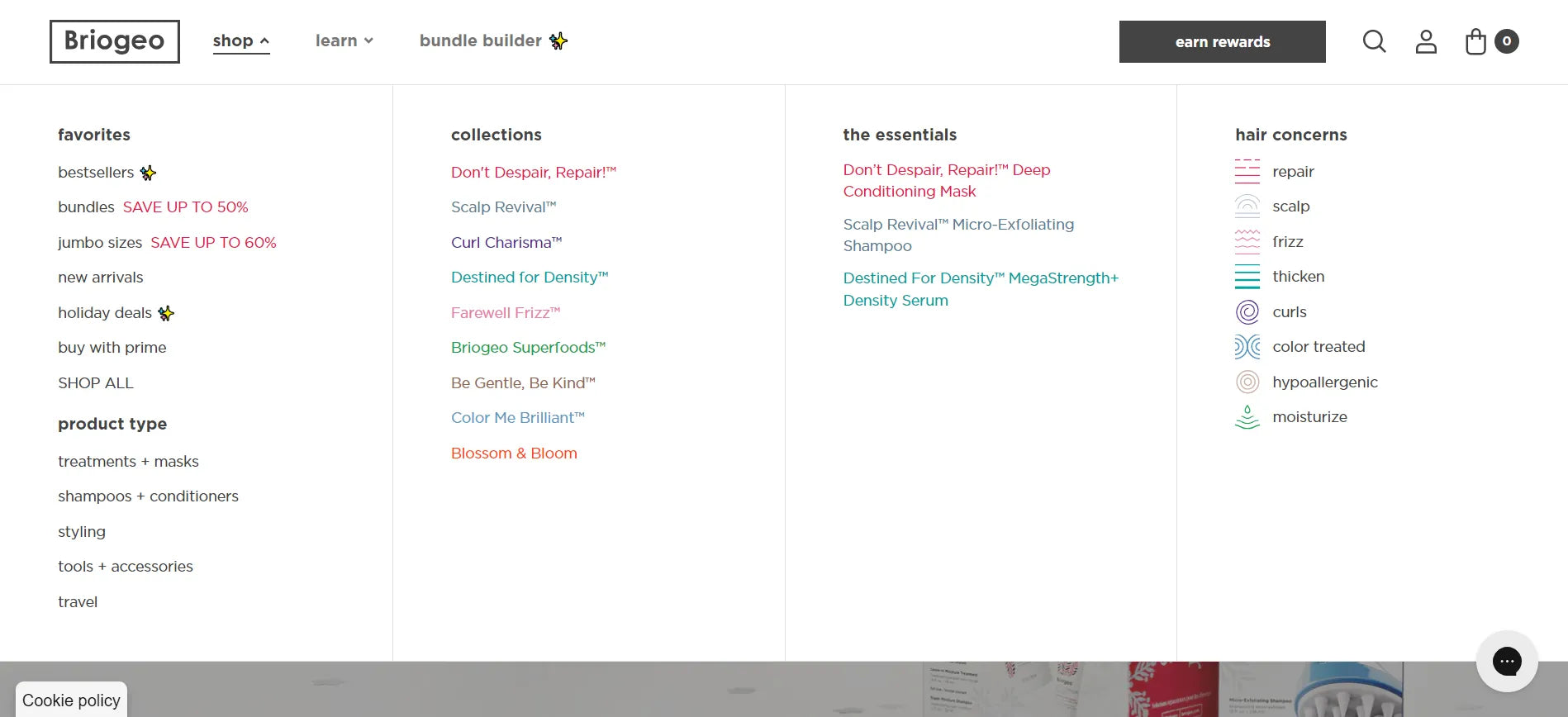
Briogeo makes use of a drop-down menu for easier navigation.
When we say user-first, we don’t mean you should meticulously guide visitors at every step of the way. Not all information is deemed worthy to be shown in its full glory on the front page. As cliché as the saying goes, less is truly more.
So how to organize your website without packing every piece of information under the sun together like sardines in a can?
It all lies in the nuances. Your customers are likely familiar with how a website works. They know where to look for based on their needs.
For instance, when buyers are looking for your contact information, they will naturally scroll down to the bottom or check the hamburger menu on the side. If you have more important components to be featured, the Contact Us page can be omitted from the top navigation menu.
The use of a drop-down menu as seen on Briogeo’s website above saves a ton of space on the top menu, while neatly dividing its products into handy categories for quicker browsing. This is one textbook example of a simplified, UX-optimized navigation.
Intuitive sales funnels
Not all of your customers discover your website by typing in the URL manually. The chance of them clicking on an ad on Facebook or from an enticing offer in their inboxes is typically higher, especially for new businesses that are still finding their footing.
In this case, landing pages will be your best friend.
The best place for new visitors to land on your website is not necessarily the home page. You’d want a striking, tailored page that tells visitors who you are, what you do, and why they should buy from you. This is also a brilliant location to advertise your current deals and offers.
By building sales funnels with a clear purpose, the user experience starts at a designated page and gradually transitions to a full-blown UX of the whole store.
Learn more: 12 Shopify Landing Page Examples from Top Brands
Compelling photographs and descriptions
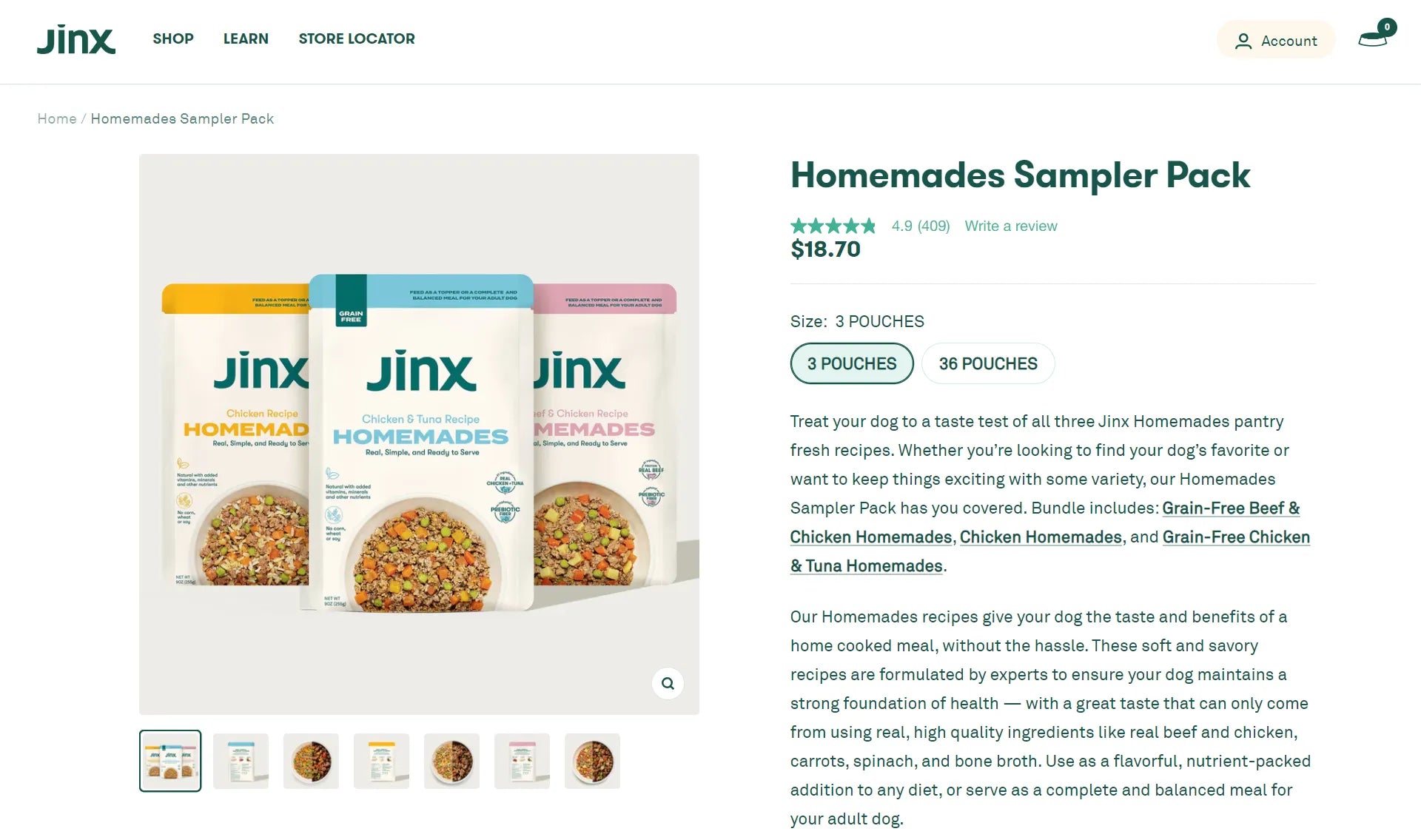
Jinx’s compelling product images and descriptions clear all doubts for first-time buyers.
Captivating images and content are the essence of any website, not just in eCommerce. However, the language used in an eCommerce setting can gain business attraction and profits. Product descriptions are not only used to describe the products, they showcase the legitimacy of the products, advertise their exclusive perks, and are a chance for sellers to resonate with their customers.
In the same sense, product photographs go beyond showing what your customers will get. They have to match your brand’s image and convey the products in their glory.
A great example goes out to Jinx’s exceptional product page. Their photographs exhibit the products perfectly, while the description tells buyers about the products’ content and lively describes the benefits to a T.
Mobile responsive design
The UX design applies to every version of your store. As mobile usage is getting more and more prevalent, crafting a mobile-friendly design never goes out of style.
Your mobile website should reflect the layout of your desktop site without major changes. Apart from keeping it consistent, mobile-first elements, namely thumb-friendly buttons or optimized media, should be on your checklist when it comes to mobile design.
This new-published blog post by GemPages will give you an in-depth look into what a mobile responsive design can do for your eCommerce business:
The Best Mobile Website Design Examples to Learn in 2026
Quick loading time
A quick loading time stands in the same league as on-site eCommerce UX designs. This detail is not to be missed, as it directly contributes to the SEO performance of your website.
PageSpeed Insights is a stellar tool that helps you test and tweak your website settings for a better load speed. Although it is not a ranking factor, it is constituted by page speed and page experience. These two factors go hand-in-hand and greatly affect your website’s ranking.
Personalized product recommendations
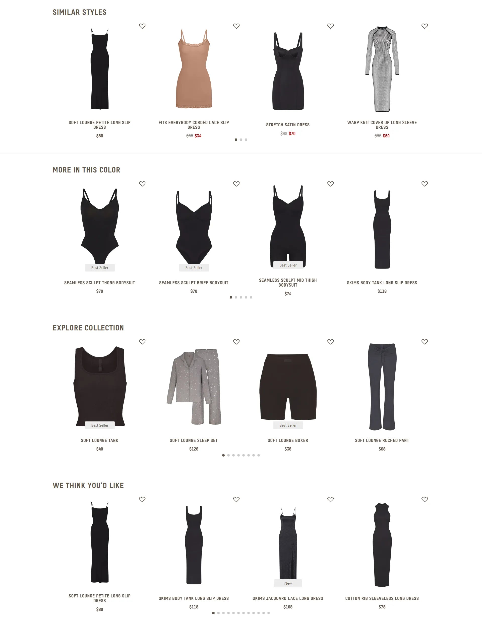
Skims offers over-the-top product recommendations on its product page.
Product recommendation is a common sale-driven tactic that suggests relevant products to the ones that customers are planning to buy. While the word “relevant” seems self-explanatory, it could be hard to nail down.
You first need to determine the similarities between your products, whether by collection, color, or style. Next, knowing where to place them is equally important. If done right, this technique can boost the Average Order Value (AOV), reduce abandoned carts, increase brand impression, and so on.
Skims does not shy away from utilizing its product recommendation feature by offering not one, not two, but four niches that are relevant to the on-page product. As pictured, buyers can browse by style, color, collection, and generally. This UX design is simple but highly efficient.
Streamlined checkout process
The checkout page is where your customers spend their last few minutes on your website, you do not want to lose them at this stage.
The UX for eCommerce covers the checkout page and how seamless it is for buyers to make a payment. Some recommended elements to add to this page are:
- Several payment gateways
- Guest checkout option
- Minimal steps and form fields
- Autofill when appropriate
- Secure checkout assurance
- A coherent look with the rest of your store
- Transparent shipping and additional fees
Learn more: How to Customize Your Shopify Checkout Page in Minutes
User-generated content (UGC)
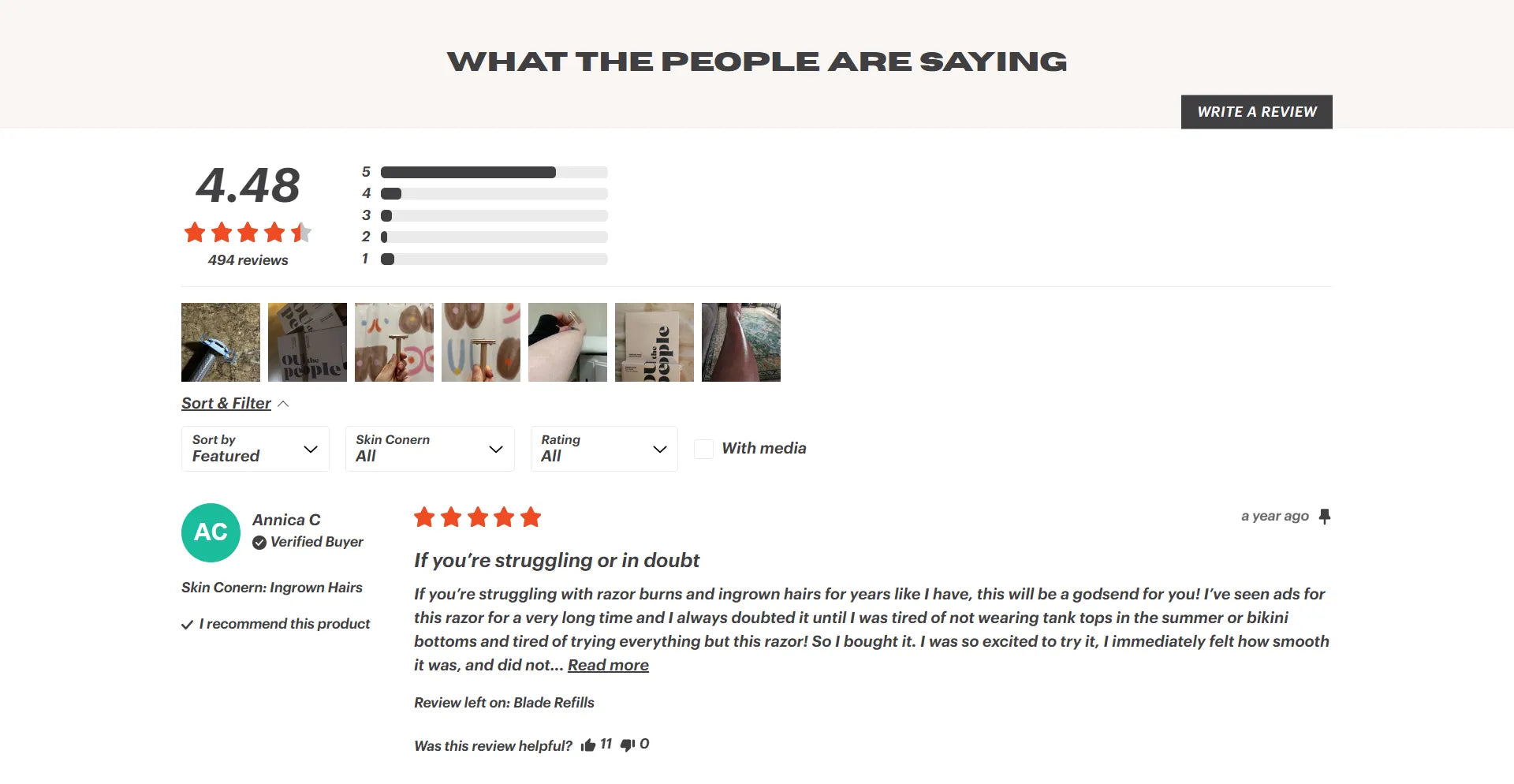
Oui The People’s product page comes with a customer reviews section.
User-generated content (UGC) refers to media (images, videos, reviews, etc.) posted by website users, as opposed to a brand or company.
In eCommerce, it was reported that products with as few as five reviews have a 270% higher chance of being purchased. Buyers are more prone to trust real people who have made a purchase instead of the business trying to sell the products. This shows how crucial customer testimonials are to a well-rounded user experience.
You can incorporate a customer reviews section on the product page, all decked out with authentic pictures, videos, and star ratings. Oui The People has done an excellent job with this practice, as pictured above.
An “As Seen On Instagram” segment that showcases your customers sporting your products is one way to use UGC to your advantage as well.

SEO-focused marketing
A marketing strategy in this digital era is not complete without the mention of SEO, or Search Engine Optimization.
As we have mentioned, the user experience begins with website discovery. How the customers find you determines your store’s traffic - that’s why it is imperative to get your store on the map through the help of SEO marketing.
Below is a helpful checklist for store owners who are building an SEO marketing strategy:
- Conduct keyword research
- Create valuable content
- Implement SEO-friendly content anatomy
- Make use of link building between posts
- Don’t forget meta titles, meta descriptions and alt-texts
- Optimize for hand-held devices
- Perform frequent website checkups
Shopify SEO Checklist for Beginners (2026)
Master SEO Optimization with Your Shopify Blog: A 2026 Guide
First-rate customer support
Last but not least, a five-star customer support system is what you need to give buyers the full user experience. All the efforts in designing and marketing will go down the drain if customers are left with unsolved questions.
Providing customers with several options to reach out to your business, whether in the moment or post-purchase, is the secret to delivering customer satisfaction and decreasing churn rate. Depending on the size of your business, this might call for an around-the-clock support team, a well-established chatbot, or both.
Once customers’ needs are met, your brand value will increase. As a result, customer loyalty will be greatly improved.
The initial setup might seem costly and time-consuming at first, but the benefits will present itself in the long run. This is why customer support is an integrated part of a top-notch UX design.
Read more: How to Create A Contact Us Page on Shopify (+ 5 Inspiring Examples)
Top 10 UI/UX trends for ecommerce websites
Here are top 10 UX trends you can follow:
-
Design Thinking: This is an approach focused on user demands and a logical, strategic design to enhance the user journey and solve problems.
-
Mobile-First Design: This trend involves designing for mobile devices first before adapting the website for larger screens.
-
Animated Elements: E-commerce sites are using animation, GIFs, and videos to create a more appealing and engaging user experience.
-
Simpler Navigation: Designers are simplifying navigation to help users easily find products through clicks, swipes, or voice commands.
-
Unique Colors: This trend involves using bold, unique colors and attractive typography to create a visually engaging and memorable design.
-
Content-Focused Design: This approach prioritizes content, building the website's design around it to create a more trustworthy and authentic connection with customers.
-
Parallax Scrolling: This is a technique where the background moves at a different speed than the foreground, creating a 3D effect that makes the site more dynamic and helps reduce bounce rate.
-
Gradients: E-commerce websites are using vivid, bright color gradients to add a modern and personalized touch to their design.
-
Illustrations: Illustrations are an emerging trend used to tell a unique story, capture attention, and add a creative, artistic element to the site.
-
Attractive Typography: Typography is taking a central role, with bold and unique fonts being used to enhance the user experience and keep customers on the page longer.
Final Thoughts
In the eCommerce world, the website is the foundation of your business. While the term user experience is not brand-new, it is a prevailing component that requires constant attention. This blog post is dedicated to giving you a fresh look at eCommerce UX and preparing you for a new year ahead with ever-changing fads and changes.
If you are hesitant due to the potential manual tasks at hand, worry not! Most of these practices above can be smoothly integrated with your Shopify store with GemPages. Now it’s over to you to start giving your store a makeover and ace the UX game!


 Facebook Community
 Change Log
 Help Center


