- What Is A Shopify Product Page?
- Must-have Components of A High-Converting Shopify Product Page
- From Trendy to Timeless: 7 Best Shopify Product Page Examples That Slay
- How to Create Shopify Product Page?
- How to Customize Shopify Product Pages with GemPages?
- Shopify Product Page Templates by GemPages That You Should Use to Drive Conversion!
- Unleash Your Inner Designer with Shopify Product Page Makeovers
- FAQs about Shopify Product Pages
The A-Z Guide to Creating Effective Shopify Product Pages (+Best Examples from The Pros)

Product pages are the lifeblood of your online store.
An effective product page shows potential customers what a product looks like, tells them what it feels like, and makes them envision their life with your product in it.
Unfortunately, creating killer product pages is not an easy feat. In fact, many brands struggle with product page design.
That's also the reason why we've crafted this article—to help you create eye-popping, high-converting Shopify product pages without a hitch.
In this piece, we'll cover:
- Vital elements of any great Shopify product pages
- Outstanding product page design examples to learn from
- Easy guide on how to customize Shopify product pages.
What Is A Shopify Product Page?
A Shopify product page is a dedicated webpage within a Shopify eCommerce store that showcases information of a specific product. With a clear layout, persuasive call-to-action buttons, and seamless navigation, it encourages potential customers to click the “Add to cart” button and purchase.
The purpose of a Shopify product page is to present and promote products, facilitating a seamless shopping experience for customers and driving conversions.
An online store might have one or multiple product pages—depending on its business model. A single-product store might need only one product page, but a multi-product store demands various product pages.
 A basic product page consists of a product image, product details, and CTAs
Must-have Components of A High-Converting Shopify Product Page
Of course, you only need a product name, a description, and a call-to-action to create a bare-bones product page.
Nevertheless, Shopify product page templates with basic components are unlikely to sell, which highlights the need for advanced Shopify customization. The more stunning your page is, the more likely it will convert.
Here’s an overview of the key elements you can include on your Shopify product pages to make them equal parts stunning and high-converting:
- An SEO-optimized, concise product title.
- Pixel-perfect product media, including product images, gifs, and videos.
- A detailed, intriguing product description.
- Special offers and discounts.
- Shipping information, return, and refund policy.
- Ample customer testimonials
- A Frequently Asked Questions (FAQ) section
- Compelling add-to-cart call-to-actions (CTAs)
Learn more: How to Create An Effective Shopify FAQ Page (+ Pre-made Templates)

From Trendy to Timeless: 7 Best Shopify Product Page Examples That Slay
1. Swedishness
Swedishness, a Scandinavian food brand, knocks it out of the park with its one-of-a-kind product pages.
Swedishness rings the changes on its product page design by locating all product details on the left and product visuals on the right. The black sidebar menu stays fixed throughout all of the different product pages for easy navigation.
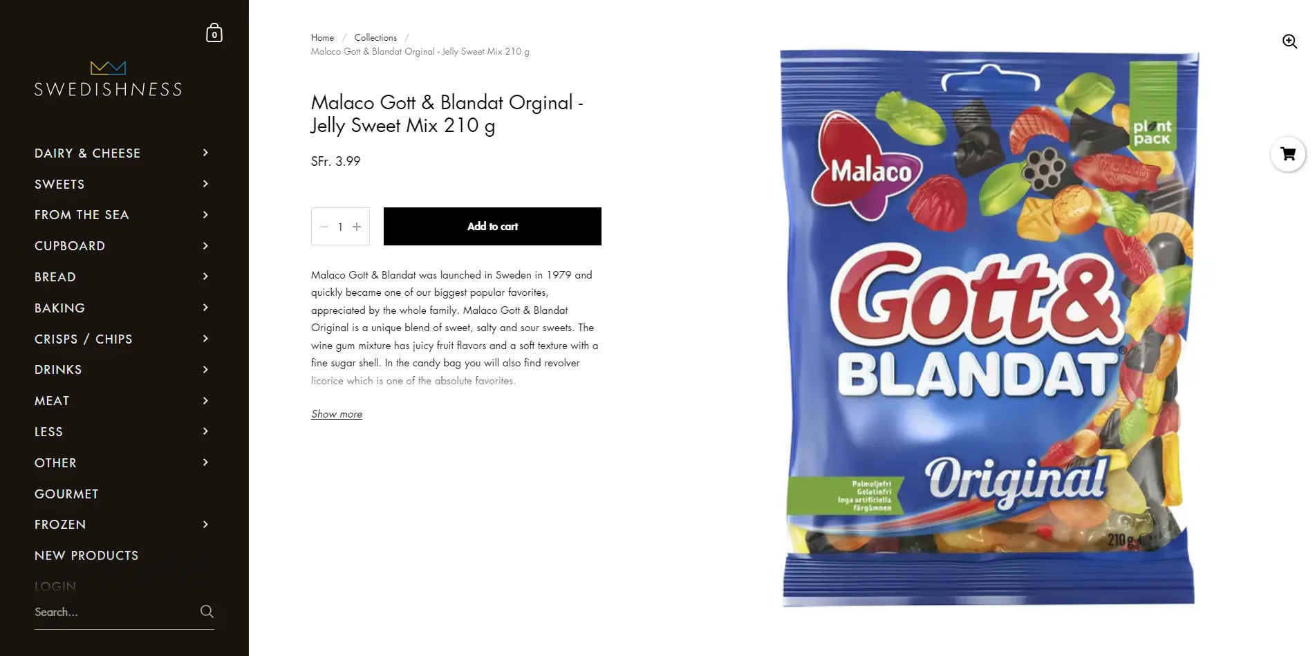
Swedishness’s product page
If you've decided to bring this jelly sweet mix to your home, click on the black Add to Cart button, and you'll be directed to a checkout window right away.
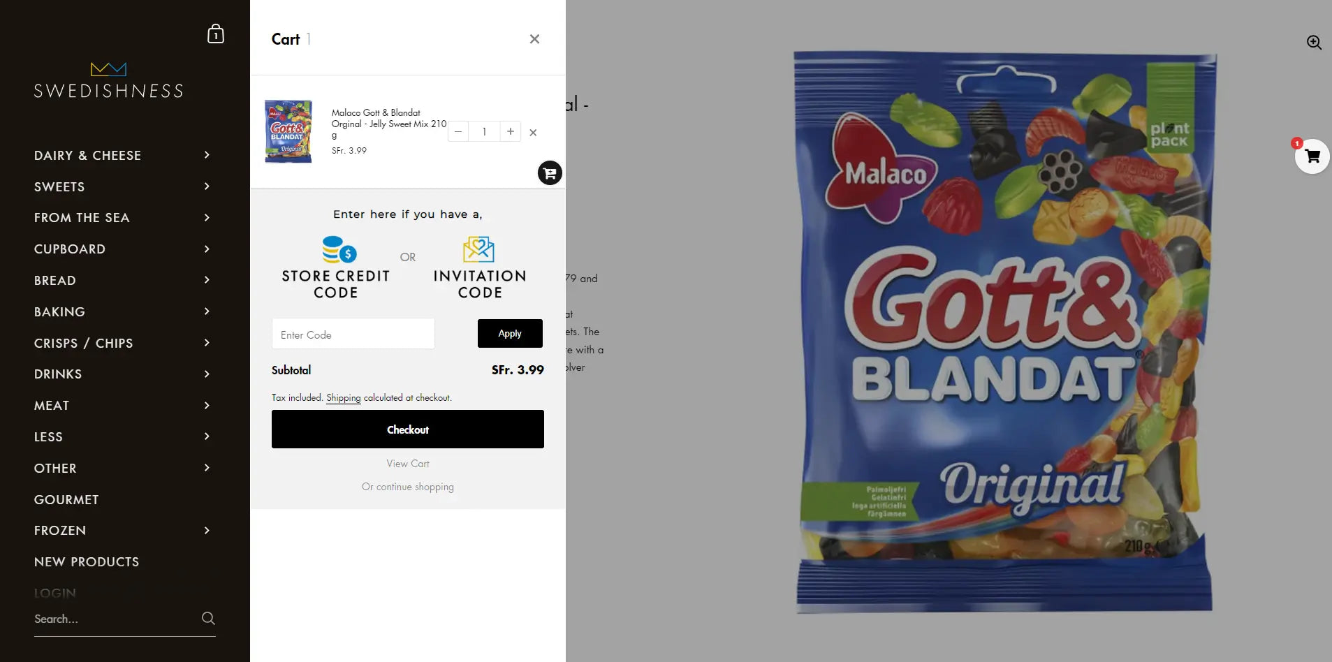
Swedishness’s product page created with GemPages
Swedishness's product page finishes off with the very last hook. We love how the brand maximizes the footer to highlight the refund policy. Bold, concise, powerful copy gives customers a feeling of security, makes them feel valued, and ultimately convinces them to purchase.

Swedishness’s product page
2. Vital Proteins
Vital Proteins is a visual brand, much like its product pages. A clean design style draws your eyes to a few key elements: the product, black copy, and an interactive button.
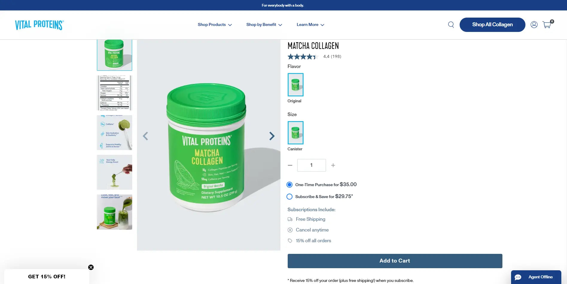
Vital Proteins’s product page
But the rest of its product page isn't as simple as what you see above the fold. Scroll down, and you'll find more infographics, product related facts and guides, customer feedback, live Q&A, and images to learn more about the product.
Learn more: 10+ Best Above the Fold Examples to Get Inspired in 2024
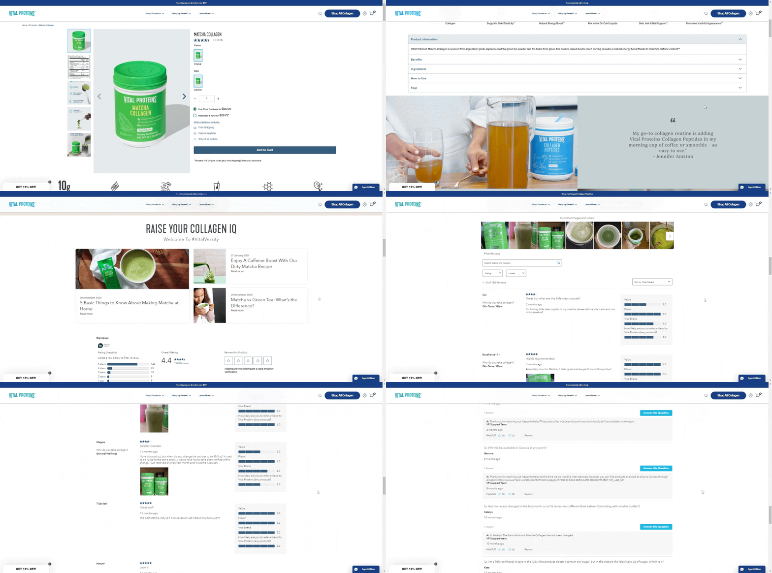 Vital Proteins includes other features in their product pages
There are lots to fawn over here. First, the images visualize all the supplement facts and ingredients, and how customers can make a smooth cup of tasty drink with Vital Proteins's product.
Underneath the product’s comprehensive information is a more profound introduction about collagen - their main product and related blog posts, making it easier for customers to compare with other products or save the recipe for future use.
Another fantastic thing about Vital Proteins's product page is that it not only gives you a bunch of product details but also provides a live Q&A section, allowing you to check the FAQs or ask questions effortlessly.
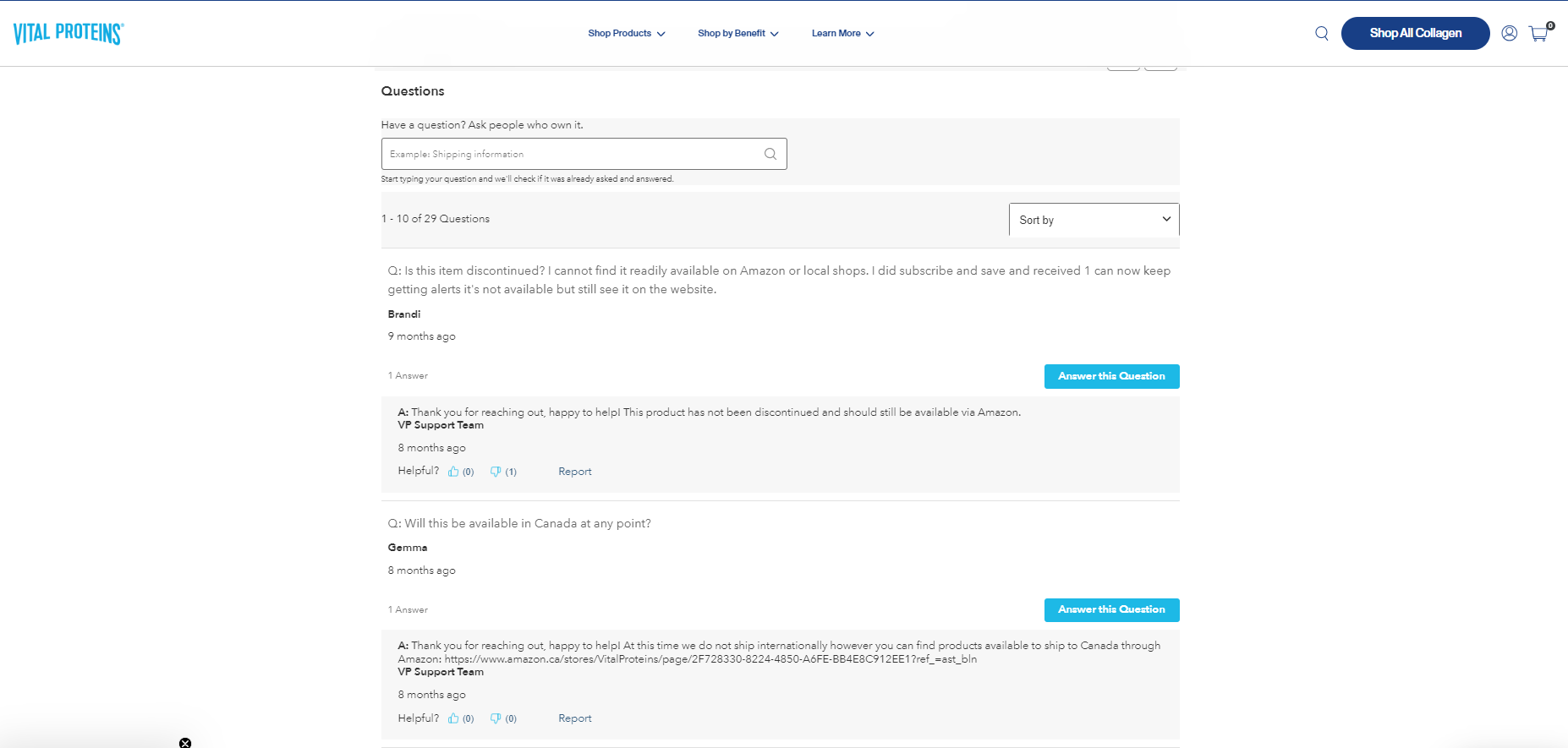
Vital Proteins includes a FAQ section in their product page

Learn more: Check out 17 Shopify Product Page Examples to Learn From in 2023
3. The Lingerist
The Lingerist, a conscious lingerie brand, creates product pages that reflect the energy of feminism.

The Lingerist’s product page
The structure of its product page is simple but exceptionally tailored. The page has exquisite images, including lifestyle shots and minimalist photos that capture the entire product against a white background.
Underneath the Add to cart button, the brand uses a subtle but effective stock quantity display to trigger urgency. It also suggests another product that can be the perfect duo combined with the product you're currently viewing. You know, the cross-selling technique.
 The Lingerist’s product page is designed carefully for a better user experience
Since many undergarments are not eligible for a return, the brand does everything it can design-wise to reduce friction, questions, and returns. The Lingerist's product page includes as much relevant information as possible, like model size and whether the product fits you in your usual size.
4. Nutt
Nutt is a renowned brand that sells daily supplements for energy boosting and muscle building. Nutt's Shopify product pages are modern-looking, colorful, and aesthetically pleasing with a mix of pastel color palettes, high-quality flat lays, easy-to-read fonts, and balanced spaces.
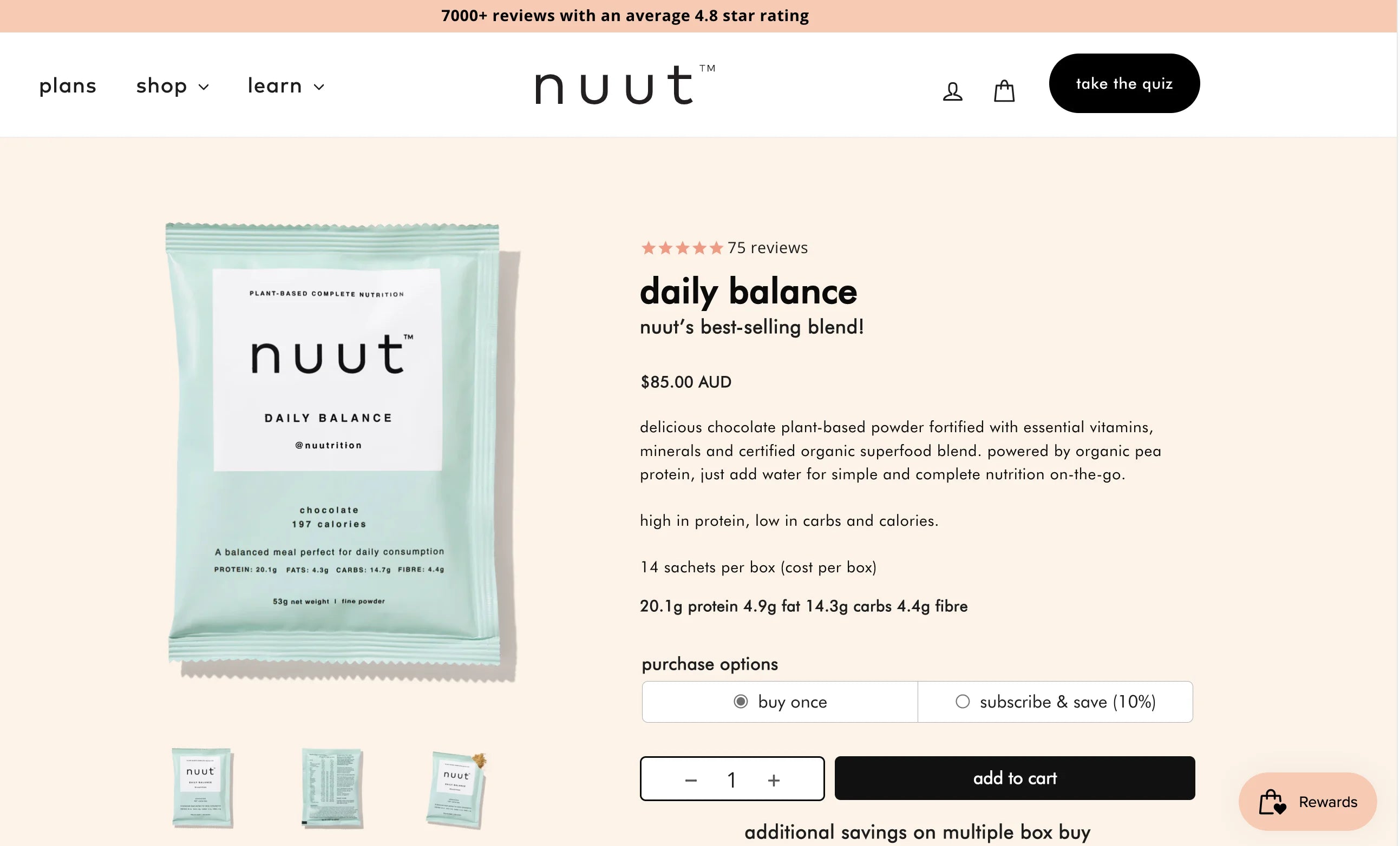 Nuut’s visually pleasing product page is well-designed with fonts, images and color palettes
Another particular element of these product pages is embedded customer reviews. On the fence about this product? Scroll down for recent testimonials. By including customer feedback right on each product page, Nuut ensures their visitors with proof of their product quality, leading to higher conversions.
 Nuut’s product page featuring their honest customer reviews
5. Nodiee
Nodiee is a brand that sells portable and versatile white noise machines for good sleep. Its product page focuses on supplying shoppers with all the information they need to make a purchase.
If you already have your credit cards out, you can go ahead and place your order straight away. To sweeten the pot, Nodiee also offers a quantity discount—buy two, get $20 off and buy three, get $40 off.
 Nodiee’s product page offering buy X get Y to boost sales
All the product details, including features and what's in the box, are stored under the dropdown menu. Hence, if you're on the fence, you have all the essential information at your disposal to make a purchase.
 Nodiee’s product page with fully detailed information about the product
Scroll down, though, and a more exciting product discovery awaits. The "why you'll love Nodiee" section, the product comparison graphic that depicts Nodiee's edge over others, and a dropdown FAQ section covering the points most shoppers have.


 Nodiee’s product page includes product benefits, product comparison, FAQs
The brand knows the power of testimonials. It spends nearly one-third of the page space to show embedded reviews—to give you a sense of how much previous customers have enjoyed this product.
Check out more: 17 Shopify Product Pages that We Love

6. BetterMan
BetterMan, a popular herbal remedy brand from the UK, has harnessed the power of online presence by creating captivating Shopify product pages.
The brand establishes its identity by using a consistent color code of blue, black, and white on both its packaging and product pages.
 BetterMan Product Page Examples
BetterMan's product page is strategically designed to boost sales. The price after the discount is prominently displayed in the middle, making it more appealing and visible to consumers. Additionally, subscribed members receive an additional 15% discount, promoting customer loyalty and retention.
To simplify the checkout process, multiple payment options are available, and the brand assures customers of bank-level security.
 Trust signals that make your product more trustworthy!
BetterMan uses various trust signals like testimonials, customer reviews, security badges, and researches to enhance their product trust. They also display Dr. Stephen Booth's advice, emphasizing that their product contains herbal ingredients and has undergone clinical testing.
 Quote from Dr. Stephen Booth

The brand focuses on increasing conversion rates by bundling products, promoting cross-selling, and encouraging customers to make additional purchases. This not only streamlines customers’ buying process but also helps to boost sales in a single click.

BetterMan’s Product Bundles
At the end of the page, BetterMan boasts a standout footer with Instagram integration that catches the eye. Those attractive thumbnails increase the chances of customers clicking through, resulting in more engagement and interaction with the brand.

Learn more: If you are a Shopify e-seller, you may wonder how BetterMan can build this Shopify product page with multiple functions, as by default, Shopify pages don't allow for easy customization of layouts. Instead, you have to modify custom HTML or CSS code to make changes.
7. Bunny James Boxes
Bunny James Boxes, a US-based online brand that offers healthy snacks, also has a product page that you may get inspired by.
The moment customers land on their product page, they are greeted by an attention-grabbing hero banner that highlights their core offering: snack gift boxes. This tactic piques customer interest and encourages further exploration of the product.
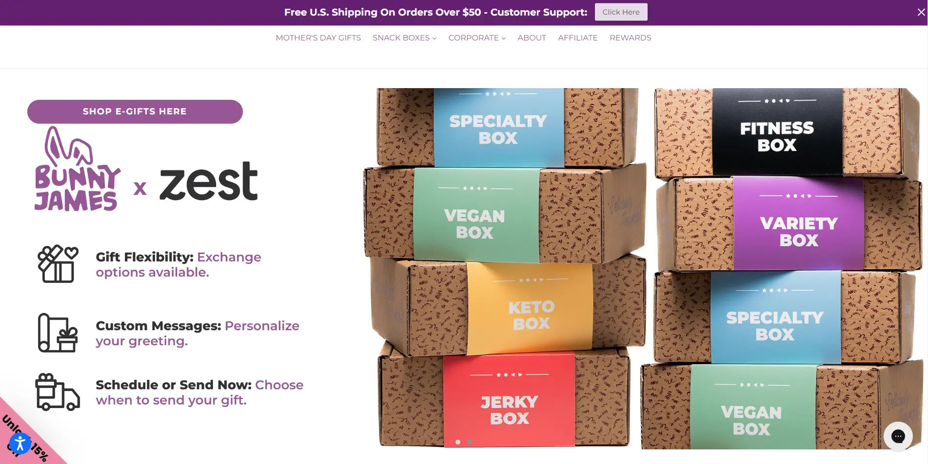
Navigating to the product listing page, you can see the design is visually focused, with high-quality images showcasing colorful features and eye-catching items. Up-close shots are also included to highlight key details, giving customers a clear view of the product and a sneak peek of what it's really like.
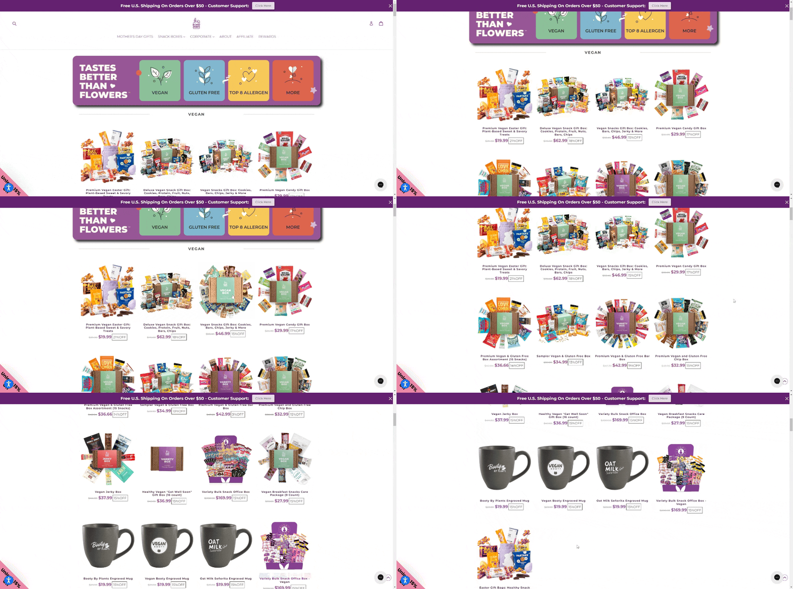
Your multi-product pages could look like these
On the product detail page, the high-quality product images are quite striking. Customers can even zoom in and out, allowing them to closely examine the texture, color, and other details that are not visible in a regular-sized image. This feature helps customers make informed purchase decisions and boosts their confidence in the product.

The brand also offers bundle options right under the product to enhance customer engagement. These added bonuses can boost customer satisfaction and loyalty, making them feel valued and appreciated. A little goes a long way, and Bunny James Boxes knows how to go the extra mile.
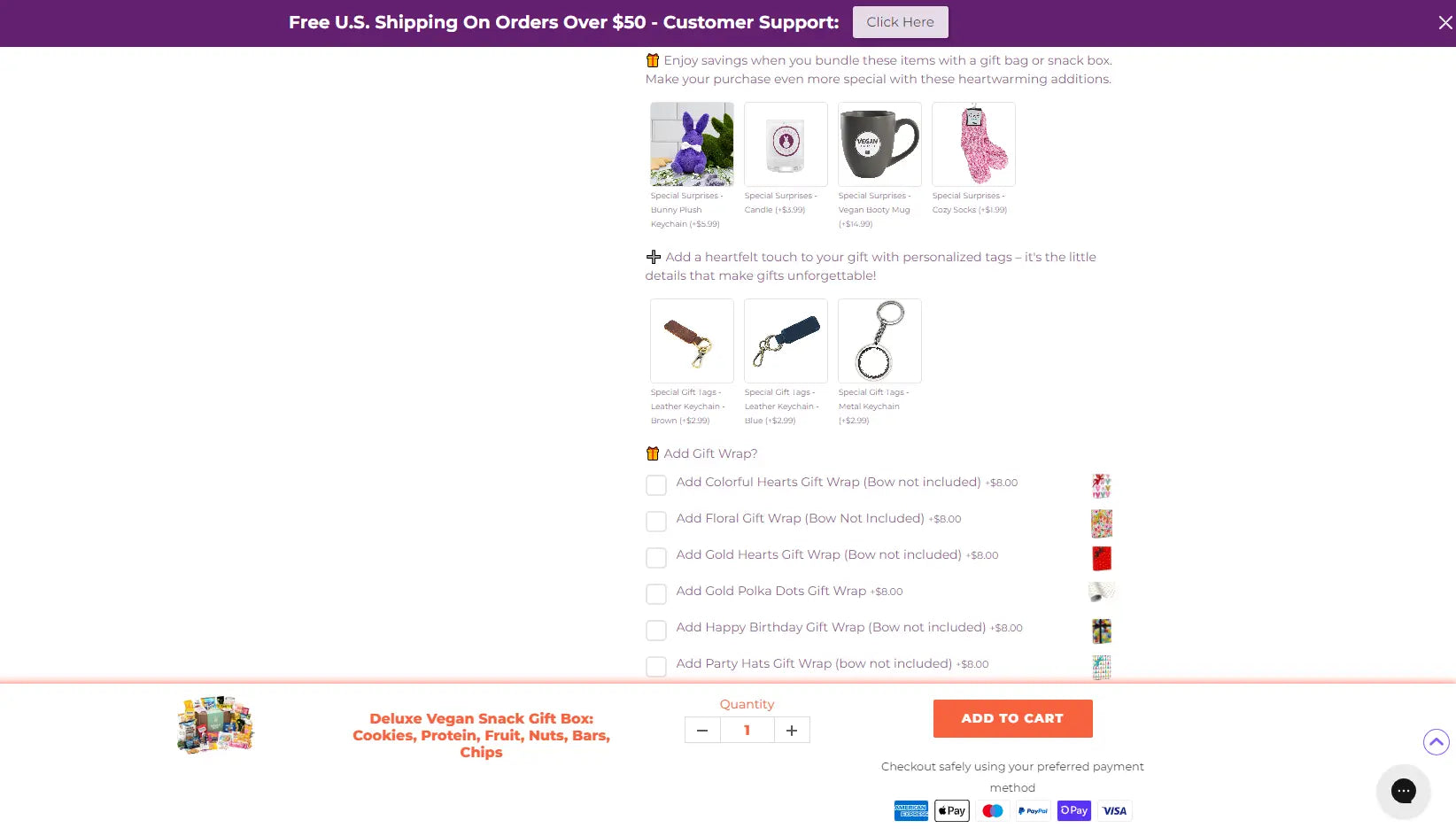
Bonuses that Bunny James Boxes offer
Bunny James Boxes' product pages prioritize clarity and convenience. The product descriptions provide all the necessary information for customers to make informed decisions, while the prominent "Add to Cart" button enables easy purchasing.
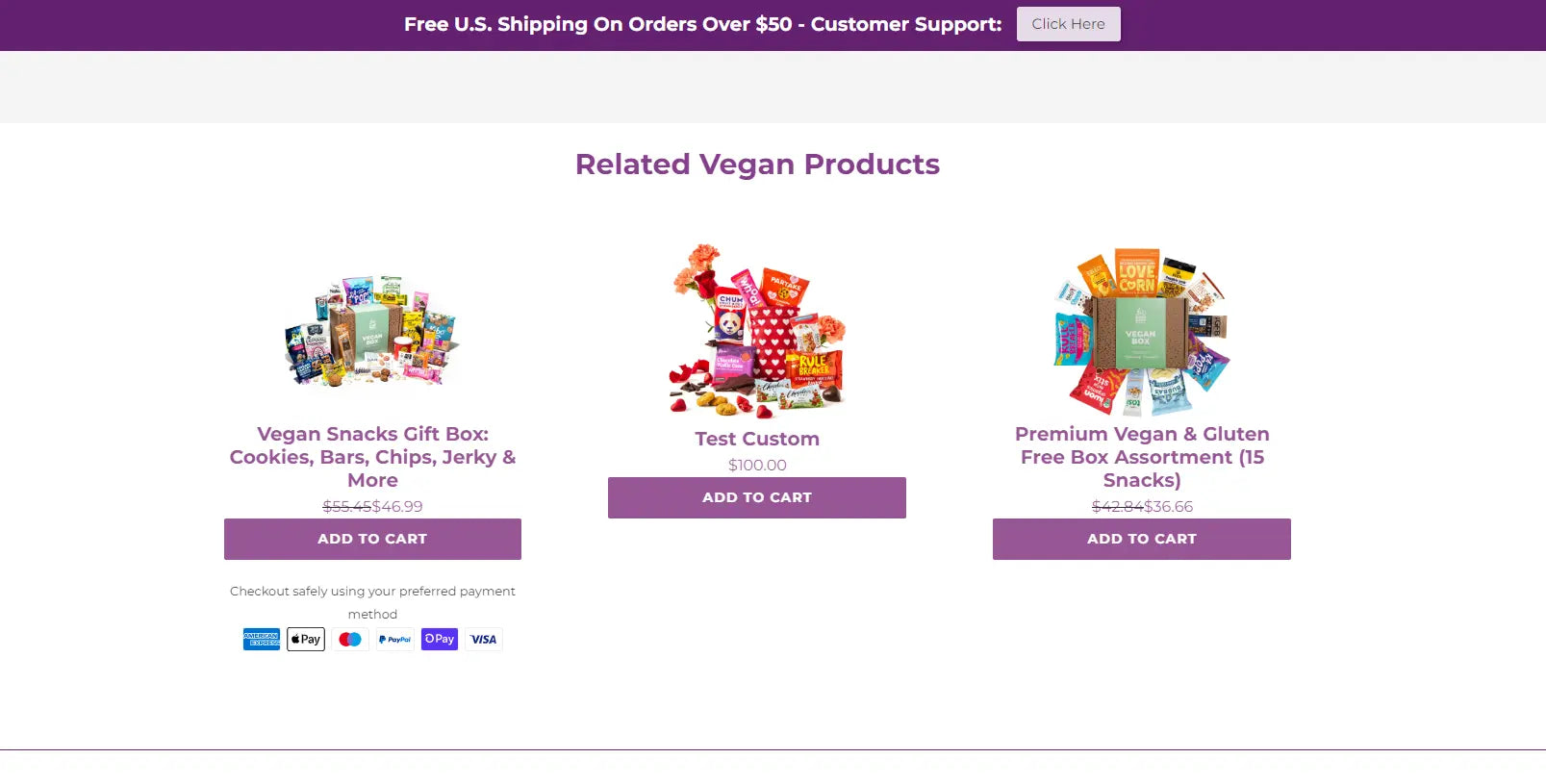
Toward the bottom of the page, you will find recommendations for related products. These suggestions aim to promote cross-selling and boost the potential for sales.
Learn more: Isn't it overwhelming to search through numerous third-party solutions just to add a single feature to your website? GemPages saves you time and hassle. Our platform offers a variety of visually appealing elements that attract more customers to your Shopify store, as well as all necessary integrations for your business to succeed. You can easily customize and create your own Shopify product pages using our user-friendly editor.
Try GemPages for free to create compelling, conversion-optimized product pages. No coding is required.

How to Create Shopify Product Page?
After perusing all of the high-converting and visually appealing pages, you may feel compelled to craft your own Shopify product page.
Fear not, as we will provide a clear and concise step-by-step guide on how to create one.
Step 1: Log in to your Shopify account and navigate to the "Products" section. Click on the "Add product" button to create a new product listing.
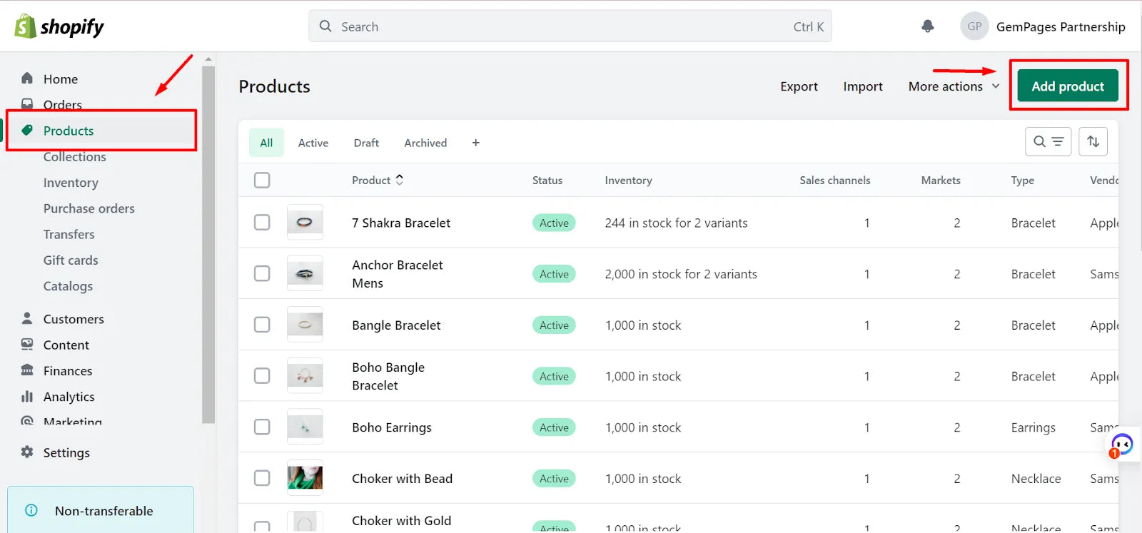
Step 2: Enter the product title, description, and images. Make sure to include high-quality images that showcase the product from multiple angles.
Step 3: Set the price and any applicable discounts or promotions.
Step 4: Choose the product type and collection. This will help organize your products and make them easier to find for customers. Add any relevant tags or keywords that will help customers find your product in search results.
Step 5: Set the shipping and fulfillment options for the product.

Step 6: Customize the product page layout and design using one of Shopify's pre-built templates or by creating a custom design using third-party integration such as GemPages.
Step 7: Preview the product page to make sure it looks and functions as intended.

Step 8: Save the product page so it is now on your Shopify store!

How to Customize Shopify Product Pages with GemPages?
We've just shown you seven outstanding Shopify product page examples. As you can see, all these product pages went beyond the standard default theme and basic Shopify customization.
To transform your page to a high-converting product page, consider using GemPages page builder, an easy yet effective way to perform advanced customization for your Shopify product pages. And the best part is you don't need to know a lick of code!

With GemPages, there’s no need to start from a blank slate. Just choose from our collection of ready-made product page templates and make it yours by uploading your products, inserting some fresh content, and adding images, videos, animations, and effects.
Here is a quick guide to bring your expected product pages to life.
Step 1: Go to the GemPages dashboard and click on the Create New Page button. From the use case list, select your page type. Click on the Product Page.

Step 2: Explore the GemPages template library to find the one that fits your needs. All GemPages templates are mobile-responsive, so you can rest assured that your Shopify product pages look on point on whatever devices your customers are browsing.
You can hover over the template and it will automatically scroll down to the bottom of the page for you to preview, or click on the Eye icon to check if it matches your requirements. Click on Select to pick the template and start making your mark.

Step 3: Click on the Save button to save your work. You can later come back and add more visuals and content to your product page. The page will be automatically switched to draft mode. Hit Publish as you're ready, or schedule your publication date.
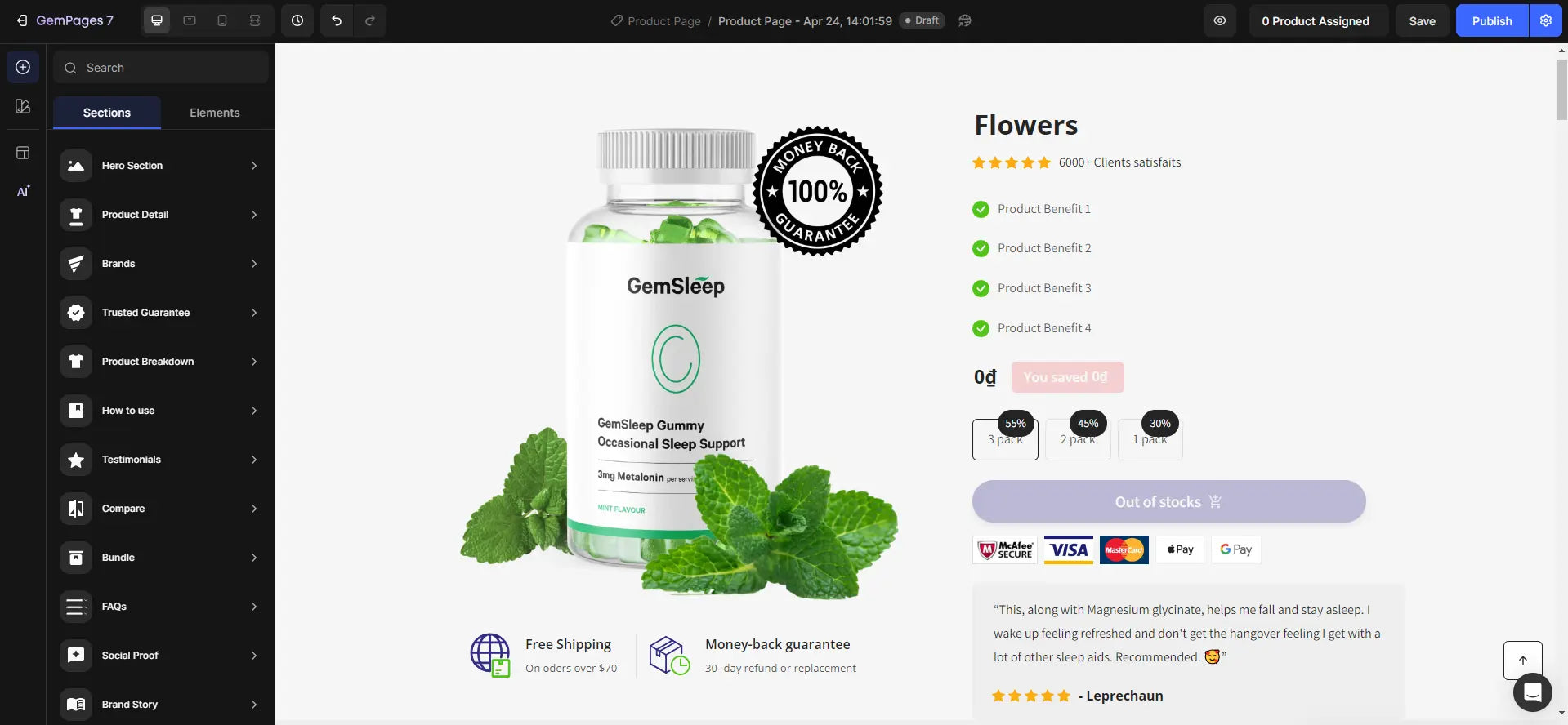
Pro tip: : If your brand has multiple products and each product has a different product page, our Global Styles feature can help make things easier for you. This feature allows you to make all your modifications in one place, save them as a preset, and apply them to each of your product pages (or any page type, for that matter).
Here is the easy guide on how to use our Global Styles feature to ensure brand consistency across your pages. Check it out!
Shopify Product Page Templates by GemPages That You Should Use to Drive Conversion!
#1. Template with product detailed information
This template features a comprehensive detail about the product features, producing process, and even related certificates as the centerpiece of the page. This template is the perfect match for products that are elaborately made of various materials or ingredients and bring enormous benefits to human health or the natural environment.
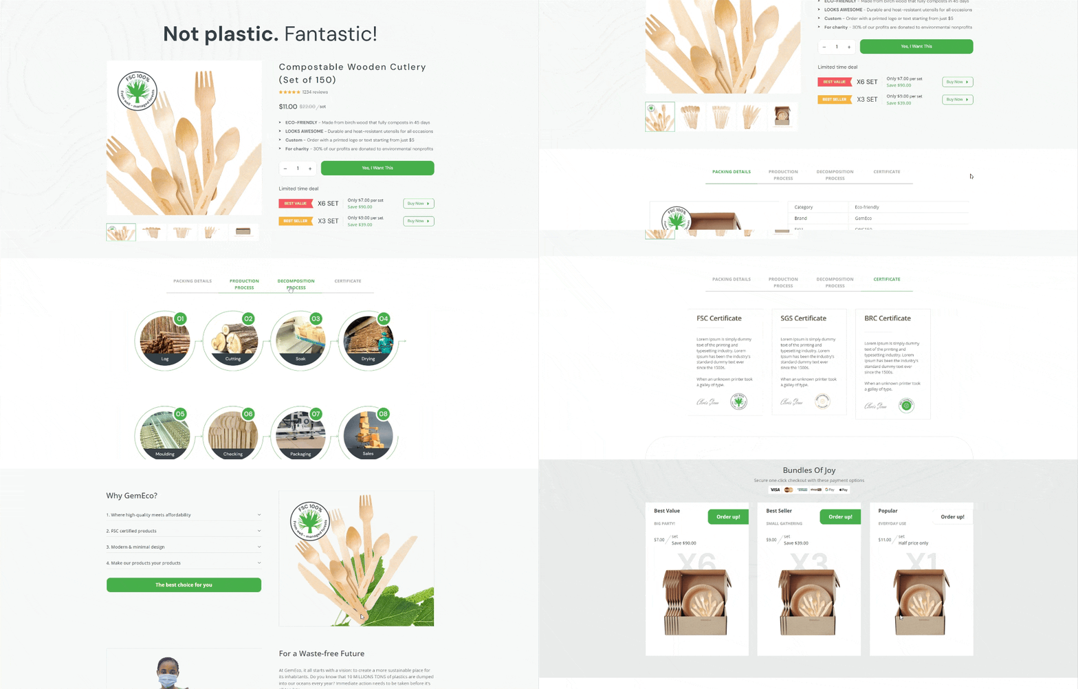
Template with product detailed information
#2. Countdown Timer or Limited-time Offer Template
Countdown timer or limited-time offer template creates a sense of urgency that encourages immediate action. This design element leverages the psychology of scarcity and time sensitivity to drive conversions and focus on customers' fear of missing out on a great deal.
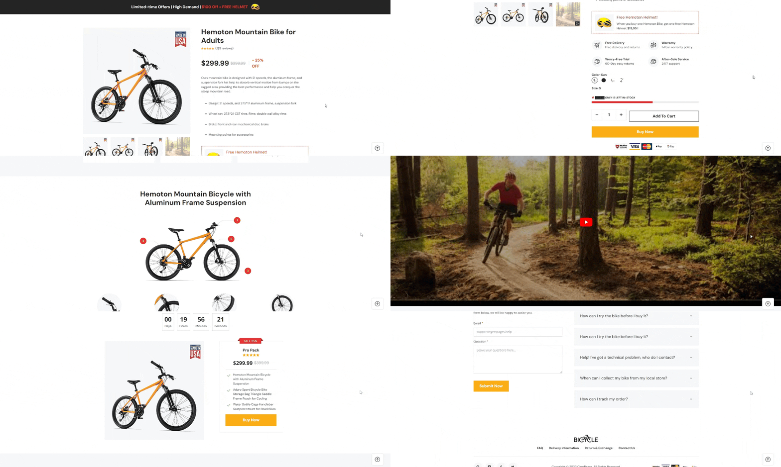
GemPages Countdown Timer or Limited-time Offer Template
#3. Template with Product Bundles Offer
 Promote your cross-selling by using the product bundles template!
The "Template with Product Bundles Offer" is a product detail page layout designed to showcase and promote bundled product offers. It presents a combination of related products or services that are bundled together at a discounted price or with added value.
The template typically highlights the main product, which serves as the centerpiece of the bundle, and displays the complementary items or services included in the package.
Pro tip: Consider offering product bundles to increase your average order value as your customers tend to buy more than what they actually need. Check out the tips to set pricing for your product bundles.
Unleash Your Inner Designer with Shopify Product Page Makeovers
We've come a long way to look at all the nuts and bolts of Shopify product pages, the best product page examples that really work, and the tools and tips you need to nail your own pages.
While the investment you put into designing your product pages is enormous, considering the great benefits it can generate, it’s definitely worth the effort.
But you can always go for the easier way with GemPages. As the most powerful page builder for Shopify, GemPages empowers you to create, customize, and optimize your product pages (or any pages, for that matter) for conversion. Even when you're a newbie, you can quickly figure out how things work and style your Shopify product pages with ease. It's coding-free, so you can be stress-free!


 Facebook Community
 Change Log
 Help Center


