


 Facebook Community
 Change Log
 Help Center


 Shopify
Inspire 85 High-Converting Call-To-Action Button Examples to Transform Store Conversions (+ Tips)
Shopify
Inspire 85 High-Converting Call-To-Action Button Examples to Transform Store Conversions (+ Tips)
Inspire 85 High-Converting Call-To-Action Button Examples to Transform Store Conversions (+ Tips)

Traffic means nothing without action. You can invest thousands in ads, SEO, and content, but if your visitors don’t click, subscribe, or buy, your funnel won't generate revenue at every stage. That’s when merchants need to enable bold, strategic, and well-optimized call-to-action buttons.
This blog covers the 85 best eCommerce CTA examples that you can use for future design and proven strategies to ensure the best results. Right now, keep scrolling to discover more with us!
What Are Call-To-Action Buttons (CTA Buttons)?
Call-to-action buttons are interactive eCommerce UI elements that prompt users to take a specific action, like purchasing an item, signing up for a newsletter, or downloading a resource. They typically include: action-driven text (e.g., “Start Free Trial”); visual contrast (color, size, placement), and psychological triggers (urgency, exclusivity). These fundamental perspectives are what every merchant should consider first to maximize eCommerce CRO for their business.
6 Tips To Makes A Good CTA for Every Web Page
1. Use Clear, Action-Oriented Language
Generic phrases like “Click Here” or “Submit” don’t communicate value. High-performing call-to-action buttons use specific, benefit-driven language that tells users what they will get. Below are typical call-to-action examples for websites that you can see to improve this aspect:
-
Get my free trial
-
Unclock 20% off today
-
Start growing my store
2. Use a page template that includes a proven CTA design
While free online store builders offer pre-built themes (including call-to-action buttons) to help beginners kickstart sales, they don’t have enough designs for different industries, niches, and sections. On the other hand, working with freelancers or CRO agencies can be time-consuming, which requires back-and-forth communication, revisions, higher costs, and greater dependence.
That’s where tailored page builders come in. For Shopify, one of the widely-used eCommerce platforms, you can easily access top-rated Shopify page builders from the Shopify App Store. GemPages Landing Page Builder for Shopify is especially renowned for its AI-powered features (Gem AI), which automatically generate high-converting images, layouts, and copy, helping you stay ahead of digital marketing trends and make your brand stand out in a competitive market.
Additionally, you can use 400+ CRO templates and sections with pre-built call-to-action buttons to simplify your store design and optimization. If you want to maximize your eCommerce AOV, don’t forget to ultilize GemPages Sales Funnel to enable up-selling and cross-selling offerings.
3. Run A/B testing to continuously improve CTR
Even the dedicated CTA buttons need validation to ensure the best performance. Small adjustments, like changing button color, copy, or placement, can significantly impact click-through rates (CTR). That’s why A/B testing is critical for any serious eCommerce brand.
As we’re using Shopify as an example, it’s worth highlighting GemX: CRO & A/B Testing, a top-rated Shopify A/B testing app that integrates seamlessly with GemPages. You can use it to:
-
Test multiple CTA variations simultaneously
-
Track real-time performance metrics
-
Identify winning designs based on actual user behaviour
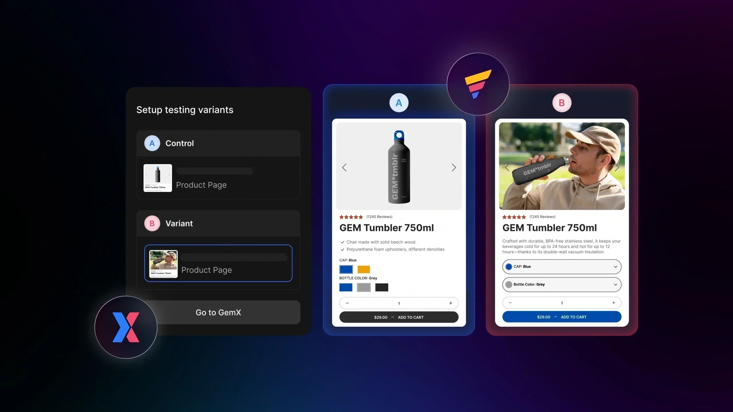
GemX: CRO & A/B Testing can work well with GemPages Landing Page Builder
Alt-text: gem x cro ab testing
This combination creates a closed-loop optimization system, where:
-
You design pages with GemPages
-
You test and refine them with GemX
As a result, you ensure your CTA buttons are continuously optimized for maximum conversions.
Learn more: How to Set Up A GemX Campaign Within GemPages Editor (Step-by-Step)

4. Create urgency and reduce hesitation
One of the most powerful psychological triggers in conversion optimization is urgency. When users feel they might miss out on an opportunity, they are far more likely to act immediately. That’s why many high-performing businesses include call-to-action buttons that use urgency-driven language, like “Limited Time Offer,” “Only a Few Left,” or “Sale Ends Tonight.”
Additionally, pairing urgency-based CTA buttons with trust signals like customer reviews, secure payment icons, or money-back guarantees can significantly reduce hesitation. This combination reassures users that they’re making a safe decision while also encouraging them not to delay
5. Make your CTA visually stand out
Most effective call-to-action button examples stand out visually from the rest. This is achieved through high-contrast colors, strategic placement, and sufficient whitespace around the button. The final goal is to create a clear hierarchy where the CTA naturally becomes the focal point.
6. Match your CTA to the customer journey
Not all visitors are ready to convert the moment they land on your site. That’s why aligning your call-to-action buttons with the customer journey is essential for maximizing conversions.
At the awareness stage, softer CTAs like “Learn More” or “Explore Features” work best, as visitors are still gathering information. As they move into the consideration phase, more specific CTAs, such as “Compare Plans” or “See Pricing,” are essential to guide them to make informed decisions.
85 High-Converting CTA Button Examples For Further Design
By types
A - Lead Generation
1. Hubspot
The first call-to-action button example is illustrated by HubSpot, which uses a high-contrast orange button that immediately draws the eye against a clean, white background. By using the phrase "Download for Free," they remove the barrier to entry and emphasize immediate value. This strategy is bolstered by social proof above the CTA button: it mentions "thousands of professionals" who use this material, which early establishes trust before visitors even click.

HubSpot features a traditional CTA button for lead generation in marketing services
2. Databox
Databox leverages a dual-CTA approach to capture users at different stages of the sales funnel. The primary "Try It Free" button uses a vibrant blue to signal action, while the secondary "Book a Demo" button remains neutral in white. This guides users toward the low-friction "free trial" option while still providing a path for high-intent leads who require a personalized walkthrough.
3. Evernote
The bold black "Get Evernote free" button stands out sharply against a soft, cream-colored background, creating a focal point that is impossible to miss. By keeping the copy focused on the core benefit of getting the tool for free, they align with their "second brain" value proposition, making the decision-making process effortless for a user overwhelmed by notes and tasks.
Charity: water provides one of the best call-to-action examples for websites tailored to non-profit organizations, using a bright yellow "SUBSCRIBE" button that mirrors their branding and stands out against the minimalist design. Unlike standard corporate sign-ups, they frame the action as "Adding Impact To Your Inbox." This benefit-driven approach, paired with an optional birthday pledge, transforms a routine newsletter signup into an emotional connection for the donor.
Silk & Willow uses an elegant pop-up that perfectly aligns with their "Inspired by Nature" brand identity. The CTA, "Join Insider List," uses a muted, earthy tone that feels sophisticated rather than aggressive. This targets "Insider" exclusivity, making the visitor feel like they are entering a curated community rather than signing up for a marketing list, which is ideal for luxury niches.

Silk and Willow enables a pop-up with the Join Insider List CTA to collect emails
6. Salesforce
Salesforce targets high-intent B2B leads by pairing a comprehensive lead generation form with a clear "GET THE EBOOK" button. The deep blue color maintains professional brand consistency while providing sufficient contrast against the container's light form. By emphasizing that users can "unlock all our resources" with one signup, they increase the perceived value of the click, making the exchange of contact information feel like a fair trade for expert knowledge.
B - Closing the sale
7. Tutti Kids
Tutti Kids demonstrates how to handle multiple purchase paths using highly visible call-to-action buttons. Their "ADD TO CART" button uses a deep forest green that anchors the product page, while a secondary, distinct CTA offers an alternative to "Shop at Costco Australia." This clear hierarchy allows the brand to drive direct sales while simultaneously promoting its retail partnerships, giving customers the power of choice without diluting the primary conversion goal.

Tutti Kids allows customers to close deals with two different CTA buttons
This brand uses color psychology to differentiate between standard and express checkout options. The traditional dark navy "ADD TO CART" button provides a grounded, reliable feel for shoppers who want to continue browsing.
In contrast, the bright purple "Buy with shop" button serves as an eye-catching express lane. By offering a recognizable one-click payment method, they significantly reduce friction and prevent cart abandonment during the final decision stage.
Jewelry brand Camille Brinch uses a refreshing lime-green "Add to Cart" button that pops against a clean, minimalist UI. This specific color choice feels modern and energetic, aligning with the brand’s vibrant photography. To capture users who aren’t ready to commit to a purchase immediately, they include a secondary "Add to wishlist" button. This prevents lead leakage, allowing the brand to remarket to interested visitors who need more time to consider.
10. LastObject
LastObject. takes a creative approach by using a soft purple-to-pink gradient for their CTA, "Try LastSwab." This stands out as a unique visual element against the white background, drawing focus to the action.
By using the word "Try" instead of "Buy," they reduce the psychological pressure on consumers. This subtle shift in copy makes the initial purchase feel like a low-risk experiment, which is particularly effective for innovative or eco-friendly replacement products.

LastObject. minimizes visitor pressure by using “try” instead of “buy” in its CTA button
C - Event promotion
11. Zero Bounce
This business designs a bright yellow "Save your spot" button to drive webinar registrations. The choice of yellow provides a striking contrast against the purple and white landing page, ensuring the CTA is the first thing a user sees. By using the word "spot" instead of "registration," they create a subtle sense of scarcity, encouraging users to act quickly to secure their place.
12. Google
For their "Scaling Up" series, Google Cloud utilizes a classic, professional blue "Register now" button. To increase the effectiveness of their call-to-action buttons, they pair the CTA with a real-time countdown timer. This creates psychological urgency, reminding the visitor exactly how much time they have left to join the AI coding assistants session before the opportunity passes.
13. DHL
DHL’s "Discover" hub uses a vibrant red "Apply now" button to encourage businesses to open an account. Positioned within a high-contrast black sidebar, the button is impossible to overlook. The copy is direct and emphasizes the start of a partnership. By placing the CTA button below a list of high-value benefits, they ensure the user is fully incentivized before being asked to click.
D. Signup
13. Click Up
ClickUp’s primary CTA, "Get started. It's FREE ->", uses a bold black background with white text to command attention. Unlike some eCommerce CTA examples that hide the cost, ClickUp proudly displays "No Credit Card" and "Free Forever" micro-copy right next to the button. This builds immediate trust, making the "sign up in seconds" promise feel achievable and risk-free.

ClickUp commits “free-forever” beside the CTA button to instantly engage visitors
14. Troubadour Goods
Troubadour Goods uses a high-end pop-up to grow its mailing list. The CTA "GET VIP ACCESS" is set in a sleek black box, perfectly aligned with their luxury brand aesthetic. By framing a simple email signup as "VIP Access" for big launches, they tap into the user's desire for status and exclusivity. This transforms a standard marketing list into a desirable inner circle.
15. Monday
This software uses a vibrant purple "Get Started ->" CTA that serves as the centerpiece of their "AI work platform" pitch. The button is placed centrally for maximum visibility and repeated in the top navigation bar to catch users who scroll. By including the small arrow icon within the button, they visually suggest forward momentum and progress, aligning perfectly with their core values.
E - Form submission
16. Diamond Law
This business uses a direct, authoritative approach for its legal consultation form. The primary call to action button features the text "GET A FREE CASE EVALUATION," which clearly communicates the value proposition to a potential client in distress. By using a bold blue color that aligns with their professional branding, they establish trust and urgency, encouraging users to submit their details for immediate professional feedback without any financial commitment.

Diamond Law creates an excellent call-to-action button for form submission with a clear benefit for a free case evaluation
17. Vividworks
Vividworks employs a sleek form designed to capture high-intent B2B leads. Their CTA, "Book a Demo," uses a vibrant blue that stands out against the dark, high-tech background of their site. The copy is low-pressure yet action-oriented, inviting the visitors to see the product in action, which is a critical step in the SaaS conversion journey.
18. Give Me Tap!
Give Me Tap! focuses on corporate social responsibility through a clean design. The "Contact Us" is bright and inviting, mirroring the brand’s mission to provide access to clean water. By keeping the form fields simple and the button prominent, they reduce the friction for partners looking to collaborate, making the act of reaching out feel as impactful as their mission clarifies.
F - Click-Through
18. Package Free
This brand uses a clean, editorial-style layout with two distinct call-to-action buttons to guide users: "Shop Bestsellers" and "Preview Plastic-Free Pods." By offering these specific paths, they cater to both the curious browser and the mission-driven shopper. The minimalist black-on-white design aligns with their zero-waste brand identity, while the descriptive copy tells users exactly what to expect, reducing hesitation and encouraging a high-value click-through.

Package Free enables a click-through CTA on the homepage for deeper discovery
19. Meow Meow Tweet
Meow Meow Tweet brings personality to their navigation with a focused "Shop Skincare" button. The CTA is framed in a hand-drawn style box that stands out against their quirky, illustrated background. This labeling helps segment the audience, guiding them to their core category and ensuring the CTA button remains highly visible without compromising the brand’s artistic charm.
G - Exclusive deals/offers
20. Fresh Heritage
The next call-to-action button example is from Fresh Heritage, featuring a clean “Subscribe” CTA tied to a VIP club incentive. While the copy is simple, the value proposition, like exclusive discounts and grooming tips, adds appeal. However, adding urgency or personalization (e.g., “Join & Save Today”) could improve conversion marketing efficiency and customer retention.
21. Bebemoss
Bebemoss uses a pop-up CTA with the engaging phrase “I’m In! Sign me up to save!”, a strong example of conversational, first-person copy. This style of CTAs reduces friction and builds emotional connection. Combined with a 10% discount incentive, it effectively captures attention.

Bebemoss instantly displays a call to action button for sign up to get 10% off when new customers visit its online store
22. Made In Cookware
Made In Cookware’s “Unlock My Offer” CTA leverages both exclusivity and curiosity. The phrasing makes users feel they’re accessing something special. This CTA is further strengthened by a bold color contrast and a focused pop-up design that minimizes distractions.
23. Adidas
This call-to-action button is strategically placed at the bottom of the homepage, targeting engaged visitors who have already browsed the site. The “SIGN UP FOR FREE” message is paired with a compelling incentive, earning 250 reward points. The green background creates strong visual contrast, while the bold, centrally aligned white text ensures visibility. Beyond driving loyalty program sign-ups, this CTA also serves as an effective lead-generation tool.
Learn more: Level Up Your Shopify Loyalty Program With A Landing Page
H - Product or service discovery
24. BLK & Bold
This eCommerce brand utilizes a high-utility grid to minimize "click fatigue." For example, using category-specific CTAs like "Shop Fresh Coffee" and "Shop K-Cup Pods" eliminates guesswork. The white-button-on-dark-image contrast is a classic CRO move, ensuring the shopping journey to purchase is unmistakable for returning customers who know their preferred format.

BLK & Bold attaches distinct CTA buttons for each collections on the hompage
Verve excels at "Cause Marketing" by pairing a deadline ("Last Chance") with a value-based CTA: "Shop & Support." This isn't only a transaction; it’s a friendly invitation to provide support. The dark button offers a strong anchor against the soft visual, driving high-intent engagement.
26. Flourist
While the "Shop Here" CTA button is a standard functional link, "See The Menu" is the real winner because it uses curiosity as a psychological trigger. The minimalist, earthy tones reflect their artisanal brand identity, though the copy leans more toward "informative" than "urgent."
I - Social sharing
27. Your Coop Food
While we don’t have a button here, the CTA logic is driven by urgency and price. Using "Today!" as a visual anchor creates a time-bound trigger. By highlighting the "£1" price point in the graphic, the post turns a simple member deal into an instant, compelling reason to visit a store.
28. Samsung
Samsung utilizes a high-value "Pre-order now" strategy to drive early adoption. By anchoring the CTA with a tangible benefit, doubling storage for free, they reduce purchase hesitation. The clear value proposition of "worth £170" makes the action feel like a good financial win for users.

Samsung strategically uses CTAs to drive early adoption from customers
29. Kitkat
This festive campaign uses a "Do check it out!!!" CTA style to drive physical event attendance. By lead-loading the copy with "FREE" rewards and "exclusive cash vouchers," it leverages gamification to turn a brand collaboration into an effective, unique FOMO marketing technique.
By platforms
A - eCommerce
30. Shopify
This example especially stands out among a range of call-to-action buttons for eCommerce. By using "Start for free," Shopify lowers the barrier to entry, while the secondary "Why we build Shopify" video button provides social proof, appealing to both entrepreneurs and researchers.

Shopify enables the Why we build Shopify video button to guide users to an interactive video explaining its features and how to use
31. WooCommerce
WooCommerce targets a technical audience with its "Get Developer Updates" CTA, focusing on long-term value and community. The purple-on-black contrast ensures the button remains the focal point, providing insights that help developers build more effectively within the ecosystem.
Adobe Commerce uses a sophisticated dual-CTA approach. "It starts with Adobe" acts as the primary emotional hook, while "Explore products" serves as the discovery path. It’s a high-intent strategy designed to move enterprise-level leads from "AI frenzy" toward measurable ROI.
33. BigCommerce
BigCommerce utilizes a "Get In Touch" CTA at the bottom of a detailed lead-capture form. This is a classic eCommerce CTA example of "friction for quality" by asking for business details first; they ensure the resulting click represents a high-value prospect for a personalized conversation.

BigCommerce attaches a clear CTA button into the Request a demo form
Learn more: Shopify vs WooCommerce: Which One Is Better For Your Business
B - Email
34. KFC
KFC uses a high-energy call-to-action button with "Order and Play." By linking a standard purchase to their "Rewards Arcade," they transform a transaction into an interactive experience. This also reduces friction in spending by promising instant gratification through potential prizes.
35. Fossil
Fossil uses highly specific, segmented CTA placements, such as "Shop Now," for distinct categories like "Date Night" or "Road Trips." This works because it helps the user self-select their intent, moving them closer to order by visualizing exactly how the product fits their life.

Fossil makes 3 different CTA buttons “Shop Now” for date night, road trips, and both in its email marketing promotions
36. Kripspy Creme
Krispy Kreme leverages sensory language and festive FOMO. Their "Tap to Treat" CTA is superior to a generic "Buy" button, as it frames the purchase as an indulgent reward. By pairing this with a secondary "Follow Us" CTA for an Easter hunt, they build multi-channel brand loyalty.
37. Just Eat
Just Eat relies on a massive typographic hierarchy to lead the eye. With a bold "60% off" hook, the dark "Order now" CTA serves as the final, necessary step to claim the "Fruitful Mondays" savings. It’s a classic high-conversion layout that prioritizes immediate financial incentive.
38. Costa Coffee
Costa uses a personalized call-to-action button with "Treat yourself, [Name]." This psychological nudge shifts the aspect from a simple "buy" to an act of self-care. The secondary "Explore our menu" CTA is a low-pressure alternative for users who aren’t ready to commit to a specific item.

Costa Coffee instant engages customers with a personalized CTA button
39. Booking.com
Booking.com focuses on the "Endowment Effect" psychology with "Activate your voucher." By framing the CTA as something the user already "owns" and only needs to trigger, it feels like a loss to ignore it. The clear deadline adds a layer of urgency, driving rapid click-through rates.
Learn more: Email Marketing Conversion Rate Optimization [+ Examples and Best Practices]
C - Social Media Ads
40. Bump & Me
On Facebook, the "Learn more" button serves as a low-friction bridge for discovery. By pairing this CTA with a bold "100+ Industry Awards" seal, this Moms & Babies brand builds immediate credibility with users. This approach effectively addresses parental concerns, guiding users from scrolling to researching a "planet-conscious" family brand without aggressive sales pressure.
41. Wayfair
Wayfair’s Instagram strategy is built for speed and visual impulse. The high-contrast "Shop now" banner at the base of the image capitalizes on the "40% OFF" sticker. By using a dark, full-width button, they ensure the banner is standout, perfect for capturing quick-scrolling bargain hunters.
42. Brother UK Ltd
LinkedIn requires a value-exchange approach, and Brother UK delivers with a "Learn more" call to action to promote its "Tech Trust Index." Rather than selling a product, this call-to-action button example offers authoritative data. It positions the business as a thought leader, targeting IT decision-makers who are more likely to click for professional insights than direct sales.

Brother UK Ltd features a common example CTA “Learn More” for ads on LinkedIn
By products
A - Jewelry
43. Satya Jewelry
This is an outstanding call-to-action button from the Shopify jewelry store. Their primary CTA, "JOIN THE JOURNEY," is a brilliant example of narrative-driven microcopy. Instead of a sterile "Sign Up," it invites customers into the brand's world of meaning and storytelling, a crucial element of emotional commerce. The large, bold, dark brown button creates a strong contrast against the light box, ensuring clear hierarchy and making the primary action unmistakable, while the underlined "Not Today" option offers a graceful exit without cluttering the interface.
Inspire more on how to build and optimize Shopify jewelry stores to achieve the best results.
44. Mounir Jewellery
Mounir Jewellery uses a split-screen CTA approach to cater to two distinct audience mindsets. The primary button, "BEST SELLERS," uses a high-contrast, deep-pink fill color to immediately draw the eye of transactional shoppers looking to find popular items quickly, a top-tier tactic for driving immediate revenue. In contrast, the secondary "OUR STORY" button is a ghost button with a thin border and no fill, designed to guide shoppers to explore the brand's ethical values.

Mounir London features a good example of CTA buttons used for jewelry stores
45. Alexmonroe
Alexmonroe employs an integrated CTA design strategy on its homepage grid. The repeated use of the underlined "Shop Now" text creates a consistent, seamless pathway for users as they browse content categories such as "Earrings," "Jewellery School," and "One Of A Kind." This low-friction text method avoids aggressive sales pitches while maintaining clear directional flow.
B - Pet stores
46. Canagan
Canagan enables CTAs that drive immediate conversion on its product pages. The "ADD TO BASKET" button features a deep crimson background that contrasts sharply against the neutral-colored website, making it outstanding. By keeping the messaging direct, the brand reduces cognitive load for pet owners. The inclusion of quantity selectors and subscription toggles above the button ensures that visitors clarify all necessary options before the final click.
47. Milly’s
Milly’s is one of the high-performing Shopify pet stores that successfully leverages the power of community-driven marketing. Their newsletter CTA button, labeled simply "Sign up," is paired with a sleek envelope icon and encased in a high-contrast black pill shape against the clean white background of the "Join the Milly's community" section. By offering a tangible "Save £10" incentive above the input field, the CTA becomes a high-value gateway for first-time visitors.
48. Lord & Labradors
This brand uses a sophisticated, wide-width call-to-action button located at the base of their "Winter Warmers" product grid. The "VIEW ALL WINTER WARMERS" button is rendered in a deep navy blue, mirroring the brand's premium identity. Its expansive size makes it a secondary "anchor" on the page, catching users who have finished scrolling through the featured carousel. This design encourages deeper site exploration and helps maintain a high session duration.

Lord & Labradors enables a click-through eCommerce CTA example to guide visitors to view all products and reviews
49. Creature Clothes
Creature Clothes features a classic CTA within its hero banner to drive category-specific traffic. The "Shop Dog Collars Now" button uses a clean "ghost" style with a thin border and black text on a white background, ensuring it doesn't distract from the striking photography of the black Labrador. The copy is action-oriented, using the word "Now" to create a subtle sense of immediacy and help users find exactly what they are looking for without a single redundant click.
Learn more: 400+ Trending Ideas For Your Pet Store Names
C - T-Shirt
This sustainable brand uses a bold, navy callout on the "Subscribe" CTA button within a warm, earthy pop-up. The contrast color between the button and the background ensures high visibility, while the "Collective Broadcast" reframes a newsletter as an exclusive community experience.
51. Truffle Shuffle
Truffle Shuffle uses a high-energy, retro-inspired call-to-action button with a white arrow inside a bright pink circle. Integrated directly into the email capture field, this compact design creates a seamless flow, leveraging the excitement of a "10% OFF" offer to drive rapid list growth.
52. T-Shirt Studio
As a print-on-demand apparel brand, T-Shirt Studio uses a functional "Add to cart" button that remains greyed out until customization is complete. This ensures users select their specific size and design options first, preventing order errors and streamlining the complex sales process.
Learn more: 17 Best Shopify T-shirt Stores to Get You Inspired
D - Cakes/Cookies
53. Cake Smiths
Cakesmiths utilizes a clean, centered CTA button overlaid on high-quality product imagery. The off-white rectangular buttons, such as "SHOP ALL CAKE," provide a sophisticated contrast that guides visitors toward specific categories without distracting from the appetizing visual appeal.
54. Cookie Chips
Cookie Chips features a cocoa-colored "Add To Cart" call-to-action button on their Shopify collection pages. Its rounded corners and rich brown hue reinforce the brand's chocolatey theme, while its placement below the quantity selector ensures a frictionless shopping journey.

Cookie Chips enables a direct, functional CTA button on its collection product pages
55. Kitkat
KitKat employs a high-contrast white CTA button with bold red text to pop against its iconic crimson background. The "FIND OUT MORE" message is perfect for brand discovery, inviting users to explore new variations while maintaining the brand's energetic and playful aesthetic.
56. Vilgain
Vilgain uses a modern, matte-black CTA that emphasizes utility and strength. By placing the "Add to Cart" button alongside detailed flavor and size selectors, they cater to the "prosumer" athlete who values efficiency and clear, data-driven shopping decisions.
If you want to discover more eCommerce CTA examples, let’s take a look at the following table.
|
Skincare |
57. |
|
|
58. |
||
|
59. |
||
|
Gift shop |
60. |
|
|
61. |
||
|
62. |
||
|
Supplements |
63. |
|
|
64. |
||
|
65. |
||
|
66. |
||
|
Furniture/Home Decor |
67. |
|
|
68. |
||
|
69. |
||
|
70. |
||
|
SaaS |
71. |
|
|
72. |
||
|
73. |
||
|
Cooking |
74. |
|
|
75. |
||
|
76. |
||
|
Education |
77. |
|
|
78. |
||
|
79. |
||
|
Wellness |
80. |
|
|
81. |
||
|
82. |
||
|
Consulting |
83. |
|
|
84. |
||
|
85. |
Conclusion
Call-to-action buttons are not only design elements; they are revenue drivers that determine whether your traffic converts or disappears. As you’ve seen across these 85+ eCommerce CTA examples, the difference between a normal CTA and a high-performing one often comes down to small but strategic decisions: the wording, placement, color, and alignment with user intent.
Read GemPages blogs to learn more about how to build a high-converting eCommerce brand!
FAQs


