How to Create a Homepage Design That Captivates and Converts
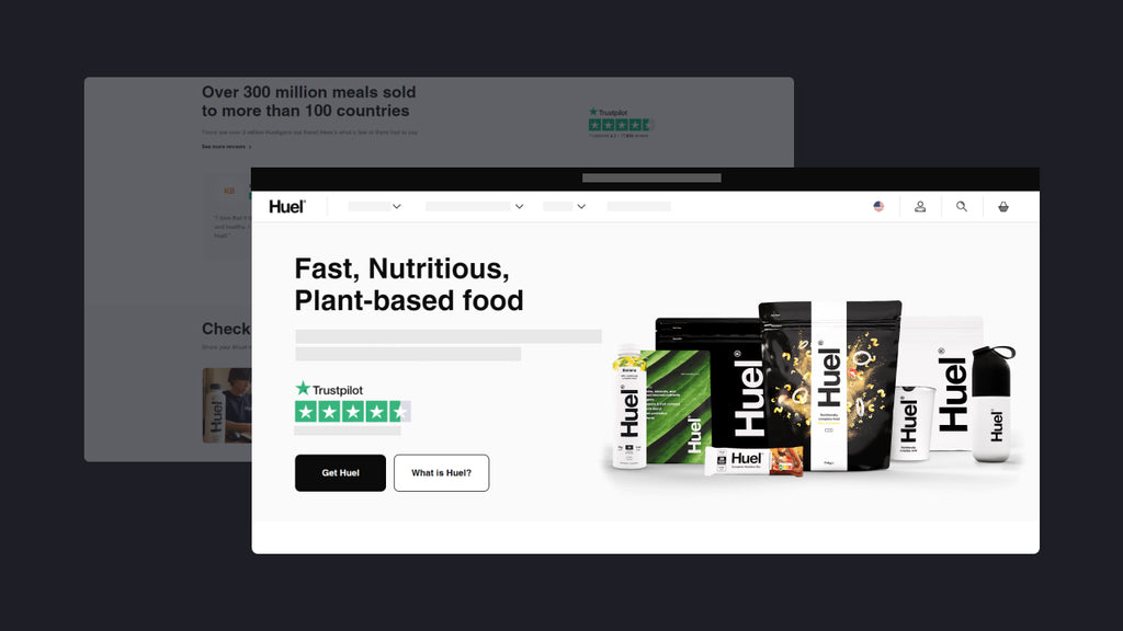
To every online store, the homepage is the most important anchor that draws visitors in and directs them towards making a purchase.
Statistics show that a visitor only spends about 10 to 20 seconds surfing a website, so crafting an effective Shopify homepage requires careful consideration of various elements to ensure it captivates and converts your audience.
In this comprehensive guide, we'll delve into the intricacies of website homepage design, exploring what it entails, what to include, best practices, customization guide, and more.
Read on now!
Learn more: 10 Killing Shopify Homepage Examples to Learn in 2024
What is a Website Homepage?
The website homepage is the first page that visitors see when they load a domain. It plays a pivotal role in shaping their perception of your brand and setting the tone for their browsing experience. Therefore, it is necessary for online merchants to create an eye-catching and user-friendly homepage.
To every Shopify store, a well-designed homepage not only welcomes visitors but also guides them towards desired actions, such as exploring products, making purchases, or engaging with your content.
Learn more: A Digital Storefront Guide For Your eCommerce Business (2024)
What to Include in your Shopify Store Homepage?
1. Above-the-Fold Section
Above the fold is the top section of a web page that appears immediately once you land on it, and before scrolling down the page.
The above-the-fold section possesses prime real estate for capturing visitors' attention. This section should succinctly communicate your brand's value proposition, showcasing compelling visuals, catchy headlines, and prominent calls-to-action (CTAs) that entice users to engage further with your site. Effective above-the-fold design sets the tone for the browsing experience and encourages visitors to explore more.
-
Header with Clear Navigation
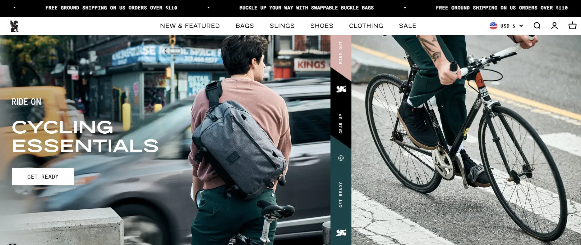
Included in the above the fold section, the most important is the header. This part serves as the gateway to your Shopify store, providing visitors with essential navigation options to explore your site effortlessly. Most store owners will place elements here including New arrival, New collection, Bundle deal or showcase by gender like For Male, For Female. Look at the Chrome Industries, they show 6 categories, namely New & Feature; Bags; Slings; Shoes; Clothing and Sale on the navigation bar. Clear labels and intuitive organization ensure users can find what they're looking for without confusion, enhancing the overall browsing experience.
Learn more: Everything you need to know about editing Shopify Header and Footer
-
Hero banner with strong CTA button
The hero banner —- prominently displayed on your homepage, serves as a visual representation of the store owner's product or aesthetic. Numerous businesses opt to collaborate with celebrities or influencers within their niche to enhance brand visibility and instill customer confidence through captivating imagery.
Pro tip: The Overlay effect is a popular hovering visual effect that not only enhances readability but also draws attention to the selected content. Implement this effect for your hero banner and witness its high-converting effectiveness.
Video Element —- An alternative way to create an attention-grabbing banner is by incorporating video content. Typically, these videos autoplay and have a fairly short duration. Sometimes only a few seconds can effectively showcase all the product's features in a concise manner.
Learn more: The Power of Video Landing Pages: Turning Clicks into Customers
CTA button —- Remember that visitors may not make a purchase immediately upon entering the store. Hence, the CTA button here can guide customers towards your highlighted products or packages, offering enticing incentives.
Tip: Incorporating eye-catching colors and compelling content such as "Buy with 20% off" or "Only $1" will encourage clicks to your call-to-action button.

Best-Selling Products/Recommended Features
Highlighting your best-selling products or recommended features on the homepage serves multiple purposes. It showcases your top offerings to visitors, instantly capturing their interest and providing social proof of your product's popularity. Additionally, featuring recommended products or key features helps guide users towards relevant content or offerings, streamlining their browsing experience and increasing the likelihood of conversion.

Better With Friends offered a section for most liked products on their homepage.
Learn more: Unlocking the Potential: Boosting eCommerce Average Order Value
Product Collections
Organizing products into distinct collections or categories makes it easier for visitors to browse and discover items aligned with their interests. Whether based on product type, theme, or seasonality, curated collections help users navigate your inventory more efficiently, leading to higher engagement and conversion rates. Each collection section on the homepage should showcase visually appealing images and provide clear pathways for exploration.
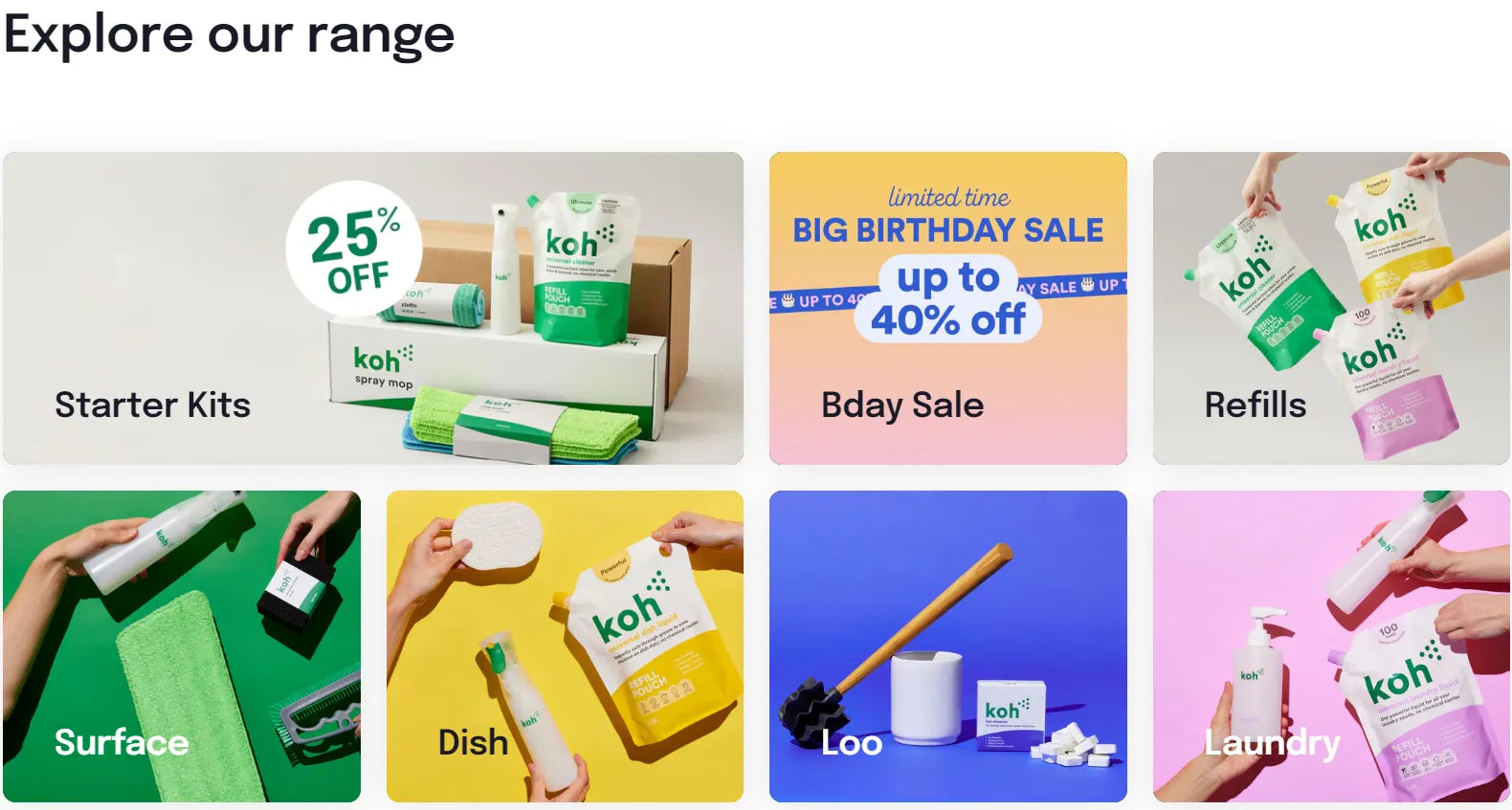
Koh.com introduces its product collections right in the homepage.
Testimonials and Social Proof
Displaying customer testimonials, reviews, or social proof signals to visitors that your products or services are trusted and valued by others. Positive feedback from satisfied customers builds credibility and trust, alleviating doubts and objections that may hinder conversion. Integrating testimonials strategically throughout the homepage reinforces your brand's reputation and encourages prospective customers to take action.

This is how Textile And Twine features its testimonials on the homepage.
Pro tip: If the Testimonial section is not enough to showcase, create a separate page for it and direct land visitors here to explore.
Blog Section
If your Shopify store includes a blog, featuring recent blog posts on the homepage can enhance engagement and provide valuable content to visitors. The blog section serves as a platform for sharing insights, product updates, industry trends, and other relevant information that adds value to your audience. By showcasing your latest blog content prominently, you can encourage visitors to explore your site further and establish your brand as a knowledgeable authority in your niche. Not to mention that featuring a blog section here can also help to enhance search engine optimization.

Fodyfoods featured its blog section right on the homepage.
Footer
The footer is often overlooked but plays a crucial role in providing additional navigation options and essential information to users. It typically includes links to important pages such as contact information, FAQs, shipping and returns policies, and terms of service. Additionally, the Shopify footer may contain social media links, newsletter signup forms, and other widgets that encourage further engagement with your brand. A well-designed footer enhances usability and ensures visitors can access important resources regardless of where they are on your site.

An example of footer from Just Collagen.
Additional Elements: Announcement Bar, Chatbot
Incorporating additional elements like an announcement bar or chatbot can further enhance the functionality and user experience of your homepage. An announcement bar allows you to communicate important messages, promotions, or announcements to visitors prominently. Meanwhile, a chatbot provides real-time assistance and support, addressing customer inquiries and guiding users towards relevant products or resources. These supplementary features can improve engagement, streamline communication, and ultimately contribute to higher conversion rates on your Shopify store.
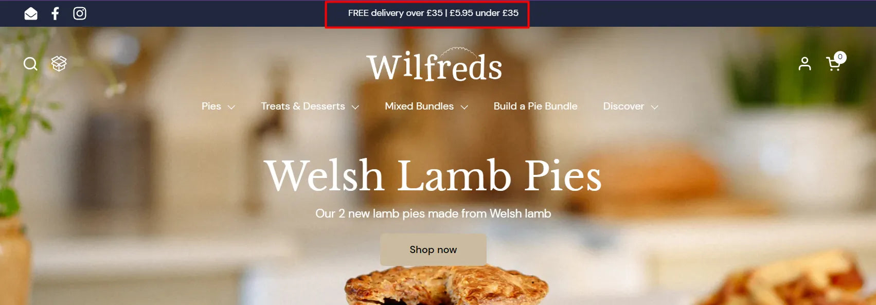
Wilfredspies displays its announcement bar right at the top of the homepage.

Best Practices for an Effective Shopify Homepage Design
Creating a captivating and conversion-focused Shopify homepage involves adhering to certain best practices. Let's explore some essential strategies:
Set a clear goal for visitors when they land on your homepage: Define the primary objective you want visitors to accomplish, whether it's making a purchase, signing up for a newsletter, or exploring specific product categories. Tailor your homepage design and content to guide users towards fulfilling that goal.
- Integrate your brand into every element: Consistency is key to reinforcing your brand identity and fostering brand recognition. Infuse your logo, color scheme, typography, and brand messaging throughout the homepage to create a cohesive and memorable user experience.
- Ensure the page is SEO-optimized and user-friendly: Did you know that more than 23.6% of online searches for products begin on Google? Therefore, SEO is a must-have requirement for designing a homepage. You should optimize your homepage for search engines by incorporating relevant keywords, descriptive meta tags, and structured data markup. Simultaneously, prioritize user experience by designing for intuitive navigation, fast loading times, and mobile responsiveness.
Learn more: How to improve SEO for your homepage or the whole Shopify store here.
- Design visually-appealing banners: Capture attention with high-quality images, compelling headlines, and clear calls-to-action (CTAs) in your homepage banners. Use eye-catching visuals that resonate with your target audience and effectively communicate your unique selling propositions.
- Avoid putting walls of text: Keep content concise and scannable to prevent overwhelming visitors with excessive text. Use bullet points, headings, and multimedia elements to break up content and make it easier to digest. This also helps to improve user experience and enhance your SEO efforts.
Read more: Transforming Words into Wealth: 10 copywriting hacks for the best conversion
How to Customize Website Homepage Design Using GemPages
GemPages is a powerful Shopify page builder that enables you to customize your homepage with ease, even if you have limited technical expertise. But why should you use GemPages to design a high-level customized Shopify homepage? Here are the reasons:
1. Drag-and-drop interface
The page builder offers you an intuitive and user-friendly drag-and-drop interface. You can create a homepage simply using pre-build blocks from the page builder.
2. Pre-designed Templates
Save time and effort in terms of design with pre-built templates tailored to various industries and niches, ready for immediate use. With almost 100+ templates available, you can seamlessly integrate them into your homepage, creating a professional and stylish appearance.
Simply install GemPages, navigate to the Editor, choose the appropriate homepage design template, and customize it to your liking.
3. Customization Options
With GemPages, customize every aspect of your homepage within the templates, including colors, fonts, layout, and functionality, to align with your brand and preferences. Additionally, with the newly-launched Theme Section feature, integrate customized sections into your existing Shopify themes without additional costs.
Explore these guideline to build your high-converting Shopify store:
- How to design a high-converting homepage
- How to design a homepage from scratch
- Shopify Tutorial: Everything For Success [2024]
Important note: GemPages' is now offering Mother & Father's Day promotion: 20% Off Monthly Plans. It is exclusively for first-time GemPages users! From April 1 to June 30, 2024, UTC. Grab it now!!!

Website Homepage Design - The First Impression to Your Paying Customers
In conclusion, designing a captivating and conversion-focused Shopify homepage requires careful planning, thoughtful design, and a deep understanding of your audience's needs and preferences. By incorporating the outlined best practices and leveraging tools like GemPages, you can elevate your homepage design and maximize its impact on your Shopify store's success.


 Facebook Community
 Change Log
 Help Center


