Master the Art of Conversion: Building the Ultimate Landing Page Funnel
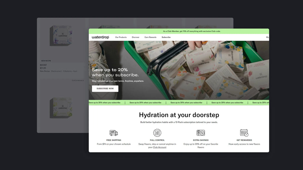
For eCommerce sellers using landing pages to boost sales, here's a crucial point to consider: what happens if potential buyers leave before taking action?
A landing page's goal is to present all necessary information and encourage the desired action. Yet, it's not uncommon for customers to leave before reaching the end, leading to a failed conversion and higher ad and customer acquisition costs. Often, this drop-off is due to weak storytelling and poor user experience on the landing page, failing to persuade visitors to proceed.
That's why we're introducing a concept that might be new to you: the landing page funnel. This strategy, as its name suggests, is designed to guide customers through their journey and lead them to the bottom of the funnel—the decision-making process.
Keep reading for our step-by-step guide on creating an effective landing page funnel to maximize your conversions.
Learn more: How to Create A Striking Landing Page on Shopify
What is a Landing Page Funnel?
Landing Page Funnel
It's a series of connected web pages, each telling a part of the story and leading customers towards the action you want (usually a sale). Every page in this funnel addresses a different part of the buyer's journey.
Benefits of Landing Page Funnel
First, let's talk about a common mistake with normal landing pages: treating all of them like pop-ups for time-limited offers. Many sellers think discounts will grab everyone's attention, so they fill their landing pages with sale banners, countdowns, and forms right away. But the truth is, if people don't really need your product, they won't buy it, even if it's on sale.
These landing pages often assume they're catching buyers right at the end, just before they decide to buy, thinking one final offer will clinch the sale. And yes, this approach might work in some cases, depending on your marketing strategy, product, and market position (we will give an example of it later).
However, the reality is that buyers usually pass through several steps before they're ready to buy, and landing pages often meet them at the beginning of their journey, especially if you're new or offering a niche product.
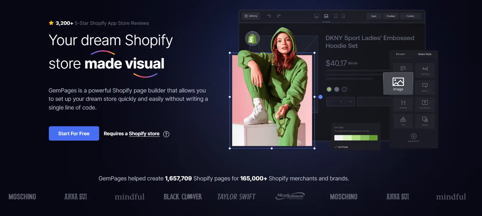
To give you a clearer picture, consider the Buyer Journey Framework from SiriusDecisions, which outlines six stages of this journey.
At the first stage, the aim is to connect the potential buyer with their issue. Essentially, it's about highlighting a problem or challenge they're facing that you can help solve. A good approach is to contrast their current situation with a much improved future one — showing how life can be better without the current pain points. The focus here should be on the issue they're facing, not your products or services.
But that's just the beginning. A truly effective landing page needs to guide customers through all these steps, aiming ultimately for sales in eCommerce.
Learn more: Start an eCommerce Business with No Money
Yet, cramming so much information onto a single page can be too much for customers, making them feel pressured or lost, especially with poor navigation. That's where the concept of a landing page funnel comes in, as we mentioned earlier.
Let’s dive into more details below.
Structure of a Landing Page Funnel
Every eCommerce store has its own way of setting up a landing page funnel, tailored to the campaign's goals. But a key point is that a good funnel should guide customers from the start to the end of their buying journey.
We often divide the funnel into three parts, each matching a phase in the buyer's journey.
Opening Page: The Why?
This page is crucial because it's your first chance to catch the customer's interest and lead them further.
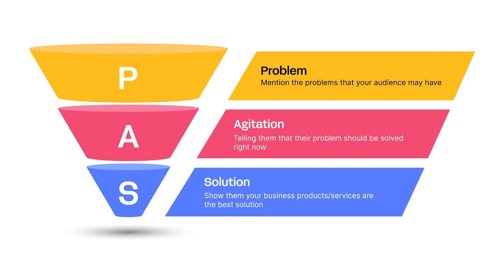
Typically, there are two main strategies for setting up your first page in your landing page funnel. The first one targets Awareness and Interest in the AIDA model (Awareness - Interest - Desire - Action), and the second focuses on Problem and Agitation in the PAS model (Problem - Agitation - Solution).
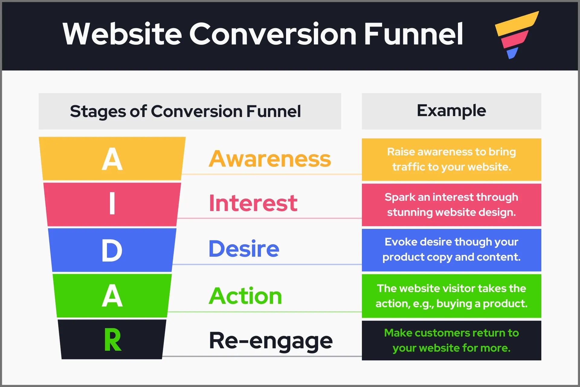
If your product is well-established in the market, the first strategy might be more suitable. For instance, if you're selling a well-known vitamin supplement, your opening page could highlight its credentials like "Top-rated Vitamin C from the leading global brand, FDA-approved, and a consumer favorite for 5 years." Here, leveraging social proof and facts can draw attention because the product is already recognized, and you're reinforcing its credibility. You can also use this approach for limited-time offer landing pages.
Learn more: 24 One Product Store Ideas for you to follow
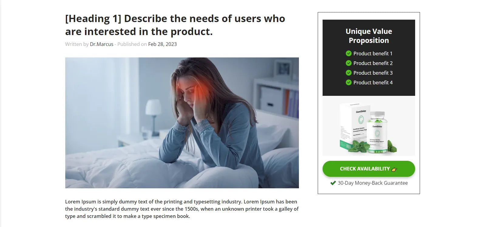
On the other hand, if you're introducing a niche product, say, a new type of supplement with unique active ingredients, its origin or certifications might not be as compelling right off the bat. In this case, begin with a relatable issue, such as "Tired of headaches during office hours?" or "Did you know 90% of urban kids are at higher risk of rickets compared to those in rural areas?"
(Note: These examples and statistics are for illustration only and not verified).
This addresses the first 'P' in PAS. Following this, you can delve deeper into the problem, showing its impact on the customer's life and the urgency of finding a solution, setting the stage for your product.
Next, place a call-to-action (CTA) button to guide the customer to the following page.
Learn more: Effective Tips to Create Call to Action Buttons that Convert
Development Pages: The What?
After identifying a pressing issue on the first page, customers will naturally start looking for solutions to address the pain point they've just recognized. This stage is crucial for customers to determine if what you offer can meet their needs or solve their problems.
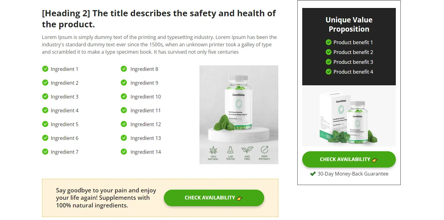
The purpose of these development pages is to clearly communicate how your product or service alleviates the identified issue.
Therefore, on these pages, highlight what sets your product apart. Consider addressing questions like:
- What solution does your product provide?
- Why should customers opt for your product over others?
Incorporating customer testimonials, especially video ones, can significantly boost your product's credibility. Given that 70% of customers look at reviews before making a purchase, tapping into user-generated content here can be very effective. Remember, reviews need to be authentic and verifiable; otherwise, customers might disregard them and lose trust in your product.
Learn more: Top Lead Generation Landing Page Examples for Your Shopify Store in 2024
Action Pages: The How?
This goal here is straightforward: seal the deal.
Now, your task is to emphasize the urgency of making a purchase. A common strategy is to introduce time-sensitive deals. Offer a special discount available only for a short period, making customers feel privileged to access this exclusive opportunity. Employ language that conveys scarcity and urgency, fueling a fear of missing out (FOMO) and compelling customers to act swiftly. Moreover, assure them that choosing your product is a wise decision that addresses their immediate need effectively.

Landing Page Funnel Best Practices
Every landing page funnel is unique and tailored to different campaigns and audiences. To craft a funnel that effectively serves your business, consider these key strategies:
- Set Clear Objectives: Define what you want to achieve with your funnel, such as boosting sales or increasing sign-ups.
- Understand Your Audience: Knowing your target market inside and out is crucial. This knowledge should shape every aspect of your landing pages, from headlines to call-to-action (CTA) buttons.
Identify Your Business's Need: Assess where your business stands, including its strengths, weaknesses, and unique selling points. This will help you pinpoint the main message for your funnel pages.
- Segment Your Funnels: Increase conversion rates by creating specific funnels for different segments of your audience, such as by age group or customer type (new visitors, subscribers, repeat customers, etc.).
Learn more: How to Create an eCommerce Website Conversion Funnel in 2024
- Maintain Consistency Across Pages: Ensure your funnel pages are cohesive. For example, a funnel for cat owners should feature cat-centric designs and imagery, not a mix of various pets.
- Align with the Customer Journey: Build your funnel by considering the information or incentives your target customers need to move forward, like detailed product info or personalized recommendations.
- Craft Compelling Copy: Use persuasive writing techniques to motivate users to interact with your CTAs, employing action-oriented verbs like 'discover' or 'get started.'
- Optimize Your CTA: Make your CTA button stand out with a contrasting color and ensure it's easily clickable across all devices, especially on mobile.
- Leverage Data for Personalization: Use the data you collect to tailor future campaigns and enhance the relevance of your messaging.
Pro tip: Your website is the face of your brand and website branding is one of the most important factors, especially for eCommerce businesses.

Must-have Elements of WebPages in a Landing Page Funnel
No matter the goal or strategy, every page in the landing page funnel needs to include sales touchpoints. These touchpoints are moments where the customer's issues or doubts are addressed and solved.
It's essential to distribute these touchpoints throughout the entire funnel, with each page focusing on a distinct type of touchpoint.
Below are some must-have elements that every page should have to effectively engage with customers.
Opening Page - a Headline
Your headline is the first touchpoint with your customers. Therefore, it can make or break your campaign. To ensure it's effective:
- Understand your customers, including their challenges and what drives them.
- Understand your product, particularly its unique benefits and how it addresses specific customer issues.
- Craft a concise and clear headline using straightforward language to grab customer interest right away. Prioritize clarity over creativity—get to the point without making customers work to decipher your message.
- Complement your headline with an attractive and relevant hero image that enhances your message.
- Conduct A/B testing to determine the most effective headline..
Developing Pages - Social Proof
The purpose of development pages, as mentioned earlier, is to illustrate why your product is the ideal solution for the customer's issue. The following elements are crucial for creating sales touchpoints on these pages:
- Detailed explanations on how your product addresses specific problems, tailored to meet the needs of your potential customers.
- Proof of your product's quality, such as certifications or awards, to underscore its superiority.
- Customer testimonials that share stories of how your product solved their problems, enhancing the page's trustworthiness.
Action Pages: Calls to Action (CTAs) and Special Offers
The final touch is a really good CTA and a tempting deal to get customers to decide. How well the previous pages did will show in how people react to your CTA here.
Also, your landing pages should tell a story, linking them together so customers can follow along their buying journey. Make sure the look and words of your pages work well together. For example, use a hot color palette for deals to make them stand out and create a sense of urgency. And don't forget about page speed – if your pages load slowly, you will lose customers. Before going live, test your funnel on various devices to guarantee optimal presentation and fast loading times.
Choose the Best Sales Funnel Builder & Software: The Complete Guide [2024]
A Step-by-Step Guide to Building An Effective Click Funnel + Actionable Tips & Examples [2024]
How to Build An eCommerce Sales Funnel Strategy in 2024 [+ Examples]
Wrap It Up
To sum it all up, making a great landing page funnel is about guiding your customers step by step, making their journey from just looking to buying as smooth as possible. Keep your pages simple, speak directly to what your customers need, and make sure each part of your funnel helps them along the way.
And if you're feeling stuck, don't worry. GemPages - Shopify’s top page builder - can make things a lot easier. It gives you lots of tools and ready-made designs that fit all kinds of businesses, helping you create landing pages that really speak to your customers and help boost your sales.


 Facebook Community
 Change Log
 Help Center


